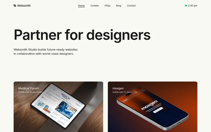
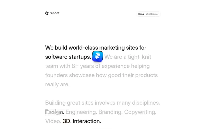
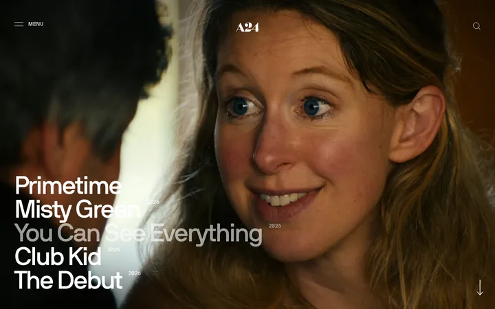
North star · Let oversized typography and deliberate white space lead; use black only to create clear structural contrast.
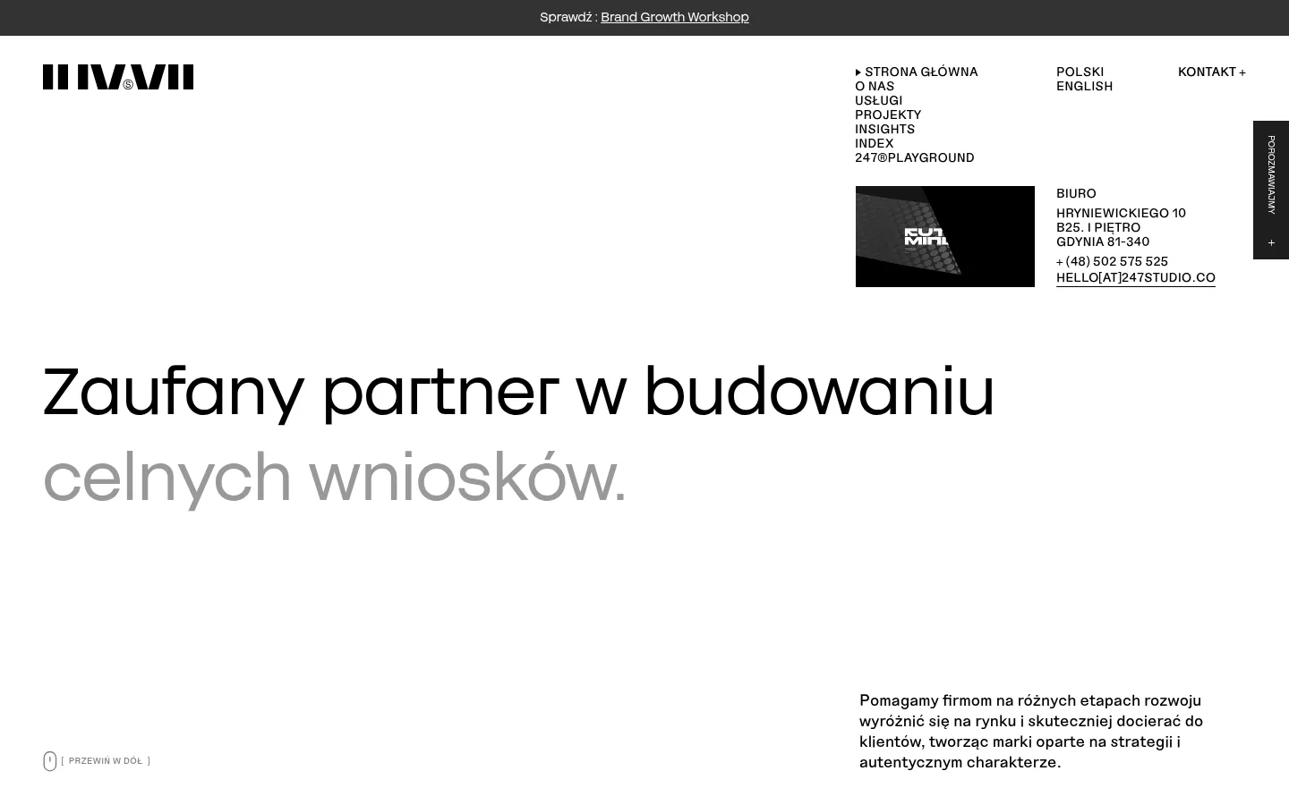
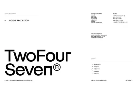
The visual strategy is built on a strict, near-monochrome palette: white is the dominant canvas, black anchors typography and one prominent services band, and muted grays distinguish selected headline phrases and supporting copy. Typography carries most of the identity. Large, light-feeling grotesk headlines sit beside compact uppercase navigation, labels, and metadata, creating a deliberate contrast in scale and density. The opening is spacious and asymmetric: a dense navigation and studio contact cluster occupies the upper right, while the oversized hero headline starts far below the top edge and supporting copy sits near the lower right. Subsequent sections alternate broad white fields with occasional media-led project layouts; a full black services section provides the main tonal break. Case studies and client proof rely on imagery rather than decorative UI. Hairline dividers and square-edged cards keep the interface flat and precise. Motion is subtle; the page’s pacing comes from whitespace, content placement, and changes in background tone.
配色
点色块复制色值。用途说明来自对页面的实测位置(背景、文字、描边、按钮)与截图判读。
品牌色
表层色
中性色
功能色
页面底色 · Gallery White表层 · Paper Gray表层 2 · Studio Ink主文字 · Studio Ink次要文字 · Soft Graphite弱文字 · Quiet Gray描边 · Rule Gray
Main compact sans-serif for body copy, uppercase navigation, captions, and utility labels.
Aa 设计
247 Grotesk
网络字体 · 字重 400 / 500 / 300 · 占比 13%
免费替代:Manrope
Display and heading face for the oversized hero, section titles, and prominent text links.
角色
示例
字号
字重
行高
字距
特大标题
Oversized opening statement and standout display headlines.
247studio
73px
400
1.2
0
一级标题
Primary hero headline and major page-level statements.
247studio
55px
400
1.2
0
二级标题
Large section headings, often with contrasting muted phrases.
247studio
51.5px
300
1.2
0
三级标题
Secondary section and content-group headings.
247studio
48px
400
1.2
0
四级标题
Smaller prominent card or subsection titles.
247studio
35px
400
1.14
0
正文
Supporting descriptions, studio information, and editorial summaries.
The quick brown fox 敏捷的狐狸
13.5px
400
1.3
0
辅助文字
Uppercase labels, dates, categories, and compact metadata.
The quick brown fox 敏捷的狐狸
12px
500
1.2
0
链接
Uppercase navigation and utility links.
The quick brown fox 敏捷的狐狸
14px
400
1.14
0
间距与布局
基准单位 2px · 密度:适中
48px版块间距
8px元素间距
—卡片内边距
1344px内容最大宽度
2px
4px
5px
6px
7px
8px
9px
11px
12px
14px
15px
16px
17px
19px
20px
24px
The measured page max width is 1344px, with comfortable density and a 48px section gap. The opening uses an asymmetric composition: compact navigation and contact information sit in the upper-right area while the hero headline begins lower and aligns left; supporting copy anchors toward the right. Broad single-column white sections alternate with split and multi-column content, including project grids and testimonial material. Keep alignments crisp, margins generous, and section transitions spacious rather than filling every field.
圆角与层次
没有测到阴影:页面是扁平的,层次靠底色和描边区分。
The interface is predominantly flat: no measured shadows or gradients. Cards and project areas use square corners, with occasional thin outlines and subtle gray separators rather than raised surfaces. Black section bands create depth through contrast, not layering. Avoid floating panels; keep media and text grounded in the page grid.
组件
下面的预览按实测的按钮、输入框、徽标、卡片样式重建(字体用替代字体)。
Studio navigation
Compact uppercase links arranged in a tight cluster, balanced by language and contact links and a separate studio address block.
Hero statement
Large left-aligned grotesk headline on white, with a selected phrase in gray and explanatory copy positioned separately near the lower right.
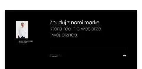
Services band
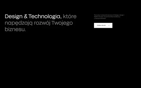
Full-width black section with a large white-and-gray heading, compact supporting copy, and a white square-cornered CTA.
Project cards
Large rectangular project media with understated captions and category details; cards use square edges and may be separated by fine outlines.
Client proof
A quiet client-logo area with a short uppercase introduction, generous whitespace, and minimal framing.
Testimonial panel
Partner quote content led by a prominent heading and compact CTA; later contact content uses a black panel with reversed text.
Editorial listing
Large section headline followed by article dates, categories, and titles in a restrained two-column content rhythm.
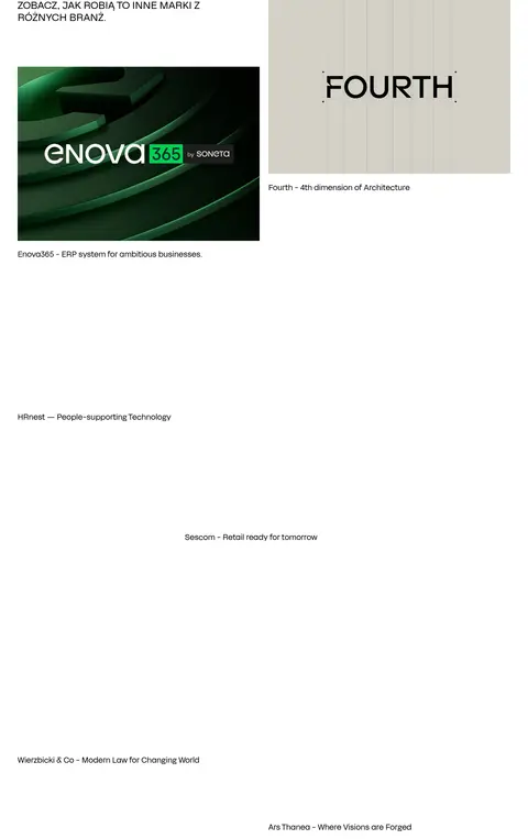
Imagery · Use project imagery as portfolio evidence, not as a decorative background system. The page includes image and video work, with examples such as Enova365 and Fourth shown in large rectangular frames and minimal captions. Client marks and project media may carry their own colors; the surrounding interface remains monochrome. The opening includes a small dark media tile near studio details. Preserve clean crops and let media scale within the spacious grid.
Use oversized grotesk headlines as the primary visual anchor.
Pair large display text with compact uppercase navigation and labels.
Preserve asymmetric placement and broad areas of whitespace.
Use black section bands sparingly for strong structural contrast.
Present portfolio media in clean rectangular frames with restrained captions.
✕ 不该做
Do not introduce bright accent colors into the interface palette.
Do not fill the hero’s open space with extra controls or decoration.
Do not add gradients, shadows, or rounded card treatments.
Do not make navigation visually heavier than the headline.
Do not let project-image colors dictate the surrounding UI palette.
Do not compress sections into a dense dashboard-like layout.
给 AI 的提示词
想快速出一个同风格的新页面,把这段话连同 DESIGN.md 一起发给 AI。
Build a new agency page in the 247studio visual style. Use Gallery White (#ffffff) as the dominant canvas, Studio Ink (#000000) for core text and occasional full-width dark bands, and Soft Graphite (#666666) or Quiet Gray (#808080) for muted phrases and secondary copy. Set display headings in a clean grotesk similar to Manrope, with compact sans-serif navigation and metadata. Create an asymmetric, spacious composition: a small utility cluster, oversized left-aligned headline, and separately anchored supporting text. Organize content in broad sections with split project layouts, crisp rectangular media, thin gray dividers, and square-edged CTAs. Let portfolio imagery carry its own color while keeping surrounding UI neutral. Avoid shadows, gradients, rounded cards, and extra decorative elements.