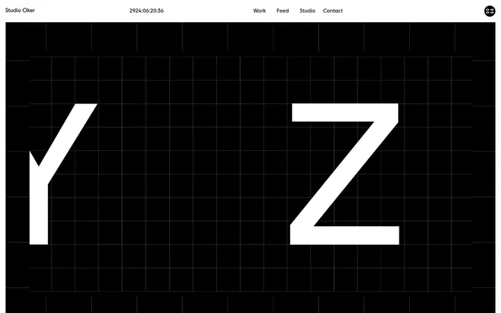
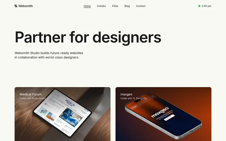
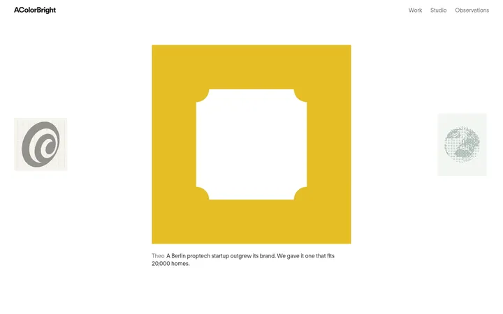
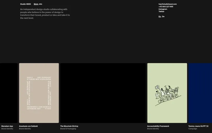
North star · Keep the interface nearly monochrome and spacious so the portfolio imagery—not decorative UI color—carries the visual energy.
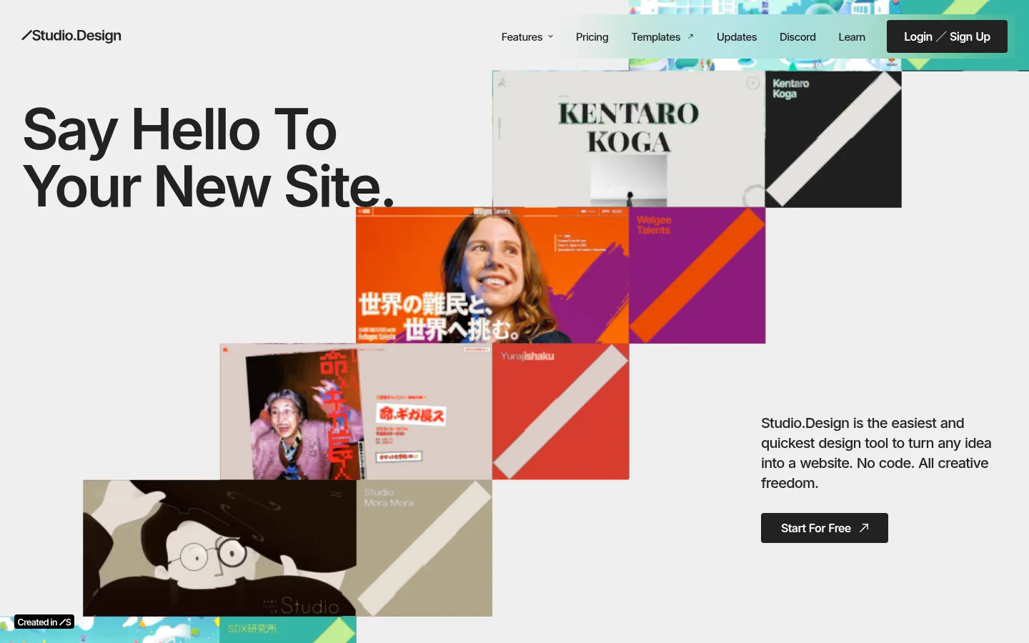
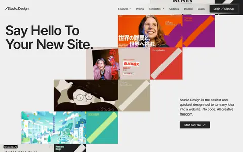
The page uses a pale gray canvas as a quiet frame for its content, reserving near-black and charcoal for headings, navigation, buttons, and the closing footer. White feature cards break up the long gray stretches without introducing decorative color; the vivid hues mostly belong to customer site previews and should remain image content, not interface accents. Inter drives the typography, with large, tightly tracked display headlines contrasting against compact explanatory copy and understated navigation. The hero is deliberately asymmetrical: a bold statement shares space with a cascading collage of portfolio work, while supporting copy and a dark CTA sit off to the side. Farther down, product features move into a dark band with bright cards, followed by image-led galleries and testimonials on the pale ground. Wide section pauses and simple card geometry keep this long page calm and scannable.
配色
点色块复制色值。用途说明来自对页面的实测位置(背景、文字、描边、按钮)与截图判读。
品牌色
表层色
中性色
页面底色 · Gallery Gray表层 · Paper White表层 2 · Graphite表层 3 · Deep Frame表层 4 · Studio Ink主文字 · Studio Ink次要文字 · Soft Chalk弱文字 · Gallery Gray
Primary typeface for display, headings, body copy, navigation, and captions.
Aa 设计
Inter Tight
网络字体 · 字重 700 / 500 · 占比 6%
免费替代:Roboto Condensed
Limited bold display treatment, secondary to the dominant Inter system.
角色
示例
字号
字重
行高
字距
特大标题
Largest hero and campaign-style display headlines.
Studio.Design
80px
600
1
-0.04em
一级标题
Primary page headline, especially the opening statement.
Studio.Design
72px
600
1
-0.04em
二级标题
Major section headings introducing feature and showcase areas.
Studio.Design
64px
600
1.66
-0.04em
三级标题
Feature card titles and testimonial names.
Studio.Design
48px
700
1.1
-0.04em
四级标题
Smaller feature and content subsection headings.
Studio.Design
36px
700
1.2
-0.04em
正文
Introductory copy and feature descriptions.
The quick brown fox 敏捷的狐狸
19px
500
1.4
0
辅助文字
Supporting notes, labels, and secondary information.
The quick brown fox 敏捷的狐狸
16px
400
1.66
0
导航
Header links and compact navigation labels.
The quick brown fox 敏捷的狐狸
16px
400
1.66
0
间距与布局
基准单位 4px · 密度:宽松
140px版块间距
16px元素间距
—卡片内边距
1051px内容最大宽度
4px
8px
10px
12px
16px
20px
24px
28px
30px
32px
48px
60px
100px
The page alternates between a constrained editorial content area and broad, image-led sections; the measured page max width is 1051px. The hero is left-aligned and intentionally asymmetric, with the headline and overlapping work collage balanced by copy and CTA at the right. Feature content uses a lead split card followed by paired cards. Later galleries and testimonials use multi-column arrangements with generous breathing room. The 4px-based spacing system includes measured section pauses up to 140px, producing a spacious, low-density rhythm.
圆角与层次
按钮 · 8px
卡片 · 8px
图片 · 6px
导航 · 4px
链接 · 8px
md · button, link
md · card
hairline · media
lg · link
Most sections and cards are flat, separated by generous whitespace and tonal contrast rather than borders. Measured cards use white surfaces with 8px or 12px corners; media uses 6px corners. Dark buttons and select links receive restrained soft shadows, while hairlines are not a defining visual device.
组件
下面的预览按实测的按钮、输入框、徽标、卡片样式重建(字体用替代字体)。
Top navigation
A compact header over the pale canvas: Studio.Design wordmark at left, feature links across the right, and a dark Login / Sign Up control.
Hero collage
Large left-aligned headline paired with overlapping portfolio previews; supporting copy and a dark Start For Free CTA sit toward the lower right.
Feature cards
A lead white split card introduces Design Editor; smaller white cards pair concise feature copy with product-preview imagery and Learn more links.
Portfolio gallery
Multiple rows of rectangular website previews form a color-rich showcase against the light-gray page canvas.
Testimonial cards
Two-column creator stories pair understated portraits with compact role labels, names, quotes, and Read Story links.
Footer
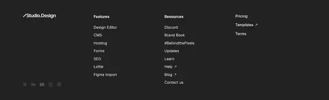
A charcoal closing area combines a centered creation prompt with compact multi-column navigation and subdued copyright details.
Imagery · Portfolio screenshots are the main source of color: vivid website designs appear in staggered hero layers, feature previews, and broad template galleries. Testimonial portraits are mostly monochrome or muted, keeping them subordinate to the work. Treat previews as framed rectangular media with restrained rounding; do not recolor them or turn their internal palette into UI accents.
Use Studio Ink (#222222) for primary copy and dark controls.
Let portfolio imagery provide the strong colors.
Make the hero asymmetric and collage-led.
Alternate open gray areas with crisp white cards.
Reserve Deep Frame (#000000) for dark showcase moments.
Use generous section pauses and tightly tracked large headings.
✕ 不该做
Do not introduce bright interface accent colors.
Do not make the hero a centered, uniform text stack.
Do not add heavy borders around every card.
Do not compress the page into a dense dashboard.
Do not apply the preview imagery's colors to buttons.
Do not use decorative shadows as the main section separator.
给 AI 的提示词
想快速出一个同风格的新页面,把这段话连同 DESIGN.md 一起发给 AI。
Build a new page in Studio.Design’s visual style: use Gallery Gray (#eeeeee) as the broad canvas, Studio Ink (#222222) for text and key controls, Paper White (#ffffff) for feature cards, and Deep Frame (#000000) only for deliberate dark bands. Set headings in Inter with tight tracking and strong scale contrast; keep navigation and body copy understated. Create an asymmetric hero with a bold left headline, a layered portfolio collage, and supporting copy with a dark CTA off to the side. Alternate spacious gray sections with white product cards, image galleries, and compact creator testimonials. Treat portfolio previews as the main color source. Keep surfaces mostly flat, with measured restrained rounding and occasional soft shadows. Favor generous section spacing, clean alignment, and an editorial rather than dashboard-like rhythm.