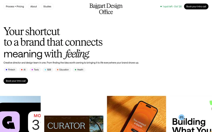
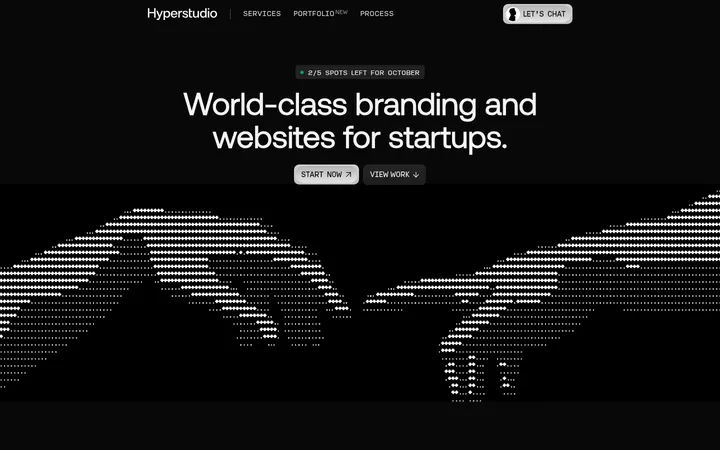
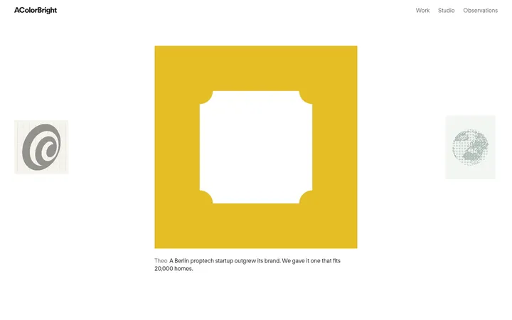
Studio Oker以克制的黑白界面搭配醒目的大字和丰富的项目影像。宽松的编辑式布局依次呈现工作室介绍、动态内容、作品集和联系方式。
North star · Keep the interface nearly invisible: use monochrome typography and generous space to let the work provide the colour and character.
The page is built on a white canvas with near-black text, muted gray supporting copy, and fine gray rules. Colour is deliberately kept out of the interface; the black-and-white opening reel and richly coloured client work carry the visual variety. NextBook’s light, sans-serif letterforms give headings a calm, open feel, while large display text creates a strong editorial scale. The navigation and project captions remain compact and understated. Layout alternates broad full-bleed media with aligned content areas, two-column project presentations, and a horizontal feed of work. Generous vertical pauses keep the long homepage from feeling crowded. Project imagery is treated as content rather than decoration: each image introduces an identity, product, or campaign, while titles and discipline labels sit close to the media. Thin dividers organize transitions without adding card-like framing or visual weight.
Site-wide sans serif for navigation, editorial headings, body copy, links, and project captions.
角色
示例
字号
字重
行高
字距
特大标题
Oversized studio wordmark and display-scale editorial moments.
Studio Oker
80px
300
1.13
-0.02em
一级标题
Primary section or introductory heading.
Studio Oker
32px
300
1.13
-0.02em
二级标题
Project and secondary content headings.
The quick brown fox 敏捷的狐狸
24px
400
1.13
-0.02em
正文
Studio description, project summaries, and supporting copy.
The quick brown fox 敏捷的狐狸
16px
400
1.25
-0.01em
导航
Header navigation and compact site links.
The quick brown fox 敏捷的狐狸
16px
400
1
-0.01em
链接
Prominent project links and named work titles.
The quick brown fox 敏捷的狐狸
24px
400
1.13
-0.02em
间距与布局
基准单位 8px · 密度:宽松
120px版块间距
—元素间距
—卡片内边距
1408px内容最大宽度
2px
8px
16px
48px
64px
120px
128px
Use a spacious, editorial page structure with a measured maximum content width of 1408px. The opening media runs nearly full width, while the introduction and contact details use aligned multi-column layouts. Work is presented in a two-column arrangement, with a horizontal content feed introducing a denser, image-led rhythm. Keep headings left aligned and let section boundaries breathe; the measured section gap is 120px. The overall density is intentionally low, with ample blank canvas between project groups.
圆角与层次
没有测到阴影:页面是扁平的,层次靠底色和描边区分。
The page is flat and unornamented: measured styles show no shadows, and cards have no raised treatment. Separate groups with thin #dcdcdc rules and whitespace rather than boxes. Keep image content flush within its layout, with no decorative surface layers competing against the work.
组件
下面的预览按实测的按钮、输入框、徽标、卡片样式重建(字体用替代字体)。
Top navigation
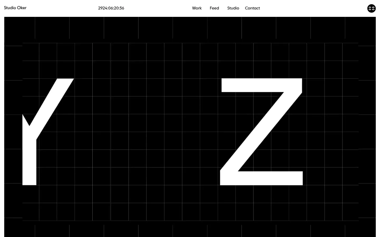
A compact, white header with the studio name, live-looking time display, and right-aligned Work, Feed, Studio, and Contact links in dark text.
Opening reel
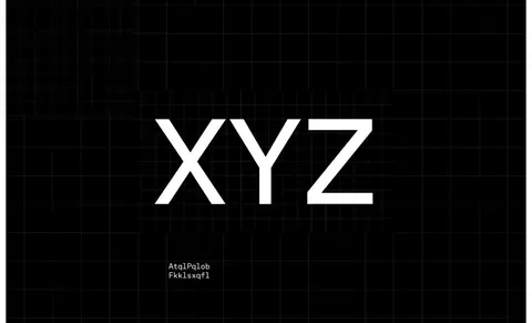
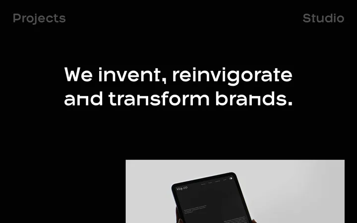
Large, near-full-width video or media block with a black grid, oversized white letterforms, and a subdued “→ Play full reel” link.
Studio introduction
Large studio heading followed by a two-column introduction and small studio facts, separated from later content with a fine rule.
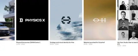
Content feed
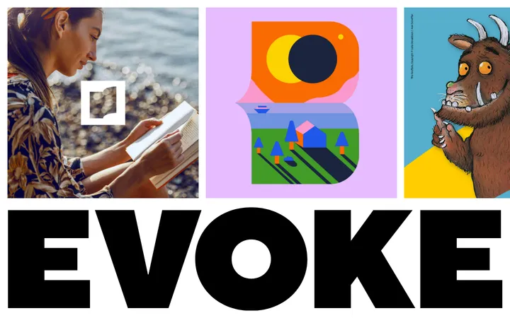
Horizontal row of project updates with image-led thumbnails, concise titles, dates, and minimal supporting copy.
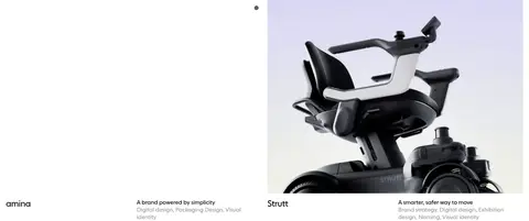
Project gallery
Two-column portfolio items with prominent rectangular media, a dark project name, and muted summary and discipline labels.
Contact footer
Sparse contact and online-link columns with copyright and date range, aligned around a subtle horizontal divider.
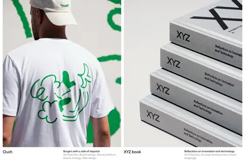
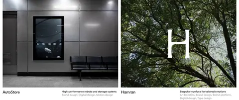
Imagery · Lead with a large black-and-white motion reel, using a geometric grid and oversized white letterforms. Below, present project photography, identity work, product imagery, and campaign visuals in prominent rectangular crops. Keep image colour intact: the interface stays monochrome while project content supplies green, blue, warm, and photographic tones. Feed images form a horizontal strip; portfolio pieces pair media with concise labels and descriptions.
Use thin #dcdcdc rules sparingly to distinguish sections.
Give project media generous space and strong visual prominence.
Keep captions concise and close to their associated work.
✕ 不该做
Do not add colourful interface accents or gradients.
Do not put work into shadowed or heavily bordered cards.
Do not crowd section transitions with extra decoration.
Do not let captions compete with the project imagery.
Do not treat the project images’ colours as interface palette colours.
Do not introduce rounded UI treatments without evidence.
给 AI 的提示词
想快速出一个同风格的新页面,把这段话连同 DESIGN.md 一起发给 AI。
Build a new page in the Studio Oker visual style: quiet, spacious, and editorial. Use Gallery White (#ffffff) as the page canvas, Studio Ink (#101010) for primary text and navigation, Quiet Gray (#a0a0a0) for metadata and supporting links, and Rule Gray (#dcdcdc) for fine separators. Use a clean sans serif close to NextBookRegular, with light, large headings and slightly tight tracking. Keep the header compact, align content to a broad central layout, and create deliberate vertical pauses between sections. Let large, uncropped or carefully cropped project media lead; use monochrome treatment only where the source work calls for it. Project captions should remain small and understated. Avoid shadows, card chrome, colourful controls, and decorative gradients. Treat each project image as the source of visual colour.