North star · Let editorial serif headlines and generous white space lead; reserve vivid violet for clear actions and navigational emphasis.
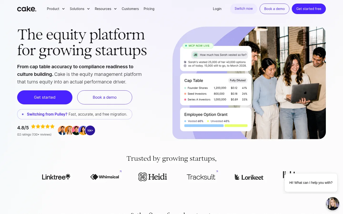
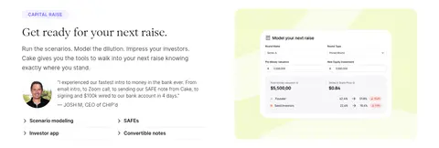
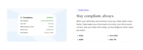
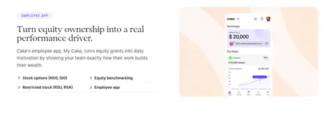
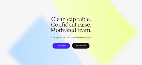
The visual identity is led by white space, near-black text, and a distinctive violet accent. White (#ffffff) is the main canvas; pale lavender (#f5f4fb) occasionally separates content, while the footer reverses to Ink (#18161a). Saturated Violet (#4823ff) marks the main calls to action, with softer violet used for category links and labels. Large, light Exposure Light serif headings give the SaaS content an editorial, founder-friendly character; Inter keeps navigation, body copy, and interface details crisp and readable. The opening hero is a balanced two-column composition: headline and concise copy on one side, a team photograph with layered cap-table UI on the other. Across the page, product stories alternate image and text, with logos, portraits, and testimonials providing social proof. Spacious section breaks, restrained hairlines, rounded pills, and a few soft pastel media backdrops keep the dense long-form page composed rather than crowded.
Navigation, body copy, buttons, labels, and compact interface text.
Aa 设计
Exposure Light
网络字体 · 字重 300 / 400 · 占比 17%
免费替代:Cormorant Garamond
Display and section headlines, giving the page its editorial character.
角色
示例
字号
字重
行高
字距
特大标题
Large editorial display headline treatment in major hero moments.
Cake Equity
56px
300
1
-0.018em
一级标题
Primary page headline and prominent section title.
Cake Equity
44px
300
1
-0.023em
二级标题
Major section headings, often centered or paired with feature content.
Cake Equity
35px
300
1.1
-0.009em
三级标题
Feature and testimonial subheadings.
Cake Equity
28px
300
1.1
-0.011em
四级标题
Smaller feature titles and FAQ questions.
The quick brown fox 敏捷的狐狸
25.5px
300
1.2
-0.001em
正文
Explanatory paragraphs and supporting product copy.
The quick brown fox 敏捷的狐狸
15.5px
300
1.4
0
辅助文字
Uppercase compact labels and category captions.
The quick brown fox 敏捷的狐狸
14px
600
1.2
0.05em
按钮
CTA text in rounded primary and secondary buttons.
The quick brown fox 敏捷的狐狸
17px
400
1
-0.001em
导航
Top-level navigation and utility links.
The quick brown fox 敏捷的狐狸
14px
400
1.3
0
链接
Inline and supporting text links.
The quick brown fox 敏捷的狐狸
16px
300
1
-0.01em
眉题
Uppercase section identifiers above headings.
The quick brown fox 敏捷的狐狸
14px
600
1.2
0.05em
间距与布局
基准单位 2px · 密度:适中
84px版块间距
20px元素间距
—卡片内边距
1296px内容最大宽度
5px
7px
10px
14px
15px
20px
25px
28px
30px
36px
56px
84px
100px
The page uses a centered content frame with a measured maximum width of 1296px and a comfortable density. The hero is a left-aligned two-column composition, followed by centered logo and trust bands, then alternating image-and-copy feature splits. Feature groups switch to centered multi-column layouts for audience cards and partner marks. A pale testimonial band and softly tinted FAQ break up the mostly white canvas. Sections breathe with a measured 84px section rhythm and 20px element gap; use these measured values rather than adding arbitrary spacing.
圆角与层次
按钮 · 9999px
图片 · 50%
徽标 · 9999px
链接 · 9999px
md · nav
lg · text
sm · button
The interface is mostly flat, relying on white space and fine gray rules rather than cards with heavy shadows. Use thin borders for dividers, outlines, and restrained secondary controls. Layer product UI cards over hero photography or pastel media when needed, while keeping elevation subtle. Buttons and compact navigation may use slight measured shadows, but avoid broad, dramatic depth.
组件
下面的预览按实测的按钮、输入框、徽标、卡片样式重建(字体用替代字体)。
Primary CTA
Saturated Violet (#4823ff) pill button with white text; measured examples use varied padding and Inter labels.
Outlined secondary CTA
White or transparent pill with a thin violet outline, paired with the filled CTA in hero and lower conversion areas.
Eyebrow label
Compact uppercase Inter semibold label, often violet on a pale lavender pill above a feature heading.
Feature split
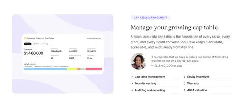
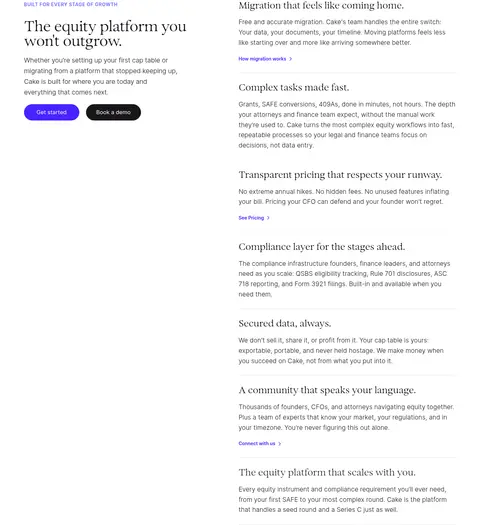
Alternating two-column sections pair a product image or UI mockup with a headline, copy, testimonial, and short link list.
Trust logo band
Centered serif heading with a horizontal group of customer or partner marks, kept visually light.
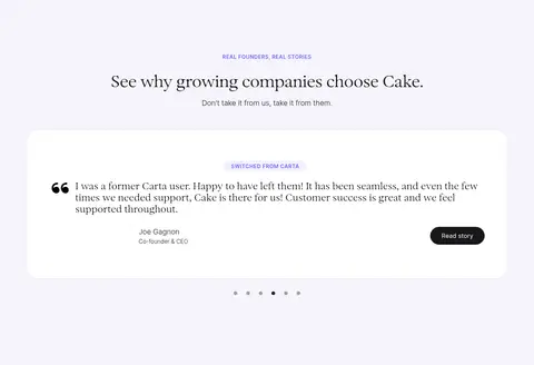
Testimonial panel
Centered Lavender Mist (#f5f4fb) section with a white quote card, attribution, and carousel indicators.
Status badge
Small uppercase live-status pill with green text and a pale green border, used over product media.
Dark footer
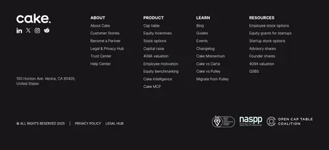
Full-width Ink (#18161a) closing area with white brand mark, grouped link columns, address, and trust marks.
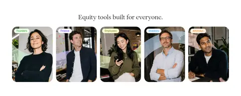
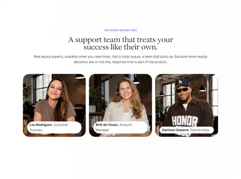
Imagery · Use real, approachable startup-team and support-team photography alongside crisp product screenshots and interface mockups. The hero pairs people with layered cap-table cards; later feature media shows product workflows against soft pastel fields. Use rounded or clipped image framing and keep UI text as part of the screenshot rather than recreating it as decorative illustration. Customer logos, review portraits, and awards act as compact trust signals; pastel greens and lilacs mainly belong to media backdrops and product visuals.
Use white as the dominant canvas and preserve generous open space.
Set major headlines in a light editorial serif.
Reserve Signal Violet (#4823ff) for the primary action.
Alternate product imagery and explanatory copy across feature sections.
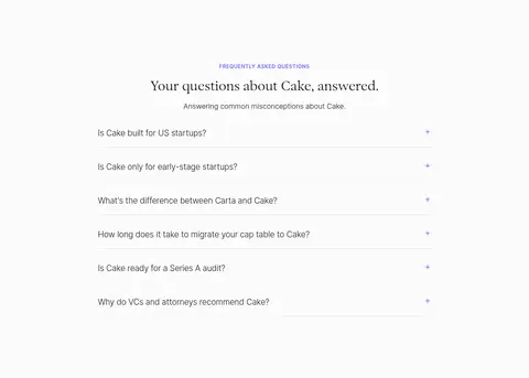
Use pale lavender bands selectively to distinguish testimonials or FAQ content.
Keep labels, dividers, and controls restrained and readable.
✕ 不该做
Do not turn every section into a boxed card.
Do not use saturated violet as a full-page background.
Do not replace editorial headlines with heavy geometric display type.
Do not crowd the hero with competing actions or decorative copy.
Do not treat illustration-only greens or pastels as dominant brand colours.
Do not add heavy shadows or invented spacing values.
给 AI 的提示词
想快速出一个同风格的新页面,把这段话连同 DESIGN.md 一起发给 AI。
Build a new Cake Equity page with an airy, editorial SaaS feel. Use Gallery White (#ffffff) as the main canvas and Ink (#18161a) for readable copy; use Signal Violet (#4823ff) for the primary pill CTA and Soft Violet (#6d67fb) for restrained links and labels. Set major headlines in a light serif similar to Exposure Light, with Inter for navigation, body text, controls, and uppercase eyebrows. Keep a centered content frame and comfortable section rhythm. Combine concise copy with authentic team photography and crisp product UI screenshots; alternate media and text in feature sections. Use Lavender Mist (#f5f4fb) sparingly for testimonial or FAQ bands, and soft pastel glows mainly behind product media. Prefer fine hairlines, rounded pills, open space, and subtle layering over card-heavy layouts or strong shadows.