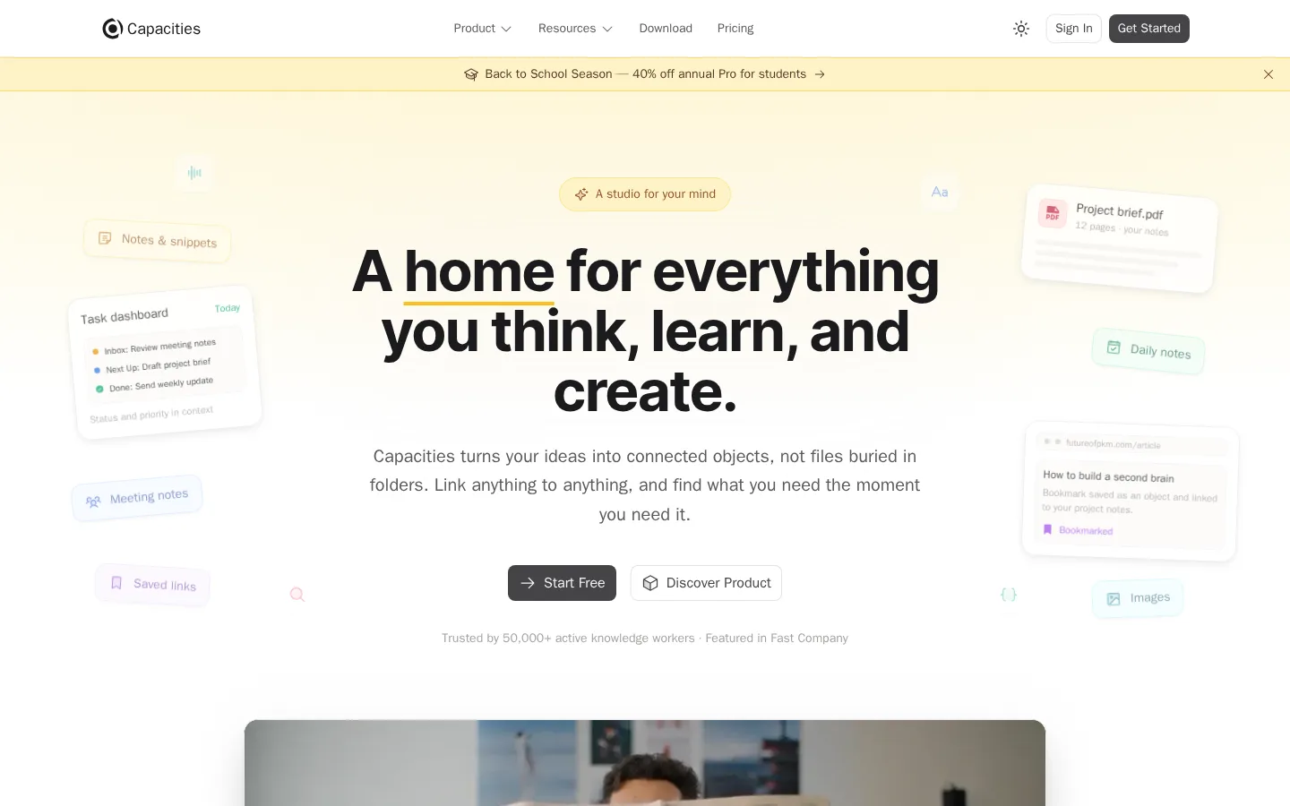
Capacities以克制的编辑式布局和暖象牙色光感,介绍其知识关联应用。产品界面、人物视频、口碑数据与简洁卡片串联起从理解产品到免费开始的路径。
North star · Keep the page mostly white and quietly structured, using warm yellow only as a soft cue around clear, centered product messaging.
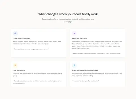
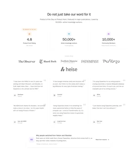
The page is built on a white canvas with recurring warm off-white section bands, giving a long landing page a gentle, legible rhythm. Near-black headings carry the strongest contrast; muted warm-gray body copy stays secondary, while pale yellow appears as a restrained highlight in the hero glow, announcement strip, badges, and selected card details. Typography is system sans, with a bold, tightly tracked centered hero headline and readable, generously leaved supporting text. The layout favors centered introductions, broad two-column feature areas, and card grids within a measured content width. Product interface fragments orbit the hero message, then give way to a framed testimonial video, comparison diagrams, press marks, statistics, and user quotes. Cards are mostly white with subtle hairlines and light shadows rather than heavy fills. Repeated section breathing room and modest rounded corners keep the experience calm and product-focused.
配色 点色块复制色值。用途说明来自对页面的实测位置(背景、文字、描边、按钮)与截图判读。
品牌色
Soft Ink
#1a1a1d
Primary headings, high-emphasis copy, and dark footer or inverse surfaces.
强调色
Soft Marigold
#fde68a
Pale yellow accent recorded in sparse text and button details; not a dominant page color.
Vanilla Glow
#fef2c4
Warm gradient and faint highlighted surfaces behind selected elements.
Butter Accent
#fddf91
Measured accent for select card details and soft yellow gradient highlights.
表层色
Gallery White
#ffffff
Primary canvas and elevated card fill across the hero, features, proof, and closing CTA.
Cream Haze
#fffae8
Very light warm tint in small badges, buttons, and decorative details.
Pale Custard
#fef6d6
Faint supporting warm tone within subtle background gradients and illustrations.
中性色
Warm Graphite
#5c5959
Muted body copy, navigation labels, and secondary text on light backgrounds.
Linen Line
#f5f4f3
Fine card and component borders, step-label fills, and light footer details.
Ash Taupe
#a7a2a1
Faint supporting copy and subdued footer, badge, or heading text.
Stone Hairline
#ecebea
Stronger card outlines and delicate link or footer dividers.
Misted Stone
#e4e3e2
Secondary outlines and subdued badge or card details.
功能色
Apricot Tint
#fed7aa
Subtle badge tint in measured UI details, not a defining section background.
Clay Signal
#cc5d23
Tiny badge or illustrative detail only; not part of the dominant brand treatment.
文字 背景 对比度 WCAG #1a1a1d Soft Ink#ffffff Gallery White17.36:1 AAA #5c5959 Warm Graphite#ffffff Gallery White6.93:1 AA #5c5959 Warm Graphite#1a1a1d Soft Ink2.5:1 不达标 #a7a2a1 Ash Taupe#ffffff Gallery White2.52:1 不达标 #a7a2a1 Ash Taupe#1a1a1d Soft Ink6.88:1 AA #fddf91 Butter Accent#ffffff Gallery White1.3:1 不达标
字体 字号阶梯:Perfect Fifth(比例约 1.549,正文 15px)。示例用免费替代字体渲染,数值为实测。
Aa 设计
ui-sans-serif 系统字体 · 字重 400 / 600 / 500 / 700 / 800 · 占比 97%
免费替代:Inter
Primary system type for headings, body, navigation, buttons, and links.
Aa 设计
JetBrains Mono 网络字体 · 字重 400 / 500 · 占比 2%
免费替代:Source Code Pro
Small code-style text and technical labels.
Aa 设计
Inter 网络字体 · 字重 700 / 500 · 占比 1%
免费替代:Inter
Limited bold display or embedded interface text.
角色 示例 字号 字重 行高 字距 一级标题 Main centered hero headline and major page title.
Capacities
36px 700 1.25 -0.025em 二级标题 Section introductions and prominent supporting statements.
The quick brown fox 敏捷的狐狸
20px 400 1.63 0 正文 Feature explanations, testimonials, and general descriptive copy.
The quick brown fox 敏捷的狐狸
15px 400 1.63 0 辅助文字 Small metadata, attribution, and card support text.
The quick brown fox 敏捷的狐狸
14px 400 1.43 0 按钮 Primary and secondary CTA labels.
The quick brown fox 敏捷的狐狸
16px 400 1.5 0 导航 Header navigation and compact menu labels.
The quick brown fox 敏捷的狐狸
14px 500 1.43 0 链接 Text links and secondary navigation actions.
The quick brown fox 敏捷的狐狸
16px 400 1.5 0 代码 Small technical or code-like labels where present.
const style = 1;
12px 400 1.33 0
间距与布局 基准单位 4px · 密度:宽松
128px 版块间距
6px 元素间距
28px 卡片内边距
1216px 内容最大宽度
2px
4px
6px
8px
10px
12px
14px
16px
20px
24px
28px
32px
40px
64px
128px
The measured page content max width is 1216px, with a spacious overall density and a 128px section rhythm. Center section headings and short introductions; use two-column compositions for hero and explanatory content, three-column grids for testimonials or steps, and a multi-column footer. Keep cards aligned within their sections and preserve generous breathing room between content groups. Alternate white canvas with soft off-white bands to mark transitions without heavy separators.
圆角与层次 hairline · card, other, link
sm · other, card, button
hairline · badge
md · card
Favor flat white cards with fine neutral outlines, then use only restrained low-opacity shadows to lift key cards and the hero video. The page's depth comes mainly from alternating section bands and layered product visuals, not dark panels or dramatic drop shadows. Use rounded corners consistently but keep borders quiet.
组件 下面的预览按实测的按钮、输入框、徽标、卡片样式重建(字体用替代字体)。
Primary CTA Dark charcoal fill with #f5f4f3 label, 8px radius, and compact padding; use for Start Free and Get Started actions.
Secondary text CTA White or transparent surface with dark text and a subtle inset or #ecebea outline; keep visually lighter than the primary action.
Feature card White card with a #ecebea hairline, 16px radius, and measured 28px internal padding; concise heading and supporting copy.
Step badge Small pill with #f5f4f3 fill, #e4e3e2 border, and dark compact label.
Announcement strip A thin pale-yellow horizontal band beneath the navigation, with centered offer copy, small icon, and a close affordance.
Proof card Minimal testimonial or metric treatment using muted attribution, light borders, and generous white space instead of strong color blocks.
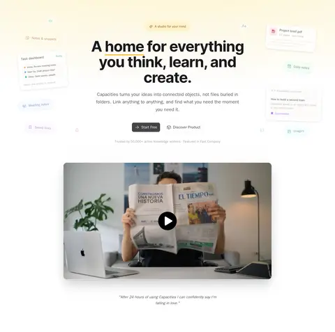
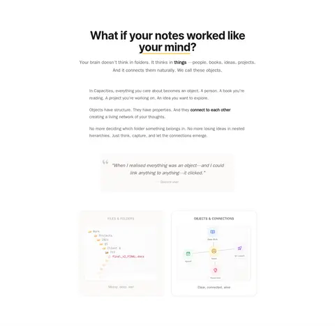
Imagery · The hero uses light product-interface fragments and floating note-like cards around its centered message; these are pale and low contrast so they support rather than obscure the headline. A rounded rectangular video frame introduces a person using the product. Additional visuals include simple file-versus-object diagrams, app-like UI panels, small category icons, and press logos. Keep product imagery clean, softly lit, and grounded in white space.
页面版块 共 10 个版块,按页面从上到下排列,每个都标了类型、布局和交互套路。
首页
首屏 产品首屏
Centered headline and copy with side-floated product details; video frame below.
功能网格 痛点卡片
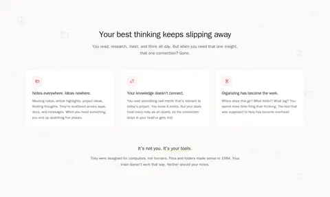
Soft off-white band with centered introduction, three cards, then a closing statement.
对比表 思维方式对比
Centered section title and intro, explanatory content, quote, then two comparison visuals.
功能网格 产品优势
Off-white band with centered heading and paired feature columns.
用户评价 口碑与评价
White section with centered heading, metrics, press logos, and a three-column quote grid.
使用步骤 上手三步
Off-white band with centered intro, three step cards, supporting text, and CTA.
图文交替 适用人群
White section with centered title, category tabs, and a two-column audience panel.
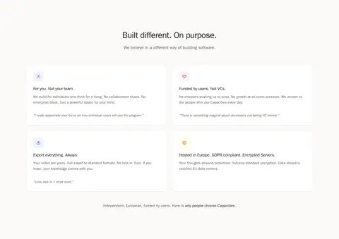
功能网格 产品理念
Off-white band with centered intro and two-column grid of principle cards.
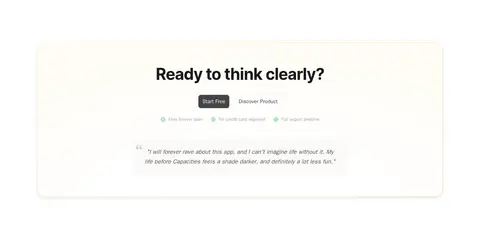
行动号召 开始使用
Centered closing message inside a softly highlighted panel with actions and reassurance.
页脚 页脚导航
Off-white footer with brand column and five compact link columns.
该做与不该做 ✓ 该做 Use white as the main canvas. Alternate in the measured warm off-white bands. Keep hero messaging centered and high contrast. Use pale yellow as a subtle highlight, not a large saturated block. Build feature cards with fine borders and restrained shadows. Leave generous space between major sections. ✕ 不该做 Do not introduce saturated brand colors absent from the palette. Do not make every section a card or boxed panel. Do not use dense, edge-to-edge text blocks. Do not let decorative product mockups compete with the headline. Do not use heavy shadows or thick borders. Do not invent colors, dimensions, or spacing values beyond the measurements. 给 AI 的提示词 想快速出一个同风格的新页面,把这段话连同 DESIGN.md 一起发给 AI。
复制 Build a new Capacities-style SaaS page with a calm, product-led editorial feel. Use Gallery White (#ffffff) as the main canvas, alternating measured warm off-white section bands, and Soft Ink (#1a1a1d) for primary headings. Set body copy in Warm Graphite (#5c5959); reserve Butter Accent (#fddf91) and Vanilla Glow (#fef2c4) for small highlights and faint gradients. Follow the measured 1216px max content width, spacious 128px section rhythm, centered introductions, and flexible two- or three-column sections. Use the system sans stack, bold tightly tracked display headings, quiet borders in Linen Line (#f5f4f3) or Stone Hairline (#ecebea), and restrained shadows. Build clean white cards, subtle badges, and dark primary CTAs. Keep imagery light and product-oriented, with ample whitespace and clear hierarchy.
DESIGN.md Tailwind v4 CSS 变量 Design Tokens
---
title: "Capacities design system"
variant: extended
source: https://capacities.io/
captured_at: 2026-10-12
theme: light
industry: productivity
generator: Design DNA (https://four.wiralomi.com/style/capacities-io)
ai_generated: true
ai_label: "本文件由 AI 辅助生成:数值取自公开网页的实测样式,命名、用途说明与建议为模型解读。商标归原所有者。 / AI-assisted content"
---
# Capacities · Design System
> A calm, sunlit canvas for connected thinking
**Theme:** light · **Industry:** productivity · **Source:** https://capacities.io/ · **Captured:** 2026-10-12 (1440×900 desktop)
_AI-assisted content: values are measured from the public page at capture time; names, roles and guidance are model-written interpretations. Trademarks belong to their owners._
Capacities pairs a restrained editorial layout with a warm ivory glow to introduce its connected-knowledge app. Product UI, a human-centered video, proof points, and compact cards guide visitors from the core idea to a free-start CTA.
## North star
Keep the page mostly white and quietly structured, using warm yellow only as a soft cue around clear, centered product messaging.
## Overview
The page is built on a white canvas with recurring warm off-white section bands, giving a long landing page a gentle, legible rhythm. Near-black headings carry the strongest contrast; muted warm-gray body copy stays secondary, while pale yellow appears as a restrained highlight in the hero glow, announcement strip, badges, and selected card details. Typography is system sans, with a bold, tightly tracked centered hero headline and readable, generously leaved supporting text. The layout favors centered introductions, broad two-column feature areas, and card grids within a measured content width. Product interface fragments orbit the hero message, then give way to a framed testimonial video, comparison diagrams, press marks, statistics, and user quotes. Cards are mostly white with subtle hairlines and light shadows rather than heavy fills. Repeated section breathing room and modest rounded corners keep the experience calm and product-focused.
## Colors
| Name | Hex | Token | Group | Role |
|---|---|---|---|---|
| Gallery White | ` | `--color-gallery-white` | surface | Primary canvas and elevated card fill across the hero, features, proof, and closing CTA. |
| Warm Graphite | ` | `--color-warm-graphite` | neutral | Muted body copy, navigation labels, and secondary text on light backgrounds. |
| Soft Marigold | ` | `--color-soft-marigold` | accent | Pale yellow accent recorded in sparse text and button details; not a dominant page color. |
| Apricot Tint | ` | `--color-apricot-tint` | semantic | Subtle badge tint in measured UI details, not a defining section background. |
| Linen Line | ` | `--color-linen-line` | neutral | Fine card and component borders, step-label fills, and light footer details. |
| Soft Ink | ` | `--color-soft-ink` | brand | Primary headings, high-emphasis copy, and dark footer or inverse surfaces. |
| Ash Taupe | ` | `--color-ash-taupe` | neutral | Faint supporting copy and subdued footer, badge, or heading text. |
| Stone Hairline | ` | `--color-stone-hairline` | neutral | Stronger card outlines and delicate link or footer dividers. |
| Vanilla Glow | ` | `--color-vanilla-glow` | accent | Warm gradient and faint highlighted surfaces behind selected elements. |
| Clay Signal | ` | `--color-clay-signal` | semantic | Tiny badge or illustrative detail only; not part of the dominant brand treatment. |
| Butter Accent | ` | `--color-butter-accent` | accent | Measured accent for select card details and soft yellow gradient highlights. |
| Cream Haze | ` | `--color-cream-haze` | surface | Very light warm tint in small badges, buttons, and decorative details. |
| Pale Custard | ` | `--color-pale-custard` | surface | Faint supporting warm tone within subtle background gradients and illustrations. |
| Misted Stone | ` | `--color-misted-stone` | neutral | Secondary outlines and subdued badge or card details. |
### Semantic aliases
`--color-canvas` → ` (Gallery White) · `--color-surface` → ` (Soft Ink) · `--color-text` → ` (Soft Ink) · `--color-text-muted` → ` (Warm Graphite) · `--color-text-subtle` → ` (Ash Taupe) · `--color-border` → ` (Linen Line) · `--color-accent` → ` (Butter Accent)
### Contrast (WCAG 2.x)
| Text | Background | Ratio | Level |
|---|---|---|---|
| ` | ` | 17.36:1 | AAA |
| ` | ` | 6.93:1 | AA |
| ` | ` | 2.5:1 | fail |
| ` | ` | 2.52:1 | fail |
| ` | ` | 6.88:1 | AA |
| ` | ` | 1.3:1 | fail |
| ` | ` | 13.35:1 | AAA |
### Gradients
- `radial-gradient(100% 70% at 50% 0%, oklch(0.9243 0.1151 95.76 / 0.5) 0%, rgba(0, 0, 0, 0) 100%)`
- `linear-gradient(oklch(0.9676 0.0016 67.02) 0%, rgba(0, 0, 0, 0) 100%)`
- `linear-gradient(oklch(1 0.0001 263.28), oklch(1 0.0001 263.28)), linear-gradient(135deg, oklch(0.9243 0.1151 95.76 / 0.5), oklch(0.8369 0.1643 84.43 / 0.5))`
- `radial-gradient(80% 100% at 50% 110%, rgba(0, 0, 0, 0) 0%, rgba(0, 0, 0, 0) 45%, oklch(0.9243 0.1151 95.76 / 0.08) 60%, oklch(0.9243 0.1151 95.76 / 0.2) 80%, oklch(0.9243 0.1151 95.76 / 0.35) 100%)`
## Typography
| Family | Token | Source | Weights | Role | Free substitute |
|---|---|---|---|---|---|
| ui-sans-serif | `--font-body` | system | 400, 600, 500, 700, 800 | Primary system type for headings, body, navigation, buttons, and links. | Inter |
| JetBrains Mono | `--font-mono` | webfont | 400, 500 | Small code-style text and technical labels. | Source Code Pro |
| Inter | `--font-inter` | webfont | 700, 500 | Limited bold display or embedded interface text. | Inter |
- **ui-sans-serif:** Use a clean sans; bold centered hero headline has tight negative tracking, while body copy is regular and open.
- **JetBrains Mono:** Restrained monospace use; keep labels compact and regular-weight.
- **Inter:** Minor measured share; use selectively rather than as a competing page-wide typeface.
### Type scale — Perfect Fifth (ratio ≈ 1.549, base 15px)
| Role | Size | Weight | Line height | Letter spacing | Case | Family | Used for |
|---|---|---|---|---|---|---|---|
| h1 | 36px | 700 | 1.25 | -0.025em | — | ui-sans-serif | Main centered hero headline and major page title. |
| h2 | 20px | 400 | 1.63 | 0 | — | ui-sans-serif | Section introductions and prominent supporting statements. |
| body | 15px | 400 | 1.63 | 0 | — | ui-sans-serif | Feature explanations, testimonials, and general descriptive copy. |
| caption | 14px | 400 | 1.43 | 0 | — | ui-sans-serif | Small metadata, attribution, and card support text. |
| button | 16px | 400 | 1.5 | 0 | — | ui-sans-serif | Primary and secondary CTA labels. |
| nav | 14px | 500 | 1.43 | 0 | — | ui-sans-serif | Header navigation and compact menu labels. |
| link | 16px | 400 | 1.5 | 0 | — | ui-sans-serif | Text links and secondary navigation actions. |
| code | 12px | 400 | 1.33 | 0 | — | JetBrains Mono | Small technical or code-like labels where present. |
## Spacing & layout
- Base unit **4px**, density **spacious**.
- Scale (most used values): 2, 4, 6, 8, 10, 12, 14, 16, 20, 24, 28, 32, 40, 64, 128 px.
- Section rhythm 128px · element gap 6px · card padding 28px · max content width 1216px.
The measured page content max width is 1216px, with a spacious overall density and a 128px section rhythm. Center section headings and short introductions; use two-column compositions for hero and explanatory content, three-column grids for testimonials or steps, and a multi-column footer. Keep cards aligned within their sections and preserve generous breathing room between content groups. Alternate white canvas with soft off-white bands to mark transitions without heavy separators.
## Shape & elevation
- Radius: button `8px` · card `16px` · badge `9999px` · nav `8px` · link `8px` · xs `6px` · sm `8px` · md `12px` · lg `16px` · xl `20px` · 2xl `24px` · pill `9999px`
- Shadow `hairline` (card, other, link): `rgba(0, 0, 0, 0) 0px 0px 0px 0px, rgba(0, 0, 0, 0) 0px 0px 0px 0px, rgba(0, 0, 0, 0) 0px 0px 0px 0px, rgba(0, 0, 0, 0) 0px 0px 0px 0px, rgba(0, 0, 0, 0.04) 0px 1px 2px 0px`
- Shadow `sm` (other, card, button): `rgba(0, 0, 0, 0) 0px 0px 0px 0px, rgba(0, 0, 0, 0) 0px 0px 0px 0px, rgba(0, 0, 0, 0) 0px 0px 0px 0px, rgba(0, 0, 0, 0) 0px 0px 0px 0px, rgba(0, 0, 0, 0.05) 0px 2px 4px 0px, rgba(0, 0, 0, 0.03) 0px 1px`
- Shadow `hairline-2` (badge): `rgba(0, 0, 0, 0) 0px 0px 0px 0px, rgba(0, 0, 0, 0) 0px 0px 0px 0px, rgba(0, 0, 0, 0) 0px 0px 0px 0px, rgba(0, 0, 0, 0) 0px 0px 0px 0px, rgba(0, 0, 0, 0.05) 0px 1px 2px 0px`
- Shadow `md` (card): `rgba(0, 0, 0, 0) 0px 0px 0px 0px, rgba(0, 0, 0, 0) 0px 0px 0px 0px, rgba(0, 0, 0, 0) 0px 0px 0px 0px, rgba(0, 0, 0, 0) 0px 0px 0px 0px, rgba(0, 0, 0, 0.08) 0px 4px 12px 0px, rgba(0, 0, 0, 0.04) 0px 2p`
- Shadow `inset` (link, nav): `oklch(0.9163 0.0017 67.07) 0px 0px 0px 1px inset`
- Shadow `xl` (card): `rgba(0, 0, 0, 0) 0px 0px 0px 0px, rgba(0, 0, 0, 0) 0px 0px 0px 0px, rgba(0, 0, 0, 0) 0px 0px 0px 0px, rgba(0, 0, 0, 0) 0px 0px 0px 0px, rgba(0, 0, 0, 0.05) 0px 4px 6px -1px, rgba(0, 0, 0, 0.12) 0px 20`
- Motion: standard transition `0.2s cubic-bezier(0.4, 0, 0.2, 1)` on interactive elements.
Favor flat white cards with fine neutral outlines, then use only restrained low-opacity shadows to lift key cards and the hero video. The page's depth comes mainly from alternating section bands and layered product visuals, not dark panels or dramatic drop shadows. Use rounded corners consistently but keep borders quiet.
## Imagery
The hero uses light product-interface fragments and floating note-like cards around its centered message; these are pale and low contrast so they support rather than obscure the headline. A rounded rectangular video frame introduces a person using the product. Additional visuals include simple file-versus-object diagrams, app-like UI panels, small category icons, and press logos. Keep product imagery clean, softly lit, and grounded in white space.
## Components
### Primary CTA
Dark charcoal fill with ### Secondary text CTA
White or transparent surface with dark text and a subtle inset or ### Feature card
White card with a ### Step badge
Small pill with ### Announcement strip
A thin pale-yellow horizontal band beneath the navigation, with centered offer copy, small icon, and a close affordance.
### Proof card
Minimal testimonial or metric treatment using muted attribution, light borders, and generous white space instead of strong color blocks.
### Measured component styles
- **Primary button** (“Start Free”): background ## Do
- Use white as the main canvas.
- Alternate in the measured warm off-white bands.
- Keep hero messaging centered and high contrast.
- Use pale yellow as a subtle highlight, not a large saturated block.
- Build feature cards with fine borders and restrained shadows.
- Leave generous space between major sections.
## Don't
- Do not introduce saturated brand colors absent from the palette.
- Do not make every section a card or boxed panel.
- Do not use dense, edge-to-edge text blocks.
- Do not let decorative product mockups compete with the headline.
- Do not use heavy shadows or thick borders.
- Do not invent colors, dimensions, or spacing values beyond the measurements.
## Agent prompt
Build a new Capacities-style SaaS page with a calm, product-led editorial feel. Use Gallery White (## Page sections (top to bottom)
| # | Type | Layout | UX patterns | UI patterns |
|---|---|---|---|---|
| 1 | hero | Centered headline and copy with side-floated product details; video frame below. | Primary free-start CTA, Secondary product link, Trust note | Pale yellow glow, Floating app cards, Dark rounded CTA |
| 2 | feature-grid | Soft off-white band with centered introduction, three cards, then a closing statement. | Problem framing, Three pain-point summaries | Light cards, Subtle icons, Muted copy |
| 3 | comparison | Centered section title and intro, explanatory content, quote, then two comparison visuals. | Concept explanation, Before-and-after comparison | File hierarchy diagram, Connected-object diagram, Quote panel |
| 4 | feature-grid | Off-white band with centered heading and paired feature columns. | Benefit-led scan, Feature detail | Two-column cards, Small colored icons |
| 5 | testimonials | White section with centered heading, metrics, press logos, and a three-column quote grid. | Social proof, Review discovery link | Metric row, Press wordmarks, Quote cards |
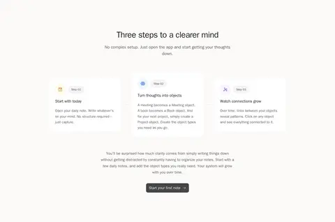
| 6 | how-it-works | Off-white band with centered intro, three step cards, supporting text, and CTA. | Three-step onboarding, Start-first-note action | Numbered pills, Compact cards, Dark CTA |
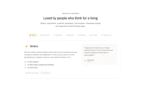
| 7 | feature-split | White section with centered title, category tabs, and a two-column audience panel. | Audience selection, Contextual use cases | Category chips, Large feature panel, Quote card |
| 8 | feature-grid | Off-white band with centered intro and two-column grid of principle cards. | Principle-led storytelling, Trust reassurance | Light cards, Small icons, Muted captions |
| 9 | cta | Centered closing message inside a softly highlighted panel with actions and reassurance. | Free-start conversion, Risk-reduction notes | Warm glow panel, Paired CTAs, Quote treatment |
| 10 | footer | Off-white footer with brand column and five compact link columns. | Grouped navigation, Legal and company discovery | Small muted links, Column headings, Social icons |
## Source CSS custom properties (selected)
```css
--ui-primary: oklch(21.91% .0058 285.84);
--landing-bg-page: oklch(100% .0001 263.28);
--landing-bg-section: oklch(98.56% .0016 67);
--landing-bg-elevated: oklch(100% .0001 263.28);
--landing-bg-card: oklch(100% .0001 263.28);
--landing-bg-card-hover: oklch(99.16% .0016 67);
--landing-text-heading: oklch(21.91% .0058 285.84);
--landing-text-body: oklch(46.68% .0039 16.75);
--landing-text-muted: oklch(71.61% .006 30.59);
--landing-text-faint: oklch(86.43% .0017 67.13);
--landing-border: oklch(94.06% .0016 67.05);
--landing-border-subtle: oklch(96.76% .0016 67.02);
--landing-border-strong: oklch(91.63% .0017 67.07);
--landing-accent: oklch(21.91% .0058 285.84);
--landing-accent-hover: oklch(38.87% .0052 301.05);
--landing-accent-light: oklch(96.76% .0016 67.02);
--landing-accent-muted: oklch(91.63% .0017 67.07);
--btn-primary-bg: oklch(38.87% .0052 301.05);
--btn-primary-bg-hover: oklch(46.68% .0039 16.75);
--btn-primary-text: oklch(96.76% .0016 67.02);
--btn-primary-text-hover: oklch(100% .0001 263.28);
--btn-primary-ring: oklch(29.87% .0072 285.88);
--btn-secondary-bg: oklch(100% .0001 263.28);
--btn-secondary-bg-hover: oklch(98.56% .0016 67);
--btn-secondary-text: oklch(38.87% .0052 301.05);
--btn-secondary-text-hover: oklch(21.91% .0058 285.84);
--btn-secondary-border: oklch(91.63% .0017 67.07);
--btn-secondary-border-active: oklch(71.61% .006 30.59);
--landing-shadow-xs: 0 1px 2px #0000000a;
--landing-shadow-sm: 0 2px 4px #0000000d,0 1px 2px #00000008;
--landing-shadow-md: 0 4px 12px #00000014,0 2px 4px #0000000a;
--landing-shadow-lg: 0 8px 24px #0000001a,0 4px 8px #0000000d;
--landing-shadow-xl: 0 16px 48px #0000001f,0 8px 16px #0000000f;
--font-serif: "Literata",Georgia,"Times New Roman",serif;
--font-display: "Inter",ui-sans-serif,system-ui,-apple-system,sans-serif;
```
---
本文件由 AI 辅助生成:数值取自公开网页的实测样式,命名、用途说明与建议为模型解读。商标归原所有者。
Generated by Design DNA · https://four.wiralomi.com/style/capacities-io