Sauce Labs 以克制的编辑式排版搭配温暖中性色,并用明亮柔和的黄绿色突出重点。页面从居中的主视觉逐步展开为产品卡片、数据证明、集成入口和企业案例。
North star · Use an editorial serif headline and warm, low-contrast surfaces, then reserve deep green and yellow-green for clear functional emphasis.
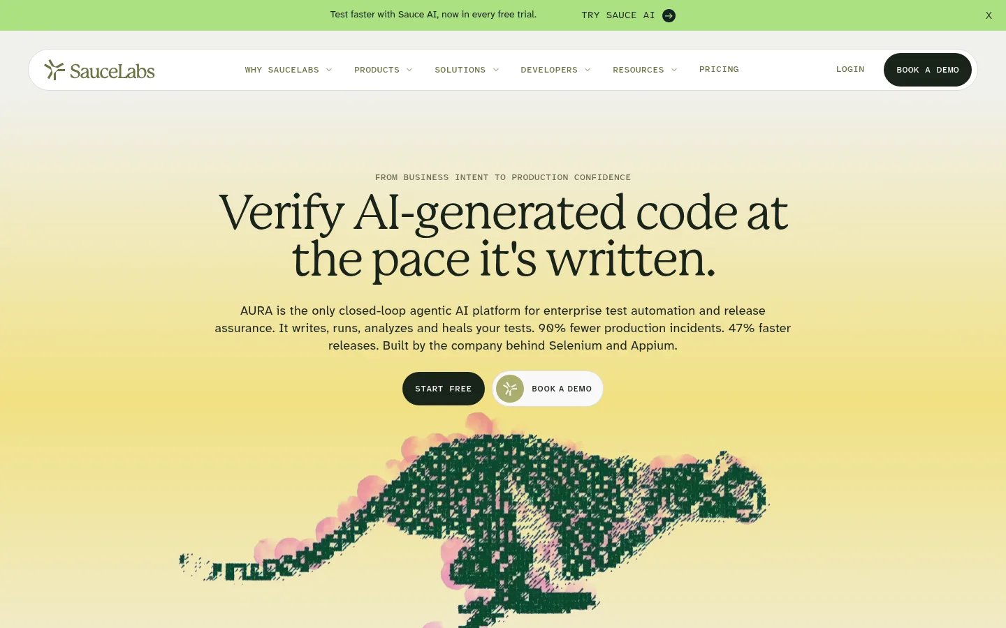
The visual identity balances a pale, warm canvas with forest-dark typography and carefully rationed yellow-green light. The hero uses a broad, softly blended yellow-to-ivory field behind a centered serif headline, compact supporting copy, dark pill CTA, and a pixel-textured running animal illustration; this illustrated treatment is expressive rather than a source for the core palette. Alternating off-white and near-white bands create section rhythm without hard colour breaks. P22 Mackinac Pro gives display headlines an editorial, human character, while Atkinson Hyperlegible Next carries navigation, body copy, and card content with functional clarity. Atkinson Hyperlegible Mono appears in small uppercase labels and links. Content shifts between centered statements, three-column outcome cards, stacked audience panels, and integration grids. Fine warm-grey borders and restrained soft shadows separate white cards from the canvas; rounded corners soften dense information. Dark green is reserved for high-contrast controls and product diagrams.
配色 点色块复制色值。用途说明来自对页面的实测位置(背景、文字、描边、按钮)与截图判读。
品牌色
Forest Ink
#192319
Primary text and inverse dark surface; also anchors dark CTA treatments and the platform diagram.
Moss Link
#3c483c
Small uppercase story-link text and restrained link emphasis.
Deep Canopy
#043423
Occasional dark green heading, text, and link emphasis.
强调色
Sunlit Butter
#f1e082
Yellow highlight in the hero and warm gradient accents that bring focus to selected sections.
Lemon Sage
#ebedb8
Pale green-yellow section surface, used for select proof or highlight bands.
Olive Signal
#6d7344
Olive accent for sparse text or interface details, including small graphic accents.
表层色
Gallery Mist
#f8f8f8
Primary near-white canvas for open sections, content bands, and much of the page background.
Warm Stone
#f0f0ec
Alternate section background, visible across the hero, outcome sections, integrations, and brand-story bands.
Paper White
#fdfdfe
Clean card and inset surface against the warmer grey canvas.
中性色
Soft Pewter
#c8c8be
Main hairline and card border colour, particularly around white content cards.
Pale Graphite
#d4d5d0
Secondary card-edge detail and subtle dividing rules.
Mist Line
#dbdcdb
Subtle separators and card-border details.
功能色
Quiet Sage
#6a6f6a
Muted paragraph text and secondary explanatory copy.
Mature Olive
#656b52
Secondary subdued green text, used sparingly for quiet supporting details.
文字 背景 对比度 WCAG #192319 Forest Ink#f8f8f8 Gallery Mist15.26:1 AAA #192319 Forest Ink#f0f0ec Warm Stone14.18:1 AAA #192319 Forest Ink#fdfdfe Paper White15.94:1 AAA #6a6f6a Quiet Sage#f8f8f8 Gallery Mist4.83:1 AA #6a6f6a Quiet Sage#f0f0ec Warm Stone4.49:1 AA-large #6a6f6a Quiet Sage#fdfdfe Paper White5.04:1 AA
字体 字号阶梯:Perfect Fourth(比例约 1.312,正文 18px)。示例用免费替代字体渲染,数值为实测。
Aa 设计
Atkinson Hyperlegible Next 网络字体 · 字重 400 / 600 / 500 · 占比 79%
免费替代:Atkinson Hyperlegible
Body, navigation, labels, and functional headings
Aa 设计
Atkinson Hyperlegible Mono 网络字体 · 字重 500 / 400 · 占比 12%
免费替代:IBM Plex Mono
Compact uppercase eyebrow labels and story links
Aa 设计
P22 Mackinac Pro 网络字体 · 字重 400 / 700 · 占比 9%
免费替代:Cormorant Garamond
Display headlines and prominent editorial statements
角色 示例 字号 字重 行高 字距 特大标题 Oversized editorial hero or section statement.
Sauce Labs
70px 400 0.95 -0.04em 一级标题 Primary hero headline.
Sauce Labs
50px 400 0.95 -0.04em 二级标题 Major section titles and centered platform statements.
Sauce Labs
36px 400 1.1 -0.04em 三级标题 Feature-card and outcome headings.
Sauce Labs
32px 400 1.1 0.005em 四级标题 Smaller card titles and audience-panel headings.
The quick brown fox 敏捷的狐狸
24px 400 1.1 -0.02em 正文 Main paragraphs, product descriptions, and explanatory copy.
The quick brown fox 敏捷的狐狸
18px 400 1.4 0.017em 辅助文字 Supporting notes, compact card copy, and secondary details.
The quick brown fox 敏捷的狐狸
16.5px 400 1.4 0.017em 代码 Small uppercase eyebrow labels and technical-style metadata.
const style = 1;
12.5px 500 1.6 0.02em
间距与布局 基准单位 2px · 密度:适中
60px 版块间距
20px 元素间距
— 卡片内边距
1372px 内容最大宽度
2px
6px
8px
10px
12px
16px
20px
24px
26px
30px
32px
40px
44px
60px
80px
100px
Use a centered content system capped at the measured 1372px maximum width, with a comfortable density and broad section pauses. The hero is centered and spacious; later bands alternate full-width warm stone and near-white backgrounds. Arrange outcome cards in three columns, audience outcomes as stacked wide panels, and integrations as a categorized grid. Maintain clear alignment within each section: centered for statements and proof, left-aligned for detailed content. The measured spacing scale is generous, with a 60px section gap and 20px element gap as recurring anchors.
圆角与层次 lg · card
lg · card
lg · card
lg · section
The page mixes flat colour bands with raised white cards. Fine warm-grey borders define card edges, while selected cards and proof panels use broad, soft shadows rather than hard outlines. Rounded card corners soften dense grids. Keep the hero and open content mostly flat; reserve stronger layering for outcome cards, video, and featured proof.
组件 下面的预览按实测的按钮、输入框、徽标、卡片样式重建(字体用替代字体)。
Announcement bar Slim bright green strip above navigation with centered offer text, compact CTA link, and a close affordance.
Pill navigation White rounded horizontal navigation surface with logo, compact uppercase menu links, login, and a dark demo CTA.
Hero block Centered mono eyebrow, tightly set serif headline, explanatory copy, paired pill CTAs, and large pixel-textured illustration over a yellow-to-ivory glow.
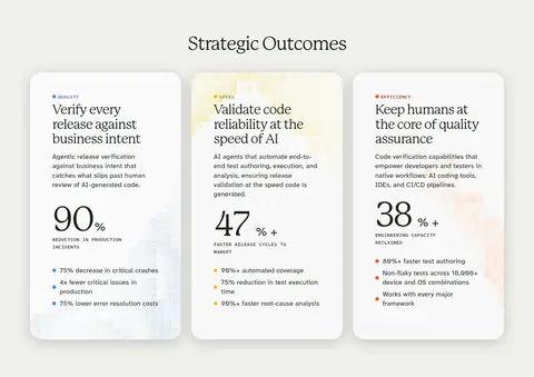
Outcome cards Three white cards on warm stone, with compact category labels, readable headings, explanatory text, oversized percentage proof, and fine supporting bullets.
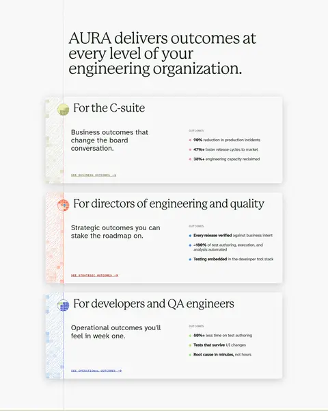
Audience panels Wide stacked cards pairing audience-specific serif titles and copy with concise outcome lists and small text links.
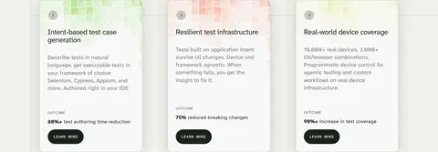
Use-case card grid Three-column set of numbered product cards with short descriptions, small outcome statements, and dark pill links.
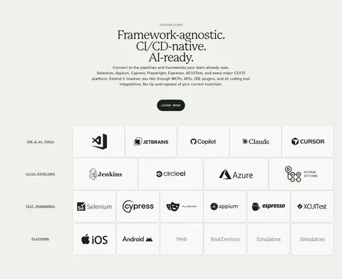
Integration matrix Categorized grid of restrained logo tiles, organized by tool or pipeline type on a warm neutral section.
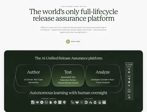
Platform diagram Dark rounded product panel with a centered title and a multi-stage release-assurance workflow illustration.
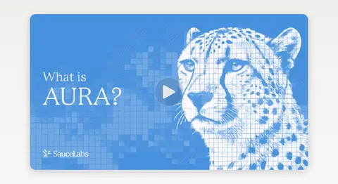
Imagery · Imagery is primarily product illustration and interface evidence rather than conventional photography. The hero’s pixelated running-animal graphic is dark green with pink and yellow-green details over a luminous yellow field; treat those extra hues as illustration-specific, not core UI colours. A blue AURA video thumbnail supplies a distinct media moment. Product cards use small visual previews, while the platform diagram is a dark, polished product graphic.
页面版块 共 15 个版块,按页面从上到下排列,每个都标了类型、布局和交互套路。
首页
首屏 AI验证主视觉
Centered hero with a wide warm gradient field, headline, paired CTAs, and large illustration.
品牌墙 客户品牌墙
Tight, full-width row of customer logos on the warm hero background.
视频 产品介绍视频
Near-white band with one large centered video thumbnail.
功能网格 战略成果
Centered section heading followed by three outcome cards in a row.
数据亮点 团队价值成果
Near-white section with a left-aligned statement and vertically stacked wide audience panels.
功能网格 运营成果一
Warm stone three-column use-case card grid, aligned from the left.
功能网格 运营成果二
Continues the three-column card grid on the same warm neutral band.
功能网格 运营成果三
Final short row of cards, followed by a transition into customer proof.
其他 案例过渡区
Open near-white transition area with minimal content and visual breathing room.
用户评价 客户案例
Near-white three-column proof row with customer marks, results, and links.
使用步骤 平台工作流程
Centered platform statement and CTA above a wide dark, rounded workflow diagram.
其他 插画过渡区
Open near-white interval with a large centered green-toned illustrative motif.
数据亮点 经济价值数据
Warm stone three-column proof band with centered heading and metrics.
集成生态 工具集成矩阵
Centered heading above categorized, multi-column logo tiles.
其他 品牌实力数据
Centered brand statement above a three-column statistics row on warm stone.
该做与不该做 ✓ 该做 Use Mackinac-style serif headlines for major statements. Keep body copy functional, legible, and neutrally coloured. Alternate warm stone and near-white section bands. Use yellow-green gradients as restrained focal lighting. Make dark green CTAs compact, rounded, and high contrast. Separate information with fine warm-grey borders and soft shadows. ✕ 不该做 Do not turn the page into a dark theme. Do not use the illustration’s incidental colours as global UI colours. Do not crowd the hero with dense navigation or copy. Do not apply heavy shadows to every section. Do not replace the editorial serif with a generic geometric display face. Do not make card grids visually loud or highly saturated. 给 AI 的提示词 想快速出一个同风格的新页面,把这段话连同 DESIGN.md 一起发给 AI。
复制 Build a new Sauce Labs-style page with a warm editorial SaaS aesthetic. Use Gallery Mist (#f8f8f8) and Warm Stone (#f0f0ec) as alternating section surfaces, Forest Ink (#192319) for primary type and dark CTAs, and Quiet Sage (#6a6f6a) for supporting copy. Add Sunlit Butter (#f1e082) and Lemon Sage (#ebedb8) sparingly for luminous emphasis. Set major headlines in an editorial serif similar to P22 Mackinac Pro; use Atkinson Hyperlegible-style sans for body and navigation, with compact mono uppercase labels. Keep the hero centered and spacious, then organize proof into calm card grids, audience panels, and categorized integration tiles. Use fine borders, rounded cards, and selective soft shadows. Make product visuals illustrative and polished, not decorative noise.
DESIGN.md Tailwind v4 CSS 变量 Design Tokens
---
title: "Sauce Labs design system"
variant: extended
source: https://saucelabs.com/
captured_at: 2026-10-12
theme: light
industry: devtools
generator: Design DNA (https://four.wiralomi.com/style/saucelabs-com)
ai_generated: true
ai_label: "本文件由 AI 辅助生成:数值取自公开网页的实测样式,命名、用途说明与建议为模型解读。商标归原所有者。 / AI-assisted content"
---
# Sauce Labs · Design System
> Editorial typography meets warm, confident engineering.
**Theme:** light · **Industry:** devtools · **Source:** https://saucelabs.com/ · **Captured:** 2026-10-12 (1440×900 desktop)
_AI-assisted content: values are measured from the public page at capture time; names, roles and guidance are model-written interpretations. Trademarks belong to their owners._
Sauce Labs pairs restrained, editorial typography with a warm neutral canvas and softly luminous yellow-green accents. Generous centered hero content gives way to structured product cards, proof points, integration tiles, and enterprise evidence.
## North star
Use an editorial serif headline and warm, low-contrast surfaces, then reserve deep green and yellow-green for clear functional emphasis.
## Overview
The visual identity balances a pale, warm canvas with forest-dark typography and carefully rationed yellow-green light. The hero uses a broad, softly blended yellow-to-ivory field behind a centered serif headline, compact supporting copy, dark pill CTA, and a pixel-textured running animal illustration; this illustrated treatment is expressive rather than a source for the core palette. Alternating off-white and near-white bands create section rhythm without hard colour breaks. P22 Mackinac Pro gives display headlines an editorial, human character, while Atkinson Hyperlegible Next carries navigation, body copy, and card content with functional clarity. Atkinson Hyperlegible Mono appears in small uppercase labels and links. Content shifts between centered statements, three-column outcome cards, stacked audience panels, and integration grids. Fine warm-grey borders and restrained soft shadows separate white cards from the canvas; rounded corners soften dense information. Dark green is reserved for high-contrast controls and product diagrams.
## Colors
| Name | Hex | Token | Group | Role |
|---|---|---|---|---|
| Gallery Mist | ` | `--color-gallery-mist` | surface | Primary near-white canvas for open sections, content bands, and much of the page background. |
| Forest Ink | ` | `--color-forest-ink` | brand | Primary text and inverse dark surface; also anchors dark CTA treatments and the platform diagram. |
| Warm Stone | ` | `--color-warm-stone` | surface | Alternate section background, visible across the hero, outcome sections, integrations, and brand-story bands. |
| Quiet Sage | ` | `--color-quiet-sage` | semantic | Muted paragraph text and secondary explanatory copy. |
| Soft Pewter | ` | `--color-soft-pewter` | neutral | Main hairline and card border colour, particularly around white content cards. |
| Sunlit Butter | ` | `--color-sunlit-butter` | accent | Yellow highlight in the hero and warm gradient accents that bring focus to selected sections. |
| Paper White | ` | `--color-paper-white` | surface | Clean card and inset surface against the warmer grey canvas. |
| Pale Graphite | ` | `--color-pale-graphite` | neutral | Secondary card-edge detail and subtle dividing rules. |
| Moss Link | ` | `--color-moss-link` | brand | Small uppercase story-link text and restrained link emphasis. |
| Lemon Sage | ` | `--color-lemon-sage` | accent | Pale green-yellow section surface, used for select proof or highlight bands. |
| Deep Canopy | ` | `--color-deep-canopy` | brand | Occasional dark green heading, text, and link emphasis. |
| Mist Line | ` | `--color-mist-line` | neutral | Subtle separators and card-border details. |
| Olive Signal | ` | `--color-olive-signal` | accent | Olive accent for sparse text or interface details, including small graphic accents. |
| Mature Olive | ` | `--color-mature-olive` | semantic | Secondary subdued green text, used sparingly for quiet supporting details. |
### Semantic aliases
`--color-canvas` → ` (Gallery Mist) · `--color-surface` → ` (Warm Stone) · `--color-surface-2` → ` (Paper White) · `--color-surface-3` → ` (Forest Ink) · `--color-surface-4` → ` (Lemon Sage) · `--color-text` → ` (Forest Ink) · `--color-text-muted` → ` (Quiet Sage) · `--color-border` → ` (Soft Pewter) · `--color-accent` → ` (Sunlit Butter) · `--color-accent-2` → ` (Olive Signal)
### Contrast (WCAG 2.x)
| Text | Background | Ratio | Level |
|---|---|---|---|
| ` | ` | 15.26:1 | AAA |
| ` | ` | 14.18:1 | AAA |
| ` | ` | 15.94:1 | AAA |
| ` | ` | 4.83:1 | AA |
| ` | ` | 4.49:1 | AA-large |
| ` | ` | 5.04:1 | AA |
| ` | ` | 3.16:1 | AA-large |
| ` | ` | 1.26:1 | fail |
| ` | ` | 1.17:1 | fail |
| ` | ` | 1.31:1 | fail |
### Gradients
- `linear-gradient(rgba(240, 240, 236, 0), rgb(241, 224, 130) 47%, rgba(240, 240, 236, 0) 101%)`
- `linear-gradient(rgb(240, 240, 236), rgb(248, 248, 248))`
## Typography
| Family | Token | Source | Weights | Role | Free substitute |
|---|---|---|---|---|---|
| Atkinson Hyperlegible Next | `--font-body` | webfont | 400, 600, 500 | Body, navigation, labels, and functional headings | Atkinson Hyperlegible |
| Atkinson Hyperlegible Mono | `--font-mono` | webfont | 500, 400 | Compact uppercase eyebrow labels and story links | IBM Plex Mono |
| P22 Mackinac Pro | `--font-display` | webfont | 400, 700 | Display headlines and prominent editorial statements | Cormorant Garamond |
- **Atkinson Hyperlegible Next:** Mostly regular weight, with selective medium or semibold emphasis; body copy is open and readable.
- **Atkinson Hyperlegible Mono:** Small monospaced uppercase labels with lightly expanded tracking.
- **P22 Mackinac Pro:** Regular-weight serif with tight negative tracking and close leading for large centered statements.
### Type scale — Perfect Fourth (ratio ≈ 1.312, base 18px)
| Role | Size | Weight | Line height | Letter spacing | Case | Family | Used for |
|---|---|---|---|---|---|---|---|
| display | 70px | 400 | 0.95 | -0.04em | — | P22 Mackinac Pro | Oversized editorial hero or section statement. |
| h1 | 50px | 400 | 0.95 | -0.04em | — | P22 Mackinac Pro | Primary hero headline. |
| h2 | 36px | 400 | 1.1 | -0.04em | — | P22 Mackinac Pro | Major section titles and centered platform statements. |
| h3 | 32px | 400 | 1.1 | 0.005em | — | Atkinson Hyperlegible Next | Feature-card and outcome headings. |
| h4 | 24px | 400 | 1.1 | -0.02em | — | Atkinson Hyperlegible Next | Smaller card titles and audience-panel headings. |
| body | 18px | 400 | 1.4 | 0.017em | — | Atkinson Hyperlegible Next | Main paragraphs, product descriptions, and explanatory copy. |
| caption | 16.5px | 400 | 1.4 | 0.017em | — | Atkinson Hyperlegible Next | Supporting notes, compact card copy, and secondary details. |
| code | 12.5px | 500 | 1.6 | 0.02em | uppercase | Atkinson Hyperlegible Mono | Small uppercase eyebrow labels and technical-style metadata. |
## Spacing & layout
- Base unit **2px**, density **comfortable**.
- Scale (most used values): 2, 6, 8, 10, 12, 16, 20, 24, 26, 30, 32, 40, 44, 60, 80, 100 px.
- Section rhythm 60px · element gap 20px · card padding — · max content width 1372px.
Use a centered content system capped at the measured 1372px maximum width, with a comfortable density and broad section pauses. The hero is centered and spacious; later bands alternate full-width warm stone and near-white backgrounds. Arrange outcome cards in three columns, audience outcomes as stacked wide panels, and integrations as a categorized grid. Maintain clear alignment within each section: centered for statements and proof, left-aligned for detailed content. The measured spacing scale is generous, with a 60px section gap and 20px element gap as recurring anchors.
## Shape & elevation
- Radius: card `13px` · xs `13px` · sm `32px`
- Shadow `lg` (card): `rgba(0, 0, 0, 0.14) 0px 2px 44px 0px`
- Shadow `lg-2` (card): `rgba(0, 0, 0, 0.18) 0px 8px 36px 0px`
- Shadow `lg-3` (card): `rgba(0, 0, 0, 0.18) 0px 7.34px 33.0101px 0px`
- Shadow `lg-4` (section): `rgba(0, 0, 0, 0.1) 0px 8px 40px 0px`
- Shadow `lg-5` (section): `rgba(0, 0, 0, 0.1) 0px 4px 4px 0px, rgba(0, 0, 0, 0.1) 0px 8px 40px 0px`
The page mixes flat colour bands with raised white cards. Fine warm-grey borders define card edges, while selected cards and proof panels use broad, soft shadows rather than hard outlines. Rounded card corners soften dense grids. Keep the hero and open content mostly flat; reserve stronger layering for outcome cards, video, and featured proof.
## Imagery
Imagery is primarily product illustration and interface evidence rather than conventional photography. The hero’s pixelated running-animal graphic is dark green with pink and yellow-green details over a luminous yellow field; treat those extra hues as illustration-specific, not core UI colours. A blue AURA video thumbnail supplies a distinct media moment. Product cards use small visual previews, while the platform diagram is a dark, polished product graphic.
## Components
### Announcement bar
Slim bright green strip above navigation with centered offer text, compact CTA link, and a close affordance.
### Pill navigation
White rounded horizontal navigation surface with logo, compact uppercase menu links, login, and a dark demo CTA.
### Hero block
Centered mono eyebrow, tightly set serif headline, explanatory copy, paired pill CTAs, and large pixel-textured illustration over a yellow-to-ivory glow.
### Outcome cards
Three white cards on warm stone, with compact category labels, readable headings, explanatory text, oversized percentage proof, and fine supporting bullets.
### Audience panels
Wide stacked cards pairing audience-specific serif titles and copy with concise outcome lists and small text links.
### Use-case card grid
Three-column set of numbered product cards with short descriptions, small outcome statements, and dark pill links.
### Integration matrix
Categorized grid of restrained logo tiles, organized by tool or pipeline type on a warm neutral section.
### Platform diagram
Dark rounded product panel with a centered title and a multi-stage release-assurance workflow illustration.
### Measured component styles
- **Link** (“READ THE STORY”): transparent background · text ## Do
- Use Mackinac-style serif headlines for major statements.
- Keep body copy functional, legible, and neutrally coloured.
- Alternate warm stone and near-white section bands.
- Use yellow-green gradients as restrained focal lighting.
- Make dark green CTAs compact, rounded, and high contrast.
- Separate information with fine warm-grey borders and soft shadows.
## Don't
- Do not turn the page into a dark theme.
- Do not use the illustration’s incidental colours as global UI colours.
- Do not crowd the hero with dense navigation or copy.
- Do not apply heavy shadows to every section.
- Do not replace the editorial serif with a generic geometric display face.
- Do not make card grids visually loud or highly saturated.
## Agent prompt
Build a new Sauce Labs-style page with a warm editorial SaaS aesthetic. Use Gallery Mist (## Page sections (top to bottom)
| # | Type | Layout | UX patterns | UI patterns |
|---|---|---|---|---|
| 1 | hero | Centered hero with a wide warm gradient field, headline, paired CTAs, and large illustration. | Primary free-trial CTA, Secondary demo CTA | Mono eyebrow, Serif headline, Pixel-style hero art, Yellow glow |
| 2 | logo-cloud | Tight, full-width row of customer logos on the warm hero background. | Enterprise trust proof | Small uppercase label, Monochrome logo row |
| 3 | video | Near-white band with one large centered video thumbnail. | Play-to-learn overview | Rounded media card, Visible play control, Blue thumbnail art |
| 4 | feature-grid | Centered section heading followed by three outcome cards in a row. | Scan measurable benefits, Compare outcome categories | White raised cards, Large percentage metrics, Compact category labels |
| 5 | stats | Near-white section with a left-aligned statement and vertically stacked wide audience panels. | Browse by engineering role, Follow outcome links | Editorial section heading, Audience cards, Outcome lists |
| 6 | feature-grid | Warm stone three-column use-case card grid, aligned from the left. | Scan use cases, Open learn-more paths | Numbered cards, Small outcome label, Dark pill links |
| 7 | feature-grid | Continues the three-column card grid on the same warm neutral band. | Compare capabilities, Explore individual topics | Numbered cards, Compact descriptions, Dark pill links |
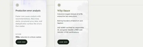
| 8 | feature-grid | Final short row of cards, followed by a transition into customer proof. | Learn about error analysis, Explore Sauce Labs | Numbered feature card, Compact brand card |
| 9 | other | Open near-white transition area with minimal content and visual breathing room. | Reset visual rhythm | Sparse neutral canvas |
| 10 | testimonials | Near-white three-column proof row with customer marks, results, and links. | Review customer outcomes, Open case studies | Logo-led columns, Compact story links, Fine dividers |
| 11 | how-it-works | Centered platform statement and CTA above a wide dark, rounded workflow diagram. | Understand lifecycle coverage, Book a demo | Centered serif heading, Dark product panel, Three-stage workflow graphic |
| 12 | other | Open near-white interval with a large centered green-toned illustrative motif. | Bridge between proof sections | Pixelated green illustration, Minimal surrounding UI |
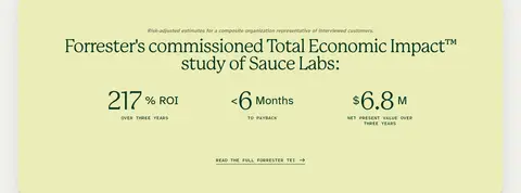
| 13 | stats | Warm stone three-column proof band with centered heading and metrics. | Scan ROI and payback, Open full study | Pale green-yellow panel, Large metrics, Underlined text link |
| 14 | integrations | Centered heading above categorized, multi-column logo tiles. | Find compatible tools, Scan by integration category | Compact logo grid, Category labels, Rounded tile borders |
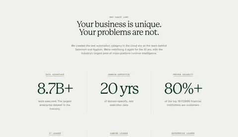
| 15 | other | Centered brand statement above a three-column statistics row on warm stone. | Understand company credibility | Centered serif heading, Large green metrics, Subtle column separators |
## Source CSS custom properties (selected)
```css
--osano-clear-dialog-background: rgba(0,0,0,0);
--osano-button-border-color: