North star · Make a calm editorial canvas carry precise, layered product evidence without competing with it.
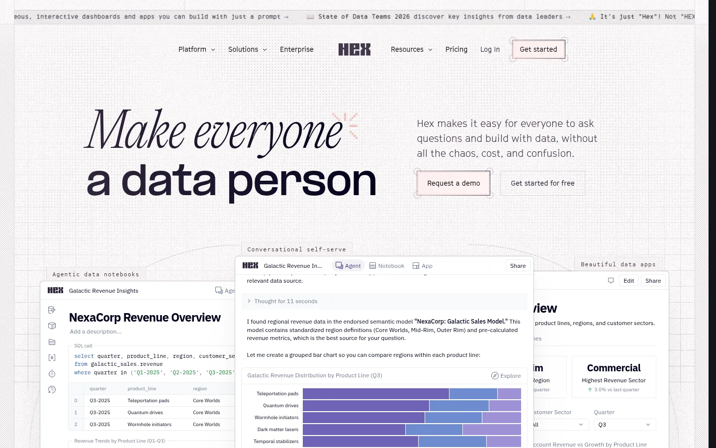
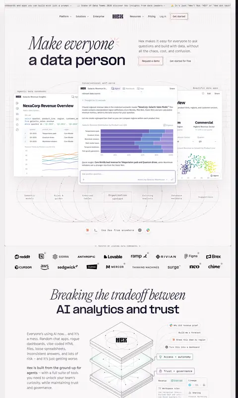
The page is built on a near-white canvas (#fffcfc) with a subtle warm cast, keeping attention on oversized typography and layered product screenshots. Deep near-black and plum tones anchor headings and body copy; muted gray-purple text supports secondary information, while restrained violet and green accents appear sparingly. The opening headline contrasts a large italic serif phrase with a bold sans-serif statement, establishing an editorial voice against the technical dashboard imagery. Content alternates between centered statements, split text-and-interface sections, and modular card grids. Product screenshots are the primary imagery: crisp, interface-dense, and often overlapped to suggest depth and capability. Fine grid lines, pale section transitions, and thin borders add structure without making the page feel heavy. Generous vertical breathing room separates its many sections, while compact monospace labels and navigation details provide a precise, data-oriented counterpoint.
Headings, body copy, buttons, and much of the navigation
Aa 设计
IBM Plex Sans
网络字体 · 字重 400 / 500 / 600 / 700 · 占比 37%
免费替代:IBM Plex Sans
Captions and compact product-interface text
Aa 设计
Cinetype Mono
网络字体 · 字重 400 / 300 · 占比 11%
免费替代:IBM Plex Mono
Compact navigation labels and interface-style annotations
Aa 设计
IBM Plex Mono
网络字体 · 字重 400 · 占比 8%
免费替代:IBM Plex Mono
Links, code-like details, and compact technical labels
Aa 设计
PP Formula
网络字体 · 字重 800 / 600 · 占比 3%
免费替代:Space Grotesk
Display headlines and prominent bold heading moments
Aa 设计
Lato
网络字体 · 字重 400 / 700 / 600 · 占比 3%
免费替代:Lato
Occasional compact badge and interface label
角色
示例
字号
字重
行高
字距
特大标题
Large hero and editorial display headlines.
Hex
60px
700
1.3
-0.031em
一级标题
Strong section titles and prominent product statements.
Hex
28px
800
1.3
-0.025em
二级标题
Secondary feature and content-section headings.
The quick brown fox 敏捷的狐狸
24px
300
1.5
0
三级标题
Feature-card and smaller subsection headings.
The quick brown fox 敏捷的狐狸
20px
300
1.5
0
正文
Explanatory copy, testimonials, and product descriptions.
The quick brown fox 敏捷的狐狸
16px
300
1.5
0
辅助文字
Small interface captions and product-preview details.
The quick brown fox 敏捷的狐狸
12px
400
1.4
0
按钮
CTA and compact action labels.
The quick brown fox 敏捷的狐狸
14px
400
1
0
导航
Top navigation and small announcement-strip text.
The quick brown fox 敏捷的狐狸
12px
400
1.57
0
链接
Small technical links and inline references.
The quick brown fox 敏捷的狐狸
11px
400
1.5
0
代码
Code-like labels and technical interface snippets.
const style = 1;
11px
400
1.5
0
间距与布局
基准单位 4px · 密度:宽松
100px版块间距
1px元素间距
—卡片内边距
—内容最大宽度
1px
2px
4px
5px
6px
7px
8px
10px
12px
14px
16px
20px
A spacious, centered long-form page with a broad content field and no visibly rigid column system across every section. The hero places a large headline beside explanatory copy, followed by an oversized layered product preview. Later blocks alternate split layouts, centered statements, and two- or three-column cards. Section transitions use ample vertical breathing room, while interface panels introduce denser local grids. Keep text alignment deliberate and let screenshots extend beyond their neighboring copy when needed.
圆角与层次
按钮 · 1px
输入框 · 7px
卡片 · 6px
图片 · 6px
徽标 · 5px
导航 · 50%
xl · card
inset · other, card
hairline · card
inset · text
The page is mostly flat, with thin pale borders and delicate grid lines defining sections and cards. Product previews receive the strongest depth through layered overlap and soft shadows; ordinary text cards remain restrained. Avoid heavy drop shadows or dark container fills outside product-interface imagery.
组件
下面的预览按实测的按钮、输入框、徽标、卡片样式重建(字体用替代字体)。
Announcement strip
A narrow top ticker with compact monospace-style updates and links, separated from the navigation by a fine rule.
Navigation bar
Centered brand mark with compact text links and a lightly outlined 'Get started' action.
Editorial hero
Large split headline pairs an italic serif phrase with a bold sans statement, alongside short copy and two restrained CTAs.
Layered product preview
Overlapping notebook and dashboard panels show real-looking interface detail, charts, labels, and side controls.
Feature split
A text-led explanation sits beside or opposite a large interface image, with a small action link or outlined button.
Feature cards
Pale modular cards combine concise headings, supporting copy, small diagrams, and fine borders.
FAQ list
A centered question list uses thin horizontal separators and compact disclosure cues.
Imagery · Product-interface screenshots dominate: dashboards, notebooks, charts, and app views are presented as clean, readable evidence rather than decorative mockups. Several panels overlap or sit offset from one another to imply depth. Supporting diagrams use fine outlines and simple geometric forms; small logos and abstract data visuals add variety. Keep imagery crisp against pale backgrounds, with restrained color in charts and minimal photographic treatment.
Pair editorial headline contrast with restrained technical UI typography.
Show product interfaces as detailed, legible evidence.
Use thin warm-gray rules to organize content.
Give section transitions generous breathing room.
Keep violet and green accents sparse.
✕ 不该做
Do not turn the page into a dark-first theme.
Do not replace product evidence with generic stock photography.
Do not use saturated color as a large background field.
Do not make every section a card grid.
Do not use heavy shadows on ordinary content blocks.
Do not crowd the headline and product imagery.
给 AI 的提示词
想快速出一个同风格的新页面,把这段话连同 DESIGN.md 一起发给 AI。
Build a new Hex-style SaaS page on a light, spacious canvas. Use Paper Veil (#fffcfc) as the main background, Midnight Type (#01011b) and Obsidian Ink (#14141c) for strong text, and Plum Smoke (#31263b) for muted copy and links. Keep Warm Hairline (#dbd7da) and UI Mist (#ecedf2) for delicate borders; reserve Hex Violet (#473982) and Leaf Signal (#22863a) for rare emphasis. Combine expressive editorial headlines with clean sans-serif body text and small monospace technical labels. Organize content in alternating split sections, centered statements, and modest card grids. Make crisp product screenshots the primary imagery, layering panels gently for depth. Leave generous vertical space, use minimal shadows, and keep controls understated and clearly outlined.