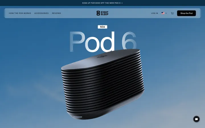
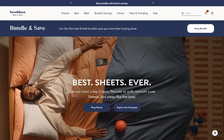
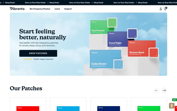
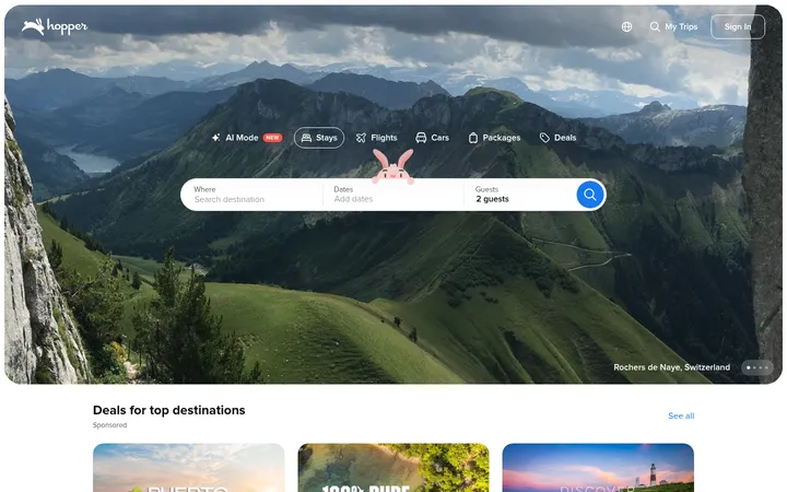
North star · Use deep blue for confident navigation and actions, then let spacious white layouts and human sleep imagery make shopping feel calm.
The visual system anchors the storefront in crisp white and deep Casper blues, using pale blue bands to distinguish promotions, review panels, and educational content without making the page feel heavy. Navy headlines and links provide strong, consistent wayfinding; a restrained red sale action is the clearest warm accent. Calibre supplies approachable, compact sans-serif navigation and body copy, while New Kansas adds a more editorial character to select headings and campaign typography. The page alternates broad, media-led sections with compact benefit rows and product cards, keeping shopping routes visible through a long scroll. Lifestyle photography shows real people resting in lived-in bedrooms, while mattress imagery communicates product differences directly. Soft corners, generous whitespace, thin separators, and subtle shadows keep cards and floating elements distinct but calm. The overall effect is friendly retail rather than clinical wellness.
Primary navigation, body copy, buttons, links, and most page headings.
Aa 设计
Copyright Klim Type Foundry-Not Licensed for Desktop Use
网络字体 · 字重 400 / 700 · 占比 4%
免费替代:Lora
Display-style heading accent, including editorial titles and selected product or testimonial headings.
Aa 设计
NewKansas-Medium
网络字体 · 字重 500 / 600 / 900 · 占比 3%
免费替代:Lora
Supporting editorial and display heading treatment.
Aa 设计
New Kansas TRIAL
网络字体 · 字重 600 · 占比 1%
免费替代:Lora
Secondary display heading variant in limited headline use.
角色
示例
字号
字重
行高
字距
一级标题
Primary campaign and hero titles, including sale and sleep-solution messages.
Casper
36px
800
1
0.006em
二级标题
Section headings introducing reviews, products, and educational content.
Casper
32px
500
1.2
-0.01em
三级标题
Editorial-style card and subsection headings.
The quick brown fox 敏捷的狐狸
24px
400
1.5
0.06em
正文
Product descriptions, explanatory copy, review text, and supporting content.
The quick brown fox 敏捷的狐狸
18px
400
1.6
0
辅助文字
Fine print, image captions, footnotes, and compact supporting labels.
The quick brown fox 敏捷的狐狸
16px
300
1.6
0.038em
按钮
Short shopping, quiz, and action labels.
The quick brown fox 敏捷的狐狸
14px
500
1.6
0
导航
Main product navigation and utility navigation labels.
The quick brown fox 敏捷的狐狸
18px
500
1.6
0
链接
Inline shopping links, secondary actions, and footer navigation.
The quick brown fox 敏捷的狐狸
18px
400
1.6
0
间距与布局
基准单位 4px · 密度:适中
32px版块间距
16px元素间距
40px卡片内边距
1344px内容最大宽度
4px
5px
8px
12px
14px
16px
18px
20px
24px
32px
40px
48px
56px
A long, responsive storefront alternates full-width campaign or media bands with centered content and product groupings. The measured page maximum is 1344px, with comfortable density and a four-pixel base spacing rhythm. The header separates utility messaging from the main product navigation. Product cards use multi-column rows, while reviews and educational proof points shift to broad, spacious panels. Headings are commonly centered in campaign zones but align left in shopping and content sections. Keep sections distinct and avoid compressing the long-scroll rhythm.
圆角与层次
按钮 · 9999px
输入框 · 8px
卡片 · 12px
图片 · 12px
徽标 · 4px
导航 · 4px
链接 · 6px
xl · section
hairline · button
md · button
md · nav
Most page sections sit flat on white or pale-blue backgrounds. Soft, restrained shadows lift the navigation, review card, and selected content cards; use them to clarify layering rather than decorate every block. Thin cool-blue borders define inputs and subtle separations. Rounded media and cards soften the otherwise clean grid.
组件
下面的预览按实测的按钮、输入框、徽标、卡片样式重建(字体用替代字体)。
Two-tier navigation
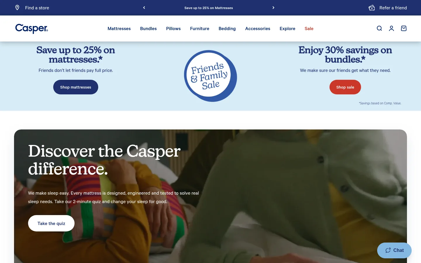
A dark navy utility announcement strip sits above a white product-navigation bar; use blue text, compact utility links, and understated elevation.
Campaign banner
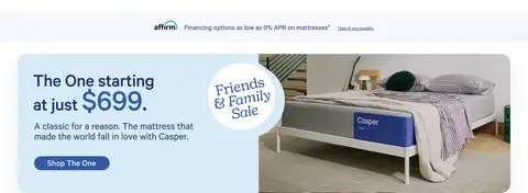
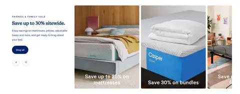
A pale blue, full-width sale band balances centered sale artwork with concise offers and rounded pill CTAs; use red only for the sale action.
Media hero
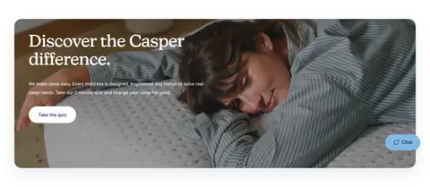
Wide rounded lifestyle photography carries a large white heading and supporting text over a darkened image, with a contrasting white pill CTA.
Trust benefits
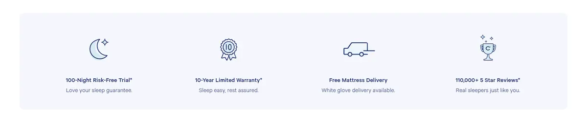
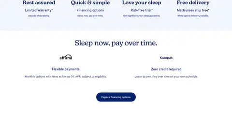
Four compact icon-and-copy benefits communicate trial, warranty, delivery, and review proof in a calm horizontal row.
Review panel
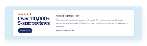
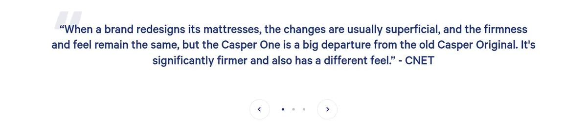
A review feature pairs a star rating and large navy score on a white card against a pale blue field, with a compact review action.
Product category cards
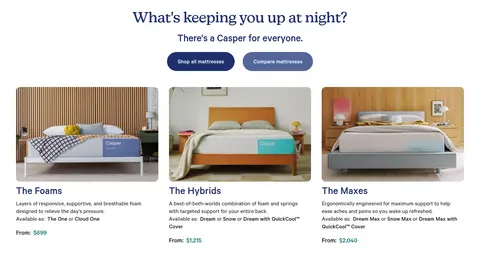
Three bedroom product images sit above concise category names, descriptions, and starting-price links in a clean row.
FAQ accordion
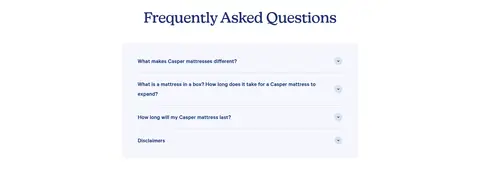
A centered heading introduces a compact pale panel of questions, each separated by fine rules and paired with a small disclosure control.
Newsletter footer
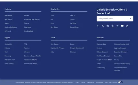
A deep navy footer organizes link columns beside an exclusive-offers email field, with fine dividers and compact social links.
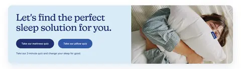
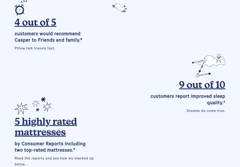
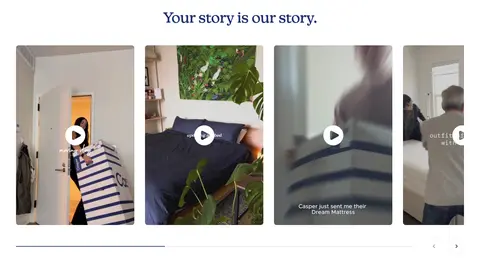
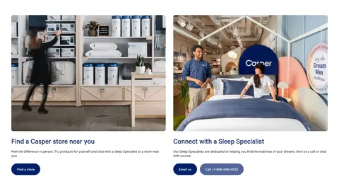
Imagery · Lifestyle photography leads: people sleeping, relaxing, and interacting with mattresses in warm, believable bedrooms. Product cards show mattresses and bedding clearly, often framed in full-room settings. Wide photographic panels use rounded corners and dark overlays where white text sits over imagery. Customer story videos appear as a horizontal gallery with play controls. Small navy line illustrations support the pale-blue sleep-proof section; they are decorative, not the core brand palette.
Keep the main canvas white and use pale blue for selected section bands.
Use Casper Blue for primary headings, links, and shopping actions.
Make lifestyle photography feel warm, domestic, and human.
Keep major CTAs pill-shaped and visually easy to find.
Pair product imagery with concise names and useful shopping details.
Use subtle shadows only to distinguish cards or floating navigation.
Preserve generous whitespace between the long page’s content groups.
✕ 不该做
Do not turn the whole page into a dark interface.
Do not use Sale Red as a general-purpose accent.
Do not place dense text over photography without a dark overlay.
Do not make every section a card with a shadow.
Do not let decorative sleep illustrations overpower product photography.
Do not replace the calm retail rhythm with tightly packed content.
Do not invent additional palette colors for brand surfaces.
给 AI 的提示词
想快速出一个同风格的新页面,把这段话连同 DESIGN.md 一起发给 AI。
Build a new Casper-style retail page with a white canvas and a two-tier header: a deep Midnight Navy (#012169) utility strip above clean product navigation. Use Casper Blue (#1e306e) for headings, links, and main pill-shaped CTAs; reserve Sale Red (#cb372a) for a clear sale action. Introduce pale Sleep Sky (#d7ecf7) or Cloud Blue (#f3f6fd) bands to separate promotions, reviews, or educational proof. Use Calibre-like sans-serif typography for navigation and body, with restrained editorial serif headings. Organize content into spacious full-width imagery, compact benefits, product-card rows, trust panels, and clear shopping routes. Use warm bedroom lifestyle photos, rounded media, subtle shadows, and fine cool-blue dividers. Keep the long-page rhythm airy, practical, and reassuring.