这是一个以健康产品为核心的线上商店,用醒目的编辑式标题搭配明亮的产品图片。白色留白让选购路径清晰,浅蓝紫色背景与深海军蓝则为页面增添层次。
North star · Keep the interface calm and legible on white, letting editorial New Kansas headings and colorful product photography provide the personality.
Vibrants balances a mostly white storefront with a deep blue-black anchor: the announcement strip, hero CTA, and footer use #021422, while the legal footer deepens to #02101b. Product imagery supplies the vivid red, green, and blue color, so these package colors should remain within photography rather than becoming extra interface accents. Pale blue #f2f6ff and warm cream #fff6ea, alongside the screenshot’s soft blue-violet washes, distinguish editorial wellness panels without breaking the airy canvas. New Kansas gives headings a rounded, expressive editorial character; Montserrat keeps body copy, product details, and links readable. The page alternates full-width image-led stories with compact product and bundle shopping grids. Borders are thin and quiet, corners are gently rounded, and depth comes mostly from imagery and background transitions rather than shadows. The result feels approachable and commercial, but not like a conventional discount-heavy marketplace.
配色 点色块复制色值。用途说明来自对页面的实测位置(背景、文字、描边、按钮)与截图判读。
品牌色
Midnight Ink
#021422
Announcement strip, primary CTA, prominent headings, and main footer; the principal dark anchor.
Deep Blue
#001f38
Dark blue heading and text variant within content areas.
Footer Midnight
#02101b
Deeper lower legal footer band, visually separated from the main footer.
强调色
Sale Green
#0c9a3d
Small sale badges in product and bundle merchandising.
Link Blue
#0000ee
Measured link text and footer links; use sparingly as a functional accent.
Forest CTA
#00852e
Measured Shop All Products button; distinct from the dark navy hero CTA shown in the screenshot.
Sky Link
#91c3ff
Light blue link accent; reserve for limited interactive text.
表层色
Gallery White
#ffffff
Main canvas, navigation, and testimonial speech cards; preserves the page’s bright, open base.
Warm Cream
#fff6ea
Pale warm card or section surface, complementing the softer editorial panels.
Cloud Blue
#f2f6ff
Pale blue nav, card, and editorial surfaces; supports soft background transitions.
Lilac Haze
#ede9f7
Pale violet gradient stop visible in soft editorial background washes.
Frost Blue
#e9f0f7
Pale blue gradient stop used in understated background transitions.
中性色
Soft Slate
#ccd2d7
Thin product-card outlines and quiet structural borders.
Mist Line
#e6e8e9
Navigation, button, and card hairlines; keep borders subtle against white.
Muted Graphite
#67727a
Secondary body copy and subdued navigation or footer text.
Blue Gray
#808f9c
Secondary copy color observed in text; subordinate to the darker primary text.
文字 背景 对比度 WCAG #021422 Midnight Ink#ffffff Gallery White18.65:1 AAA #021422 Midnight Ink#f2f6ff Cloud Blue17.23:1 AAA #021422 Midnight Ink#fff6ea Warm Cream17.43:1 AAA #ffffff Gallery White#021422 Midnight Ink18.65:1 AAA #ffffff Gallery White#f2f6ff Cloud Blue1.08:1 不达标 #ffffff Gallery White#fff6ea Warm Cream1.07:1 不达标
字体 字号阶梯:Perfect Fourth(比例约 1.316,正文 16px)。示例用免费替代字体渲染,数值为实测。
Aa 设计
new-kansas 网络字体 · 字重 600 / 500 / 400 / 700 · 占比 39%
免费替代:DM Serif Display
Display headings, navigation, captions, and product titles
Aa 设计
Montserrat 网络字体 · 字重 500 / 400 / 700 / 600 · 占比 33%
免费替代:Montserrat
Body copy, links, product details, badges, and testimonial text
Aa 设计
inter 网络字体 · 字重 500 / 400 / 700 / 600 · 占比 23%
免费替代:Inter
Product-card labels and product or bundle links
Aa 设计
rift-soft 网络字体 · 字重 600 · 占比 5%
免费替代:Oswald
Uppercase eyebrow labels above editorial headings
角色 示例 字号 字重 行高 字距 一级标题 Large editorial hero headline.
Vibrants
48px 600 1.25 0 二级标题 Major section headings such as Our Patches.
Vibrants
32px 500 1.13 0 三级标题 Secondary editorial and feature headings.
Vibrants
28px 500 1.29 -0.02em 四级标题 Product, bundle, and smaller content headings.
The quick brown fox 敏捷的狐狸
24px 600 1.17 -0.01em 正文 Descriptive copy, benefits, and supporting paragraphs.
The quick brown fox 敏捷的狐狸
16px 500 1.8 0 辅助文字 Compact labels and short supporting metadata.
The quick brown fox 敏捷的狐狸
14px 600 normal 0 导航 Announcement and primary navigation labels.
The quick brown fox 敏捷的狐狸
16px 600 1.5 -0.01em 链接 Product links and secondary calls to action.
The quick brown fox 敏捷的狐狸
14.5px 400 normal 0 眉题 Uppercase section labels above feature headings.
The quick brown fox 敏捷的狐狸
16px 600 1 0.063em
间距与布局 基准单位 4px · 密度:紧凑
40px 版块间距
6px 元素间距
— 卡片内边距
1280px 内容最大宽度
3px
6px
8px
10px
12px
16px
18px
20px
22px
24px
32px
40px
48px
64px
80px
The measured content uses a 1280px maximum page width and a compact density, with a 12-column product area and two-column bundle and editorial sections. The hero and mission stories are full-bleed media-led panels; surrounding merchandise sits in aligned card grids. Most sections are left-aligned, with select trust and testimonial blocks centered. A measured 40px section gap provides a consistent cadence, while generous white canvas around cards keeps the overall page from feeling crowded.
圆角与层次 The page is mostly flat: thin measured gray borders define product cards, with no prominent shadows recorded. Rounded card and button corners soften the otherwise crisp grid. Background color and photography create separation between editorial sections; reserve layering for image compositions and testimonial message bubbles rather than adding heavy drop shadows.
组件 下面的预览按实测的按钮、输入框、徽标、卡片样式重建(字体用替代字体)。
Announcement bar A narrow #021422 strip with repeating promotional text in small New Kansas navigation styling.
Main navigation White header with wordmark, category links, and account and cart icons; restrained dark text and subtle separators.
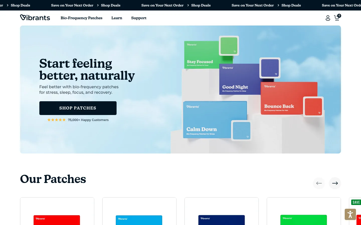
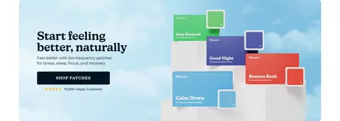
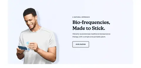
Hero panel Full-width lifestyle/product image with left-aligned New Kansas headline, supporting copy, and a dark navy Shop Patches CTA.
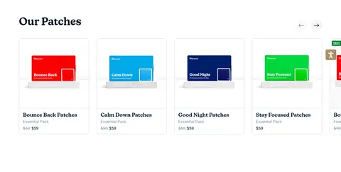
Product card Compact product grid card with package imagery, thin #ccd2d7 or #e6e8e9 outline, title, price, and occasional sale badge.
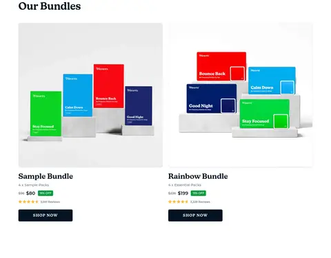
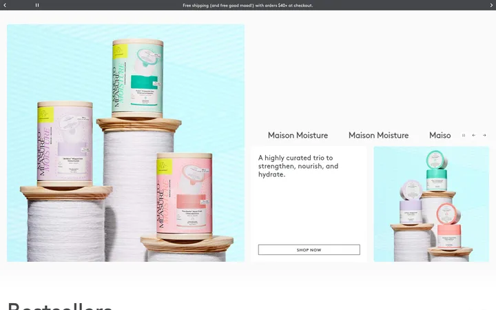
Bundle feature Two-column bundle merchandising with large pack imagery, bundle name, rating, price, green discount badge, and dark Shop Now button.
Editorial feature panel Image-and-copy split with uppercase rift-soft eyebrow, New Kansas heading, body text, and a simple outlined action.
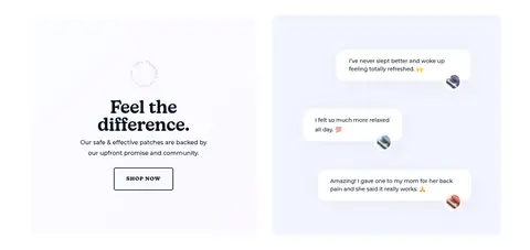
Testimonial bubbles Small white rounded quote cards layered over a pale blue-violet surface, with concise customer messages.
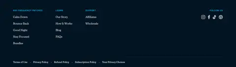
Footer Three-column deep navy link area followed by a darker legal band, small text, and social icons.
Imagery · Realistic product-pack photography is the core shopping asset, shown in vivid color against bright, uncluttered backdrops. Lifestyle photos of people applying or holding patches anchor the editorial stories. Images are often arranged as full-width split panels, with text alongside the subject; subtle pastel blue and violet washes soften content backgrounds. Testimonials use floating white message cards rather than illustrations.
页面版块 共 9 个版块,按页面从上到下排列,每个都标了类型、布局和交互套路。
该做与不该做 ✓ 该做 Keep the main canvas white and bright. Use Midnight Ink for strong structural anchors. Let package photography supply the strongest saturated colors. Set prominent headings in an expressive serif display face. Use pale blue or lilac washes for selected editorial panels. Keep card outlines thin and understated. ✕ 不该做 Do not turn product package colors into extra interface accents. Do not add heavy shadows to cards. Do not make every section use a tinted background. Do not crowd product cards with decorative elements. Do not use generic sans-serif styling for every heading. Do not replace the bright canvas with a dark overall theme. 给 AI 的提示词 想快速出一个同风格的新页面,把这段话连同 DESIGN.md 一起发给 AI。
复制 Build a new wellness storefront page in the Vibrants visual style. Use Gallery White (#ffffff) as the dominant canvas, with Midnight Ink (#021422) for dark navigation bands, prominent headings, and primary CTAs; use Footer Midnight (#02101b) for a distinct legal footer. Set editorial headings in a New Kansas-like display serif and supporting copy in Montserrat. Organize products in a compact, aligned card grid with thin Soft Slate (#ccd2d7) or Mist Line (#e6e8e9) borders and rounded corners. Use Cloud Blue (#f2f6ff), Frost Blue (#e9f0f7), and Lilac Haze (#ede9f7) in a few soft editorial panels. Let vivid product photography carry the saturated colors. Include full-width image-and-copy stories, simple outlined secondary actions, and a clear multi-column footer. Keep shadows minimal and preserve generous white breathing room.
DESIGN.md Tailwind v4 CSS 变量 Design Tokens
---
title: "Vibrants design system"
variant: extended
source: https://vibrants.com/
captured_at: 2026-10-12
theme: light
industry: health
generator: Design DNA (https://four.wiralomi.com/style/vibrants-com)
ai_generated: true
ai_label: "本文件由 AI 辅助生成:数值取自公开网页的实测样式,命名、用途说明与建议为模型解读。商标归原所有者。 / AI-assisted content"
---
# Vibrants · Design System
> Calm editorial design for everyday wellness
**Theme:** light · **Industry:** health · **Source:** https://vibrants.com/ · **Captured:** 2026-10-12 (1440×900 desktop)
_AI-assisted content: values are measured from the public page at capture time; names, roles and guidance are model-written interpretations. Trademarks belong to their owners._
A wellness storefront pairs bold editorial headings with bright, product-led imagery and a restrained palette. White space keeps the shopping experience clear, while pale blue-violet panels and deep navy anchors bring warmth and structure.
## North star
Keep the interface calm and legible on white, letting editorial New Kansas headings and colorful product photography provide the personality.
## Overview
Vibrants balances a mostly white storefront with a deep blue-black anchor: the announcement strip, hero CTA, and footer use ## Colors
| Name | Hex | Token | Group | Role |
|---|---|---|---|---|
| Gallery White | ` | `--color-gallery-white` | surface | Main canvas, navigation, and testimonial speech cards; preserves the page’s bright, open base. |
| Midnight Ink | ` | `--color-midnight-ink` | brand | Announcement strip, primary CTA, prominent headings, and main footer; the principal dark anchor. |
| Soft Slate | ` | `--color-soft-slate` | neutral | Thin product-card outlines and quiet structural borders. |
| Mist Line | ` | `--color-mist-line` | neutral | Navigation, button, and card hairlines; keep borders subtle against white. |
| Sale Green | ` | `--color-sale-green` | accent | Small sale badges in product and bundle merchandising. |
| Muted Graphite | ` | `--color-muted-graphite` | neutral | Secondary body copy and subdued navigation or footer text. |
| Warm Cream | ` | `--color-warm-cream` | surface | Pale warm card or section surface, complementing the softer editorial panels. |
| Deep Blue | ` | `--color-deep-blue` | brand | Dark blue heading and text variant within content areas. |
| Link Blue | ` | `--color-link-blue` | accent | Measured link text and footer links; use sparingly as a functional accent. |
| Cloud Blue | ` | `--color-cloud-blue` | surface | Pale blue nav, card, and editorial surfaces; supports soft background transitions. |
| Blue Gray | ` | `--color-blue-gray` | neutral | Secondary copy color observed in text; subordinate to the darker primary text. |
| Forest CTA | ` | `--color-forest-cta` | accent | Measured Shop All Products button; distinct from the dark navy hero CTA shown in the screenshot. |
| Sky Link | ` | `--color-sky-link` | accent | Light blue link accent; reserve for limited interactive text. |
| Lilac Haze | ` | `--color-lilac-haze` | surface | Pale violet gradient stop visible in soft editorial background washes. |
| Footer Midnight | ` | `--color-footer-midnight` | brand | Deeper lower legal footer band, visually separated from the main footer. |
| Frost Blue | ` | `--color-frost-blue` | surface | Pale blue gradient stop used in understated background transitions. |
### Semantic aliases
`--color-canvas` → ` (Gallery White) · `--color-surface` → ` (Midnight Ink) · `--color-surface-2` → ` (Cloud Blue) · `--color-surface-3` → ` (Warm Cream) · `--color-surface-4` → ` (Footer Midnight) · `--color-text` → ` (Midnight Ink) · `--color-text-muted` → ` (Gallery White) · `--color-text-subtle` → ` (Muted Graphite) · `--color-border` → ` (Mist Line) · `--color-accent` → ` (Link Blue) · `--color-accent-2` → ` (Forest CTA) · `--color-accent-3` → ` (Sky Link) · `--color-on-accent` → `
### Contrast (WCAG 2.x)
| Text | Background | Ratio | Level |
|---|---|---|---|
| ` | ` | 18.65:1 | AAA |
| ` | ` | 17.23:1 | AAA |
| ` | ` | 17.43:1 | AAA |
| ` | ` | 18.65:1 | AAA |
| ` | ` | 1.08:1 | fail |
| ` | ` | 1.07:1 | fail |
| ` | ` | 4.92:1 | AA |
| ` | ` | 3.79:1 | AA-large |
| ` | ` | 4.55:1 | AA |
| ` | ` | 4.6:1 | AA |
### Gradients
- `linear-gradient(90deg, rgb(233, 240, 247), rgb(237, 233, 247))`
- `linear-gradient(360deg, rgb(254, 247, 236) 41.79%, rgb(254, 239, 236) 98.82%)`
- `linear-gradient(300deg, rgba(114, 77, 153, 0.05) 0px, rgba(58, 61, 138, 0.05) 17.39%, rgba(2, 175, 224, 0.05) 34.81%, rgba(95, 183, 62, 0.05) 51.04%, rgba(255, 237, 0, 0.05) 66.67%, rgba(237, 116, 43, 0.05) 83.16%, rgba(`
- `radial-gradient(96.88% 50%, rgb(255, 255, 255) 0px, rgb(238, 233, 255))`
## Typography
| Family | Token | Source | Weights | Role | Free substitute |
|---|---|---|---|---|---|
| new-kansas | `--font-display` | webfont | 600, 500, 400, 700 | Display headings, navigation, captions, and product titles | DM Serif Display |
| Montserrat | `--font-body` | webfont | 500, 400, 700, 600 | Body copy, links, product details, badges, and testimonial text | Montserrat |
| inter | `--font-inter` | webfont | 500, 400, 700, 600 | Product-card labels and product or bundle links | Inter |
| rift-soft | `--font-rift-soft` | webfont | 600 | Uppercase eyebrow labels above editorial headings | Oswald |
- **new-kansas:** Use measured 500–600 weights for headings, with clean tracking and sentence case.
- **Montserrat:** Use readable regular-to-semibold weights; body copy has generous leading, while badges use uppercase.
- **inter:** Compact, neutral product information; regular weight and restrained presentation.
- **rift-soft:** Use the measured semibold style, uppercase, with visibly expanded tracking.
### Type scale — Perfect Fourth (ratio ≈ 1.316, base 16px)
| Role | Size | Weight | Line height | Letter spacing | Case | Family | Used for |
|---|---|---|---|---|---|---|---|
| h1 | 48px | 600 | 1.25 | 0 | — | new-kansas | Large editorial hero headline. |
| h2 | 32px | 500 | 1.13 | 0 | — | new-kansas | Major section headings such as Our Patches. |
| h3 | 28px | 500 | 1.29 | -0.02em | — | new-kansas | Secondary editorial and feature headings. |
| h4 | 24px | 600 | 1.17 | -0.01em | — | new-kansas | Product, bundle, and smaller content headings. |
| body | 16px | 500 | 1.8 | 0 | — | Montserrat | Descriptive copy, benefits, and supporting paragraphs. |
| caption | 14px | 600 | normal | 0 | — | new-kansas | Compact labels and short supporting metadata. |
| nav | 16px | 600 | 1.5 | -0.01em | — | new-kansas | Announcement and primary navigation labels. |
| link | 14.5px | 400 | normal | 0 | — | Montserrat | Product links and secondary calls to action. |
| eyebrow | 16px | 600 | 1 | 0.063em | uppercase | rift-soft | Uppercase section labels above feature headings. |
## Spacing & layout
- Base unit **4px**, density **compact**.
- Scale (most used values): 3, 6, 8, 10, 12, 16, 18, 20, 22, 24, 32, 40, 48, 64, 80 px.
- Section rhythm 40px · element gap 6px · card padding — · max content width 1280px.
The measured content uses a 1280px maximum page width and a compact density, with a 12-column product area and two-column bundle and editorial sections. The hero and mission stories are full-bleed media-led panels; surrounding merchandise sits in aligned card grids. Most sections are left-aligned, with select trust and testimonial blocks centered. A measured 40px section gap provides a consistent cadence, while generous white canvas around cards keeps the overall page from feeling crowded.
## Shape & elevation
- Radius: button `8px` · card `8px` · media `50%` · badge `4px` · nav `12px` · link `20px` · xs `3px` · sm `4px` · md `5px` · lg `8px` · xl `10px` · 2xl `12px`
- Shadow `hairline` (other): `rgb(242, 242, 248) 1px 0px 0px 0px`
- Motion: standard transition `0.2s ease` on interactive elements.
The page is mostly flat: thin measured gray borders define product cards, with no prominent shadows recorded. Rounded card and button corners soften the otherwise crisp grid. Background color and photography create separation between editorial sections; reserve layering for image compositions and testimonial message bubbles rather than adding heavy drop shadows.
## Imagery
Realistic product-pack photography is the core shopping asset, shown in vivid color against bright, uncluttered backdrops. Lifestyle photos of people applying or holding patches anchor the editorial stories. Images are often arranged as full-width split panels, with text alongside the subject; subtle pastel blue and violet washes soften content backgrounds. Testimonials use floating white message cards rather than illustrations.
## Components
### Announcement bar
A narrow ### Main navigation
White header with wordmark, category links, and account and cart icons; restrained dark text and subtle separators.
### Hero panel
Full-width lifestyle/product image with left-aligned New Kansas headline, supporting copy, and a dark navy Shop Patches CTA.
### Product card
Compact product grid card with package imagery, thin ### Bundle feature
Two-column bundle merchandising with large pack imagery, bundle name, rating, price, green discount badge, and dark Shop Now button.
### Editorial feature panel
Image-and-copy split with uppercase rift-soft eyebrow, New Kansas heading, body text, and a simple outlined action.
### Testimonial bubbles
Small white rounded quote cards layered over a pale blue-violet surface, with concise customer messages.
### Footer
Three-column deep navy link area followed by a darker legal band, small text, and social icons.
### Measured component styles
- **Primary button** (“Shop All Products”): background ## Do
- Keep the main canvas white and bright.
- Use Midnight Ink for strong structural anchors.
- Let package photography supply the strongest saturated colors.
- Set prominent headings in an expressive serif display face.
- Use pale blue or lilac washes for selected editorial panels.
- Keep card outlines thin and understated.
## Don't
- Do not turn product package colors into extra interface accents.
- Do not add heavy shadows to cards.
- Do not make every section use a tinted background.
- Do not crowd product cards with decorative elements.
- Do not use generic sans-serif styling for every heading.
- Do not replace the bright canvas with a dark overall theme.
## Agent prompt
Build a new wellness storefront page in the Vibrants visual style. Use Gallery White (## Page sections (top to bottom)
| # | Type | Layout | UX patterns | UI patterns |
|---|---|---|---|---|
| 1 | hero | Full-width image-led hero; copy and CTA on the left, colorful product packages on the right. | Primary shop CTA, Customer-count social proof | Editorial display headline, Dark CTA, Sky-toned imagery |
| 2 | product-grid | Horizontal 12-column product carousel with image-first cards and compact product details. | Carousel arrows, Product links, Price comparison | Thin card borders, Package imagery, Green sale badges |
| 3 | product-showcase | Two-column bundle comparison with large product imagery and purchase details below. | Bundle comparison, Ratings and review counts, Shop Now CTA | Large image panels, Discount badges, Dark buttons |
| 4 | feature-split | Full-width split panel with lifestyle photo on one side and editorial copy on the other. | Learn-more action, Benefit explanation | Uppercase eyebrow, Soft blue-violet surface, Outlined button |
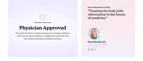
| 5 | feature-grid | Two side-by-side trust panels; centered approval copy beside a physician endorsement. | Trust-building proof, Expert endorsement | Pale gradient panels, Centered heading, Portrait image |
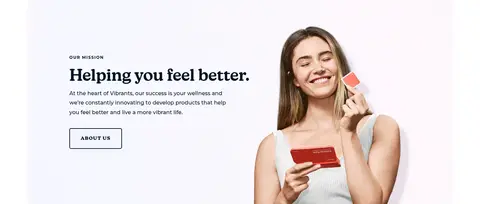
| 6 | feature-split | Full-width image-and-copy composition with text on the left and lifestyle subject on the right. | Brand story, About Us link | Uppercase eyebrow, Editorial heading, Soft tinted background |
| 7 | testimonials | Centered introduction and CTA beside a pale testimonial area with floating quote cards. | Customer quotes, Shop Now action | White message bubbles, Soft blue-lilac panel, Centered heading |
| 8 | footer | Three-column dark footer with product, learning, support, and social links. | Grouped navigation, Social links | Midnight background, Small uppercase labels, Social icons |
| 9 | footer | Full-width darker legal strip with compact copyright, policies, and product disclaimer. | Policy links, Health disclaimer | Deeper navy band, Small muted text |
## Source CSS custom properties (selected)
```css
--primary-color: