North star · Let destination photography create the mood, then keep travel choices crisp, compact, and unmistakably actionable.
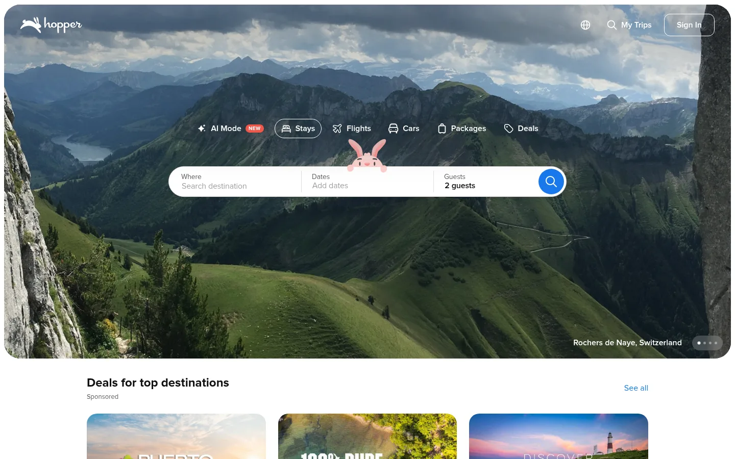
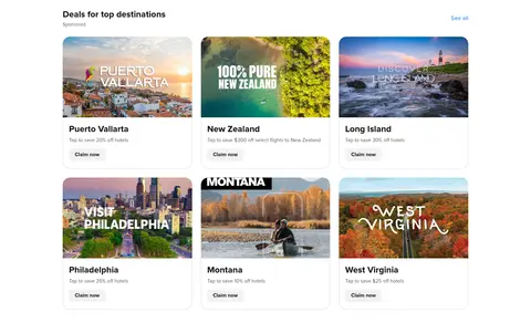
The visual strategy balances a cinematic destination photograph with a bright, restrained interface. A full-bleed ocean hero carries white navigation and search controls, while the booking form sits in a white pill-like panel with a vivid blue search action. Below, a white canvas keeps the destination deal grid and app promotion feeling open and legible; a pale gray exploration band provides the page’s clearest section contrast. Proxima Nova supplies compact, friendly sans-serif typography, with heavy headings and regular supporting copy. Cards use rounded imagery and concise deal details rather than elaborate framing. The page’s measured spacing system is compact but uses larger section breaks to distinguish content groups. Blue links connect otherwise quiet sections, while the small coral badge is a limited alert accent. Most screen color comes from travel photography, not the brand palette.
Brand-wide interface type for headings, body copy, controls, labels, and links.
角色
示例
字号
字重
行高
字距
一级标题
Prominent page or campaign headline where present.
Hopper
32px
800
1.25
0
二级标题
Section headings such as Deals for top destinations.
The quick brown fox 敏捷的狐狸
24px
700
1.33
0
三级标题
Subsection headings and card titles.
The quick brown fox 敏捷的狐狸
20px
700
1.4
0
四级标题
Small supporting headings within content blocks.
The quick brown fox 敏捷的狐狸
18px
600
1.33
0
正文
Deal descriptions, helper copy, and general interface text.
The quick brown fox 敏捷的狐狸
14px
400
1.43
0
辅助文字
Compact labels, ratings, and secondary metadata.
The quick brown fox 敏捷的狐狸
13px
400
1.23
0
按钮
Bold labels on booking and deal actions.
The quick brown fox 敏捷的狐狸
14px
700
1.43
0
链接
Destination links and See all navigation.
The quick brown fox 敏捷的狐狸
14px
400
1.43
0
眉题
Small uppercase status or category labels.
The quick brown fox 敏捷的狐狸
10px
700
1.2
0.05em
间距与布局
基准单位 8px · 密度:紧凑
32px版块间距
8px元素间距
—卡片内边距
1100px内容最大宽度
4px
6px
8px
10px
12px
16px
20px
24px
32px
40px
48px
The homepage begins with a wide, rounded-corner hero, then moves into centered content on a white canvas. The destination offers use a three-column grid; the app promotion uses a two-column split, followed by a full-width pale-gray exploration band. The footer expands into multiple link columns. The measured content maximum is 1100px, with a compact 8px-based spacing rhythm and larger section gaps. Headings align to the start of their content blocks.
圆角与层次
按钮 · 9999px
图片 · 20px
徽标 · 9999px
链接 · 12px
lg · other
The interface is mostly flat, relying on whitespace, image framing, and subtle borders rather than stacked shadows. Deal cards have softly rounded photo corners and light edge definition. The hero controls sit directly over the photograph, while the booking panel provides the strongest raised, layered effect through its bright surface contrast.
组件
下面的预览按实测的按钮、输入框、徽标、卡片样式重建(字体用替代字体)。
Hero booking search
Overlay a white, rounded search panel on destination photography; divide destination, dates, and guests into clear fields and finish with a circular #1878ec search action.
Travel category navigation
Place compact icon-and-label choices for stays, flights, cars, packages, and deals above the search panel; keep the active choice visibly outlined.
Destination deal card
Use a rounded destination image, concise place name, muted offer detail, and a small Claim now action; arrange cards in a three-column grid.
Deal status badge
Use a small uppercase white label on #f1574b for occasional NEW status, keeping the bright coral treatment rare.
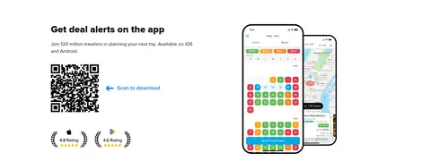
App promotion
Split concise copy and QR download guidance from overlapping app screenshots; use a clear section heading and restrained supporting details.
Exploration link band
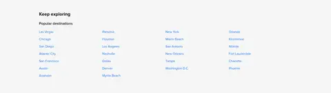
Set destination links in tidy columns on #f6f6f6, with a bold heading and #1878ec link text.
Footer link groups
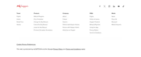
Use a white, multi-column footer for travel, product, company, FAQs, and media links, with muted text and fine separators.
Imagery · Travel photography is the defining visual material: the hero uses expansive, cinematic ocean-and-coast imagery, while deal cards use cropped destination scenes. Images are rounded and retain their natural color, with interface controls layered cleanly over the hero. The app section pairs product screenshots with a QR code; the tiny Hopper character and illustration details are supporting accents, not the main brand palette.
Use destination photography as the hero’s main visual.
Keep search controls white, legible, and easy to scan.
Use #1878ec for primary actions and destination links.
Keep card copy concise and deal-focused.
Use Proxima Nova or a close sans-serif substitute.
Separate content groups with generous section breaks.
Reserve coral for occasional status badges.
✕ 不该做
Don’t let decorative color compete with destination imagery.
Don’t turn every surface into a raised card.
Don’t use oversized, dense blocks of supporting copy.
Don’t use coral as a general action color.
Don’t crowd the booking fields or category choices.
Don’t invent gradients or decorative effects absent from the measured style.
给 AI 的提示词
想快速出一个同风格的新页面,把这段话连同 DESIGN.md 一起发给 AI。
Build a new Hopper-style travel page with a bright, compact interface and destination-led photography. Use Canvas White (#ffffff) as the main canvas, Headline Ink (#111111) for prominent text, Quiet Charcoal (#606060) for supporting copy, and Hopper Blue (#1878ec) for primary actions and links. Use Cloud Gray (#f6f6f6) selectively for section bands and Coral Alert (#f1574b) only for small status badges. Set type in Proxima Nova or Lato, with bold headings and regular body text. Organize content into clearly separated sections with a restrained grid, rounded destination imagery, and concise offer details. Prefer flat surfaces and subtle borders; keep controls highly legible over photography. Make the booking action the clearest interface element without overpowering the destination image.