North star · Keep the interface quiet and spacious so cinematic product imagery and credible sleep-science evidence lead the story.
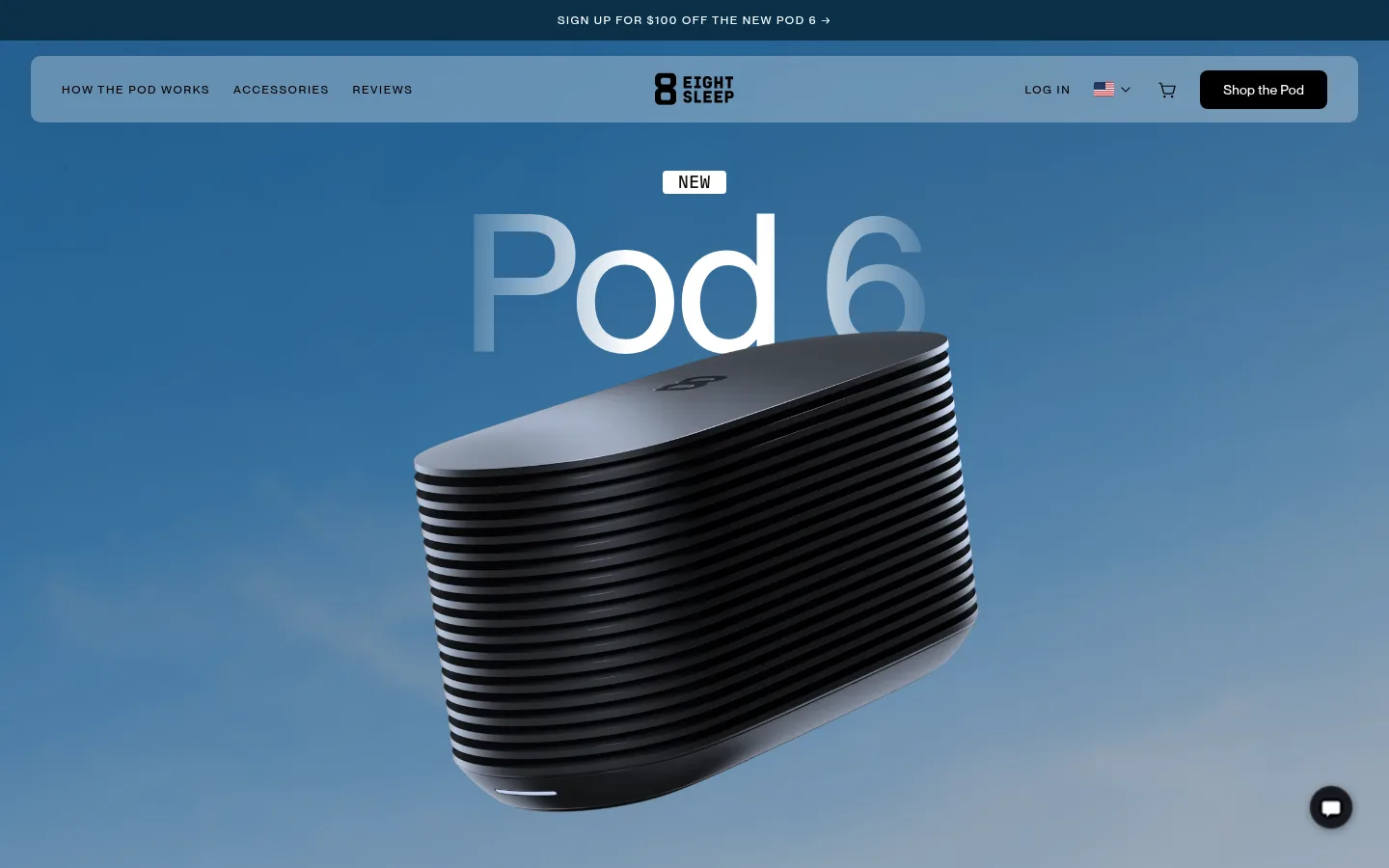
The page uses a clean white canvas as a quiet frame for full-bleed visual moments: the opening blue-toned Pod 6 render, dark product film, warm sand-coloured interface feature, and black scientific-advisory section. Treat those image-led colours as section-specific atmosphere rather than a replacement for the measured neutral brand palette. NeueMontreal carries the interface, with compact uppercase navigation and restrained, medium-weight display headings; Bethany Elingston adds a rare serif accent. The composition alternates centered, cinematic panels with modular card layouts and split product explanations. Generous vertical breathing room keeps the long homepage from feeling like a dense catalogue, while tightly composed cards make technical benefits and evidence scannable. Use black for high-contrast controls and occasional inverse sections, soft greys for quiet content bands, and blue or warm beige chiefly where they support imagery and product storytelling.
Primary interface and display sans across headings, body, navigation, links, and controls.
Aa 设计
Bethany Elingston
网络字体 · 字重 400 · 占比 14%
免费替代:Cormorant Garamond
Occasional expressive serif treatment for secondary display headings.
角色
示例
字号
字重
行高
字距
一级标题
Hero product name and principal launch headline.
Eight Sleep
44px
500
1.1
0.01em
二级标题
Major feature, research, and section headings.
Eight Sleep
36px
500
1.1
0.01em
三级标题
Product explanations and supporting feature titles.
Eight Sleep
28px
400
1.1
0.01em
四级标题
Occasional serif-led editorial or feature heading.
The quick brown fox 敏捷的狐狸
22px
400
1.45
0.008em
正文
Compact explanatory copy and product descriptions.
The quick brown fox 敏捷的狐狸
13px
400
1.2
0.011em
辅助文字
Small review, product, and image captions.
The quick brown fox 敏捷的狐狸
12px
400
1.2
0.01em
按钮
Prominent shop and section-action labels.
Eight Sleep
44px
500
1.1
0.01em
导航
Uppercase header links with conspicuous letter spacing.
The quick brown fox 敏捷的狐狸
12px
500
1.33
0.133em
链接
Inline calls to action such as Learn more.
The quick brown fox 敏捷的狐狸
18px
400
1.33
0.01em
眉题
Uppercase section labels for research and product updates.
The quick brown fox 敏捷的狐狸
14.5px
500
1.15
0.18em
间距与布局
基准单位 4px · 密度:宽松
112px版块间距
4px元素间距
18px卡片内边距
1312px内容最大宽度
1px
2px
4px
6px
7px
8px
10px
11px
12px
14px
16px
18px
20px
24px
32px
40px
A spacious, long-form homepage with a measured 1312px maximum content width and a 4px base spacing unit. The hero and film sections are centered and full bleed; later content alternates between centered product cards, split feature layouts, and dense evidence grids. Major sections have generous separation, while compact text and controls keep cards readable. Preserve the wide white canvas and use image-led bands to establish changes in pace.
圆角与层次
按钮 · 50%
卡片 · 20px
图片 · 2px
徽标 · 9999px
导航 · 10px
链接 · 8px
xl · card
hairline · other
lg · card
sm · other
The interface is mostly flat, with subtle hairlines and lightly differentiated grey surfaces instead of constant shadows. Use rounded card containers and restrained layering for media. Product and testimonial cards may receive a deep, soft shadow where measured, while navigation and text sections remain visually unraised.
组件
下面的预览按实测的按钮、输入框、徽标、卡片样式重建(字体用替代字体)。
Announcement strip
Slim dark-blue promotional band at the top with small, uppercase, widely tracked white offer text.
Floating navigation
Translucent pale header panel over the hero; compact uppercase links, centered logo, account and cart actions, and a dark shop CTA.
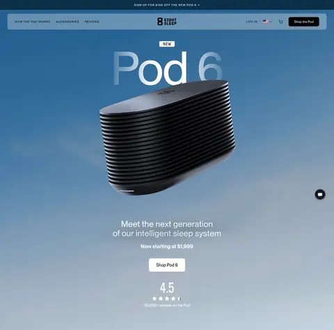
Hero product stage
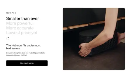
Centered Pod 6 title and new badge over a full-bleed blue product render, followed by launch copy, price, shop action, and rating.
Video feature panel
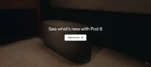
Full-width dark product film with centered white heading and a compact watch-film control.
Feature cards
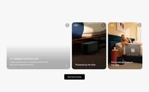
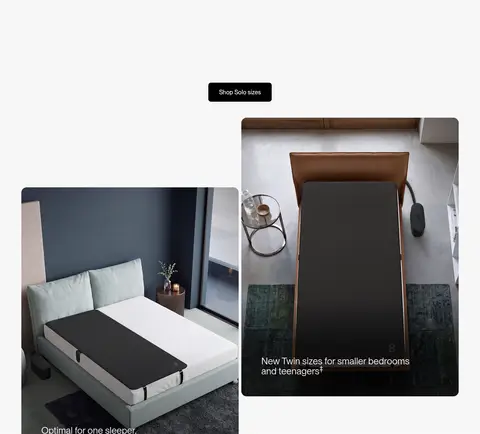
Rounded image-led cards combine product or lifestyle visuals with short overlay labels and a centered section action.
Split product feature
Editorial text column with uppercase eyebrow, large heading, supporting copy, dark CTA, and a rounded product video or image.
Evidence cards
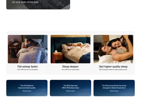
Research and benefit modules pair sleep photography or dark blue cards with concise claims and study links.
Expert and review panels
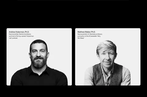
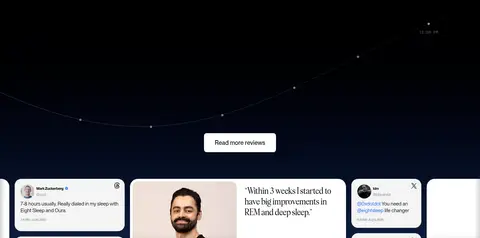
Portrait-led advisor cards sit on a black field; customer quotes appear in a horizontally browsable card group.
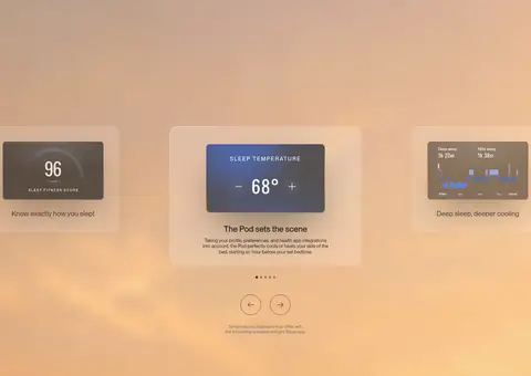
Imagery · Lead with oversized, cinematic 3D product imagery against a blue atmospheric backdrop, followed by full-bleed product video. Supporting sections use rounded lifestyle and product photographs, interface-like sleep data cards, and portraits of scientific advisors. Keep photos realistic and softly graded; reserve warm and dark colour treatments for the imagery or the specific section they belong to.
Keep the base canvas white and let photography create the dramatic colour shifts.
Use NeueMontreal for the interface and reserve the serif for occasional emphasis.
Make hero and film sections wide, centered, and media-led.
Use compact uppercase navigation and eyebrow labels with visible tracking.
Alternate open editorial layouts with organized, rounded card groups.
Use black controls for strong contrast against light surfaces.
✕ 不该做
Do not apply the hero's blue image palette as a site-wide interface colour.
Do not fill every section with cards or decorative borders.
Do not make the generous vertical rhythm feel like a dense product catalogue.
Do not turn accent blue into the dominant button colour.
Do not use the serif typeface throughout body copy or navigation.
Do not add heavy shadows to otherwise flat sections.
给 AI 的提示词
想快速出一个同风格的新页面,把这段话连同 DESIGN.md 一起发给 AI。
Build a new Eight Sleep page as a quiet, premium sleep-tech storefront. Use Gallery White (#ffffff) as the principal canvas, Soft Ink (#151514) and Deep Black (#000000) for typography and strong actions, and Cloud Grey (#f7f7f7) or Mist Grey (#e8e8e8) for restrained content bands. Keep Sleep Blue (#4f7fff), Signal Blue (#1862ff), and Warm Sand (#e2b68f) occasional, and chiefly tied to product imagery or specific feature moments. Use NeueMontreal or Inter for compact, carefully tracked navigation and clean headings; introduce the serif only as a rare editorial accent. Build spacious, centered hero and film moments, then alternate split product explanations with rounded image cards and evidence modules. Keep controls crisp, borders subtle, and shadows limited to media or raised cards. Let realistic product imagery carry the drama; keep interface decoration minimal.