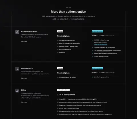
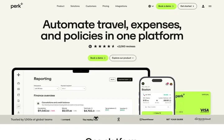
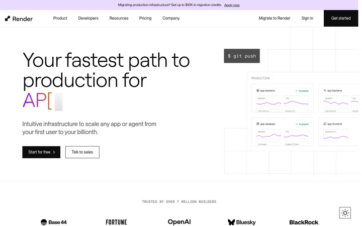
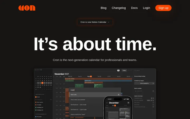
North star · Make the product interface the visual proof: keep the canvas quiet, alternate light and charcoal bands, and use accent color sparingly.
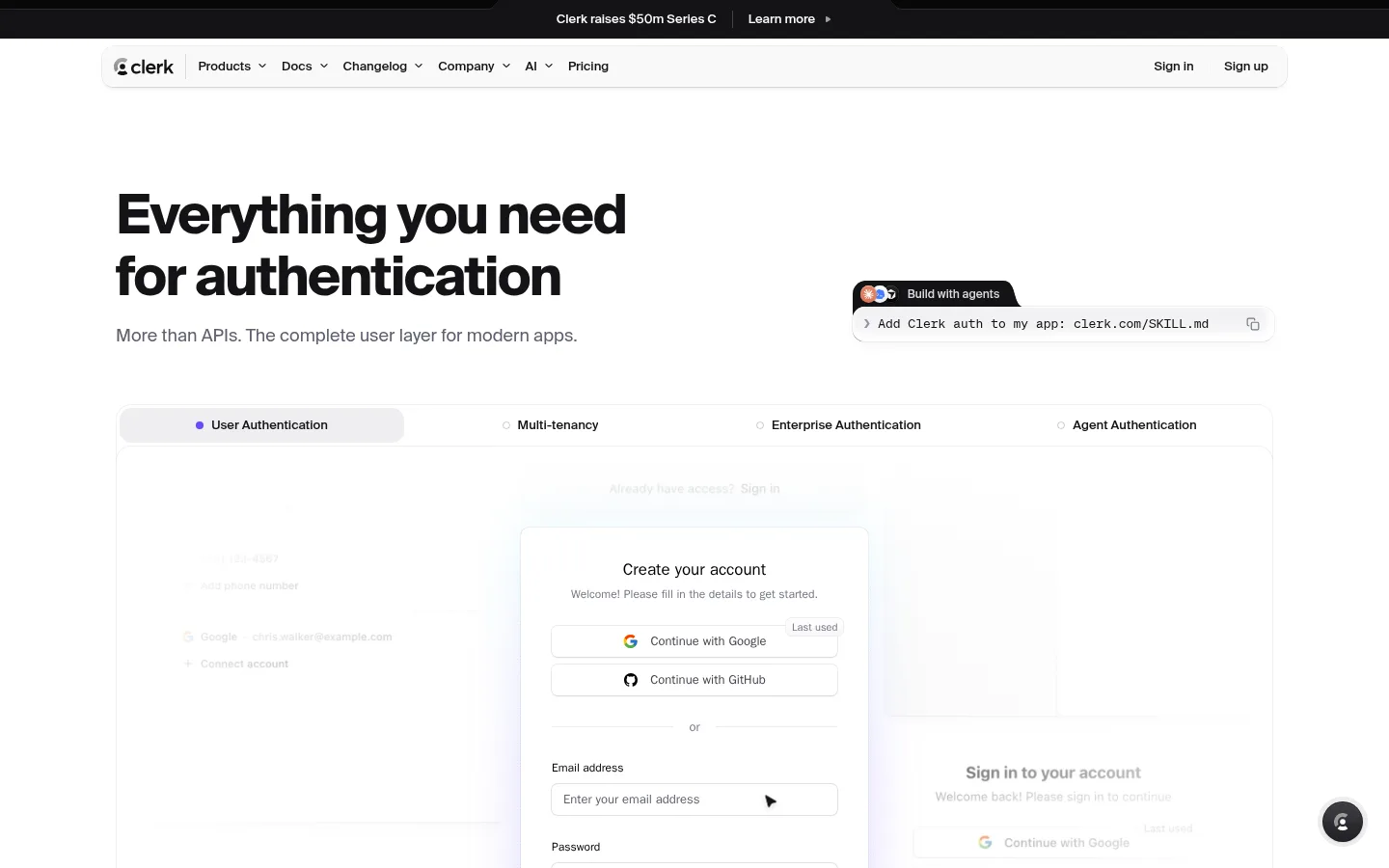
The page uses a restrained neutral system to let product interfaces carry the visual detail. White leads the opening hero and mockup presentation, while #f7f7f8 distinguishes broad content bands and pale cards. Near-black #131316 creates dramatic feature and framework sections; slightly lighter charcoal cards add depth without introducing a new bright palette. Violet #6248f6 and cyan #3ad4fd appear as a narrow gradient accent rather than broad fills, with violet also marking selected states. GeistNumbers supplies compact, confident headings and readable interface-oriented body text; Söhne Mono is reserved for code-like labels and small captions. The layout alternates between a generous two-column hero, dense visual feature cards, split editorial product sections, and centered framework grids. Interface screenshots, account flows, logos, and small technical illustrations are framed as real product evidence. Fine gray borders, restrained shadows, rounded cards, and ample section breathing room keep the long page polished rather than ornamental.
配色
点色块复制色值。用途说明来自对页面的实测位置(背景、文字、描边、按钮)与截图判读。
品牌色
强调色
表层色
中性色
功能色
页面底色 · Soft Canvas表层 · Gallery White表层 2 · Clerk Ink表层 3 · Deep Charcoal主文字 · Clerk Ink次要文字 · Muted Ink弱文字 · Quiet Slate描边 · Fine Divider强调 · Signal Violet强调 2 · Electric Cyan
Primary headings, body copy, navigation, buttons, and links
Aa 设计
ui-sans-serif
系统字体 · 字重 400 / 500 / 700 / 510 · 占比 25%
免费替代:Inter
Secondary headings and some account/product interface cards
Aa 设计
soehneMono
网络字体 · 字重 400 · 占比 11%
免费替代:Roboto Mono
Code samples, small technical captions, and monospace labels
Aa 设计
Inter
网络字体 · 字重 400 / 500 / 700 / 600 · 占比 6%
免费替代:Inter
Small product-mockup badges and selected embedded interface labels
角色
示例
字号
字重
行高
字距
一级标题
Large bold hero and primary section headline.
Clerk
32px
600
1.25
-0.015em
二级标题
Bold feature titles and subsection headings.
The quick brown fox 敏捷的狐狸
17px
700
1.41
0
正文
Compact explanatory copy and supporting product descriptions.
The quick brown fox 敏捷的狐狸
13px
400
1.54
0
辅助文字
Small tracked technical labels and captions.
The quick brown fox 敏捷的狐狸
10px
400
1.4
0.1em
按钮
Medium-weight action labels in product and navigation controls.
The quick brown fox 敏捷的狐狸
13px
500
1.23
0
链接
Compact medium-weight navigation and inline action links.
The quick brown fox 敏捷的狐狸
13px
500
1.85
0
代码
Monospace snippets and developer-oriented command text.
const style = 1;
10px
400
1.4
0.1em
间距与布局
基准单位 4px · 密度:宽松
128px版块间距
8px元素间距
—卡片内边距
1200px内容最大宽度
2px
4px
6px
8px
10px
12px
16px
17px
20px
24px
32px
40px
Use a centered content frame capped at the measured 1200px maximum, with broad side margins and a spacious overall rhythm. The hero aligns its headline and supporting copy left, balancing them with a product prompt and interface showcase. Follow with a dense, multi-column feature mosaic, then alternate pale product sections and full-width charcoal bands. Keep headings and copy aligned to clear content columns; center the framework and integration groupings. The measured section gap is 128px, while small component spacing follows a compact 4px-based scale. The page feels spacious overall but lets interface cards create local density.
圆角与层次
按钮 · 6px
卡片 · 8px
图片 · 8px
徽标 · 4px
导航 · 12px
链接 · 12px
lg · media
sm · other
inset · other
inset · other
Most surfaces stay flat, with fine #f0f0f0 or pale gray boundaries doing the separation. White mockups lift slightly from the canvas using soft, low-opacity shadows, while dark feature cards separate through tonal contrast. Use measured rounded card and media treatments; avoid heavy drop shadows or thick outlines.
组件
下面的预览按实测的按钮、输入框、徽标、卡片样式重建(字体用替代字体)。
Announcement strip
A narrow black top band with centered launch news and a compact Learn more link.
Floating navigation
Centered white rounded navigation container with Clerk mark, product links, and right-aligned sign-in/sign-up actions.
Hero product tabs
Wide framed showcase with four authentication categories; the selected tab uses a pale fill and violet indicator.
Authentication mockup
Layered account-creation interface with restrained outlines, white panels, and a subtle shadow.
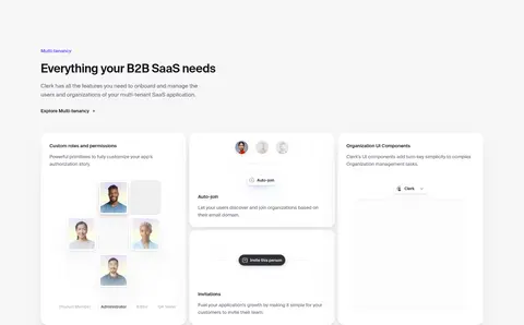
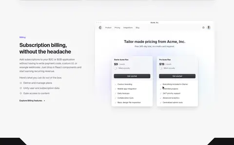
White or pale cards with rounded corners, fine boundaries, and interface previews for tenancy and billing.
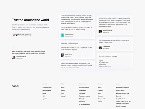
Testimonial cards
Compact customer quotes with small portraits and muted metadata on a light background.
Footer link columns
Brand mark followed by compact grouped navigation columns and subdued social links.
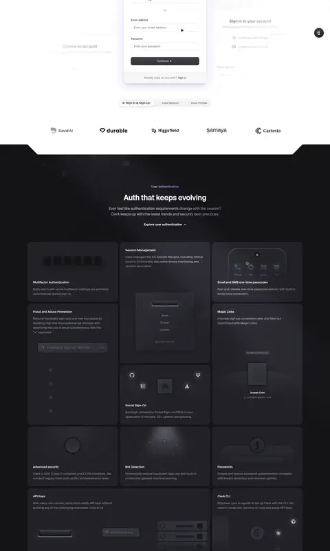
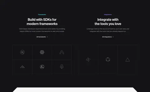
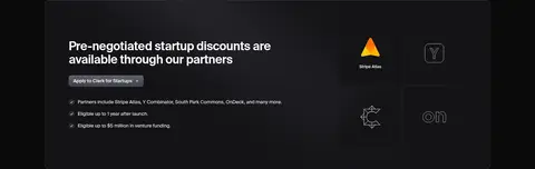
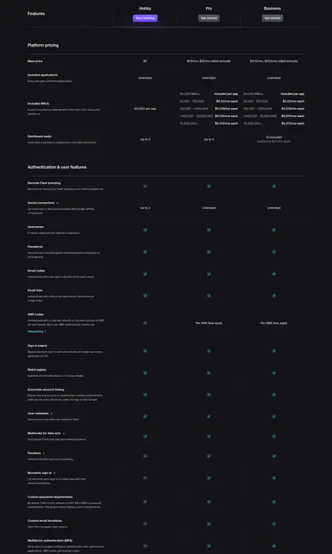
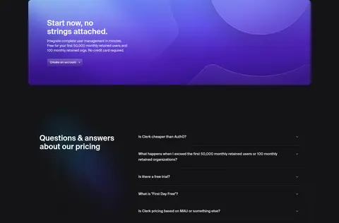
Imagery · Treat product UI as the primary imagery: account creation panels, profile and billing interfaces, organization flows, and framework marks. Use screenshots and interface mockups inside clean cards with delicate borders and soft shadows. Dark feature areas use subdued technical illustrations and diagrams rather than vivid photography. Customer logos and testimonial portraits add limited human evidence; keep them small and contained. Avoid decorative stock photography or cinematic imagery.
Use #ffffff and #f7f7f8 as the dominant light surfaces.
Alternate pale product bands with broad #131316 sections.
Keep violet and cyan mostly to gradients and small state indicators.
Show believable interface mockups as the primary visual evidence.
Use compact Geist-style typography and reserve monospace for code details.
Separate cards with hairlines and gentle shadows rather than heavy borders.
✕ 不该做
Do not make every section dark or brightly colored.
Do not use the accent gradient as a large page background.
Do not replace product UI with generic stock photography.
Do not crowd the hero with excessive copy or decorative elements.
Do not use heavy shadows, thick outlines, or oversized radii.
Do not treat incidental green or black mockup pixels as core brand colors.
给 AI 的提示词
想快速出一个同风格的新页面,把这段话连同 DESIGN.md 一起发给 AI。
Build a new developer-facing page in Clerk’s visual style. Use a quiet white and #f7f7f8 canvas, with broad #131316 feature bands and tonal #212126 cards for contrast. Set primary headings and body in a compact Geist-like sans, using a close free substitute; reserve a monospace face for code snippets and technical captions. Keep violet #6248f6 and cyan #3ad4fd as small indicators or a narrow gradient accent, never broad decoration. Create a centered, spacious content frame with clear columns, then alternate product showcase, feature cards, and editorial sections. Make realistic UI mockups the main imagery. Use fine #f0f0f0 dividers, modest rounded cards, and soft shadows only where surfaces lift. Keep labels concise and layouts precise.