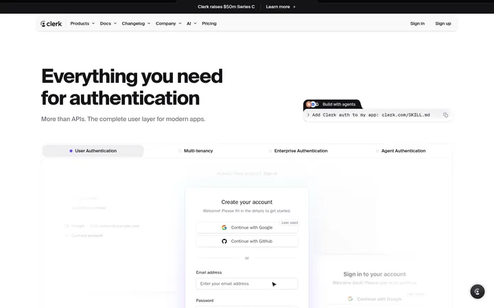
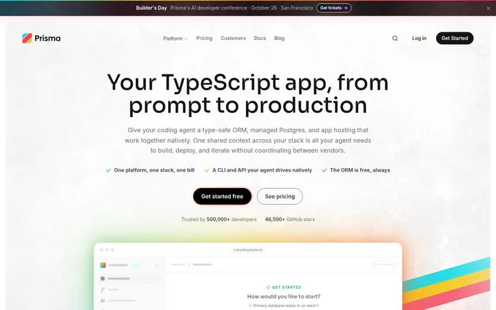
Perk以温暖的米白底色、醒目的深色大字和亮绿色行动按钮建立品牌辨识度。产品界面、职场摄影与克制的浅彩点缀,让长页面呈现清晰、有节奏的产品故事。
North star · Let oversized, tightly tracked typography and warm whitespace lead; use lime only to make the next action unmistakable.
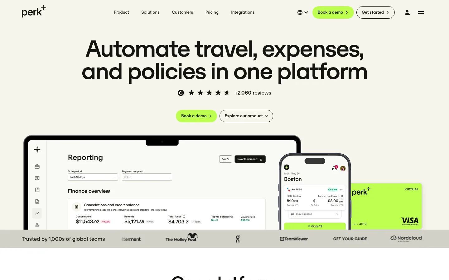
The page opens on a warm off-white canvas, with a centered, oversized headline, compact navigation, and vivid lime demo buttons. OTSono supplies a distinctive geometric sans voice: large headings use tight tracking and dense line spacing, while smaller navigation and copy remain clean and practical. The first product mock-up sits directly beneath the hero, followed by a slim customer-logo band that bridges into white content sections. Across the page, spacious centered statements alternate with softly tinted cards, split feature rows, product UI, and broad photographic panels. Lime is reserved for high-priority actions and selected interface details; cyan, lavender, pink, orange, and pale green appear chiefly as illustration or card accents. Rounded pill controls and generously rounded media soften the strong typography. Most sections stay flat and uncluttered, using subtle tonal separation instead of heavy borders or shadows.
配色 点色块复制色值。用途说明来自对页面的实测位置(背景、文字、描边、按钮)与截图判读。
品牌色
Gallery Cream
#f5f5eb
Warm canvas for the hero, navigation, and selected product or feature cards.
Soft Ink
#14140f
Primary headings, navigation, body copy, and dark button surfaces.
强调色
Perk Lime
#beff50
Primary demo and conversion buttons, footer background, and selected UI highlights.
Sky Tint
#a7e6fb
Occasional pastel card or illustration accent; not a core interface color.
Lilac Tint
#d8bcff
Occasional pastel card or illustration accent; not a core interface color.
Blush Pink
#fbcefb
Pastel decorative card or illustration color, not a general-purpose UI surface.
Soft Coral
#ffae8f
Pastel decorative card or illustration color, not a primary CTA.
Spring Green
#d1ff84
Secondary pale-green decorative card or illustration accent.
表层色
Paper White
#ffffff
Main background for the long-form content sections and clean card surfaces.
Slate Gray
#8c8c8c
Inverse section surface measured in a small area; not a defining page canvas color.
中性色
Muted Olive
#6e6e64
Muted supporting text and hairline borders across the interface.
Stone Gray
#93938d
Low-contrast gray details and tonal transitions, chiefly in footer and decorative treatments.
Cloud Stone
#c4c4bc
Pale gray transition and decorative tones, not a primary brand surface.
Misted Linen
#dcdcd3
Soft gray-beige gradient or decorative transition tone.
Warm Divider
#d2d2c8
Subtle button or gradient transition detail and occasional pale interface background.
功能色
Pure Black
#000000
Sparse measured text and product-card content; primary brand text uses Soft Ink.
文字 背景 对比度 WCAG #14140f Soft Ink#f5f5eb Gallery Cream16.84:1 AAA #14140f Soft Ink#ffffff Paper White18.47:1 AAA #14140f Soft Ink#8c8c8c Slate Gray5.49:1 AA #6e6e64 Muted Olive#f5f5eb Gallery Cream4.69:1 AA #6e6e64 Muted Olive#ffffff Paper White5.15:1 AA #6e6e64 Muted Olive#8c8c8c Slate Gray1.53:1 不达标
字体 字号阶梯:Golden Ratio(比例约 1.657,正文 16px)。示例用免费替代字体渲染,数值为实测。
Aa 设计
OTSono 网络字体 · 字重 400 / 500 · 占比 100%
免费替代:Outfit
All measured display, heading, body, navigation, button, caption, and eyebrow text.
角色 示例 字号 字重 行高 字距 特大标题 Oversized hero or campaign-style display messaging.
Perk
200px 500 1.2 -0.03em 一级标题 Main hero headline, set large and tightly tracked.
Perk
90px 500 0.89 -0.03em 二级标题 Centered statements introducing major homepage sections.
Perk
80px 500 0.9 -0.03em 三级标题 Feature, audience, and card-level headings.
Perk
60px 500 1 -0.03em 四级标题 Smaller supporting headings within content blocks.
Perk
36px 400 1.06 -0.03em 正文 Explanatory paragraphs and product descriptions.
The quick brown fox 敏捷的狐狸
16px 400 1.25 0 辅助文字 Compact review, proof, or supporting metadata.
The quick brown fox 敏捷的狐狸
14px 500 1.29 0 按钮 CTA labels and compact action controls.
The quick brown fox 敏捷的狐狸
14px 400 1.29 0 导航 Primary navigation and footer navigation links.
The quick brown fox 敏捷的狐狸
14px 400 1.29 0 眉题 Uppercase audience, category, and section labels.
The quick brown fox 敏捷的狐狸
14px 500 1.29 0.1em
间距与布局 基准单位 8px · 密度:宽松
40px 版块间距
32px 元素间距
24px 卡片内边距
1300px 内容最大宽度
2px
4px
8px
10px
12px
16px
20px
24px
32px
40px
100px
Use a spacious page capped at the measured 1300px maximum width. The hero is centered, with a large headline above its CTA row and full-width product media. Follow with white section bands, alternating centered proof statements, multi-column content, and two-column feature rows. Keep the section rhythm generous, with measured 40px section gaps and 32px element gaps as the underlying spacing cues. The page remains low-density overall, while the footer becomes a denser multi-column directory.
圆角与层次 Most content is flat, separated by white space and warm-neutral surfaces rather than strong outlines. Cards and media use generous measured rounding; buttons are pill-shaped. A subtle measured shadow appears on a section, but avoid applying elevation broadly. Use light borders or tonal separation only where controls or card edges need definition.
组件 下面的预览按实测的按钮、输入框、徽标、卡片样式重建(字体用替代字体)。
Primary demo button A Perk Lime pill with Soft Ink label, compact arrow cue, and measured 26px radius; use for the primary conversion action.
Secondary outline button A light or transparent pill with a Soft Ink outline and label, paired beside the primary CTA.
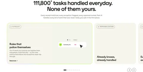
Hero product showcase Large product UI imagery beneath the centered headline and CTA row, with app and payment-card visuals layered into the composition.
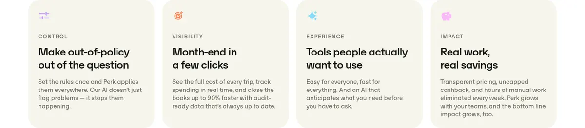
Feature card Warm cream content panel with a measured 28px radius and 24px padding; combine a concise label, heading, and short copy.
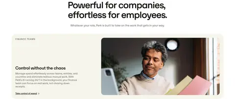
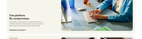
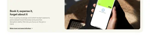
Audience feature row Two-column rounded panel with audience and explanatory copy on the left and a wide workplace or app image on the right.
Customer proof strip Narrow horizontal band of customer logos or review proof that separates the hero media from the following content.
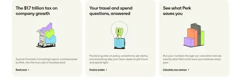
Resource card Three-column white-page card with a small colorful illustration, short heading, compact summary, and simple text link.
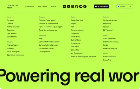
Footer directory Bright lime footer with a compact help and social row above dense, multi-column product, company, travel, and platform links.
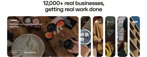
Imagery · Mix crisp product-interface mock-ups with workplace and travel photography, including wide media inside rounded feature panels. Show hardware and app screens prominently in the hero, then use real-world images to contextualize audience-specific stories. Smaller resource cards use bright, simplified illustrations. Treat images as the visual proof point rather than as decoration; keep surrounding copy concise and surfaces quiet.
页面版块 共 16 个版块,按页面从上到下排列,每个都标了类型、布局和交互套路。
该做与不该做 ✓ 该做 Lead with a centered, oversized headline. Use Perk Lime for the primary conversion action. Keep the warm cream canvas distinct from white content bands. Pair product UI with relevant workplace or travel photography. Use rounded media and cards to soften the editorial layout. Alternate proof statements with practical feature content. ✕ 不该做 Do not make every section lime or brightly colored. Do not crowd the hero with extra copy or controls. Do not use heavy shadows as the default card treatment. Do not treat illustration-only pastels as core UI colors. Do not replace the open section rhythm with dense grids throughout. Do not use several competing primary CTA styles. 给 AI 的提示词 想快速出一个同风格的新页面,把这段话连同 DESIGN.md 一起发给 AI。
复制 Build a new Perk-style SaaS page with a calm editorial rhythm. Use Gallery Cream (#f5f5eb) for the hero canvas and Paper White (#ffffff) for most content bands; set primary text in Soft Ink (#14140f). Reserve Perk Lime (#beff50) for the primary CTA and a few meaningful highlights. Use OTSono, or Outfit as a free substitute, with tight tracking and strong hierarchy for large headings and regular-weight utility copy. Center the opening statement and product showcase, then alternate proof blocks, rounded feature cards, split image-and-copy rows, and customer evidence. Keep generous whitespace, softly rounded imagery, restrained borders, and minimal shadow. Use pastel colors only for small illustration or card accents. Finish with a dense, clearly grouped lime footer directory.
DESIGN.md Tailwind v4 CSS 变量 Design Tokens
---
title: "Perk design system"
variant: extended
source: https://www.perk.com/
captured_at: 2026-10-12
theme: light
industry: saas
generator: Design DNA (https://four.wiralomi.com/style/travelperk-com)
ai_generated: true
ai_label: "本文件由 AI 辅助生成:数值取自公开网页的实测样式,命名、用途说明与建议为模型解读。商标归原所有者。 / AI-assisted content"
---
# Perk · Design System
> Calm neutrals, bold type, and a flash of lime
**Theme:** light · **Industry:** saas · **Source:** https://www.perk.com/ · **Captured:** 2026-10-12 (1440×900 desktop)
_AI-assisted content: values are measured from the public page at capture time; names, roles and guidance are model-written interpretations. Trademarks belong to their owners._
Perk pairs a warm off-white canvas and oversized black typography with bright lime calls to action. Product UI, workplace photography, and restrained pastel accents turn a long SaaS homepage into a clear, editorial product story.
## North star
Let oversized, tightly tracked typography and warm whitespace lead; use lime only to make the next action unmistakable.
## Overview
The page opens on a warm off-white canvas, with a centered, oversized headline, compact navigation, and vivid lime demo buttons. OTSono supplies a distinctive geometric sans voice: large headings use tight tracking and dense line spacing, while smaller navigation and copy remain clean and practical. The first product mock-up sits directly beneath the hero, followed by a slim customer-logo band that bridges into white content sections. Across the page, spacious centered statements alternate with softly tinted cards, split feature rows, product UI, and broad photographic panels. Lime is reserved for high-priority actions and selected interface details; cyan, lavender, pink, orange, and pale green appear chiefly as illustration or card accents. Rounded pill controls and generously rounded media soften the strong typography. Most sections stay flat and uncluttered, using subtle tonal separation instead of heavy borders or shadows.
## Colors
| Name | Hex | Token | Group | Role |
|---|---|---|---|---|
| Muted Olive | ` | `--color-muted-olive` | neutral | Muted supporting text and hairline borders across the interface. |
| Paper White | ` | `--color-paper-white` | surface | Main background for the long-form content sections and clean card surfaces. |
| Gallery Cream | ` | `--color-gallery-cream` | brand | Warm canvas for the hero, navigation, and selected product or feature cards. |
| Perk Lime | ` | `--color-perk-lime` | accent | Primary demo and conversion buttons, footer background, and selected UI highlights. |
| Soft Ink | ` | `--color-soft-ink` | brand | Primary headings, navigation, body copy, and dark button surfaces. |
| Stone Gray | ` | `--color-stone-gray` | neutral | Low-contrast gray details and tonal transitions, chiefly in footer and decorative treatments. |
| Slate Gray | ` | `--color-slate-gray` | surface | Inverse section surface measured in a small area; not a defining page canvas color. |
| Cloud Stone | ` | `--color-cloud-stone` | neutral | Pale gray transition and decorative tones, not a primary brand surface. |
| Misted Linen | ` | `--color-misted-linen` | neutral | Soft gray-beige gradient or decorative transition tone. |
| Sky Tint | ` | `--color-sky-tint` | accent | Occasional pastel card or illustration accent; not a core interface color. |
| Lilac Tint | ` | `--color-lilac-tint` | accent | Occasional pastel card or illustration accent; not a core interface color. |
| Pure Black | ` | `--color-pure-black` | semantic | Sparse measured text and product-card content; primary brand text uses Soft Ink. |
| Warm Divider | ` | `--color-warm-divider` | neutral | Subtle button or gradient transition detail and occasional pale interface background. |
| Blush Pink | ` | `--color-blush-pink` | accent | Pastel decorative card or illustration color, not a general-purpose UI surface. |
| Soft Coral | ` | `--color-soft-coral` | accent | Pastel decorative card or illustration color, not a primary CTA. |
| Spring Green | ` | `--color-spring-green` | accent | Secondary pale-green decorative card or illustration accent. |
### Semantic aliases
`--color-canvas` → ` (Gallery Cream) · `--color-surface` → ` (Paper White) · `--color-surface-2` → ` (Slate Gray) · `--color-text` → ` (Soft Ink) · `--color-text-muted` → ` (Muted Olive) · `--color-border` → ` (Muted Olive) · `--color-accent` → ` (Perk Lime) · `--color-accent-2` → ` (Sky Tint) · `--color-accent-3` → ` (Lilac Tint) · `--color-on-accent` → ` (Soft Ink)
### Contrast (WCAG 2.x)
| Text | Background | Ratio | Level |
|---|---|---|---|
| ` | ` | 16.84:1 | AAA |
| ` | ` | 18.47:1 | AAA |
| ` | ` | 5.49:1 | AA |
| ` | ` | 4.69:1 | AA |
| ` | ` | 5.15:1 | AA |
| ` | ` | 1.53:1 | fail |
| ` | ` | 1.09:1 | fail |
| ` | ` | 1.19:1 | fail |
| ` | ` | 2.82:1 | fail |
### Gradients
- `linear-gradient(rgb(245, 245, 235), rgb(245, 245, 235)), conic-gradient(from 220deg at 35% 80%, rgba(130, 220, 250, 0.7) -6deg, rgba(200, 160, 255, 0.7) 25deg, rgba(250, 185, 250, 0.7) 41deg, rgba(255, 140, 95, 0.7) 51de`
- `linear-gradient(to right, rgba(0, 0, 0, 0.4), rgba(0, 0, 0, 0.2), rgba(0, 0, 0, 0.1))`
- `linear-gradient(to right, rgb(210, 210, 200) 0%, rgb(210, 210, 200) calc(100% - 30px), rgba(0, 0, 0, 0) 100%)`
## Typography
| Family | Token | Source | Weights | Role | Free substitute |
|---|---|---|---|---|---|
| OTSono | `--font-body` | webfont | 400, 500 | All measured display, heading, body, navigation, button, caption, and eyebrow text. | Outfit |
- **OTSono:** Use medium weight for large headings with tight negative tracking; keep utility text regular and eyebrow labels uppercase.
### Type scale — Golden Ratio (ratio ≈ 1.657, base 16px)
| Role | Size | Weight | Line height | Letter spacing | Case | Family | Used for |
|---|---|---|---|---|---|---|---|
| display | 200px | 500 | 1.2 | -0.03em | — | OTSono | Oversized hero or campaign-style display messaging. |
| h1 | 90px | 500 | 0.89 | -0.03em | — | OTSono | Main hero headline, set large and tightly tracked. |
| h2 | 80px | 500 | 0.9 | -0.03em | — | OTSono | Centered statements introducing major homepage sections. |
| h3 | 60px | 500 | 1 | -0.03em | — | OTSono | Feature, audience, and card-level headings. |
| h4 | 36px | 400 | 1.06 | -0.03em | — | OTSono | Smaller supporting headings within content blocks. |
| body | 16px | 400 | 1.25 | 0 | — | OTSono | Explanatory paragraphs and product descriptions. |
| caption | 14px | 500 | 1.29 | 0 | — | OTSono | Compact review, proof, or supporting metadata. |
| button | 14px | 400 | 1.29 | 0 | — | OTSono | CTA labels and compact action controls. |
| nav | 14px | 400 | 1.29 | 0 | — | OTSono | Primary navigation and footer navigation links. |
| eyebrow | 14px | 500 | 1.29 | 0.1em | uppercase | OTSono | Uppercase audience, category, and section labels. |
## Spacing & layout
- Base unit **8px**, density **spacious**.
- Scale (most used values): 2, 4, 8, 10, 12, 16, 20, 24, 32, 40, 100 px.
- Section rhythm 40px · element gap 32px · card padding 24px · max content width 1300px.
Use a spacious page capped at the measured 1300px maximum width. The hero is centered, with a large headline above its CTA row and full-width product media. Follow with white section bands, alternating centered proof statements, multi-column content, and two-column feature rows. Keep the section rhythm generous, with measured 40px section gaps and 32px element gaps as the underlying spacing cues. The page remains low-density overall, while the footer becomes a denser multi-column directory.
## Shape & elevation
- Radius: button `9999px` · card `28px` · media `28px` · nav `28px` · link `9999px` · xs `6px` · sm `8px` · md `18px` · lg `28px` · pill `9999px`
- Shadow `md` (section): `rgba(0, 0, 0, 0.08) 0px 3px 12px 0px`
- Shadow `md-2` (other): `rgba(0, 0, 0, 0) 0px 0px 0px 0px, rgba(0, 0, 0, 0) 0px 0px 0px 0px, rgba(0, 0, 0, 0.08) 0px 3px 12px 0px`
- Motion: standard transition `0.2s cubic-bezier(0.4, 0, 0.2, 1)` on interactive elements.
Most content is flat, separated by white space and warm-neutral surfaces rather than strong outlines. Cards and media use generous measured rounding; buttons are pill-shaped. A subtle measured shadow appears on a section, but avoid applying elevation broadly. Use light borders or tonal separation only where controls or card edges need definition.
## Imagery
Mix crisp product-interface mock-ups with workplace and travel photography, including wide media inside rounded feature panels. Show hardware and app screens prominently in the hero, then use real-world images to contextualize audience-specific stories. Smaller resource cards use bright, simplified illustrations. Treat images as the visual proof point rather than as decoration; keep surrounding copy concise and surfaces quiet.
## Components
### Primary demo button
A Perk Lime pill with Soft Ink label, compact arrow cue, and measured 26px radius; use for the primary conversion action.
### Secondary outline button
A light or transparent pill with a Soft Ink outline and label, paired beside the primary CTA.
### Hero product showcase
Large product UI imagery beneath the centered headline and CTA row, with app and payment-card visuals layered into the composition.
### Feature card
Warm cream content panel with a measured 28px radius and 24px padding; combine a concise label, heading, and short copy.
### Audience feature row
Two-column rounded panel with audience and explanatory copy on the left and a wide workplace or app image on the right.
### Customer proof strip
Narrow horizontal band of customer logos or review proof that separates the hero media from the following content.
### Resource card
Three-column white-page card with a small colorful illustration, short heading, compact summary, and simple text link.
### Footer directory
Bright lime footer with a compact help and social row above dense, multi-column product, company, travel, and platform links.
### Measured component styles
- **Primary button** (“Book a demo”): background ## Do
- Lead with a centered, oversized headline.
- Use Perk Lime for the primary conversion action.
- Keep the warm cream canvas distinct from white content bands.
- Pair product UI with relevant workplace or travel photography.
- Use rounded media and cards to soften the editorial layout.
- Alternate proof statements with practical feature content.
## Don't
- Do not make every section lime or brightly colored.
- Do not crowd the hero with extra copy or controls.
- Do not use heavy shadows as the default card treatment.
- Do not treat illustration-only pastels as core UI colors.
- Do not replace the open section rhythm with dense grids throughout.
- Do not use several competing primary CTA styles.
## Agent prompt
Build a new Perk-style SaaS page with a calm editorial rhythm. Use Gallery Cream (## Page sections (top to bottom)
| # | Type | Layout | UX patterns | UI patterns |
|---|---|---|---|---|
| 1 | hero | Warm cream canvas; centered headline and CTA above broad product imagery. | Primary demo CTA, Secondary product exploration, Review proof | Large centered heading, Lime pill button, Layered product mock-up |
| 2 | stats | Centered headline, supporting copy, and action above a three-column product proof area. | Quantified benefit, Explore platform link | Large centered statistic, Product interface visual, Customer outcome strip |
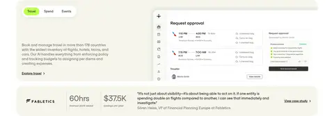
| 3 | product-showcase | Three-column product section with tabbed travel, spend, and events content. | Category tabs, Explore travel link, Case-study link | Tabbed selector, Product media, Outcome metrics |
| 4 | stats | Centered claim and supporting copy followed by a three-column proof statement. | Cost-savings proof, Switch CTA | Oversized metric, Centered action, Supporting evidence |
| 5 | feature-grid | Four-column set of compact feature cards on a white band. | Scanable capability comparison | Rounded cream cards, Small icons, Short feature copy |
| 6 | product-showcase | Centered introduction above a multi-item product carousel. | Carousel browsing, Read-more links, Slide controls | Product cards, Pill category labels, Pagination dots |
| 7 | feature-split | Centered section heading followed by two-column audience feature rows. | Audience-specific exploration, Contextual links | Rounded text-and-image panels, Eyebrow labels, Wide photography |
| 8 | feature-split | Two-column audience panel with copy and a wide supporting image. | Role-specific benefit, Program optimization link | Eyebrow label, Rounded split panel, Photographic media |
| 9 | feature-split | Two-column text and image panel with aligned audience details. | Operational benefit, Streamlining link | Compact eyebrow, Rounded media, Editorial copy block |
| 10 | feature-split | Two-column traveler panel with copy beside app-focused photography. | Traveler benefit, Expense workflow link | Role label, App imagery, Rounded panel |
| 11 | testimonials | Centered customer proof heading above a featured story and a gallery of customer cards. | Browse stories, Read case study, Select featured customer | Large photographic feature, Narrow image cards, Rounded media |
| 12 | logo-cloud | Single horizontal proof strip within a white section. | Trust reinforcement | Compact user label, Award and review badges |
| 13 | feature-grid | Three-column resource cards following a section introduction. | Read report, Explore guides, Calculate savings | Illustrated cards, Compact summaries, Text links |
| 14 | cta | Full-width dark photographic panel with centered statement and action. | Partner proof, Switch to Perk action | Darkened image overlay, Centered white heading, Lime pill CTA |
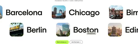
| 15 | gallery | Four-column location gallery with large city names and small place images. | Company credibility, Learn about us, Join the team | City-name typography, Rounded location thumbnails, Compact eyebrow |
| 16 | footer | Lime footer with top utility row and dense four-column link directory. | Contact and help access, Language selector, App download | Social icons, Grouped link columns, Bright brand surface |
## Source CSS custom properties (selected)
```css
--brand-offwhite: