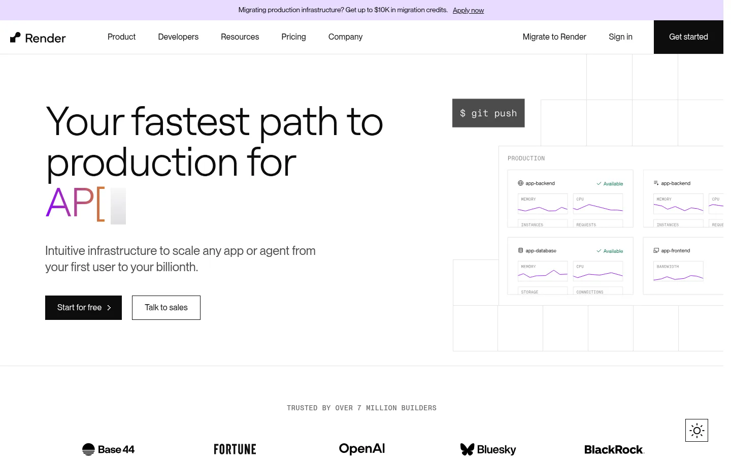
North star · Keep the interface airy and precise: let black typography and hairline grids lead, and reserve violet for purposeful emphasis.
The page is built on a white canvas, with near-black text and fine pale-gray rules defining sections, cards, and the product mock-up grid. Violet is the signature accent: it appears in links, small feature graphics, highlighted words, and occasional soft lavender washes rather than as a dominant page background. The typography pairs light, oversized Roobert headlines with PPNeueMontreal body copy, keeping the hero editorial and readable while labels and navigation stay compact. A mono face adds a technical note to code-like labels. The layout alternates broad, quiet sections with denser feature grids and product screenshots; centered customer marks provide a pause between content blocks. Imagery is mostly product UI, logos, and simple developer-oriented graphics, treated with thin borders and minimal depth. A dark footer creates the page’s strongest contrast, while square-cornered controls keep the overall system crisp and utilitarian.
Primary body, navigation, links, buttons, and captions.
Aa 设计
Roobert
网络字体 · 字重 300 / 400 · 占比 21%
免费替代:Manrope
Display headlines and major section headings.
Aa 设计
PPNeueMontrealMono
网络字体 · 字重 500 / 400 · 占比 2%
免费替代:IBM Plex Mono
Small technical labels and code-like interface details.
角色
示例
字号
字重
行高
字距
特大标题
Oversized hero or campaign headline.
Render
80px
300
1
-0.03em
一级标题
Primary hero headline.
Render
64px
300
1.06
-0.02em
二级标题
Major section headings.
Render
56px
300
1.07
-0.02em
三级标题
Feature group and testimonial headings.
Render
48px
300
1.08
-0.02em
四级标题
Individual feature titles.
Render
40px
300
1.1
-0.015em
正文
Descriptions, explanatory copy, and standard page text.
The quick brown fox 敏捷的狐狸
16px
400
1.5
0.01em
辅助文字
Compact metadata, credits, and secondary labels.
The quick brown fox 敏捷的狐狸
14px
400
1.43
0.01em
导航
Primary navigation and menu links.
The quick brown fox 敏捷的狐狸
16px
400
1.25
0.01em
链接
Inline actions and calls to explore more.
The quick brown fox 敏捷的狐狸
16px
400
1.5
0.01em
代码
Technical labels, code snippets, and deployment details.
const style = 1;
14px
500
1.43
0.02em
间距与布局
基准单位 4px · 密度:适中
90px版块间距
8px元素间距
90px卡片内边距
—内容最大宽度
2px
5px
6px
8px
10px
12px
15px
16px
20px
23px
24px
30px
32px
36px
40px
50px
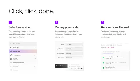
The page uses a broad desktop composition with content aligned to a consistent left edge and sections divided by thin rules. The measured page maximum width is unspecified, so preserve the screenshot’s generous horizontal margins rather than imposing a new fixed value. Hero content and product UI share the first viewport; later blocks shift among three-column instructions, modular feature grids, and centered testimonial content. Vertical rhythm is spacious overall, with denser content kept inside clearly separated modules.
圆角与层次
没有测到阴影:页面是扁平的,层次靠底色和描边区分。
The visual system is predominantly flat: measured shadows are absent, and card corners are square. Use thin #e3e3e3 borders and background grid lines to separate surfaces. Layer product mock-ups over the page sparingly, with contrast and overlapping panels doing the work instead of drop shadows.
组件
下面的预览按实测的按钮、输入框、徽标、卡片样式重建(字体用替代字体)。
Announcement strip
A narrow pale lavender band above the white navigation, with centered migration messaging and an understated text link.
Primary navigation
White horizontal bar with Render mark, compact dark links, secondary account actions, and a solid black square-cornered Get started button.
Hero actions
Pair a black #0d0d0d Start for free button with white text and an outlined Talk to sales button; both use square corners.
Hero product diagram
Place deployment and service-monitoring UI on the right, framed by #e3e3e3 grid lines with restrained violet chart marks.
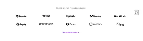
Customer logo cloud
Center a small uppercase monospace-style trust label above several rows of monochrome customer logos and a violet story link.
Feature cards
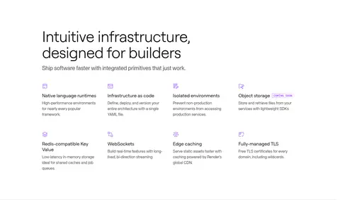
Arrange product capabilities in bordered modular panels with concise dark headings, short copy, links, and small UI previews.
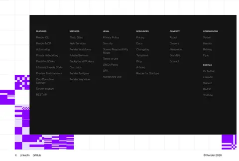
Inverse footer
Use a #141414 footer block with compact multi-column navigation and subdued #6b6b6b link text.
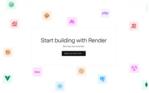
Imagery · Use product UI screenshots and diagrams as the primary imagery, including deployment panels, service selectors, and monitoring interfaces. Customer marks appear in clean logo rows. Supplement these with simple technical illustrations, framework icons, and occasional violet-tinted artwork. Keep imagery crisp, mostly flat, and bounded by subtle grid lines rather than using lifestyle photography or heavy 3D effects.
Use white as the dominant page and section canvas.
Set major headlines in a light, oversized sans serif.
Reserve Signal Violet for selective emphasis and links.
Use #e3e3e3 hairlines to organize content and diagrams.
Show real-looking product interfaces in crisp, flat panels.
Keep buttons and cards square-cornered and free of shadows.
✕ 不该做
Do not flood large sections with saturated violet.
Do not add decorative drop shadows or rounded-card styling.
Do not make body copy compete with the hero headline.
Do not replace product interface visuals with lifestyle photography.
Do not use heavy borders where a fine divider is sufficient.
Do not crowd the whitespace between major content groups.
给 AI 的提示词
想快速出一个同风格的新页面,把这段话连同 DESIGN.md 一起发给 AI。
Build a new Render-style developer cloud page with an airy white canvas (#ffffff), dark Render Ink (#0d0d0d) typography, and selective Signal Violet (#8a05ff) emphasis. Use light, oversized sans-serif headlines and readable, compact body copy. Organize sections with fine Gridline Gray (#e3e3e3) borders and occasional technical grid motifs; avoid shadows and rounded corners. Give the page a clear left-aligned content structure, generous separation between major blocks, and responsive modular grids for features. Use product UI panels, deployment diagrams, framework marks, and customer logos instead of lifestyle imagery. Add a restrained lavender wash (#f4f0ff or #e7dbff) only where illustration or gradient treatment helps. Keep primary actions black with white text, secondary actions outlined, and finish with a deep Footer Charcoal (#141414) navigation area.