North star · Let white space and clear product storytelling lead; reserve saturated purple for decisive actions and purposeful contrast.
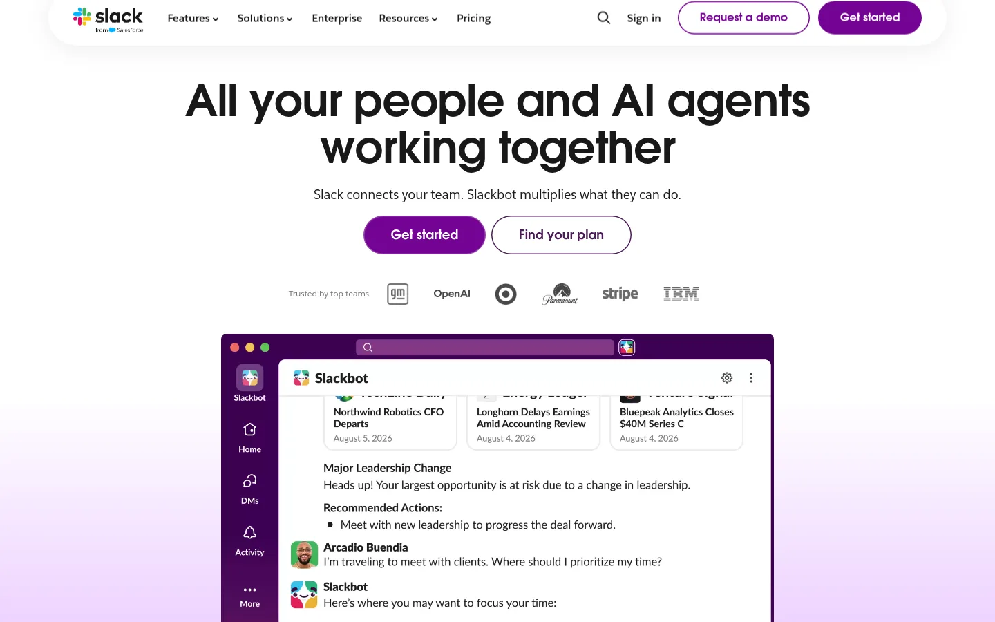
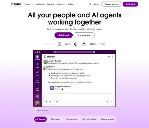
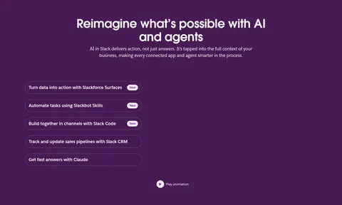
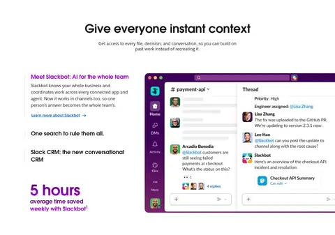
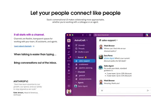
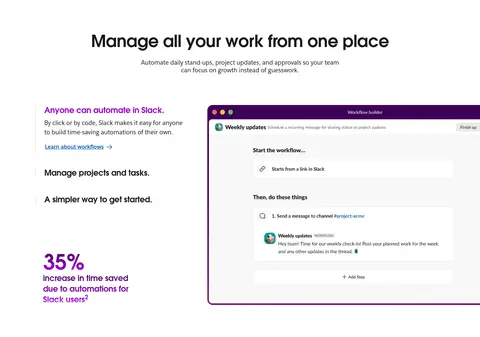
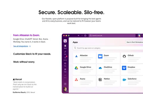
The page uses white as its dominant canvas, keeping the navigation, hero, feature explanations, resource cards, and footer bright and legible. Deep Aubergine (#481a54) creates deliberate contrast in the AI story, business metrics, and closing CTA; Signal Purple (#730394) marks primary actions and small feature labels. Headlines use Salesforce-Avant-Garde with compact, bold forms, while Salesforce-Sans carries navigation, body copy, and utility text. The hero centers its headline, actions, trust marks, and Slack product interface, then the page shifts into alternating split layouts, card rows, and centered proof points. Generous whitespace separates these long-form sections. Product screenshots are framed as interface demonstrations rather than decoration, with purple application chrome echoing the brand. Soft lavender gradient tones appear behind the hero media, while hairline borders and restrained shadows keep cards and controls from feeling heavy.
配色
点色块复制色值。用途说明来自对页面的实测位置(背景、文字、描边、按钮)与截图判读。
品牌色
强调色
表层色
中性色
功能色
页面底色 · Gallery White表层 · Aubergine表层 2 · Violet Mist表层 3 · Media Gray主文字 · Headline Black次要文字 · Soft Ink弱文字 · Muted Graphite描边 · Quiet Rule强调 · Signal Purple强调 2 · Aubergine强调 3 · Link Blue
Body copy, navigation, buttons, links, labels, and utility text
Aa 设计
Salesforce-Avant-Garde
网络字体 · 字重 700 / 600 / 400 · 占比 26%
免费替代:League Spartan
Display headlines, section headings, and prominent CTA labels
角色
示例
字号
字重
行高
字距
特大标题
Oversized hero and highest-emphasis campaign headline.
Slack
64px
700
1.06
-0.012em
一级标题
Primary hero title and major page headings.
Slack
50px
600
1.12
-0.012em
二级标题
Section titles introducing feature, proof, and CTA blocks.
Slack
32px
700
1.25
-0.012em
三级标题
Card titles and nested feature headings.
The quick brown fox 敏捷的狐狸
24px
700
1.25
-0.004em
四级标题
Smaller supporting subsection headings.
The quick brown fox 敏捷的狐狸
18px
400
normal
0
正文
Feature descriptions, explanatory copy, and card summaries.
The quick brown fox 敏捷的狐狸
14px
400
1.56
-0.002em
辅助文字
Badges, resource labels, and compact metadata.
The quick brown fox 敏捷的狐狸
12px
700
1.33
0
按钮
Primary and secondary CTA labels.
The quick brown fox 敏捷的狐狸
16px
700
1.5
0
导航
Header navigation and utility links.
The quick brown fox 敏捷的狐狸
16px
700
1.5
0
链接
Inline actions such as learn-more and resource links.
The quick brown fox 敏捷的狐狸
16px
700
1.5
0
眉题
Uppercase category or introductory labels.
The quick brown fox 敏捷的狐狸
14px
700
1.56
0.057em
间距与布局
基准单位 4px · 密度:宽松
96px版块间距
8px元素间距
—卡片内边距
1230px内容最大宽度
4px
6px
7px
8px
10px
12px
13px
14px
16px
20px
24px
32px
40px
48px
96px
A spacious long-form page constrained to a measured 1230px maximum width, with a centered navigation and hero followed by broad section bands. The hero centers its headline and actions above a large product interface; later feature stories use two-column text-and-media layouts, while updates and resources use card grids. Centered titles and stats punctuate the split layouts. Sections have generous measured vertical rhythm, with broad white stretches interrupted by full-width Aubergine panels. The footer switches to dense multi-column link groups.
圆角与层次
按钮 · 4px
卡片 · 16px
图片 · 16px
徽标 · 9999px
导航 · 9999px
链接 · 16px
inset · other
inset · button
md · link
inset · nav, link
The design is mostly flat, using whitespace and full-width color bands for hierarchy. Fine borders separate selected links or card elements; measured cards have rounded corners, while primary buttons use pill-like shapes. Shadows are restrained and appear around media or selected controls, not as a general card treatment.
组件
下面的预览按实测的按钮、输入框、徽标、卡片样式重建(字体用替代字体)。
Header navigation
White top bar with brand mark, compact navigation and utility links, an outlined demo action, and a filled purple Get started CTA.
Hero CTA pair
Centered hero buttons contrast a purple filled primary action with a white secondary action outlined in aubergine.
Product UI showcase
Large Slack interface screenshots with rounded framing and saturated purple app chrome; used to demonstrate real workflows.
New badge
Small bold purple label on a pale Violet Mist (#f9f0ff) pill, used to flag new features.
Feature story split
Section title and summary above a two-column story, with explanatory text and links beside a product screenshot.
Resource card
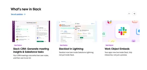
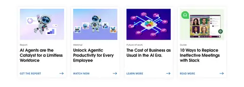
Thumbnail-led content card with a compact category, bold title, and concise action link.
Metric band
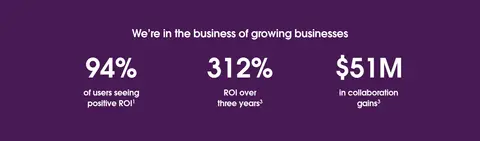
Centered white heading and large proof metrics on an Aubergine (#481a54) full-width panel.
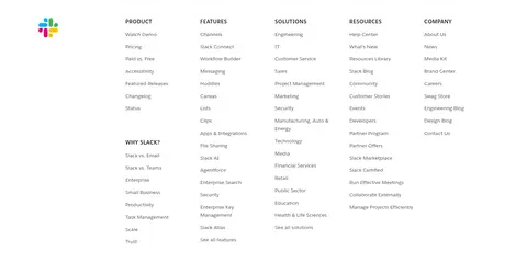
Multi-column footer
White footer with regional and social controls, grouped link columns, and a compact legal row.
Imagery · The dominant visual is product UI: Slack windows, conversations, workflow tools, and integrations, usually shown within purple application chrome. The hero layers interface media beneath centered copy and trust logos; feature sections pair large screenshots with explanatory text. Customer-story cards introduce photographic and video imagery, while resource tiles use illustrated or editorial thumbnails. Keep media crisp and legible, with rounded framing rather than heavy filters.
Reserve Signal Purple for primary actions and clear highlights.
Center the hero and major proof-point headings.
Pair product screenshots with concise explanatory copy.
Use bold display typography for major headings.
Keep borders and shadows subtle.
✕ 不该做
Do not make every section purple.
Do not add decorative gradients across unrelated content.
Do not replace real product UI with generic abstract art.
Do not compress the long page into a dense dashboard.
Do not use saturated blue as the primary brand accent.
Do not apply heavy shadows to every card.
Do not make all headings uppercase.
给 AI 的提示词
想快速出一个同风格的新页面,把这段话连同 DESIGN.md 一起发给 AI。
Build a new Slack-style page using a bright, spacious canvas and clear product storytelling. Use Gallery White (#ffffff) for most sections, Aubergine (#481a54) for a few full-width contrast bands, and Signal Purple (#730394) for primary actions and small emphasis. Set display headings in a bold geometric sans like League Spartan and body text in Inter; keep headlines crisp and supporting copy readable. Start with centered messaging and a strong product-interface showcase, then alternate split feature stories with card grids and centered proof points. Use authentic-looking collaboration UI as the main imagery, framed with rounded corners and purple app chrome. Keep section spacing generous, borders fine, and shadows restrained. Finish with a distinct CTA band and organized multi-column footer.