North star · Keep the interface quiet and neutral so the client work—not the portfolio chrome—carries the color and visual drama.
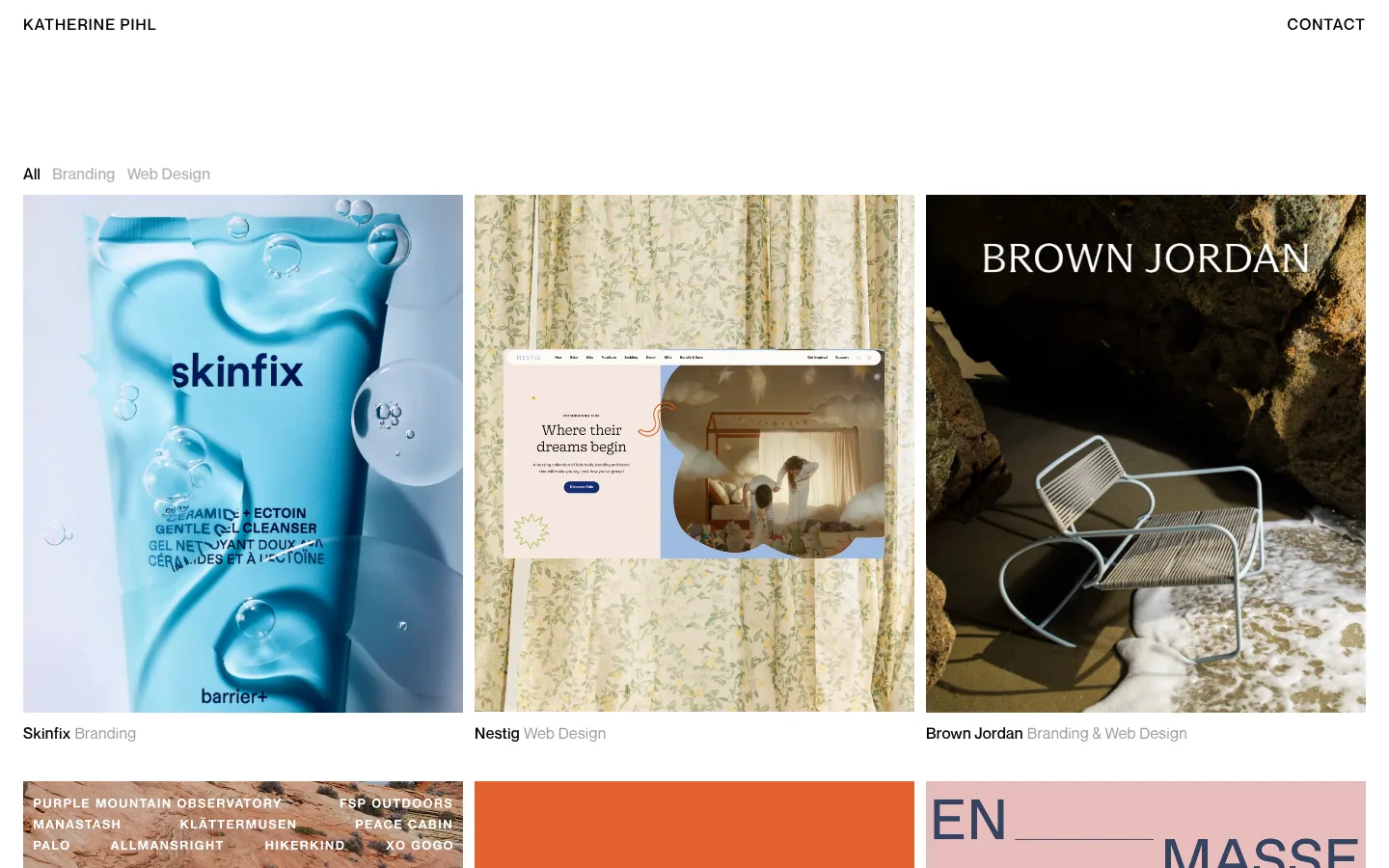
The page uses white as an uninterrupted canvas, with black for navigation, headings, and primary text; muted grays soften secondary labels and project descriptors. The brand palette stays deliberately neutral, while colorful client imagery supplies most of the visual variety—those image colors belong to individual projects, not the site chrome. Neue Montreal provides a clean, practical sans-serif for uppercase navigation, filters, and compact metadata. Ryhmes adds an elegant, light serif voice to larger project links and the closing studio introduction. A three-column portfolio grid dominates the page, with consistent image-led cards and restrained captions. Generous open space above the work creates a calm entrance, while compact gaps within the grid keep the portfolio cohesive. Thin black rules separate the closing information area; the overall treatment is flat, with no measured shadows, gradients, or decorative card surfaces.
配色
点色块复制色值。用途说明来自对页面的实测位置(背景、文字、描边、按钮)与截图判读。
表层色
中性色
页面底色 · Gallery White主文字 · Studio Ink次要文字 · Soft Graphite描边 · Studio Ink
文字
背景
对比度
WCAG
#000000 Studio Ink
#ffffff Gallery White
21:1
AAA
#999999 Soft Graphite
#ffffff Gallery White
2.85:1
不达标
字体
字号阶梯:Custom(比例约 2,正文 16px)。示例用免费替代字体渲染,数值为实测。
Aa 设计
Neue Montreal
网络字体 · 字重 500 / 300 / 400 · 占比 70%
免费替代:Inter
Navigation, filters, project metadata, and body copy.
Aa 设计
Ryhmes
网络字体 · 字重 300 · 占比 30%
免费替代:Cormorant Garamond
Large project links and the closing studio introduction.
角色
示例
字号
字重
行高
字距
一级标题
Large light serif project titles and prominent editorial headings.
Katherine Pihl
32px
300
1.1
-0.03em
正文
Studio description, contact copy, and supporting page text.
The quick brown fox 敏捷的狐狸
16px
300
1.5
0.02em
导航
Uppercase name at left and contact link at right.
The quick brown fox 敏捷的狐狸
16px
500
1.2
0.07em
链接
Large serif studio links and prominent project links.
Katherine Pihl
32px
300
1.1
-0.03em
眉题
Uppercase labels such as filter and section identifiers.
The quick brown fox 敏捷的狐狸
16px
500
1.2
0.07em
间距与布局
基准单位 4px · 密度:紧凑
40px版块间距
4px元素间距
—卡片内边距
—内容最大宽度
4px
8px
12px
16px
24px
40px
120px
A compact header anchors the page, followed by a broad three-column project grid with left-aligned captions. The first viewport leaves substantial white space between navigation and the filter row; thereafter, image cards form a dense, consistent rhythm. The final information section breaks from the grid into three columns, with a serif introduction alongside services and collaborator lists. Keep edges and alignments crisp; no measured maximum page width is available.
圆角与层次
没有测到阴影:页面是扁平的,层次靠底色和描边区分。
The measured design is flat: no shadows, gradients, or rounded card treatments are present. Images sit directly on the white canvas, with captions beneath rather than in raised containers. A thin black horizontal rule separates the closing information area from the portfolio above.
组件
下面的预览按实测的按钮、输入框、徽标、卡片样式重建(字体用替代字体)。
Top navigation
White-background header with uppercase, medium-weight Katherine Pihl at left and a contact link at right; typography uses Neue Montreal.
Category filters
Compact All, Branding, and Web Design labels above the grid; the active filter is black and inactive labels are muted gray.
Project card
Image-led portfolio item with a rectangular visual and a short caption underneath; project title is darker than its muted category label.
Project grid
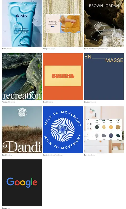
Three-column, left-aligned arrangement of client work, maintaining consistent gutters and a compact vertical rhythm.
Studio introduction
Large light serif paragraph describing the designer and inviting contact, placed at the left of the closing information block.
Services and collaborators
Small sans-serif lists in adjacent columns, with concise headings and tightly set entries.
Footer links
Minimal bottom row with Instagram at left and the email address at right, set directly on white.
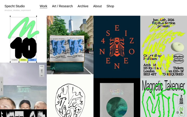
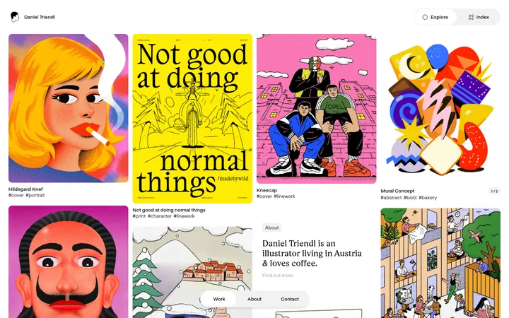
Imagery · Project imagery is the main source of color: skincare packaging, interiors, outdoor scenes, brand graphics, and website mockups appear as varied client work. Use large rectangular image frames with minimal visible treatment and preserve each asset’s original palette. The imagery mixes photography, graphic identity applications, and screen captures; it is not unified by a site-wide filter.
Keep the interface canvas white and visually quiet.
Use black for primary text and gray for secondary labels.
Let project imagery supply most of the page’s color.
Use a clear sans-serif for navigation and compact metadata.
Reserve the light serif for expressive editorial moments.
Align project images and captions in a disciplined grid.
✕ 不该做
Do not add brand-colored CTA fills or decorative gradients.
Do not place project captions inside raised cards.
Do not apply one color filter across varied client imagery.
Do not introduce rounded corners or shadows without evidence.
Do not make navigation larger or louder than the work.
Do not crowd the opening area with extra promotional copy.
给 AI 的提示词
想快速出一个同风格的新页面,把这段话连同 DESIGN.md 一起发给 AI。
Build a new portfolio page in Katherine Pihl’s restrained visual style. Use Gallery White (#ffffff) as the canvas and Studio Ink (#000000) for primary text, navigation, and fine dividers; use Soft Graphite (#999999) and, sparingly, Pale Graphite (#b2b2b2) for secondary labels. Pair a clean, widely tracked sans-serif similar to Inter for navigation, filters, metadata, and body copy with a light editorial serif similar to Cormorant Garamond for prominent project links and studio introduction. Create a compact header, understated category filters, and a disciplined three-column image-led project grid with captions below each image. Keep client assets in their native colors. End with a thin-rule-separated studio introduction and concise service, collaborator, and contact details. Avoid shadows, gradients, rounded cards, and decorative color fills.