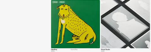
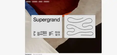
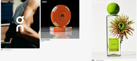
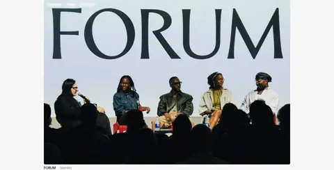
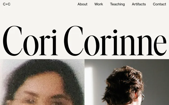
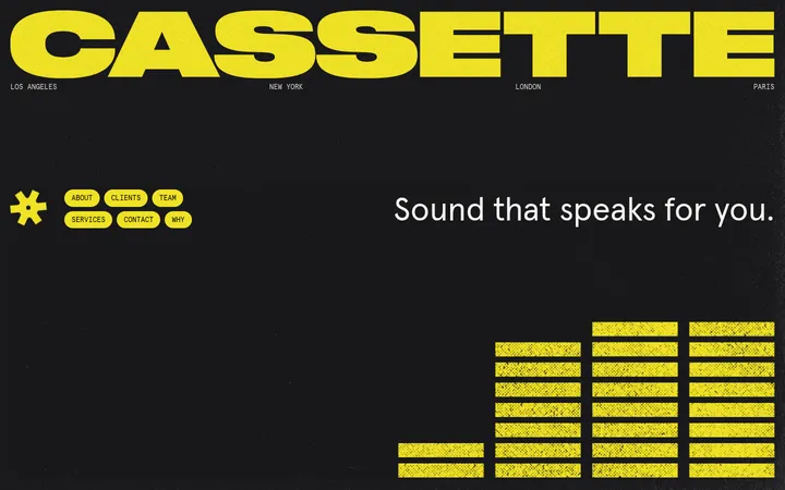
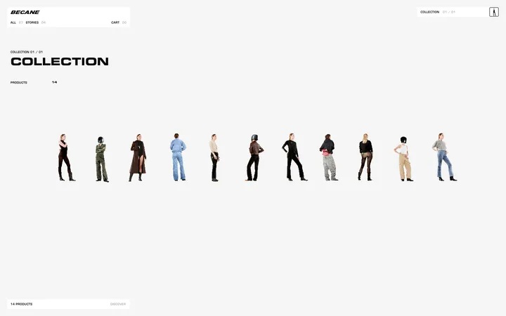
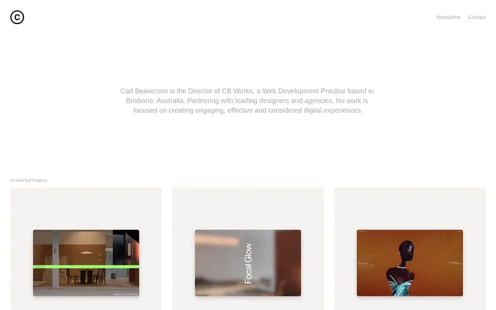
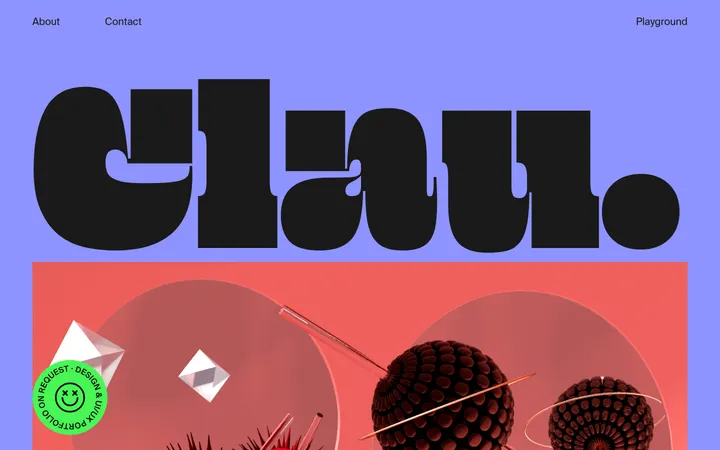
North star · Keep the interface quiet and spacious so the distinctive creative work supplies nearly all of the colour and visual energy.
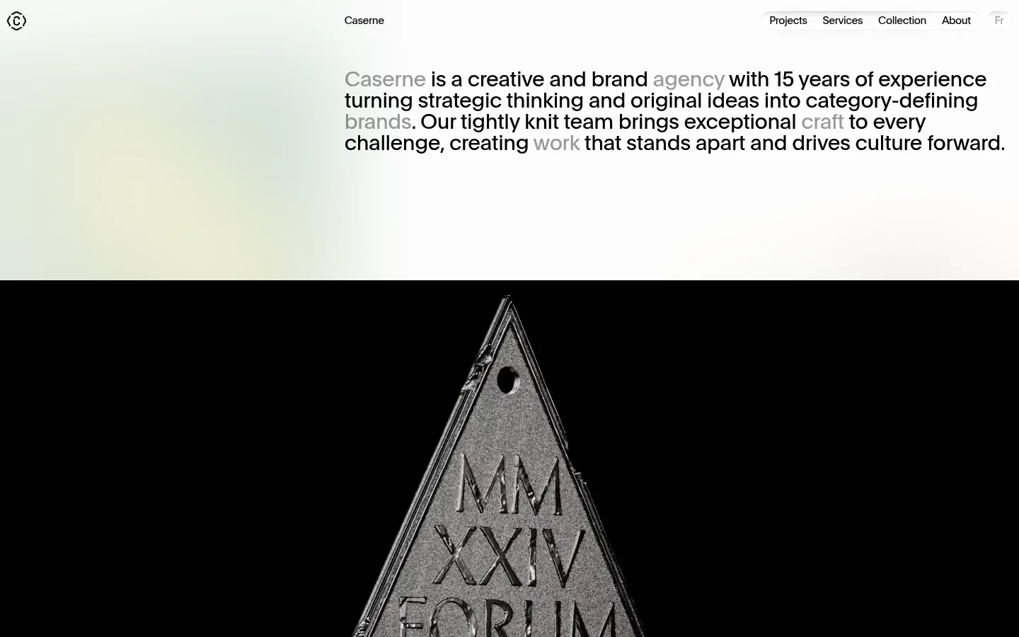
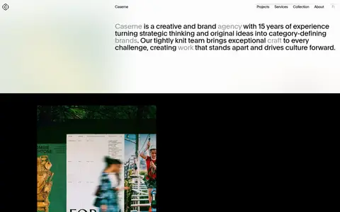
The page uses a pale off-white canvas (#f6f6f6) as a consistent ground, with near-black type (#000000) establishing a sharp editorial hierarchy. Muted gray (#949494) softens secondary copy and metadata, while fine gray rules separate the client list and footer without enclosing the portfolio in cards. Plain is the sole measured typeface: regular weight, compact tracking, and restrained line heights create a clean, contemporary voice. The opening statement is large and horizontally placed beside generous empty space; the portfolio then unfolds as a sequence of image-led projects with changing image widths and positions. Photography, campaign artwork, product imagery, and video carry their own strong colours, so the interface stays neutral rather than competing. A spacious section rhythm gives each project room to register. Navigation sits in a compact rounded grouping, while project captions and labels remain small and quiet. The result feels like a studio’s curated work archive rather than a conventional storefront or dashboard.
All measured headings, body copy, navigation, links, and captions.
角色
示例
字号
字重
行高
字距
一级标题
Opening studio statement and prominent page-level display copy.
Caserne
30px
400
1
-0.015em
二级标题
Project titles and secondary section headings.
The quick brown fox 敏捷的狐狸
20px
400
1
-0.022em
正文
Project descriptions, service labels, and general supporting copy.
The quick brown fox 敏捷的狐狸
15px
400
1.05
-0.03em
辅助文字
Small project metadata and secondary image captions.
The quick brown fox 敏捷的狐狸
12px
400
1.05
-0.037em
导航
Compact primary navigation links.
The quick brown fox 敏捷的狐狸
15px
400
1
-0.03em
链接
Prominent project links and studio wordmark links.
Caserne
30px
400
1
-0.015em
间距与布局
基准单位 2px · 密度:宽松
96px版块间距
6px元素间距
—卡片内边距
1063px内容最大宽度
5px
6px
8px
10px
12px
20px
30px
180px
The page sits on a spacious, pale canvas and uses a measured maximum content width of 1063px. The opening statement is aligned to the right of the introductory area, while the project sequence alternates centered wide images with smaller images positioned asymmetrically. Project sections are separated by generous vertical intervals rather than panels. Captions sit close to their images. The client list becomes a restrained multi-column text block, followed by a simple split footer. Overall density is low, with varied media sizes creating rhythm.
圆角与层次
按钮 · 4px
导航 · 9999px
inset · nav, footer
The interface is mostly flat: no recurring card shadows or raised panels are evident. A thin gray border provides quiet separation in the lower client and footer areas. Navigation uses a compact pill-shaped treatment with a very subtle inset shadow. Let imagery and whitespace create depth instead of adding interface elevation.
组件
下面的预览按实测的按钮、输入框、徽标、卡片样式重建(字体用替代字体)。
Header navigation
A small studio mark and wordmark sit alongside compact links; the measured navigation treatment is pill-shaped with a subtle inset shadow.
Opening statement
Large, regular-weight Plain text aligned to the right in the first viewport, with selected words softened in gray.
Project feature
Image-led project entry with a prominent title, small service or category labels, and understated supporting caption.
Project gallery
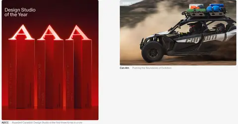
An editorial sequence of wide and smaller media, varied in position and scale rather than contained in uniform cards.
Selected clients
A heading and dense multi-column client list, separated from surrounding content by a fine gray rule.
Footer contact
Minimal closing area with a brief greeting, contact prompt, small copyright, and understated destination links.
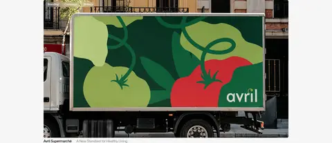
Imagery · Project imagery is the primary source of colour: campaign posters, brand applications, product stills, photography, and video appear in a varied editorial sequence. Images retain their original visual identity rather than receiving a common colour overlay. Some are broad and centered; others are smaller and offset. The opening media includes a stark black field, while later project artwork supplies brighter greens, reds, and pastels.
Use Gallery White (#f6f6f6) as the dominant canvas.
Set primary text in Studio Ink (#000000).
Keep metadata quiet in Caption Gray (#949494).
Give project imagery generous space and varied placement.
Use thin Rule Gray (#c5c5c5) separators sparingly.
Use typography and whitespace for hierarchy, not heavy decoration.
✕ 不该做
Do not turn every project into a uniform boxed card.
Do not apply portfolio artwork colours as global UI accents.
Do not add heavy shadows or layered panels.
Do not make captions compete with project titles or images.
Do not use bold weights where measured text is regular.
Do not compress the generous vertical pacing.
给 AI 的提示词
想快速出一个同风格的新页面,把这段话连同 DESIGN.md 一起发给 AI。
Build a creative-agency portfolio page with Caserne’s quiet editorial character. Use Gallery White (#f6f6f6) as the canvas, Studio Ink (#000000) for primary text, Caption Gray (#949494) for secondary copy, and Rule Gray (#c5c5c5) for rare hairlines. Use a clean sans-serif close to Plain, regular weight, with tight tracking and compact line-height. Place a prominent studio statement above an image-led project sequence; vary image sizes and alignment rather than using a uniform card grid. Let project artwork retain its own colours, and keep captions small and subdued. Preserve large areas of whitespace between sections. Finish with a restrained client list and simple contact footer. Avoid decorative gradients, strong shadows, loud interface accents, and dense controls.