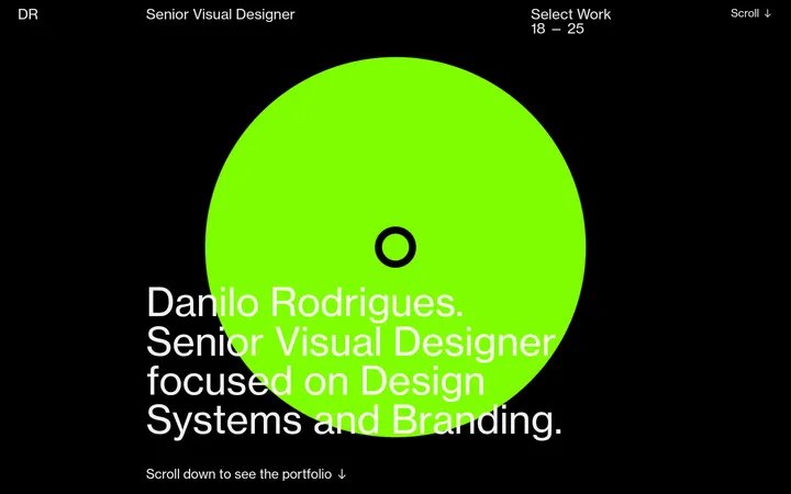
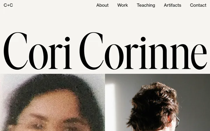
North star · Keep the interface nearly black and quiet so oversized white type and one expressive project image dominate.
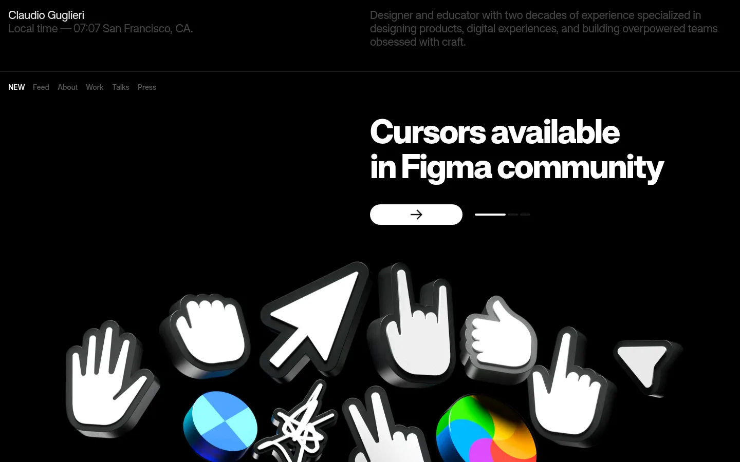
The page is built around a near-total black canvas (#000000), making white display text and the featured artwork carry nearly all the visual emphasis. Grey text establishes hierarchy for the quiet introduction and navigation, while white is reserved for key headings and high-contrast controls. The type system uses a heavy, tightly tracked sans serif with compact line spacing; the hero title is large and deliberately broken across lines. Layout is spacious and asymmetrical: introductory details sit in two distant columns, followed by a small horizontal navigation and a two-column hero where text and artwork occupy separate sides. The cursor project’s glossy, dimensional objects inject bright colour, but those colours belong to the project imagery rather than the site palette. Thin dark separators keep the contact area and next-project preview distinct without adding card-like framing.
Primary display, headings, body copy, and captions throughout the page.
Aa 设计
Inter Display
网络字体 · 字重 400 · 占比 1%
免费替代:Inter
Minor supporting text and isolated interface details.
角色
示例
字号
字重
行高
字距
特大标题
Oversized hero or project title with tightly set lines.
Claudio Guglieri
64px
1000
1.06
-0.04em
一级标题
Primary section heading and prominent contact statement.
Claudio Guglieri
32px
1000
1.2
-0.02em
二级标题
Secondary project and contact headings.
The quick brown fox 敏捷的狐狸
22px
1000
1.18
-0.02em
正文
Introductory profile copy and supporting descriptions.
The quick brown fox 敏捷的狐狸
14px
1000
1.6
-0.02em
辅助文字
Compact navigation labels and minor interface notes.
The quick brown fox 敏捷的狐狸
12px
1000
1.2
0
间距与布局
基准单位 4px · 密度:宽松
116px版块间距
10px元素间距
—卡片内边距
—内容最大宽度
4px
8px
10px
12px
14px
16px
24px
40px
116px
Use a spacious, full-width black composition with content arranged in two columns where the page allows. The introductory identity and profile sit far apart across the top; a compact horizontal navigation follows beneath a fine divider. The hero places its large text and small control to one side while the project artwork occupies the other, extending broadly across the lower area. Keep section transitions generous and nearly borderless. The measured page uses a spacious rhythm; no reliable maximum content width is specified.
圆角与层次
按钮 · 9999px
链接 · 8px
没有测到阴影:页面是扁平的,层次靠底色和描边区分。
The interface is predominantly flat: black backgrounds, light typography, and no measured shadow system. Fine dark horizontal separators subtly mark transitions without turning sections into cards. Depth comes from the featured artwork itself, whose glossy 3D forms have dimensional highlights and dark edging; keep interface elements visually unraised.
组件
下面的预览按实测的按钮、输入框、徽标、卡片样式重建(字体用替代字体)。
Identity and intro
A compact name and local-time note align opposite a muted, multi-line profile statement across the black header.
Section navigation
A small horizontal row of text links follows the header divider; the current NEW item is bright while other labels recede into grey.
Project hero
An oversized two-line white title sits beside a broad cursor-art showcase on a black field.
Pill action
A white rounded control with a dark arrow sits below the hero heading, paired with a minimal progress mark.
Contact block
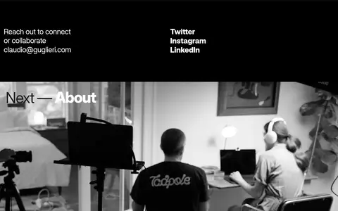
Contact prompt and email occupy one column, with stacked social links in the other; keep the typography direct and uncluttered.
Next-project preview
A wide monochrome studio image is introduced by a short overlaid Next — About title.
Imagery · The featured project uses glossy, dimensional cursor and hand forms against black, mixing mostly white objects with saturated colour accents. Treat this as project artwork, not as the brand palette. Frame it broadly beneath the hero copy so its scattered silhouettes feel tactile and playful. The next-project area uses a monochrome, cinematic studio photograph with a short overlay title, contrasting the polished 3D objects with documentary imagery.
Set key headings in bright white with bold, tight typography.
Keep navigation and supporting copy subdued in measured greys.
Give project artwork broad space to read as the visual focus.
Separate major areas with restrained, dark hairlines.
Use expressive media while keeping interface chrome minimal.
✕ 不该做
Do not add bright brand-colour UI accents.
Do not turn sections into elevated cards.
Do not make navigation compete with the project title.
Do not treat the illustration’s saturated colours as site-wide colours.
Do not crowd the page with dense copy or controls.
Do not invent layout measurements absent from the measured data.
给 AI 的提示词
想快速出一个同风格的新页面,把这段话连同 DESIGN.md 一起发给 AI。
Build a portfolio page with a near-black #000000 canvas and a quiet, editorial presence. Use Gallery White (#ffffff) for oversized, heavy project headings and key controls; use Quiet Charcoal (#454545), Soft Ash (#b7b7b7), and Slate Grey (#575757) for lower-priority navigation and supporting text. Set a compact identity/profile header in two distant columns, then a restrained horizontal navigation separated by a fine dark rule. Create a spacious two-column hero with a large, tightly tracked title, a white pill action, and broad expressive project media. Keep the media’s vivid colours confined to the artwork. Follow with a simple contact block and a cinematic next-project image. Avoid cards, shadows, extra accents, and invented dimensions; preserve strong contrast and generous breathing room.