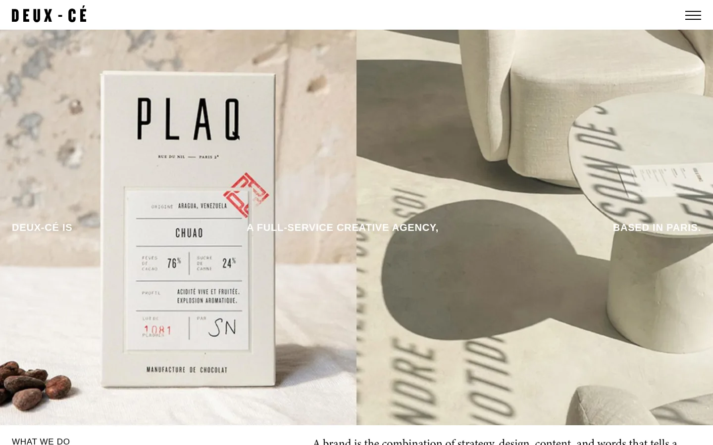
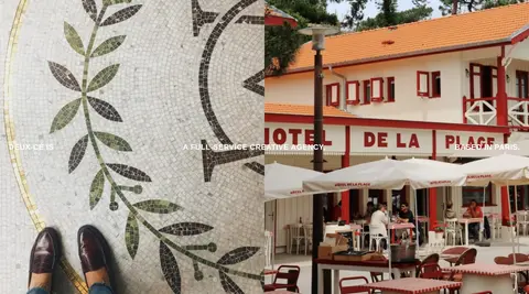
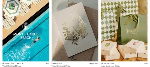
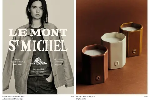
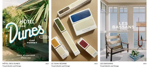
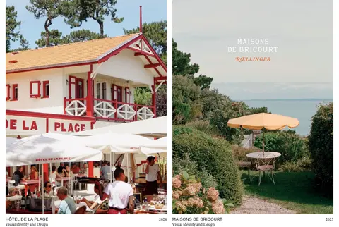
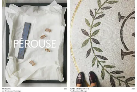
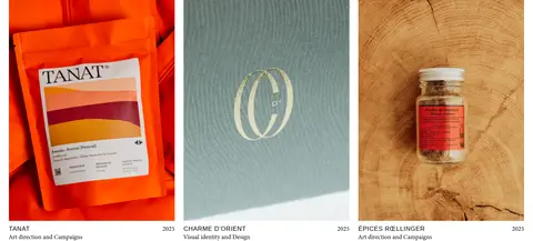
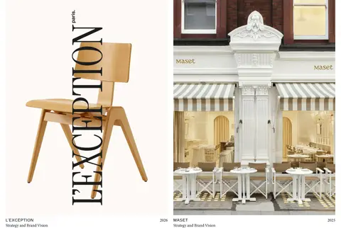
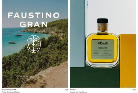
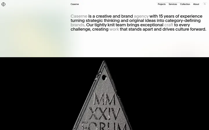
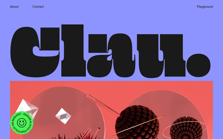
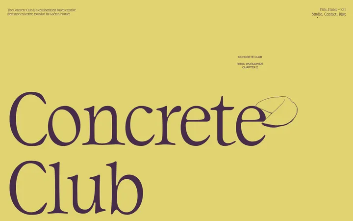
North star · Keep the interface nearly invisible so large, carefully art-directed project images carry the page.
The page is built around a white canvas and nearly black typography, with no competing decorative palette in the main editorial flow. A saturated green footer provides the clearest brand-colour anchor; muted olive, stone, taupe, and brown tones are largely carried by project imagery and should not be promoted into interface colours. Helvetica handles uppercase labels, navigation, filters, and metadata with open tracking, while Minion 3 brings a quieter editorial voice to descriptive copy and captions. A narrow masthead leads into a full-bleed photographic hero, then the page alternates between concise explanatory content and a varied portfolio grid. Project images are the visual event: captions remain small and direct, keeping attention on art direction. The layout feels spacious despite the long page, using consistent gutters and simple alignment rather than cards, shadows, or ornamental containers.
Navigation, uppercase service and category labels, links, project metadata, and utility text.
Aa 设计
minion-3
网络字体 · 字重 400 · 占比 46%
免费替代:Source Serif 4
Editorial descriptions, explanatory copy, and select project captions.
角色
示例
字号
字重
行高
字距
一级标题
Serif agency statement and prominent editorial headline.
The quick brown fox 敏捷的狐狸
24px
400
1.2
0
正文
Uppercase tracked sans labels and concise interface copy.
The quick brown fox 敏捷的狐狸
17px
400
1.2
0.04em
辅助文字
Serif uppercase project and supporting captions.
The quick brown fox 敏捷的狐狸
16px
400
1.2
0
链接
Uppercase tracked service filters and navigation links.
The quick brown fox 敏捷的狐狸
17px
400
1.2
0.04em
眉题
Small uppercase tracked labels above or beside content.
The quick brown fox 敏捷的狐狸
17px
400
1.2
0.04em
间距与布局
基准单位 8px · 密度:适中
48px版块间距
24px元素间距
18px卡片内边距
1392px内容最大宽度
2px
12px
18px
24px
40px
48px
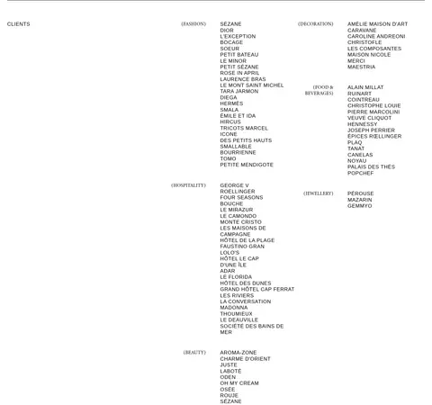
The page uses a broad, centered working area, with the measured maximum width of 1392px and comfortable density. A slim top navigation gives way to a full-bleed hero, then a two-column introduction and service list. Portfolio rows alternate between two- and three-column image arrangements, with the proportions changing to suit each project. Captions sit immediately below images, aligned simply rather than enclosed in cards. The client directory returns to a two-column editorial layout, followed by a full-width footer. Keep the measured 48px section rhythm and 24px element rhythm where applicable.
圆角与层次
没有测到阴影:页面是扁平的,层次靠底色和描边区分。
The visual language is flat: no measured shadows or gradient treatments, and no rounded-card system. Project images sit directly on the white canvas with captions below. Keep outlines and separators restrained; the measured black border colour may define fine rules, while the green footer creates separation through a solid colour field rather than elevation.
组件
下面的预览按实测的按钮、输入框、徽标、卡片样式重建(字体用替代字体)。
Masthead
White top strip with the black Atelier Deux-Cé wordmark at left and a simple black two-line menu control at right.
Hero statement
Full-width project photography with a short uppercase agency statement positioned across the image in white sans-serif text.
Service introduction
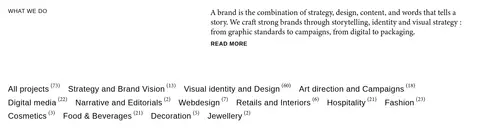
Two-column white section: a compact uppercase heading sits opposite serif explanatory copy and a read-more link.
Service filters
Inline, text-only category links with compact counts; uppercase tracked sans treatment, without button fills.
Portfolio tiles
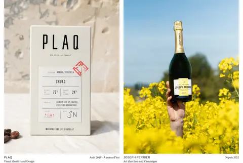
Large project images in alternating two- and three-column rows, followed by small black project name, discipline, and date metadata.
Client directory
Dense but orderly two-column lists, with category labels and client names presented as simple text links.
Green footer
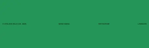
Full-width #259558 field with address and agency note above small utility links and an oversized black wordmark.
Imagery · Photography and branded project artwork dominate the page: packaging, hospitality spaces, fashion, food, and identity applications. The hero uses large cropped imagery with a short white agency statement overlaid across it. Portfolio tiles vary in ratio and content, with direct crops and little visible framing. Preserve the artwork’s own colour and typography; the measured greens, browns, and warm neutrals mostly belong to these images rather than the interface.
Let project photography provide most of the colour.
Pair tracked uppercase sans labels with editorial serif copy.
Use varied portfolio columns while keeping captions close to images.
Reserve the saturated green for the footer field.
Keep surfaces flat and corners square.
✕ 不该做
Do not turn image-derived olive and brown tones into interface accents.
Do not add gradients, glows, or decorative shadows.
Do not wrap every project in a rounded card.
Do not replace the varied portfolio grid with uniform product tiles.
Do not use oversized interface controls that compete with the artwork.
Do not crowd the page with heavy borders or boxed sections.
给 AI 的提示词
想快速出一个同风格的新页面,把这段话连同 DESIGN.md 一起发给 AI。
Build a new creative-agency page in the Atelier Deux-Cé visual language. Use Gallery White (#ffffff) as the main canvas and Studio Ink (#000000) for navigation, headings, labels, and project metadata. Set tracked uppercase labels in Helvetica or a close sans substitute, contrasting them with restrained Minion 3-style serif editorial copy. Create a slim masthead, a full-width photographic lead, concise introduction, text-only category links, and a long portfolio with alternating two- and three-column image rows. Keep image captions direct and close to their artwork. Use Atelier Green (#259558) as a distinctive solid footer field only. Treat olive, taupe, and brown samples as project-image colours, not interface palette. Prefer open whitespace, flat surfaces, sharp corners, and minimal borders; avoid shadows, gradients, and generic rounded cards.