Two Create Studio以温暖克制的浅色画布和轻盈的大字展示设计工作。作品集通过疏朗的项目版式依次展开,图片只在局部带来色彩与对比。
North star · Keep the interface nearly invisible so expansive typography and selected project imagery lead the experience.
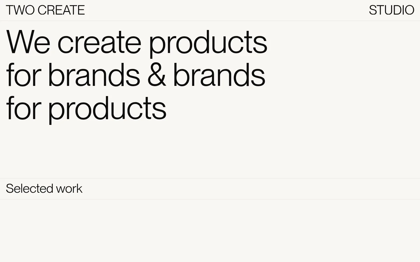
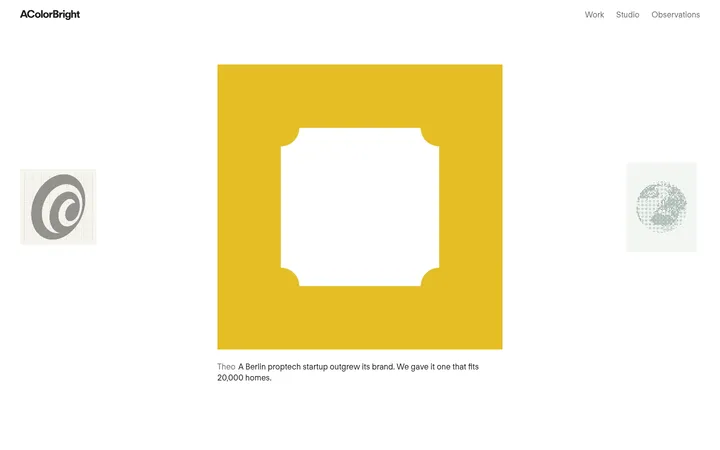
The page builds its identity from a tightly controlled palette: warm off-white fills the canvas, near-black carries the typography, and a pale gray-beige hairline separates broad content bands. There are no persistent accent colors; richer hues belong to individual project imagery rather than the studio interface. PP Neue Montreal is used with a clean, light presence, from an oversized sentence-case hero to compact uppercase project labels. Layout is editorial and deliberately sparse: navigation sits at the top edge, the hero is left aligned, and selected work continues as a long vertical portfolio with changing two-column arrangements and occasional full-bleed media. Generous empty areas give projects room to register and keep the page from feeling like a conventional card grid. Borders are subtle, corners remain square, and the presentation avoids visible shadows or decorative UI. The result is quiet and gallery-like, with typography and the work itself doing nearly all the visual talking.
配色
点色块复制色值。用途说明来自对页面的实测位置(背景、文字、描边、按钮)与截图判读。
表层色
中性色
页面底色 · Gallery Ivory主文字 · Studio Ink描边 · Soft Rule
Display, body, caption, navigation, and project-link typography throughout the page.
角色
示例
字号
字重
行高
字距
特大标题
Oversized left-aligned hero statement.
Two Create Studio
111px
400
1.02
-0.01em
正文
Prominent supporting and project-description text.
Two Create Studio
66.5px
400
1.02
-0.01em
辅助文字
Compact uppercase project labels and metadata.
Two Create Studio
33.5px
400
1.1
0
间距与布局
基准单位 2px · 密度:适中
72px版块间距
—元素间距
—卡片内边距
1400px内容最大宽度
5px
10px
14px
20px
36px
50px
72px
140px
Use a wide, left-aligned editorial canvas with a measured page maximum width of 1400px. Keep the header close to the top edge and let the hero statement occupy a broad, open field. Below it, sequence portfolio work vertically, alternating two-column project arrangements and occasional full-bleed imagery rather than repeating a uniform card grid. The measured section gap is 72px; spacing is comfortable and generous, with alignment shifts helping each project feel individually composed.
圆角与层次
没有测到阴影:页面是扁平的,层次靠底色和描边区分。
Keep the interface flat: the measured data reports no shadows, gradients, or radius scale. Use the pale measured border color for delicate separators, not heavy card outlines. Preserve clean, square-edged framing and avoid stacked surfaces that compete with the imagery.
组件
下面的预览按实测的按钮、输入框、徽标、卡片样式重建(字体用替代字体)。
Top navigation
Minimal edge-aligned wordmarks and studio navigation in uppercase, set in near-black without filled buttons or visible container styling.
Hero statement
Large, regular-weight PP Neue Montreal headline, left aligned and broken into short lines across the warm off-white canvas.
Portfolio divider
A quiet horizontal hairline and a restrained section label separate the introductory hero from selected work.
Project label
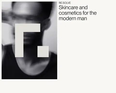
Compact uppercase client or project name sits above a larger, sentence-case project description.
Project feature
A spacious two-column composition pairs project copy with imagery or video; select work can expand into a full-bleed media treatment.
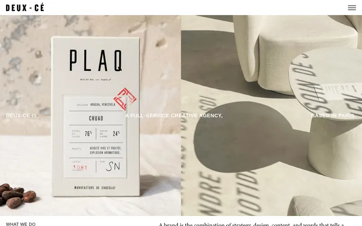
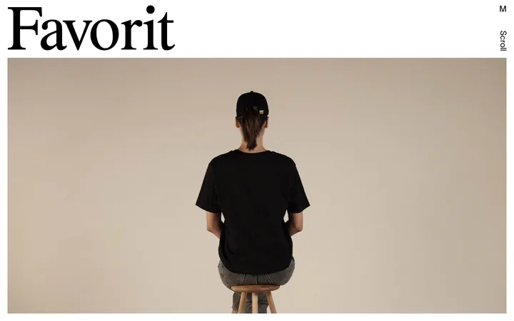
Imagery · Let project imagery provide the page's occasional color, texture, and subject matter: product and packaging work, editorial imagery, and a video-led project appear within the portfolio. Images sit in spacious compositions, sometimes paired with project text and sometimes given a wider, full-bleed presence. Treat their colors as project-specific, not as interface palette.
Use the measured warm off-white as the continuous page canvas.
Set primary text in the measured near-black.
Give the hero statement generous room and strong left alignment.
Use thin, low-contrast rules to separate major page regions.
Vary project composition while keeping the overall page sparse.
Let project photography supply color rather than interface accents.
✕ 不该做
Do not add unmeasured colors to the studio interface palette.
Do not turn the portfolio into a dense, uniform card grid.
Do not add shadows, gradients, or rounded-card treatments.
Do not make project captions compete with the display headline.
Do not treat vivid colors inside project images as brand UI colors.
Do not fill generous whitespace with unnecessary decoration.
给 AI 的提示词
想快速出一个同风格的新页面,把这段话连同 DESIGN.md 一起发给 AI。
Build a new page in the Two Create Studio visual style: an editorial, minimal canvas in Gallery Ivory (#f9f7f4), with Studio Ink (#0c0c0c) typography and Soft Rule (#e3e1dd) separators. Use PP Neue Montreal when available, or a close sans-serif substitute such as Inter. Keep navigation understated and uppercase, then anchor the page with a large, regular-weight, left-aligned statement. Structure the content as a spacious vertical sequence, using varied two-column project compositions and occasional full-bleed imagery instead of repetitive cards. Keep interface surfaces flat and square-edged; the measured system has no shadows, gradients, or radius scale. Preserve generous whitespace, compact project labels, and a clear distinction between interface colors and any color appearing inside portfolio imagery.