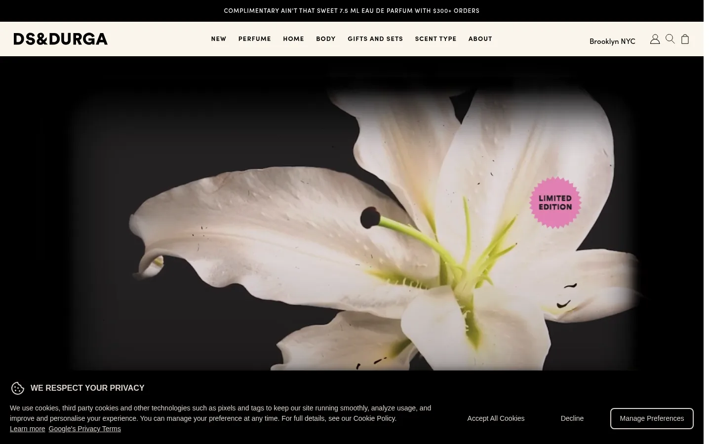
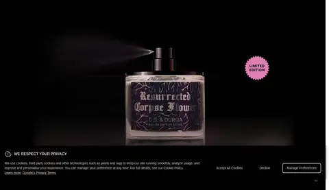
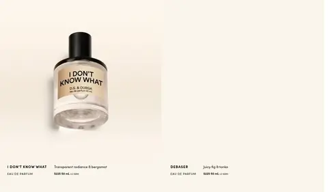
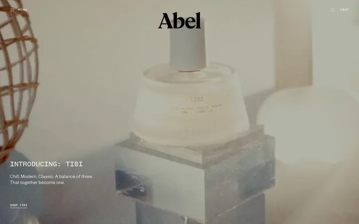
North star · Let tactile, full-bleed fragrance imagery lead, then give it room to breathe on a warm cream canvas with precise black typography.
The visual identity is built from three measured colours: Ink Black (#000000), Canvas Cream (#faf5eb), and Paper White (#ffffff). Cream establishes the warm page canvas and broad section fields; black anchors navigation, text, promotional bands, dark cards, and primary buttons; white appears in product areas and as reverse text on dark surfaces. Sofia Pro carries the system throughout, shifting from compact uppercase navigation and labels to expressive, tightly tracked display headings. The layout alternates full-bleed, dark product or flower imagery with quiet cream product fields, creating a deliberate visual pause between dense image moments. Product photography is large and tactile, while supporting copy remains brief and secondary. A sparse grid supports product browsing; later sections shift to modular black cards, a typographic shopping graphic, and a simple newsletter form. Borders and shadows are restrained, so contrast, imagery, and spacing do most of the work.
配色
点色块复制色值。用途说明来自对页面的实测位置(背景、文字、描边、按钮)与截图判读。
品牌色
表层色
中性色
页面底色 · Canvas Cream表层 · Paper White表层 2 · Ink Black主文字 · Ink Black次要文字 · Paper White描边 · Ink Black
Used across navigation, headings, product labels, body copy, links, and controls.
角色
示例
字号
字重
行高
字距
特大标题
Large editorial headlines for prominent campaign or statement moments.
D.S. & DURGA
67px
400
0.9
-0.05em
一级标题
Primary product and promotional section headings.
D.S. & DURGA
41.5px
400
0.85
-0.03em
二级标题
Secondary section titles and product-feature headings.
The quick brown fox 敏捷的狐狸
24px
400
1
-0.02em
三级标题
Supporting subheads and compact content titles.
The quick brown fox 敏捷的狐狸
18px
500
1.3
0
正文
Bold uppercase product or section labels and short descriptive copy.
The quick brown fox 敏捷的狐狸
14px
700
1.3
0.06em
辅助文字
Small uppercase metadata, badges, and product details.
The quick brown fox 敏捷的狐狸
13px
700
1
0.08em
导航
Uppercase primary navigation links with prominent letter spacing.
The quick brown fox 敏捷的狐狸
13px
800
normal
0.08em
链接
Bold uppercase shopping links and calls to action.
The quick brown fox 敏捷的狐狸
16px
700
1.3
0.07em
眉题
Small uppercase introductory labels above headings.
The quick brown fox 敏捷的狐狸
14px
700
1.3
0.06em
间距与布局
基准单位 2px · 密度:适中
72px版块间距
10px元素间距
—卡片内边距
—内容最大宽度
2px
4px
5px
6px
8px
10px
12px
13px
16px
18px
20px
24px
25px
Use broad, mostly full-width bands, alternating immersive campaign imagery with cream product and content fields. Keep product browsing in sparse, aligned columns rather than enclosing every item in a card. Center hero copy over media where present; align supporting labels and footer content to clear grid edges. The page rhythm is comfortable, with distinct visual pauses between sections. Avoid inventing a fixed max width: the measured layout is fluid and includes full-bleed media.
圆角与层次
按钮 · 50%
没有测到阴影:页面是扁平的,层次靠底色和描边区分。
The interface is predominantly flat: no measured shadows, and square-cornered controls and badges. Black and cream section changes, full-bleed media, and occasional thin black rules create separation. Reserve layering for text or badges placed directly over campaign imagery rather than adding generic card shadows.
组件
下面的预览按实测的按钮、输入框、徽标、卡片样式重建(字体用替代字体)。
Announcement strip
A narrow black top band carries compact, tracked uppercase offer copy in white.
Navigation
Cream header with a bold wordmark, uppercase Sofia Pro links, location, and simple utility icons.
Campaign hero
Full-bleed dark video or image with a centered fragrance story and a contrasting limited-edition badge.
Product listing
Open product browsing with concise uppercase names, fragrance notes, prices, sizes, and simple shopping controls.
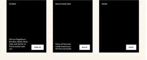
Dark promo cards
Three black promotional panels pair small uppercase headings and brief white copy with direct white buttons.
Newsletter field
A cream subscription area combines a sentence-case heading with a bordered email input and arrow action.
Footer navigation
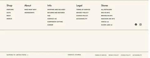
Multi-column link groups sit above a fine rule and a compact legal and locale bar.
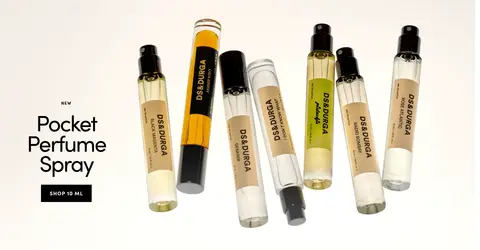
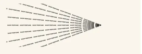
Imagery · Lead with large campaign photography or video, including close-up flowers and perfume bottles against deep black. Product images sit prominently in pale, quiet fields with little decorative framing. Preserve photographic texture and strong light-dark contrast. The repeated-shop graphic is typographic artwork, not a source of additional brand palette colours.
Use #000000 for navigation, text, and strong CTA contrast.
Give hero photography substantial visual area.
Keep product copy short and label-led.
Use Sofia Pro with tracked uppercase utility text.
Separate page moments with generous whitespace.
✕ 不该做
Do not introduce unmeasured brand colours.
Do not add gradients, shadows, or rounded card treatments.
Do not let decorative UI compete with product imagery.
Do not crowd product listings with long descriptions.
Do not style every section as a bordered card.
Do not use generic pastel beauty-store conventions.
给 AI 的提示词
想快速出一个同风格的新页面,把这段话连同 DESIGN.md 一起发给 AI。
Build a new D.S. & DURGA-style storefront page with an editorial, fragrance-led visual system. Use Canvas Cream (#faf5eb) as the warm page field, Ink Black (#000000) for typography, navigation, dark panels, and primary actions, and Paper White (#ffffff) for light product surfaces and reverse text. Set all type in Sofia Pro or a close free sans-serif substitute; make utility labels and navigation compact, bold, uppercase, and tracked, while keeping display headlines clean and tightly set. Lead with tactile, high-contrast campaign photography, then alternate it with spacious product fields and concise product details. Use simple grids, flat surfaces, square controls, and thin rules only where needed. Keep the page rhythm generous, avoid unmeasured colours and decoration, and let photography and typography carry the identity.