North star · Keep the warm canvas and open, floating composition dominant; let typography and controls stay quiet around the 3D jewelry imagery.
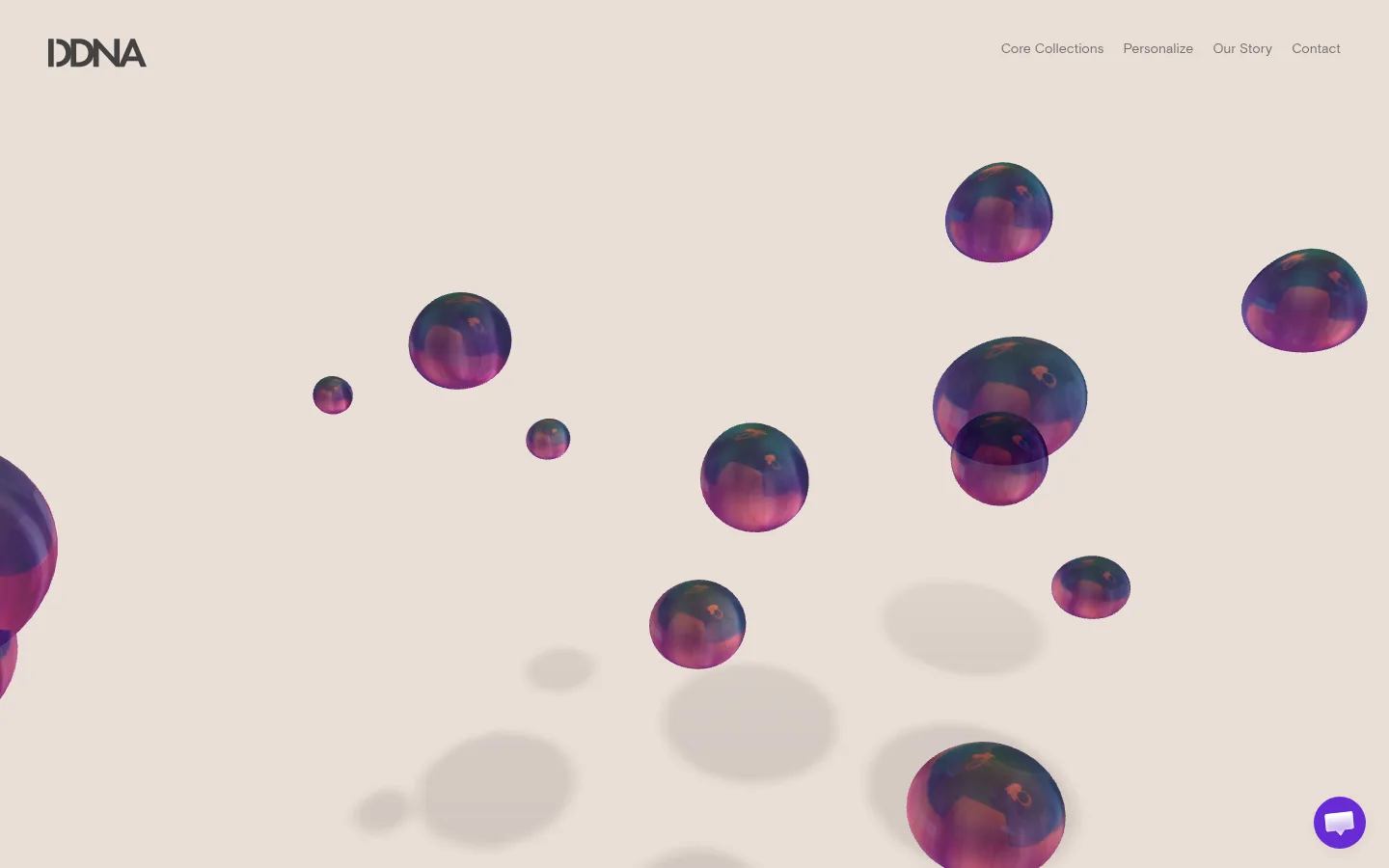
The page is built around a single warm canvas, #e9ded6, which fills the first viewport and gives the jewel-like 3D forms room to float. Dark, soft-edged typography in #444242 keeps the wordmark and navigation legible without competing with the scene. The small violet #682ad5 accent is most visible in the floating chat control; it is a utility detail rather than a defining brand colour. Favorit is used for the large display heading, while Basis carries navigation and body copy in a quiet, consistent voice. A compact header sits at the top edge, with the logo left and a short navigation run right. The hero uses generous open space instead of cards or framed content: rendered spherical objects are distributed across the canvas, with soft shadows adding depth. Overall, the composition favors a comfortable, low-density rhythm and full-bleed imagery over conventional product-grid structure.
Header links for collections, personalization, story, and contact.
The quick brown fox 敏捷的狐狸
14px
400
1.5
0
间距与布局
基准单位 2px · 密度:适中
50px版块间距
—元素间距
—卡片内边距
—内容最大宽度
40px
50px
Use a single-column, full-bleed canvas rather than a boxed page frame. The measured header places the logo at the left and a compact navigation group at the right; the hero remains broadly open, with its heading aligned to the start rather than centered. Maintain comfortable breathing room and low content density, letting the large visual field carry the first screen. No measured maximum content width or card padding is supplied, so do not impose a rigid grid or invent those dimensions. Keep section transitions spacious and simple.
圆角与层次
按钮 · 50%
md · other
The page is visually flat at the interface level: no prominent card frames, borders, or section dividers are measured. Depth comes from the soft shadows beneath rendered objects. Keep navigation and content unboxed; use layering sparingly, with the small floating chat control as a distinct utility element.
组件
下面的预览按实测的按钮、输入框、徽标、卡片样式重建(字体用替代字体)。
Header navigation
Place a compact DDNA wordmark at the left and the Core Collections, Personalize, Our Story, and Contact links at the right; use #444242 text on #e9ded6.
Immersive hero canvas
A full-bleed warm field with sparse floating 3D jewelry-like spheres and soft projected shadows; preserve generous negative space.
Hero messaging
Use Favorit for the main brand statement and supporting message, with quiet sizing and natural casing rather than a loud promotional treatment.
Chat launcher
A small circular floating utility control uses the measured violet accent #682ad5; keep it visually separate from the brand’s neutral canvas.
Imagery · The first viewport is dominated by colorful, floating spherical 3D forms with reflective, jewel-like surfaces. Scatter objects at varied apparent sizes across the pale canvas and use soft, diffuse shadows to suggest depth. The forms belong to the rendered hero scene, not the measured brand palette; keep their saturated purples and blues confined to imagery rather than UI.
Use saturated jewel colors inside imagery, not as broad UI fills.
Let soft rendered shadows supply depth.
Keep interface framing minimal and unobtrusive.
✕ 不该做
Do not introduce unmeasured palette colors as brand tokens.
Do not turn the hero into a dense product grid.
Do not add heavy borders or card treatments.
Do not overemphasize the violet chat accent.
Do not crowd the navigation or hero with copy.
Do not make the rendered spheres look like flat UI icons.
给 AI 的提示词
想快速出一个同风格的新页面,把这段话连同 DESIGN.md 一起发给 AI。
Build a new DDNA-style jewelry page with a quiet, immersive feel. Use Porcelain Sand (#e9ded6) as the dominant canvas and Soft Charcoal (#444242) for the wordmark, navigation, and restrained text. Reserve Violet Signal (#682ad5) for a small utility accent, not large backgrounds. Set display headings in Favorit or a close substitute such as DM Sans; use Basis or Inter for navigation and body copy, at regular weight. Keep the header compact, with brand left and a short link group right. Favor broad open space and full-bleed imagery over cards or dense grids. Create a few floating, reflective jewel-like 3D forms with soft shadows; keep their saturated colors within the artwork. Avoid heavy borders, invented measurements, and loud interface treatments.