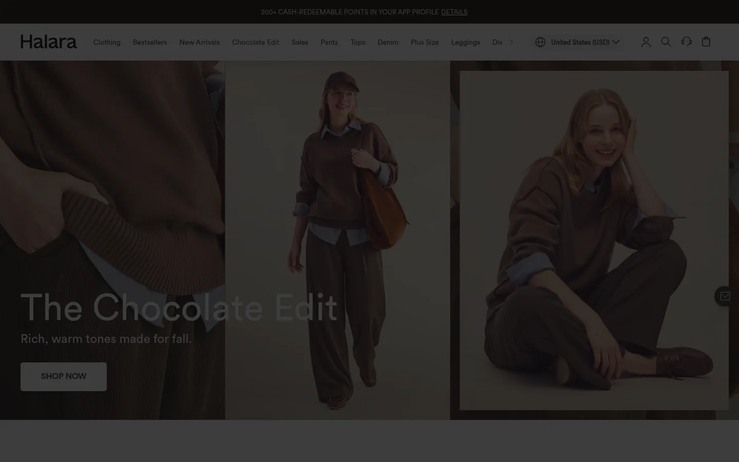
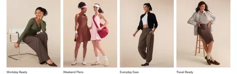
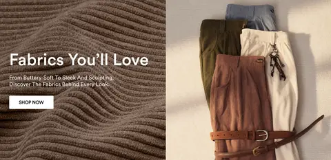
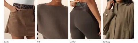
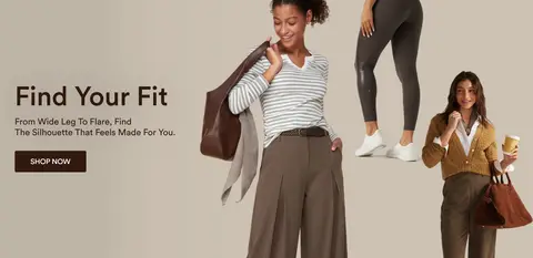
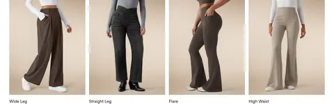
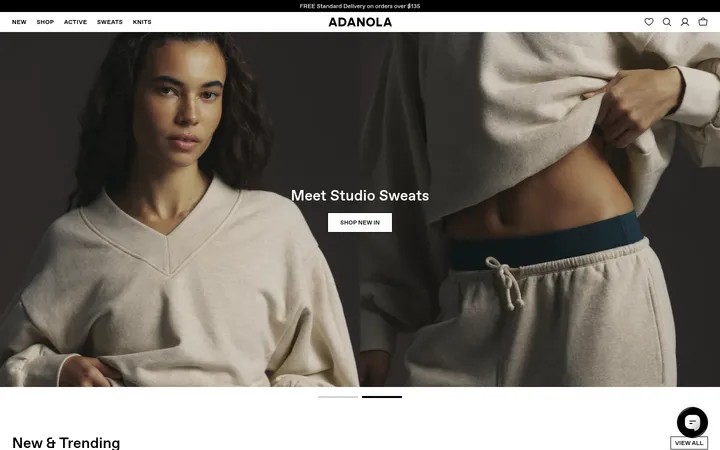
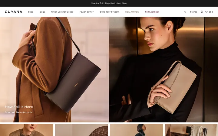
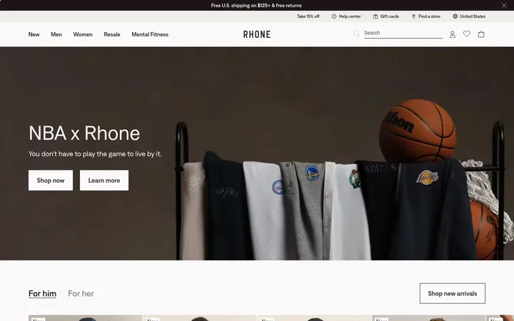
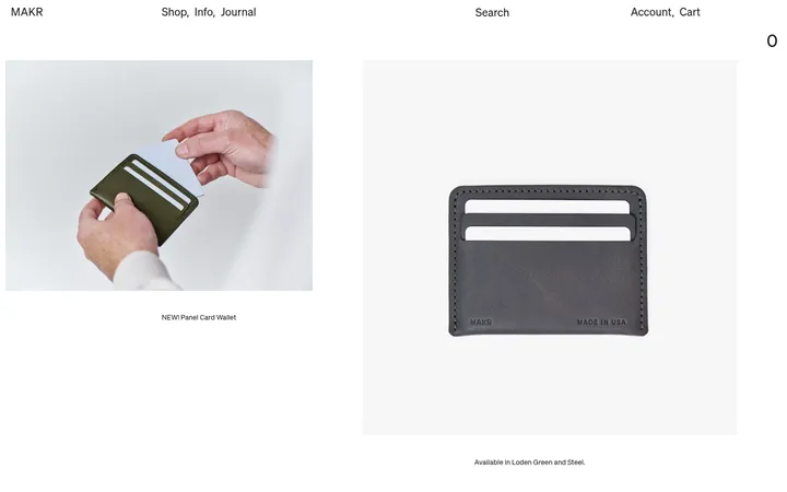
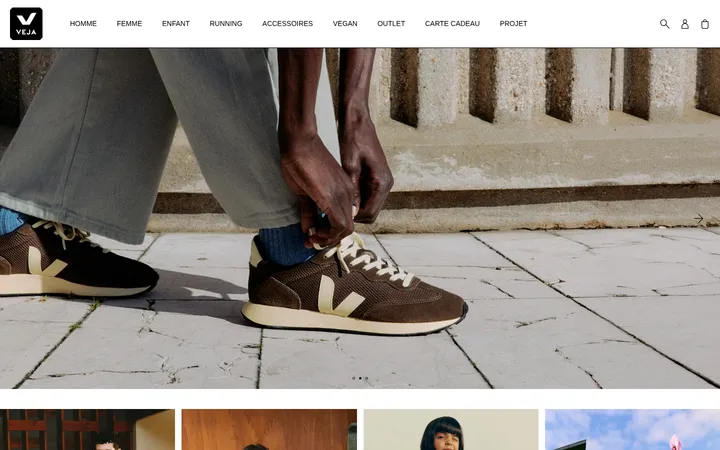
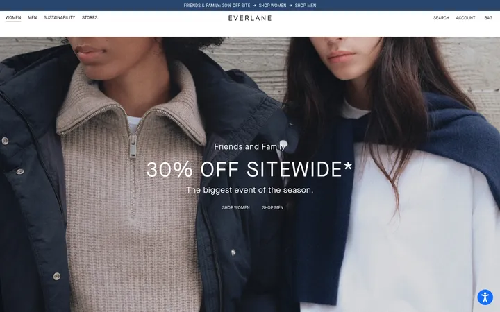
North star · Let warm, full-bleed fashion photography lead, and keep the shopping interface crisp, white, and quiet.
The visual identity is built on a white canvas, near-black text, and soft gray utility surfaces; the measured dark red accent is limited and should not be expanded into a dominant theme. The first view is deliberately image-led: a wide chocolate-toned campaign carries the mood, while the header and navigation remain quiet and compact. Mukta handles most interface text, with CircularBook reserved for prominent display and heading treatments, giving campaign copy a cleaner, rounder contrast against practical product labels. The page alternates broad split-image campaigns with compact four-column category rows and a dense merchandise grid. Generous white gaps separate these distinct shopping missions, while aligned card edges keep browsing orderly. Photography supplies nearly all the warm color and texture, so UI chrome stays flat, neutral, and unobtrusive. Rounded controls and fine gray borders add just enough affordance without turning the experience into a heavily elevated interface.
配色
点色块复制色值。用途说明来自对页面的实测位置(背景、文字、描边、按钮)与截图判读。
强调色
表层色
中性色
功能色
页面底色 · Gallery White表层 · Mist Gray表层 2 · Cloud Gray表层 3 · Night Panel主文字 · Soft Ink次要文字 · Gallery White弱文字 · True Black描边 · Fine Silver强调 · Sale Red
Primary interface, navigation, captions, product labels, and supporting copy.
Aa 设计
CircularBook
网络字体 · 字重 400 / 500 / 600 / 700 · 占比 2%
免费替代:Manrope
Campaign display headings, major headings, and prominent CTA labels.
角色
示例
字号
字重
行高
字距
特大标题
Large campaign titles layered over fashion imagery.
Halara
72px
400
1.15
0
一级标题
Primary campaign headline or prominent section heading.
Halara
44px
400
0.93
0
二级标题
Secondary campaign and collection headings.
The quick brown fox 敏捷的狐狸
24px
400
1.1
0
三级标题
Category and editorial section titles.
The quick brown fox 敏捷的狐狸
18px
400
1.3
0
正文
Supporting copy, navigation details, and product information.
The quick brown fox 敏捷的狐狸
14px
400
1.14
0
辅助文字
Compact product metadata and small labels.
The quick brown fox 敏捷的狐狸
13px
500
normal
0
按钮
Shopping CTA and other prominent action labels.
The quick brown fox 敏捷的狐狸
16px
600
1
0
间距与布局
基准单位 2px · 密度:适中
56px版块间距
20px元素间距
103px卡片内边距
1360px内容最大宽度
4px
6px
10px
12px
15px
16px
20px
35px
40px
56px
80px
Use a centered storefront structure with a measured maximum width of 1360px, while campaign media can run full bleed. Keep headings aligned to the left and arrange category and editorial cards in four-column rows where shown. The measured section rhythm is spacious, with a 56px section gap and 20px element gap; preserve generous white separation around imagery. Product browsing is intentionally denser than campaign blocks, with repeated aligned cards and concise metadata.
圆角与层次
按钮 · 50%
图片 · 50%
徽标 · 9999px
sm · other
sm · link
Favor flat white sections and clean image edges over layered cards. Use fine #dddddd borders for understated controls and only subtle measured shadows for small interface elements. Rounded pill-like buttons and badges provide the main shape contrast; avoid heavy drop shadows or stacked panels.
组件
下面的预览按实测的按钮、输入框、徽标、卡片样式重建(字体用替代字体)。
Store header
Compact white navigation with the Halara wordmark, category links, country selector, and utility icons in dark ink.
Campaign split
Wide paired fashion imagery with a concise title, short supporting line, and compact shopping CTA over or beside the photo.
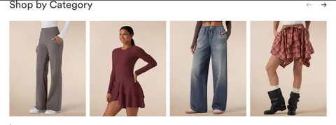
Category tiles
Four-up image row with short labels, white gutters, and a left-aligned section heading.
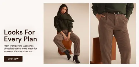
Editorial collection row
Four fashion-look images with concise names beneath, separated from adjacent campaigns by generous white space.
Product cards
Dense aligned merchandise grid with pale image surfaces, small sale or offer badges, brief names, prices, and color swatches.
Pill CTA
Compact shopping action with a rounded silhouette, clear label, and neutral or dark treatment that stays subordinate to campaign photography.
Imagery · Use real fashion photography rather than illustration or 3D. Campaign imagery appears in large split compositions, with models and garment details framed against warm, softly lit neutral settings. Category tiles crop close to clothing or full looks and sit in tidy rows. Keep images edge-aligned and largely untreated; let garment color, fabric texture, and styling provide the visual richness.
Keep the overall canvas white and storefront chrome quiet.
Let warm fashion photography carry the strongest color.
Use Mukta for most navigation, captions, and product copy.
Reserve CircularBook-like display styling for campaign headlines.
Alternate broad campaign blocks with compact shopping grids.
Keep product cards aligned and metadata concise.
✕ 不该做
Do not turn the measured red accent into a dominant palette.
Do not add gradients or decorative illustration to image-led sections.
Do not crowd campaign photography with interface controls.
Do not use heavy shadows or layered card treatments.
Do not replace the airy section rhythm with continuous dense content.
Do not force all headings and labels into uppercase.
给 AI 的提示词
想快速出一个同风格的新页面,把这段话连同 DESIGN.md 一起发给 AI。
Build a new Halara-style fashion storefront page with a bright Gallery White (#ffffff) canvas and restrained Soft Ink (#121212) interface text. Use warm, natural fashion photography as the main source of color; frame campaign content in broad split-image blocks, then follow with compact category rows and neatly aligned product cards. Set most navigation, captions, and product copy in Mukta or a close sans-serif equivalent, reserving a clean rounded display face for campaign headings. Use Cloud Gray (#f5f5f5) and Mist Gray (#ececec) only for quiet surfaces, Fine Silver (#dddddd) for delicate borders, and Sale Red (#b40a0a) sparingly. Keep spacing open between sections, with a denser merchandise grid where shoppers compare items. Prefer flat surfaces, subtle outlines, and rounded CTA shapes over pronounced elevation.