North star · Let expressive serif headlines and rich project imagery breathe against warm, quiet surfaces, keeping controls and labels precise and understated.
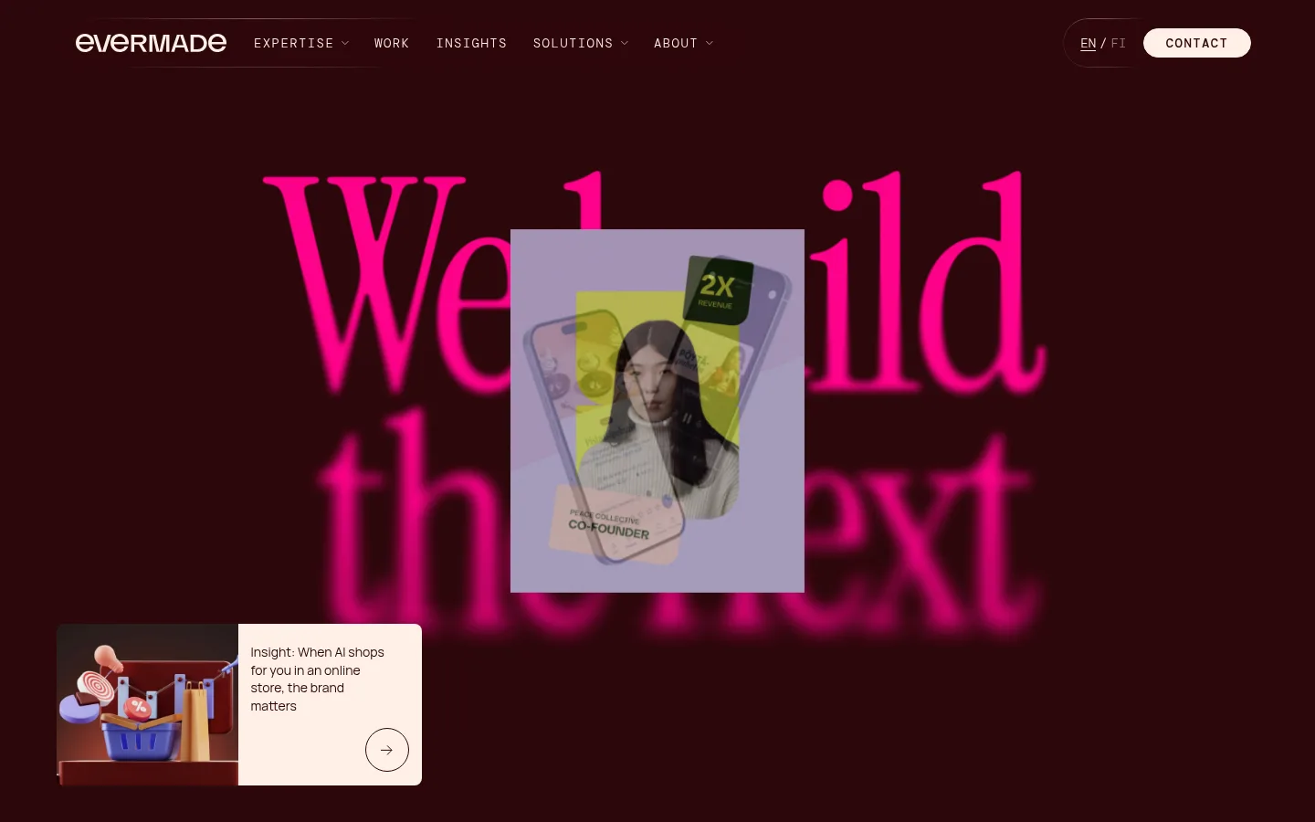
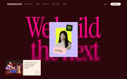
The page opens with a full-bleed, near-black burgundy hero: oversized Instrument Serif lettering in vivid pink sits behind layered project imagery, while compact uppercase navigation stays discreet at the top. The rest of the site shifts to a warm peach canvas, using dark burgundy for copy and display type, white for occasional section surfaces, and pale pink for selected labels or text accents. Instrument Serif gives statements and case-study titles an editorial voice; Manrope keeps explanatory copy approachable, while DM Mono makes navigation, categories, and small labels feel precise. Content aligns to a wide central frame, alternating broad text-led passages with client marks, case-study images, and horizontally presented insight cards. Sections retain substantial breathing room rather than adding decorative containers. The client area uses a ruled grid, while project cards rely on their images and typography instead of heavy borders or shadows. Rounded pill controls provide the main interface accent.
配色
点色块复制色值。用途说明来自对页面的实测位置(背景、文字、描边、按钮)与截图判读。
品牌色
强调色
表层色
中性色
页面底色 · Warm Porcelain表层 · Gallery White表层 2 · Black Cherry主文字 · Black Cherry描边 · Black Cherry强调 · Electric Rose强调 2 · Petal Pink
Display headlines, introductory statements, section titles, and project headlines.
Aa 设计
DM Mono
网络字体 · 字重 300 / 500 · 占比 32%
免费替代:Space Mono
Navigation, uppercase eyebrows, category labels, badges, and pill-button text.
Aa 设计
Manrope
网络字体 · 字重 400 · 占比 17%
免费替代:Inter
Body copy, descriptions, project text, and standard links.
角色
示例
字号
字重
行高
字距
特大标题
Oversized hero statement and other high-impact display moments.
Evermade
128px
400
1.1
-0.01em
一级标题
Primary page or section headline in Instrument Serif.
Evermade
60px
400
1.1
-0.01em
二级标题
Major editorial section headline or introduction.
Evermade
48px
400
1.1
-0.01em
三级标题
Project titles and supporting editorial headings.
Evermade
32px
400
1.4
-0.01em
四级标题
Compact supporting headings and card subheads.
The quick brown fox 敏捷的狐狸
22px
400
1.4
0
正文
Agency description, explanatory paragraphs, and card copy.
The quick brown fox 敏捷的狐狸
18px
400
1.4
0
辅助文字
Small uppercase metadata and project category labels.
The quick brown fox 敏捷的狐狸
11px
300
1.4
0.009em
按钮
Uppercase DM Mono labels on pill-shaped actions.
The quick brown fox 敏捷的狐狸
14px
500
1
0.1em
导航
Compact uppercase primary navigation and language links.
The quick brown fox 敏捷的狐狸
14px
300
1.6
0.1em
链接
Inline text links within copy and insight content.
The quick brown fox 敏捷的狐狸
18px
400
1.4
0
眉题
Small uppercase section identifiers above content.
The quick brown fox 敏捷的狐狸
14px
300
1.6
0.1em
代码
Tiny uppercase mono metadata-style labels.
const style = 1;
11px
300
1.4
0.009em
间距与布局
基准单位 4px · 密度:宽松
104px版块间距
8px元素间距
—卡片内边距
1316px内容最大宽度
1px
4px
5px
8px
12px
14px
16px
21px
24px
36px
41px
78px
Use a wide, centered content frame, with the measured page max width of 1316px as the outer guide. The opening viewport is a dark, full-bleed hero; the long body returns to a continuous warm canvas. Alternate centered editorial statements with broad client and project grids, keeping headings mostly left-aligned within content groups. Use generous section gaps and ample internal breathing room. Client marks sit in a ruled grid; work and insight cards form denser image-led rows. Maintain the measured spacious density without inventing extra layout dimensions.
圆角与层次
按钮 · 9999px
徽标 · 9999px
导航 · 9999px
没有测到阴影:页面是扁平的,层次靠底色和描边区分。
The interface is mostly flat, relying on surface contrast, imagery, and thin rules rather than shadow. The client-logo area uses fine dark grid lines; project cards stay visually open. Use pill-shaped outlines or fills for controls, and reserve overlapping layers for the hero imagery instead of applying elevation to every card.
组件
下面的预览按实测的按钮、输入框、徽标、卡片样式重建(字体用替代字体)。
Primary navigation
Compact uppercase links sit across the top of the hero, with language selection and a warm-filled, dark-text CONTACT pill aligned to the right.
Hero composition
A full-bleed burgundy field pairs oversized pink serif lettering with layered project media; a smaller insight preview anchors the lower-left area.
Editorial introduction
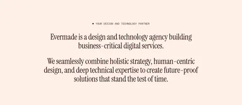
Centered small mono eyebrow and serif-led agency statement sit on the warm canvas, followed by a vertically stacked expertise word group.
Client logo grid
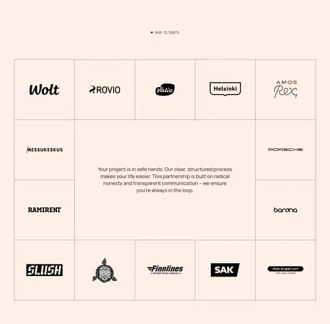
Client marks occupy a ruled, multi-column grid with a central reassurance message and surrounding logo cells.
Project cards
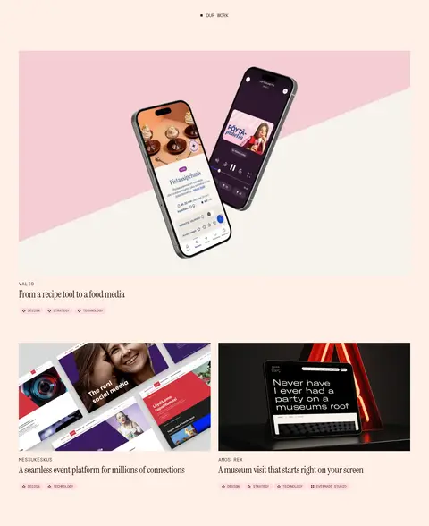
Rectangular case-study images lead into compact client names, serif project titles, and small uppercase mono category tags.
Insight carousel
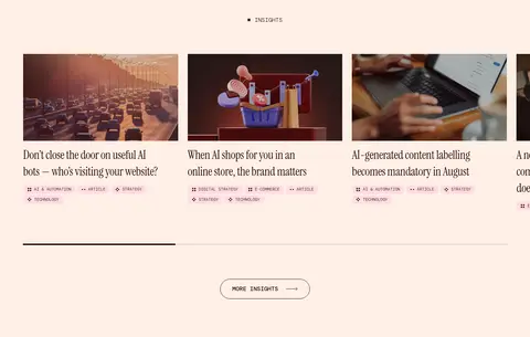
A horizontally presented row of image-led insight cards uses serif headlines, tiny category labels, a progress rule, and an outlined MORE INSIGHTS pill.
Expertise badge
Small uppercase DM Mono labels appear inside rounded pills; dark-section instances use the warm canvas color for their text.
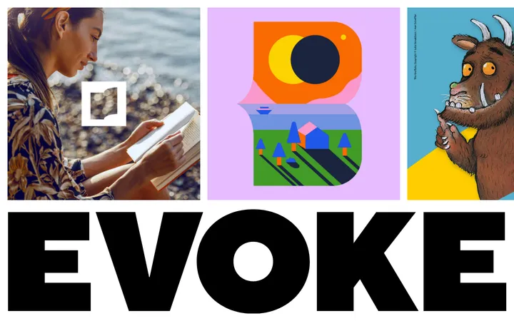
Imagery · Treat imagery as a key part of the agency portfolio: use prominent project visuals, including device mockups, interface compositions, editorial photography, and playful illustrated scenes. The hero layers a central portrait-led project tile and a smaller insight preview over an oversized blurred pink statement. In later sections, keep images rectangular and let their distinct palettes speak; avoid adding decorative image frames that compete with the work.
Use Black Cherry #2d070b for primary copy and the opening hero surface.
Keep Warm Porcelain #fef0e6 as the long-form page canvas.
Set display statements and project titles in an expressive serif.
Use DM Mono uppercase labels for navigation, categories, and actions.
Let project images carry their own color and visual character.
Give editorial blocks generous breathing room and clear alignment.
Use fine rules for grid structure and pill shapes for key controls.
✕ 不该做
Do not make the body a uniform white or generic gray canvas.
Do not use Electric Rose #ff0389 as a broad background color.
Do not add heavy card shadows or thick decorative borders.
Do not turn mono navigation and metadata into large display text.
Do not force project images into uniform color treatments.
Do not crowd the spacious editorial sections with dense UI.
Do not add measurements or component dimensions beyond the supplied data.
给 AI 的提示词
想快速出一个同风格的新页面,把这段话连同 DESIGN.md 一起发给 AI。
Build a new agency page in Evermade’s editorial visual language. Use Black Cherry #2d070b for primary ink and any dramatic opening surface, with Warm Porcelain #fef0e6 as the main canvas. Reserve Electric Rose #ff0389 for selective high-impact lettering or links; use Petal Pink #ffc7de as a softer text accent and Gallery White #ffffff only for occasional light sections. Pair Instrument Serif-style display typography with Manrope-like readable copy and DM Mono-like uppercase navigation, labels, and pill actions. Organize content inside a wide centered frame, alternating spacious editorial statements with ruled client grids and image-led project cards. Keep surfaces mostly flat: use fine rules, minimal borders, and no prominent shadows. Give portfolio imagery room to lead, and keep navigation and metadata compact.