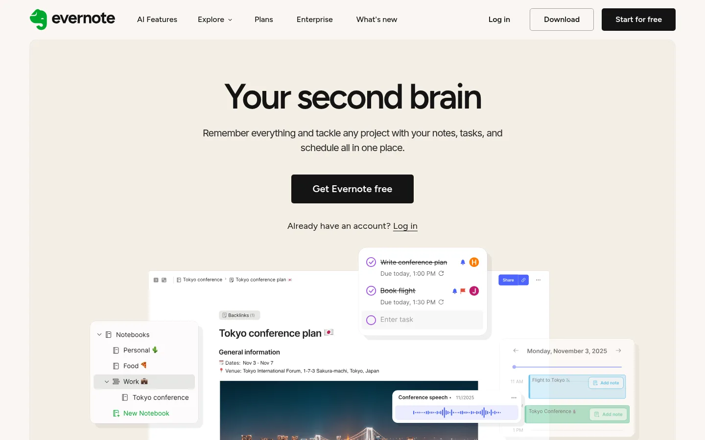
North star · Use warm paper-like surfaces, confident Figtree headlines, and layered product imagery to make productivity feel calm and tangible.
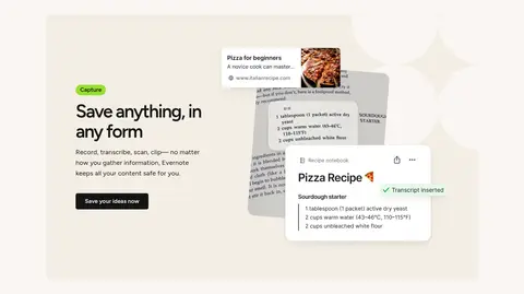
The page is built on a warm off-white canvas, with pale beige feature panels and a single charcoal band creating gentle section contrast. Near-black headings carry the message, while muted gray supports explanatory copy; vivid lime is reserved for occasional emphasis and CTA moments. Figtree gives large headings a rounded, compact presence with tight tracking, while Inter keeps supporting text straightforward and legible. The layout alternates centered introductory and promotional sections with broad, rounded feature panels that pair copy and product imagery. Product screenshots, notes, task overlays, and photography are arranged as layered compositions, giving the software tangible context without turning the page into a dense interface. Generous whitespace separates sections and card groups. Cards stay mostly flat, relying on pale surfaces, subtle borders, and overlap rather than pronounced shadows. The result feels editorial and calm, while still making the product’s capabilities immediately visible.
Body copy, supporting descriptions, and selected secondary headings.
Aa 设计
Figtree
网络字体 · 字重 600 / 400 / 300 / 500 · 占比 47%
免费替代:Nunito Sans
Display and section headings, navigation, links, captions, and much of the interface copy.
角色
示例
字号
字重
行高
字距
特大标题
Large hero or campaign headline when a display scale is needed.
Evernote
72px
600
1
-0.05em
一级标题
Primary hero title, centered above the lead description.
Evernote
50px
600
1.1
-0.05em
二级标题
Major feature and promotional section headings.
Evernote
40px
600
1.1
-0.03em
三级标题
Card titles and compact feature headings.
The quick brown fox 敏捷的狐狸
24px
600
1.1
0
四级标题
Secondary explanatory headings within content.
The quick brown fox 敏捷的狐狸
20px
400
1.5
-0.05em
正文
Standard feature descriptions and supporting paragraphs.
The quick brown fox 敏捷的狐狸
16px
400
1.3
0
辅助文字
Small metadata, labels, and interface annotations.
The quick brown fox 敏捷的狐狸
12px
300
1.2
0
导航
Top-level navigation labels and menu items.
The quick brown fox 敏捷的狐狸
16px
500
1.5
0
链接
Text links and inline calls to action.
The quick brown fox 敏捷的狐狸
18px
400
1.6
0.01em
间距与布局
基准单位 8px · 密度:适中
40px版块间距
16px元素间距
32px卡片内边距
1024px内容最大宽度
1px
2px
4px
8px
10px
12px
16px
20px
24px
28px
32px
40px
80px
Use a centered desktop content area with a measured maximum width of 1024px, while section backgrounds can span the viewport. The hero and selected promotional blocks center their headings and copy; feature panels switch to left-aligned text beside product visuals. The page alternates feature splits, card collections, and broad section bands with comfortable breathing room. The measured spacing system uses an 8px base, a 40px section gap, and 16px element gap; preserve this generous, comfortable density rather than packing content tightly.
圆角与层次
按钮 · 5px
卡片 · 10px
导航 · 10px
hairline · card
The page is mostly flat: surfaces are distinguished by warm background shifts and fine borders rather than visible shadows. White cards and floating product windows can overlap to create depth, with rounded edges and carefully contained UI details. Keep elevation restrained and avoid heavy drop shadows.
组件
下面的预览按实测的按钮、输入框、徽标、卡片样式重建(字体用替代字体)。
Top navigation
Logo and text links sit on the warm canvas; measured navigation uses Figtree at 16px, with a dark rounded free-start button.
Hero CTA
Centered hero copy leads to a dark rounded primary button, followed by a compact existing-account link.
Template cards
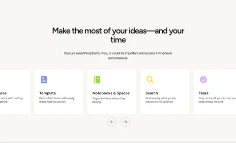
White cards use a measured 10px radius and 32px padding, with concise titles, icons, and text links.
Feature split panel
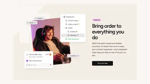
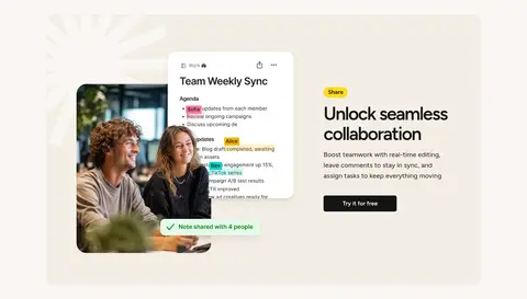
Warm rounded panel pairs an image or layered product UI with a left-aligned title, description, and dark CTA.
Dark promotion band
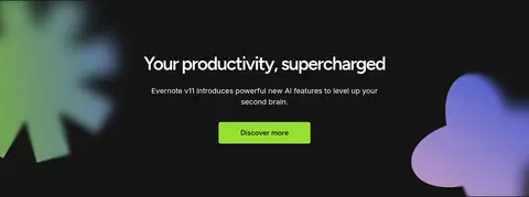
Charcoal background centers the productivity headline and copy; a lime CTA stands out against the dark section.
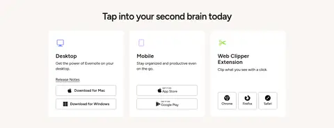
Download cards
Three desktop, mobile, and browser-extension cards group short descriptions with platform or browser download links.
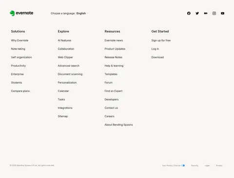
Footer link columns
A quiet canvas supports the logo, language selector, social icons, and several compact columns of text links.
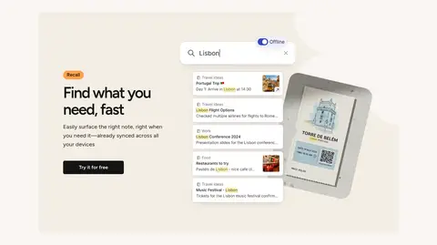
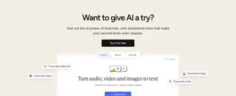
Imagery · Use product-interface mockups as the primary visual language: notes, task lists, calendars, search results, and collaboration screens overlap in clean, floating layers. Mix in occasional lifestyle photography within those compositions, but keep screenshots readable and framed by warm neutral panels. Small colorful UI details may appear inside the product imagery; treat them as product content rather than core brand colors.
Reserve lime for a small number of high-attention moments.
Pair feature copy with recognizable product-interface imagery.
Separate sections with whitespace and gentle surface changes.
✕ 不该做
Do not make every section a different saturated color.
Do not use heavy shadows to lift ordinary cards.
Do not crowd the feature panels with dense copy.
Do not turn product UI colors into the overall brand palette.
Do not center every feature; preserve the page’s left-aligned split sections.
Do not use oversized decorative gradients as the dominant visual.
给 AI 的提示词
想快速出一个同风格的新页面,把这段话连同 DESIGN.md 一起发给 AI。
Build a new productivity SaaS page in Evernote’s calm, paper-like visual style. Use Paper Canvas (#f9f6f2) as the main background, Oat Section (#f4eee5) for occasional section panels, Evernote Ink (#141414) for headings and dark CTAs, and Signal Lime (#94e130) sparingly for emphasis. Set large, tightly tracked headlines in Figtree and supporting copy in Inter. Use a centered content area aligned to the measured 1024px maximum width, with generous section breathing room and clear alternation between centered introductions and left-aligned feature splits. Make the product tangible through readable, layered note and task interface mockups, optionally mixed with lifestyle photography. Keep cards mostly flat, using Card White (#ffffff), subtle Quiet Divider (#e7e7e7) borders, and restrained overlap instead of heavy shadows. Include compact, well-organized navigation and footer links.