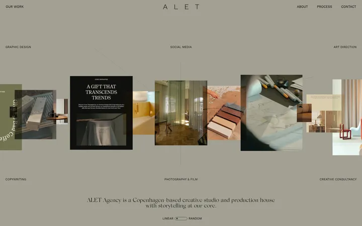
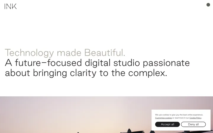
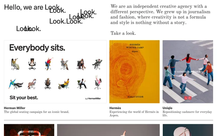
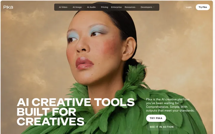
North star · Keep the aqua canvas continuous and let deep teal typography, fine rules, and expressive project artwork do the structural work.
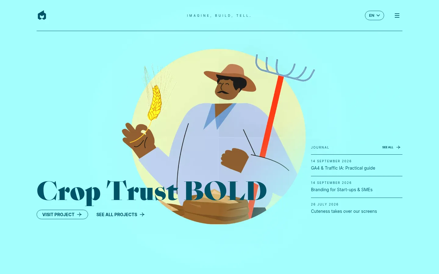
The page is built on a continuous aqua canvas (#a3fffe) that makes the identity unmistakable from the first viewport through the footer. Deep teal (#005368) carries the logo, navigation, headline, body copy, thin dividers, links, and outlined pill buttons, keeping contrast consistent without relying on filled CTA blocks. Sang Bleu gives the hero and section titles an editorial, high-contrast character; Inter handles navigation, metadata, and supporting copy. Oversized display typography overlaps the featured illustration, while small uppercase labels and letter-spaced captions punctuate the open layout. Project artwork supplies softer colors such as pale yellow and blue, but these read as content illustration rather than core brand colors. A large black video panel provides the page’s strongest tonal interruption. Generous blank space separates the hero, video, agency statement, services artwork, and footer, allowing each moment to feel deliberate rather than card-heavy.
配色
点色块复制色值。用途说明来自对页面的实测位置(背景、文字、描边、按钮)与截图判读。
品牌色
强调色
表层色
中性色
页面底色 · Electric Aqua表层 · Video Black主文字 · Deep Teal描边 · Deep Teal强调 · Deep Teal强调 2 · Muted Gold
文字
背景
对比度
WCAG
#005368 Deep Teal
#a3fffe Electric Aqua
7.51:1
AAA
#005368 Deep Teal
#000000 Video Black
2.44:1
不达标
#005368 Deep Teal
#a3fffe Electric Aqua
7.51:1
AAA
#005368 Deep Teal
#000000 Video Black
2.44:1
不达标
字体
字号阶梯:Custom(比例约 1.711,正文 14px)。示例用免费替代字体渲染,数值为实测。
Aa 设计
inter
网络字体 · 字重 400 / 700 / 600 · 占比 65%
免费替代:Inter
Navigation, body copy, labels, metadata, buttons, and supporting interface text.
Aa 设计
sang-bleu
网络字体 · 字重 400 / 900 / 700 · 占比 36%
免费替代:Bodoni Moda
Oversized project headline and editorial display or statement typography.
角色
示例
字号
字重
行高
字距
特大标题
Oversized editorial display lettering for standout titles.
EPIC agency
120px
900
1.2
0
一级标题
Featured project headline, prominent and tightly set.
EPIC agency
80px
900
1
0
二级标题
Large agency statements and section-level editorial copy.
EPIC agency
42px
400
1.65
0
三级标题
Supporting subsection headings in sans serif.
The quick brown fox 敏捷的狐狸
18px
400
1.7
0
正文
Agency descriptions and general explanatory text.
The quick brown fox 敏捷的狐狸
14px
400
1.56
0
辅助文字
Tiny uppercase metadata labels with generous tracking.
The quick brown fox 敏捷的狐狸
10px
400
3
0.5em
按钮
Compact text inside outlined pill actions.
The quick brown fox 敏捷的狐狸
14px
400
1.65
0
导航
Header and footer navigation links.
The quick brown fox 敏捷的狐狸
14px
400
1.65
0
链接
Inline and editorial links, occasionally highlighted in gold.
The quick brown fox 敏捷的狐狸
14px
400
1.65
0.036em
眉题
Small uppercase section labels above main content.
The quick brown fox 敏捷的狐狸
10px
400
3
0.5em
间距与布局
基准单位 1px · 密度:适中
80px版块间距
5px元素间距
20px卡片内边距
—内容最大宽度
2px
4px
5px
6px
7px
9px
10px
12px
14px
15px
18px
20px
32px
50px
80px
Use a centered, broad content frame with consistent side alignment and a thin header rule. The hero balances a large illustrated project and overlapping headline against a narrow journal list. Subsequent content shifts through full-width horizontal dividers, a broad video panel, and a centered agency statement. The page has comfortable density and extensive open space between blocks. Preserve the long vertical rhythm; avoid compressing the distinct hero, video, services, and footer moments into a dense grid.
圆角与层次
按钮 · 9999px
链接 · 50%
没有测到阴影:页面是扁平的,层次靠底色和描边区分。
The interface is predominantly flat, with no measured shadow system. Separate areas using thin deep-teal rules and ample breathing room instead of raised cards. The black video player is the clearest surface contrast; project art layers visually with the headline but does not create a general card treatment.
组件
下面的预览按实测的按钮、输入框、徽标、卡片样式重建(字体用替代字体)。
Header
Compact brand mark at left, spaced uppercase slogan centered, and outlined language pill plus menu icon at right; finish with a thin teal divider.
Featured project hero
Large Sang Bleu project title overlaps illustrative artwork; pair an outlined VISIT PROJECT pill and a text link beneath it.
Journal list
Narrow right-side feed with a small uppercase label, a see-all link, and three dated entries separated by teal rules.
Video panel
Broad black media surface with a centered circular play affordance and small playback controls.
Agency statement
Centered editorial paragraph in Sang Bleu, with selected phrases emphasized in heavier deep-teal lettering.
Services transition
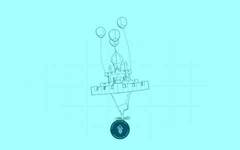
Sparse line-art illustration leads into a centered services label and large serif title, framed by horizontal rules.
Footer
Compact agency contact details, policy links, social icons, and a small outlined newsletter action on the aqua canvas.
Imagery · The featured project uses a colorful, flat illustration of a farmer framed by a soft circular backdrop; the artwork overlaps with the oversized title. Lower down, a restrained line-art services illustration appears against the same aqua canvas. A wide black video player forms a separate media moment. Keep imagery playful and graphic, with content-specific colors treated as illustration rather than new brand tokens.
Keep the aqua canvas continuous across major sections.
Use deep teal for text, rules, and outlined controls.
Reserve Sang Bleu-style serif typography for expressive headlines.
Set utility copy and navigation in clean Inter-like sans serif.
Use fine horizontal rules to divide content areas.
Leave generous open space around major visual moments.
✕ 不该做
Do not introduce a dark overall theme.
Do not turn outlined actions into large filled buttons.
Do not treat illustration colors as core brand palette colors.
Do not crowd the journal list or footer with extra decoration.
Do not add shadows or raised-card styling.
Do not replace the editorial display type with generic sans-serif headings.
给 AI 的提示词
想快速出一个同风格的新页面,把这段话连同 DESIGN.md 一起发给 AI。
Build a new agency page in EPIC’s visual language. Use Electric Aqua (#a3fffe) as the uninterrupted canvas and Deep Teal (#005368) for typography, fine dividers, navigation, links, and outlined pill actions. Keep the layout broad and editorial: a compact header, a visually dominant project or idea with expressive illustration, and a restrained secondary information column. Use Sang Bleu-style high-contrast serif display typography for headlines and Inter for navigation, metadata, and body copy. Add small uppercase, letter-spaced labels and preserve substantial whitespace between major blocks. A dark media panel may use Video Black (#000000); use Muted Gold (#bc994e) only as a restrained text accent. Keep surfaces flat, avoid shadows, and let artwork—not interface chrome—supply secondary colors.