North star · Keep the interface quiet and white so oversized type and expressive full-bleed project imagery can command attention.
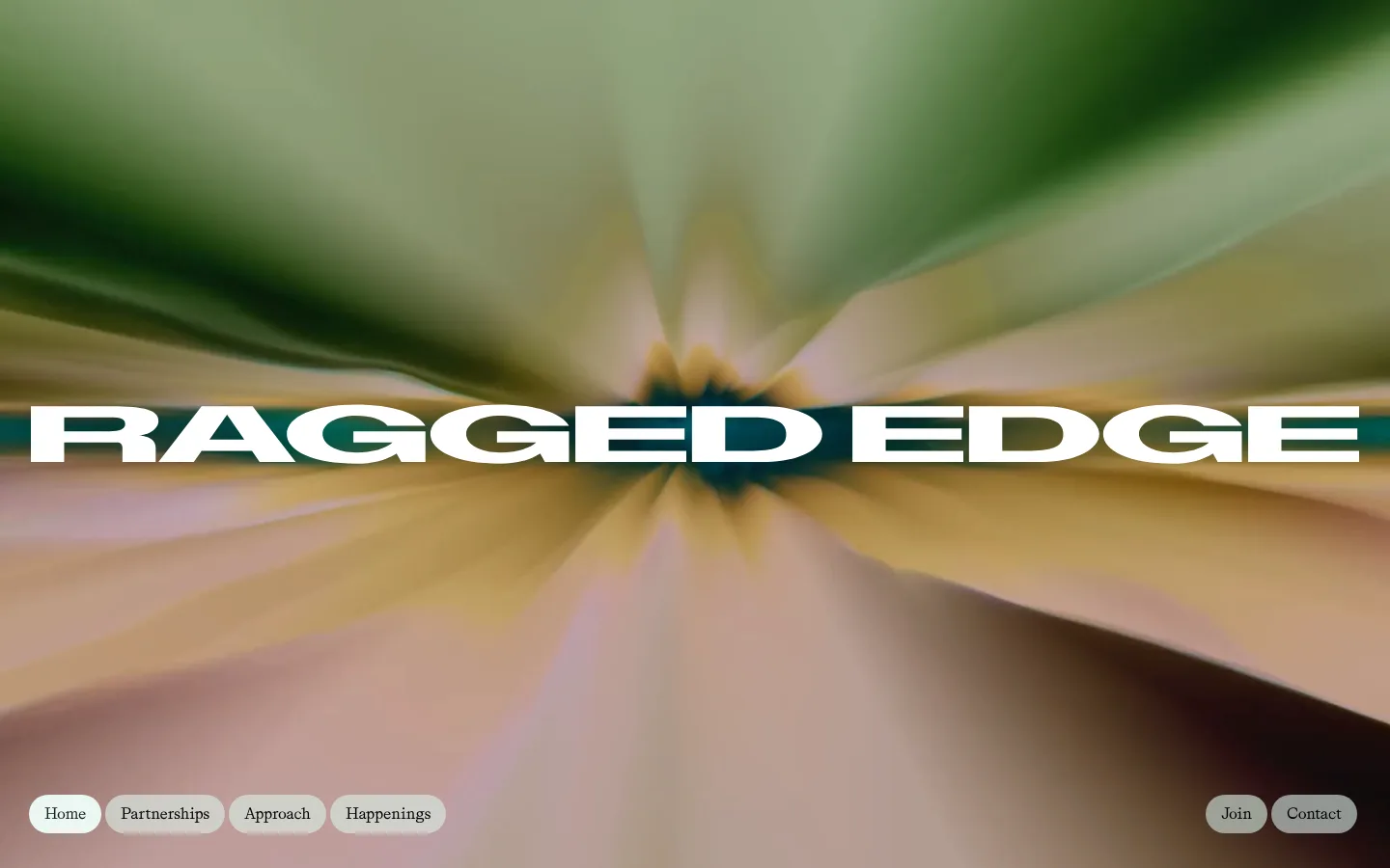
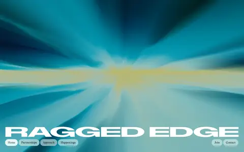
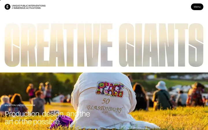
The page establishes its identity through contrast: a clean white canvas and deep charcoal text frame a dramatic, full-bleed video hero. The opening wordmark is oversized, white, and stretched across the moving image; small, pale pill-shaped navigation controls sit near the lower edge. Across the long portfolio, white space dominates, while fine gray rules quietly separate project rows. Typography combines the broad, assertive sans of ABCDiatypeExpanded-Bold with Grit-Regular, whose serif character brings an editorial counterpoint to navigation, case details, and headings. Project media supplies most of the page’s color, so warm, green, and other image tones should be treated as content rather than brand palette. Measured yellow, pink, and cyan accents belong to a gradient treatment, not the persistent canvas. The result is spacious and image-led, but the interface itself remains flat, direct, and carefully restrained.
Display, primary headings, and prominent body copy; broad, bold sans-serif voice.
Aa 设计
Grit-Regular
网络字体 · 字重 400 / 500 · 占比 38%
免费替代:Cormorant Garamond
Editorial headings, navigation, buttons, case-study links, and supporting text.
角色
示例
字号
字重
行高
字距
特大标题
Oversized hero or brand statement typography.
Ragged Edge
82px
400
1.1
-0.02em
一级标题
Primary section headline, including the agency introduction.
Ragged Edge
78px
400
1.15
-0.01em
二级标题
Editorial section and feature headings.
Ragged Edge
56px
400
1.2
0
三级标题
Project titles and prominent content-feed headlines.
Ragged Edge
40px
400
1.2
-0.01em
四级标题
Supporting editorial headings and secondary statements.
Ragged Edge
30px
500
1.5
0
正文
Prominent introductory and descriptive copy.
The quick brown fox 敏捷的狐狸
20px
400
1.2
0
辅助文字
Compact metadata, labels, and small supporting details.
The quick brown fox 敏捷的狐狸
10px
400
1.2
0
按钮
Pill navigation, calls to action, and form actions.
The quick brown fox 敏捷的狐狸
16px
400
1
0
间距与布局
基准单位 4px · 密度:紧凑
32px版块间距
12px元素间距
—卡片内边距
1376px内容最大宽度
4px
11px
12px
16px
24px
32px
34px
41px
64px
80px
180px
200px
Use a broad centered content area, with the measured page maximum width of 1376px. The opening hero is full-bleed and visually distinct; the rest of the page reads as a long, mostly single-column sequence of spacious white sections. Portfolio entries use two-column arrangements for media and case details, while the happenings area shifts to three columns. Align headings and copy to the start, and let thin horizontal rules define case-study rhythm. Overall density is compact within controls but generous between major content blocks.
圆角与层次
按钮 · 9999px
输入框 · 9999px
没有测到阴影:页面是扁平的,层次靠底色和描边区分。
The interface is predominantly flat: no measured shadows, raised cards, or layered panels define the page. Use white canvas, direct typography, and subtle #d1d2d2 hairlines to structure content. Reserve overlap for the hero wordmark over video and keep pill controls visually light, with dark fill used selectively for the Join action.
组件
下面的预览按实测的按钮、输入框、徽标、卡片样式重建(字体用替代字体)。
Hero wordmark
Set the white brand name large across full-bleed video; preserve strong contrast and let the footage provide changing color.
Pill navigation
Use Grit-Regular labels in rounded capsule controls along the hero’s lower edge, with light fills and opposing left/right groups.
Case-study row
Arrange project media and concise case details in a two-column layout; use Deep Ink text and occasional Quiet Silver top rules.
Content feed
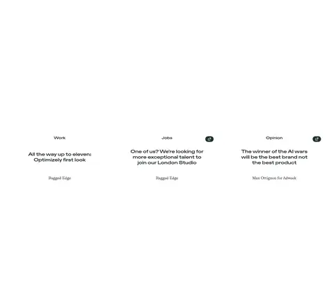
Present work, jobs, and opinion as a three-column editorial group with small category labels and linked headlines.
Newsletter form
Pair a concise signup heading with a rounded input and signup action; keep supporting privacy copy visually secondary.
Contact footer
Group business enquiry, address, phone, email, and social links in clear columns, followed by a compact navigation row.
Imagery · Use motion-led hero media as a full-bleed backdrop, with the wordmark layered prominently over it and navigation anchored low in the frame. Portfolio cases rely on large project imagery and video rather than decorative UI illustration; frame each project as editorial evidence, not a generic card. The vivid olive, green, tan, and other screenshot colors come from image content and should not be promoted into the interface palette.
Keep the primary canvas white and the interface low-noise.
Use Deep Ink for core text and primary dark actions.
Let the hero video fill the frame and carry the color.
Use the wide sans for high-impact display typography.
Pair editorial serif details with the broad sans.
Separate long portfolio content with subtle measured hairlines.
✕ 不该做
Do not turn project-image colors into permanent UI colors.
Do not add shadows or raised-card styling.
Do not make the hero feel like a conventional boxed banner.
Do not overuse the measured gradient accent colors.
Do not center all portfolio copy; keep the measured start alignment.
Do not replace spacious editorial pacing with dense dashboards.
给 AI 的提示词
想快速出一个同风格的新页面,把这段话连同 DESIGN.md 一起发给 AI。
Build a new agency page in Ragged Edge’s restrained, editorial style. Use Gallery White (#ffffff) as the dominant canvas and Deep Ink (#181f1f) for primary text and strong actions. Set oversized statements in a broad, assertive sans-serif; use an editorial serif for navigation, buttons, and supporting case details. Create a full-bleed motion-led hero with a prominent reversed wordmark and discreet pill navigation. Keep subsequent sections white and image-forward, with start-aligned text, broad project media, two-column case-study layouts, and subtle Quiet Silver (#d1d2d2) rules. Treat vivid image colors as content, not UI palette. Use Marquee Gold (#ffc240), Blush Signal (#ffc4f4), and Electric Mist (#96ebeb) only as restrained gradient accents. Avoid shadows, card chrome, and unnecessary decoration.