North star · Keep the product readable and calm on white, then use near-black feature bands to make vivid flight-interface imagery feel immersive.
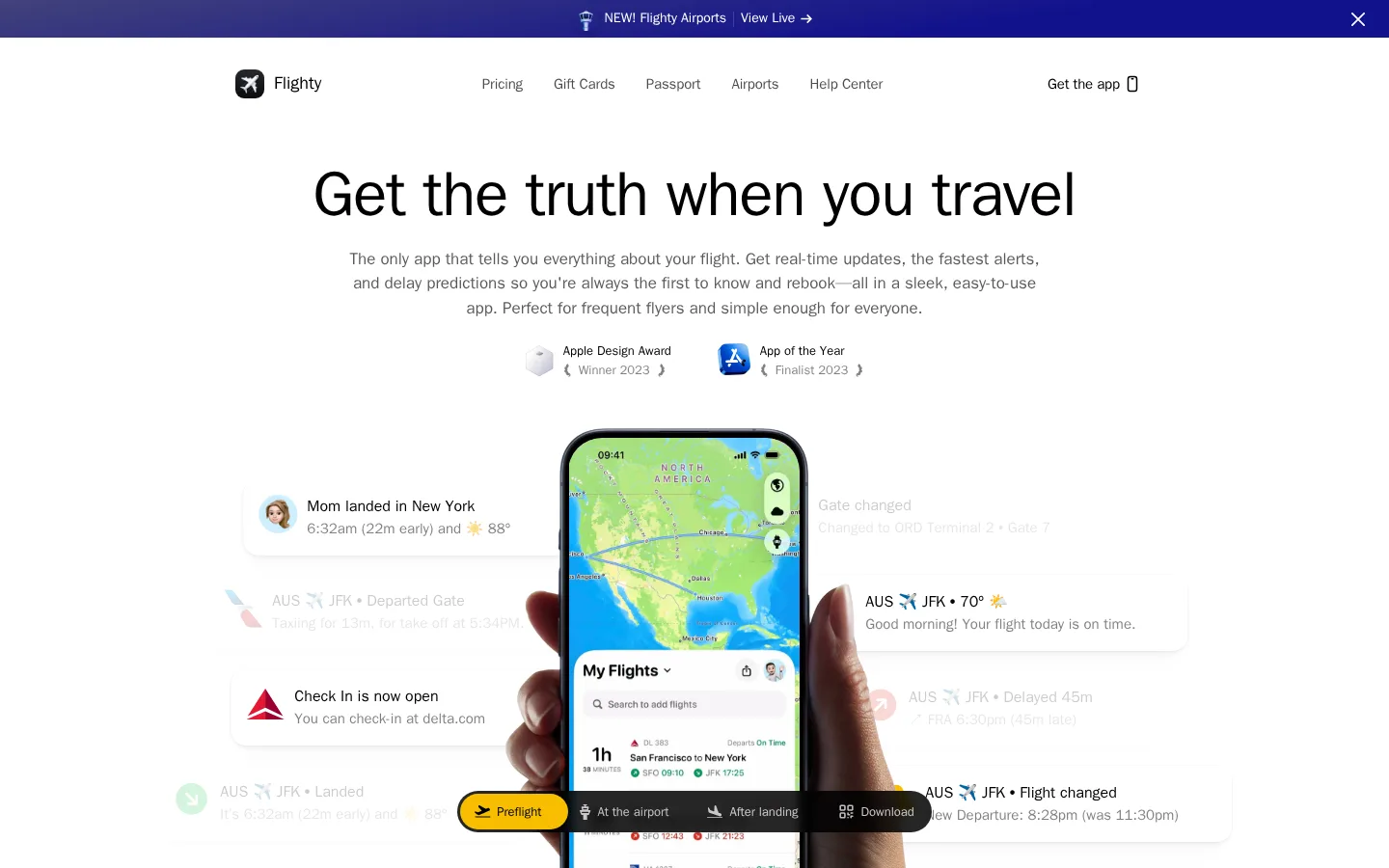
The page opens on a pure white canvas with black system-sans typography, muted supporting copy, and generous breathing room around a centered headline and phone-in-hand product image. A narrow indigo announcement strip is the only strong color at the top. As the page moves into product features, the white canvas gives way to near-black and deep purple surfaces; these dark bands make vivid app screens, airport imagery, and gradient-lit cards feel immersive. Later sections return to white for sharing, travel history, airport information, and reviews, creating a deliberate light-dark rhythm rather than a uniform backdrop. Typography is mostly system-ui, bold and tightly composed for large headings, with smaller gray paragraphs. Rounded cards, pill-shaped actions, and subtly layered product mockups soften the otherwise precise layout. Bright blue and yellow are reserved for selected controls and product-interface details; much of the other saturated color belongs to screenshots and illustrations.
Primary UI, navigation, headings, body copy, and links.
Aa 设计
EB Garamond
网络字体 · 字重 700 · 占比 4%
免费替代:Cormorant Garamond
Occasional display or editorial serif detail.
Aa 设计
SF Pro Text Regular
网络字体 · 字重 400 · 占比 3%
免费替代:Inter
Small product-interface text and embedded app-style details.
角色
示例
字号
字重
行高
字距
特大标题
Large centered hero headline establishing the page’s main promise.
Flighty
65px
700
1.2
-0.015em
一级标题
Primary section headline where a strong single-line title is needed.
Flighty
56px
700
1
-0.005em
二级标题
Major feature and content-section headings.
Flighty
48px
700
1.2
0
三级标题
Secondary feature titles and prominent card headings.
Flighty
44px
700
1.1
0
四级标题
Smaller feature or subsection headings.
Flighty
40px
700
1.2
0
正文
Main explanatory paragraphs below headlines.
The quick brown fox 敏捷的狐狸
16px
500
1.5
0
辅助文字
Awards, supporting labels, and compact secondary details.
The quick brown fox 敏捷的狐狸
15px
400
1.5
0
导航
Header links and announcement-strip text.
The quick brown fox 敏捷的狐狸
15px
500
2
-0.01em
链接
Inline actions and linked feature copy.
The quick brown fox 敏捷的狐狸
16px
500
1.5
0
间距与布局
基准单位 4px · 密度:紧凑
32px版块间距
10px元素间距
40px卡片内边距
952px内容最大宽度
4px
6px
8px
10px
12px
16px
20px
24px
32px
40px
64px
The measured content max width is 952px, centered within a much wider desktop canvas. The header and hero are centered, while later feature and editorial sections use aligned content blocks and paired cards. The page alternates full-width white and dark section bands, with a compact density inside feature cards but broad open space around major moments. Keep copy blocks narrow enough to scan, and let product imagery occupy the visual center without crowding the text.
圆角与层次
按钮 · 9999px
卡片 · 20px
图片 · 50%
导航 · 6px
lg · other
lg · card
lg · other
lg · nav
The white sections are mostly flat, relying on spacing and image composition rather than visible borders. Product cards use large rounded corners and restrained, subtle shadows; dark feature artwork gains depth from gradients, layered phone mockups, and edge vignettes. Use pill-shaped buttons and overlapping interface elements to establish hierarchy without adding heavy outlines.
组件
下面的预览按实测的按钮、输入框、徽标、卡片样式重建(字体用替代字体)。
Announcement strip
A slim full-width indigo gradient band above the white header, with centered new-feature messaging, a live-view link, and a close control.
Main navigation
White horizontal header with the Flighty mark at left, compact page links in the center, and a right-aligned app action.
Hero
Centered black headline, muted explanatory copy, award marks, and a large phone-in-hand product image against white.
Dark feature cards
Rounded, media-led cards on near-black sections; combine short copy with colorful interface screenshots and gradient treatments.
Pill action
Compact rounded CTA treatment; the measured set includes white and black text on white, and a yellow selected product control.
Editorial content sections
White-background sharing, passport, airport, and testimonial blocks with restrained text and prominent app or travel imagery.
Imagery · Use polished app screenshots and product mockups as the main visual evidence: a phone held in hand in the hero, then flight timelines, maps, airport views, and travel-history screens. Mix these with travel and airport photographs or atmospheric artwork in feature cards. Keep imagery crisp and integrated into rounded panels; saturated map colors and purple-orange gradients belong chiefly to media, not the overall page canvas.
Keep the primary canvas pure white and reserve near-black for feature bands.
Center the opening headline and phone imagery in the hero.
Use system-style sans-serif typography with bold, clean headings.
Let muted gray copy remain clearly subordinate to black titles.
Use bright blue and yellow as small, purposeful interface accents.
Alternate white and dark sections to create a deliberate page rhythm.
✕ 不该做
Do not make every section dark or gradient-filled.
Do not use saturated illustration colors as the general page palette.
Do not crowd the hero with extra controls or dense copy.
Do not add prominent borders to otherwise flat white content blocks.
Do not replace product screenshots with generic decorative imagery.
Do not use heavy shadows that compete with the app imagery.
给 AI 的提示词
想快速出一个同风格的新页面,把这段话连同 DESIGN.md 一起发给 AI。
Build a travel-product page in Flighty’s visual style. Use Gallery White (#ffffff) for the main canvas, Runway Ink (#000000) for headlines, and restrained gray copy; keep the opening hero spacious, centered, and led by a real product-screen composition. Add a slim indigo announcement band, then alternate white editorial sections with a focused Midnight Plum (#05010d) feature area. Use system-ui-like sans typography, bold display headings, compact navigation, rounded cards, and pill-shaped controls. Reserve Flight Blue (#007bff) and Taxiway Gold (#f7be00) for small functional highlights. Let maps, airport imagery, and app screenshots carry saturated color; do not spread their palette across backgrounds. Keep depth subtle through gradients, soft layering, and product imagery.