North star · Let oversized, tightly composed lettering and uninterrupted color fields define the page, with commerce details kept secondary and graphic.
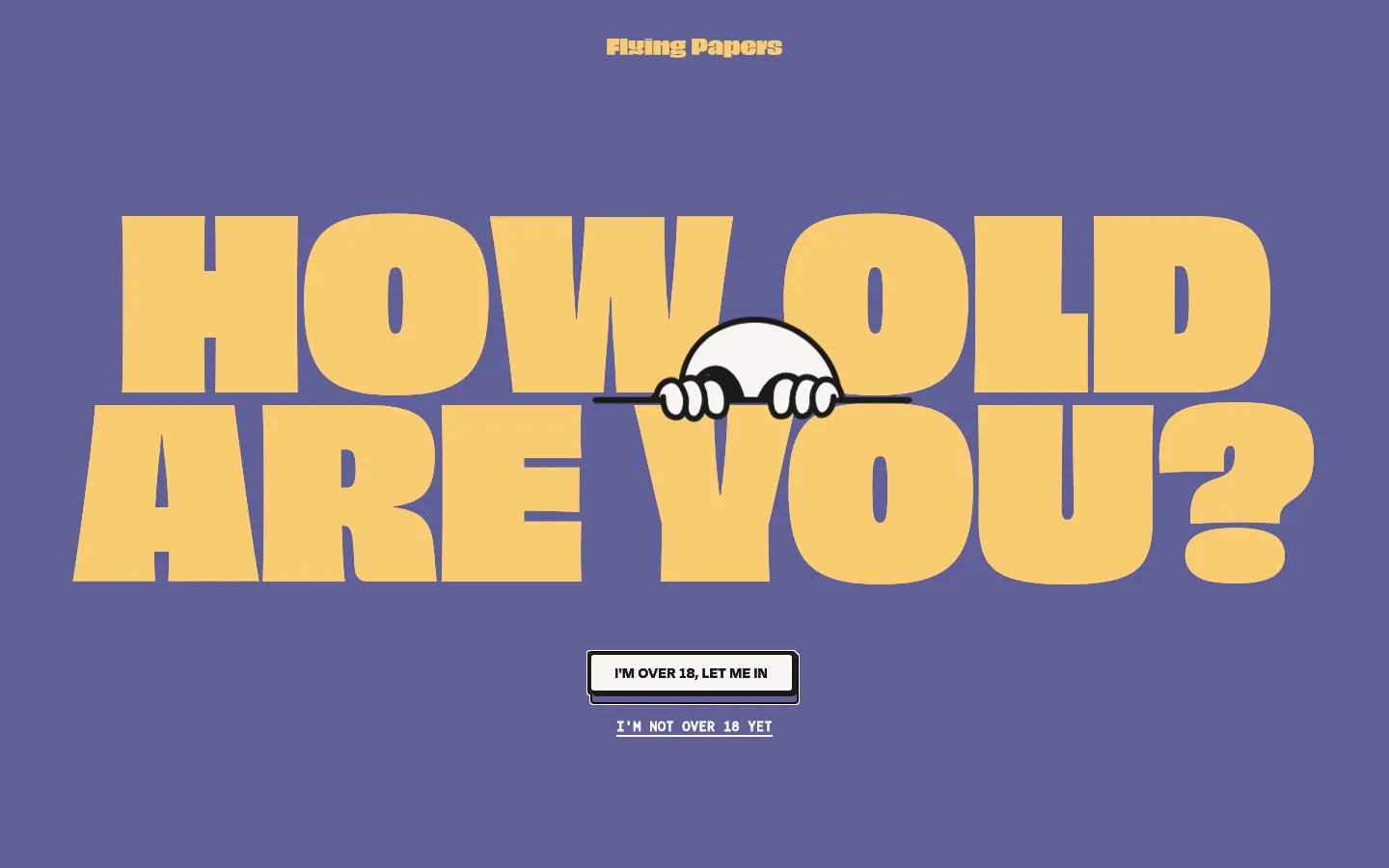
The identity is driven by expansive color fields and oversized display type rather than conventional storefront chrome. The first viewport uses a muted indigo-violet canvas, warm yellow headline lettering, and a tiny centered wordmark; age-check controls sit beneath the headline. Across the page, lavender-blue and magenta fields are paired with warm yellow, pale pink, and off-white accents. ObviouslyVariable supplies heavy, compressed-feeling uppercase display statements, while Bergen Mono gives navigation and small labels a compact, poster-like cadence. Degular adds a bold supporting text voice. Layouts are centered and spacious, with large stretches of uninterrupted background between content moments; category links and product cards provide the more functional rhythm. Imagery is sparse in the measured sections and should remain graphic and illustrative, not polished lifestyle photography. Borders are dark and conspicuous where cards appear, while most of the page stays flat and unshadowed.
Oversized uppercase hero and section display statements.
Flying Papers
244px
900
0.8
0
一级标题
Primary hero statement, set at monumental scale.
Flying Papers
241px
900
0.9
0
二级标题
Large uppercase section headline.
Flying Papers
149px
900
0.8
0
三级标题
Secondary oversized product or editorial headline.
Flying Papers
145px
900
0.8
0
四级标题
Smaller but still emphatic uppercase headline.
Flying Papers
133px
800
0.8
0
正文
Bold uppercase supporting copy and short descriptions.
The quick brown fox 敏捷的狐狸
16px
700
1
0.05em
辅助文字
Compact uppercase product and content labels.
The quick brown fox 敏捷的狐狸
14px
600
0.8
0
导航
Small uppercase navigation labels.
The quick brown fox 敏捷的狐狸
14px
400
0.8
0
眉题
Short bold uppercase introductory labels.
The quick brown fox 敏捷的狐狸
16px
700
1
0.05em
代码
Monospaced utility labels where needed.
const style = 1;
14px
600
0.8
0
间距与布局
基准单位 1px · 密度:适中
80px版块间距
20px元素间距
7px卡片内边距
1120px内容最大宽度
2px
7px
9px
11px
14px
15px
17px
20px
25px
27px
29px
30px
37px
40px
60px
70px
The page is organized as a long sequence of centered, full-width color fields with generous vertical breathing room. Measured content uses a four-column pattern in category and product areas, with other sections adapting to three columns. The measured maximum content width is 1120px. Headlines align centrally and act as the principal anchors; product and category content sits beneath them. Keep the density comfortable and avoid adding persistent conventional storefront chrome that competes with the broad color fields.
圆角与层次
卡片 · 6px
没有测到阴影:页面是扁平的,层次靠底色和描边区分。
The visual system is mostly flat: large color surfaces meet directly without gradients or prominent shadows. Where cards appear, use a conspicuous dark outline and a subtle measured corner treatment rather than soft floating elevation. The age-check control is a compact, high-contrast outlined element that reads as a deliberate graphic object.
组件
下面的预览按实测的按钮、输入框、徽标、卡片样式重建(字体用替代字体)。
Age-check hero
Centered, oversized uppercase greeting or age prompt over a broad color field, with a compact primary confirmation control and a secondary text link.
Centered wordmark
Small yellow Flying Papers mark placed centrally above the main hero statement.
Category links
A centered section heading followed by four concise shopping-category links in a four-column arrangement.
Outlined product cards
Product or category cards use strong #1a1a1a outlines, a measured 6px card radius, and colored surfaces including #8584bd.
Oversized editorial statement
Large uppercase display copy is centered and treated as a visual event against an uninterrupted section background.
Promotion tiles
Three centered promotional blocks for discount, affiliate, and holiday content, each with a short learn-more action.
Imagery · The first viewport is primarily typography and a small monochrome character illustration peeking over the hero lettering. Measured product areas contain only a few images, and the full-page screenshots show long, largely uninterrupted color surfaces rather than dense photography. Keep any image treatment graphic, playful, and high-contrast; use product or character imagery as a focused accent instead of filling every section with lifestyle photography.
Use broad, uninterrupted color fields as the main composition.
Set major statements in huge, heavy uppercase display type.
Center hero and section headlines.
Use Warm Marigold #f9cc73 for key headlines and links.
Keep navigation and utility labels small and monospaced.
Use dark outlines to give product cards a poster-like edge.
✕ 不该做
Do not introduce unmeasured palette colors.
Do not fill every section with lifestyle photography.
Do not shrink display headlines into ordinary page headings.
Do not add gradients or soft shadows as a default treatment.
Do not crowd the page with dense navigation or interface chrome.
Do not treat illustration-only colors as primary brand surfaces.
给 AI 的提示词
想快速出一个同风格的新页面,把这段话连同 DESIGN.md 一起发给 AI。
Build a new Flying Papers page as a graphic, playful storefront rather than a conventional catalog. Use Paper Magenta #ac4f98 and Indigo Slate #61609a for broad color fields, with Warm Marigold #f9cc73 as the primary headline and link accent; reserve Paper Cream #f9f5f2 and Soft Black #1a1a1a for readable contrast. Compose centered, oversized uppercase statements in a heavy display face, then keep navigation, captions, and shopping labels small and monospaced. Use spacious full-width sections, simple three- or four-column content groupings, and sparse illustrative imagery. Product cards may use colored surfaces and strong dark outlines, but keep most sections flat and unshadowed. Preserve the brand’s poster-like scale and playful age-check sensibility without copying the existing page’s exact content.