North star · Keep the page warm and spacious, using deep teal for confident structure and violet only to signal emphasis or action.
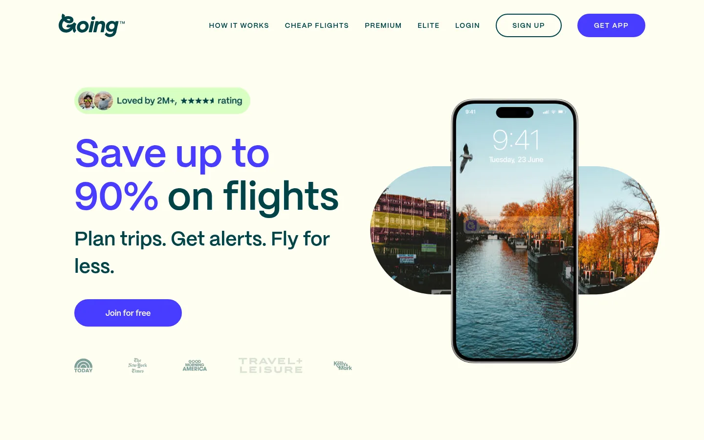
The page builds its identity from a warm, nearly-white canvas (#fffef0), punctuated by bright green feature sections (#d7ffc2) and a dark teal inverse treatment (#004449) for the app panel and footer. Violet (#483cff) is a concentrated action and headline accent, not a background wash; reserve it for key buttons and selected words. PP Mori gives the page a clean, rounded sans-serif voice: large, bold display headlines sit beside more restrained body copy, while navigation and small labels use uppercase styling. The hero uses a generous two-part composition, pairing headline and membership prompt with a phone mock-up over travel photography. Below, the page alternates a green three-step feature band, an ivory testimonial carousel, and a dark app promotion. Rounded pill CTAs and soft-corner cards keep the experience friendly. Spacing is comfortable, with clear separation between sections and imagery given room to breathe.
配色
点色块复制色值。用途说明来自对页面的实测位置(背景、文字、描边、按钮)与截图判读。
品牌色
强调色
表层色
中性色
页面底色 · Gallery White表层 · Warm Ivory表层 2 · Fresh Lime表层 3 · Deep Teal主文字 · Deep Teal次要文字 · Warm Ivory描边 · Signal Violet强调 · Signal Violet
Site-wide type for headlines, navigation, body copy, CTAs, and small labels.
角色
示例
字号
字重
行高
字距
特大标题
Oversized hero headline and primary promotional statement.
Going
80px
600
1.1
0
一级标题
Main hero heading and prominent top-level page title.
Going
48px
475
1.17
0
二级标题
Feature, testimonial, and app-promotion section headings.
Going
40px
600
1.4
0
三级标题
Feature-step headings and smaller card titles.
Going
28px
600
1.14
0
四级标题
Supporting subsection headings and compact promotional titles.
The quick brown fox 敏捷的狐狸
24px
600
1.33
0
正文
Feature explanations, testimonial text, and supporting descriptions.
The quick brown fox 敏捷的狐狸
16px
475
1.5
0.02em
辅助文字
Compact labels and metadata, styled in uppercase.
The quick brown fox 敏捷的狐狸
14px
600
1.14
0.1em
导航
Uppercase main navigation links and compact utility navigation.
The quick brown fox 敏捷的狐狸
14px
600
1.14
0.1em
眉题
Small uppercase pre-headings and section labels.
The quick brown fox 敏捷的狐狸
14px
600
1.14
0.1em
间距与布局
基准单位 8px · 密度:适中
32px版块间距
16px元素间距
—卡片内边距
1200px内容最大宽度
8px
16px
24px
32px
40px
48px
60px
64px
80px
104px
Use a centered content frame with a measured maximum width of 1200px and a comfortable density. The hero aligns its headline and CTA to the left, balanced by a phone-and-photo composition on the right. Follow with a centered feature heading above three columns, then a horizontal testimonial-card carousel and a two-column app promotion. Maintain clear section bands and generous whitespace; the footer switches to a structured multi-column link layout.
圆角与层次
按钮 · 9999px
卡片 · 24px
导航 · 9999px
sm · card
Most surfaces are flat, with color bands and dark inverse panels providing structure instead of heavy shadows. Cards have soft rounded corners and measured card styling includes a subtle shadow. Buttons are pill-shaped and distinguished with filled or outlined borders; phone mock-ups and layered photography provide the main depth.
组件
下面的预览按实测的按钮、输入框、徽标、卡片样式重建(字体用替代字体)。
Pill CTAs
Use fully rounded buttons with horizontal padding. Primary app actions use #483cff with #fffef0 text; free membership actions use #d7ffc2 with #004449 text.
Outlined signup
A pill-shaped signup control uses a #004449 outline and matching text on the warm light canvas.
Hero phone composition
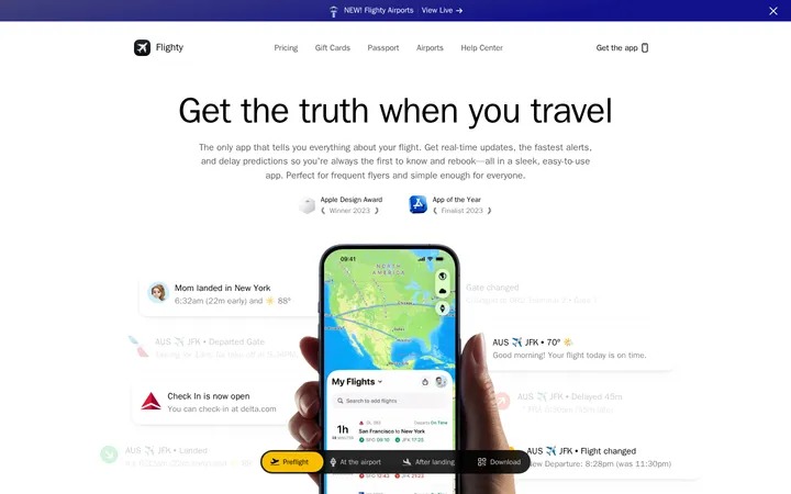
Pair a large, left-aligned message with a prominent phone mock-up layered over a wide destination image.
Three-step feature cards
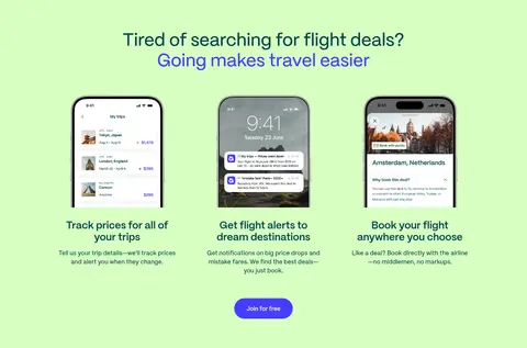
Place three concise travel workflow steps in a centered row over a full-width #d7ffc2 section band.
Testimonial carousel
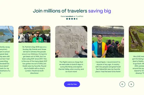
Show rounded lime member-story cards in a horizontal carousel, with compact navigation controls and a centered signup action.
Inverse app promotion
Combine travel photography and phone imagery with a #004449 panel, light text, selective green emphasis, and a pale CTA.
Multi-column footer
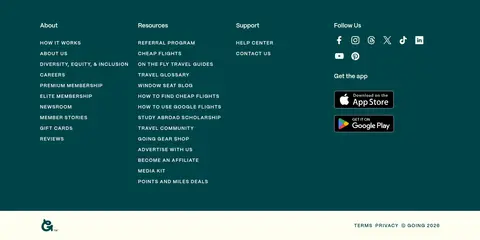
Use a dark teal footer with grouped link lists, social icons, app badges, and a narrow light legal strip.
Imagery · Use vivid travel photography, destination scenes, and realistic smartphone UI mock-ups as the primary visual storytelling. Frame phone screens prominently, sometimes layered over wide landscape crops or rounded photo shapes. Feature and testimonial sections use compact image-led cards; keep images bright and natural rather than applying heavy decorative filters. Small logos and publication marks remain secondary details.
Use Warm Ivory (#fffef0) as the main content backdrop.
Reserve Signal Violet (#483cff) for primary actions and selective emphasis.
Use Deep Teal (#004449) for navigation, headings, and inverse surfaces.
Break up the page with Fresh Lime (#d7ffc2) feature surfaces.
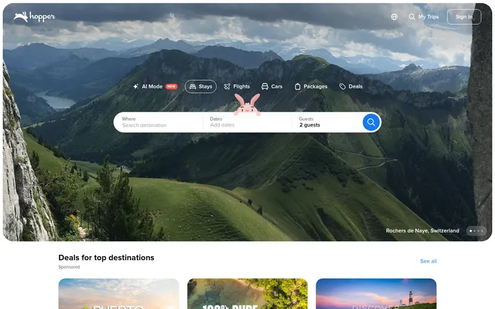
Pair travel photography with recognizable phone UI mock-ups.
Keep buttons and testimonial cards visibly rounded.
Leave generous space around major headings and imagery.
✕ 不该做
Do not turn violet into a dominant page background.
Do not replace the warm light canvas with a cold gray system.
Do not crowd the hero or feature sections with dense text.
Do not make every section a card or add heavy shadows.
Do not use generic abstract illustrations in place of travel imagery.
Do not flatten all headings into one uniform size and weight.
给 AI 的提示词
想快速出一个同风格的新页面,把这段话连同 DESIGN.md 一起发给 AI。
Build a new page in Going’s friendly travel-deal visual style. Use Warm Ivory (#fffef0) as the primary canvas, Deep Teal (#004449) for structural text and inverse panels, Fresh Lime (#d7ffc2) for feature bands and soft CTA fills, and Signal Violet (#483cff) sparingly for primary actions and emphasized words. Set type in PP Mori or a close sans-serif substitute, with prominent confident headlines, readable body copy, and tracked uppercase navigation labels. Use a centered content frame, comfortable section spacing, rounded pill buttons, and soft-corner cards. Pair copy with bright destination photography and realistic phone UI mock-ups. Alternate open light sections with green feature areas and occasional dark teal promotions; keep card shadows subtle and avoid gradients or crowded layouts.