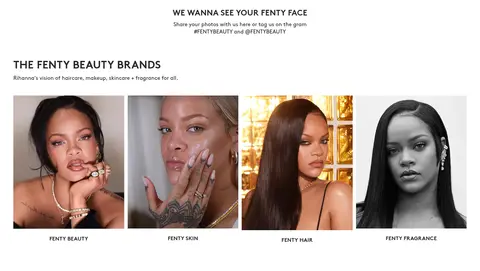
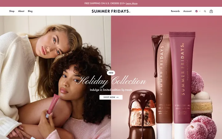
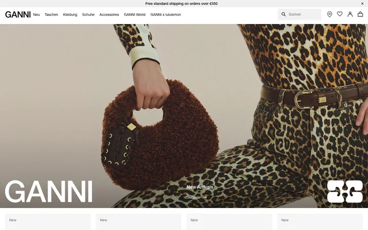
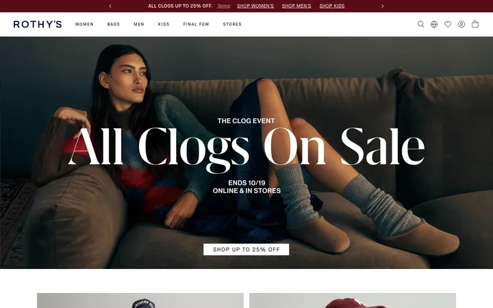
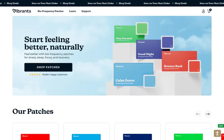
North star · Keep the shopping interface quiet and compact so vivid campaign imagery and beauty products carry the visual impact.
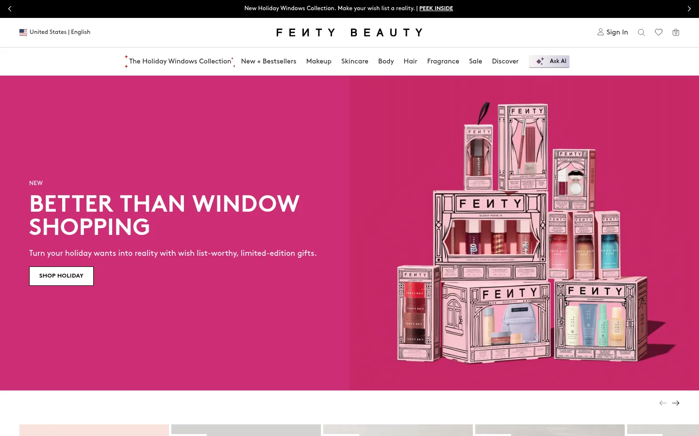
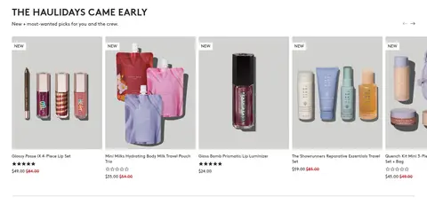
The page uses white as its primary canvas, letting product photography and campaign artwork supply the strongest color. Black and deep charcoal anchor the announcement strip, footer, headings, and purchase controls; the saturated pink hero is a campaign moment rather than a replacement for the neutral interface. Brown is used throughout, with heavy, large headings set against compact body copy and small uppercase button labels. A narrow announcement and layered navigation lead into a two-column hero, then into dense horizontal product carousels, gift-category imagery, and full-width campaign panels. The page alternates between open white space and image-heavy bands, while card edges stay visually quiet. Product images are presented in pale neutral fields; gift imagery adds vivid pink and varied beauty packaging. The result is a high-contrast retail system that makes merchandise easy to scan without diluting the personality of each campaign.
Site-wide display, navigation, product information, buttons, captions, and promotional copy.
角色
示例
字号
字重
行高
字距
一级标题
Large, heavy campaign or page headline.
Fenty Beauty
48px
900
1
0.01em
二级标题
Section headline introducing campaign and shopping modules.
Fenty Beauty
32px
700
1
0.01em
三级标题
Product names and smaller content headings.
The quick brown fox 敏捷的狐狸
24px
700
1
0.01em
正文
Descriptions, promotional copy, and standard product information.
The quick brown fox 敏捷的狐狸
14px
400
1.29
0
辅助文字
Compact secondary labels and supporting details.
The quick brown fox 敏捷的狐狸
12px
300
1.33
0
按钮
Uppercase shopping and conversion actions.
The quick brown fox 敏捷的狐狸
12px
700
1.33
0.025em
导航
Header navigation and primary menu labels.
The quick brown fox 敏捷的狐狸
14px
400
1.29
0
链接
Small utility, product, and secondary action links.
The quick brown fox 敏捷的狐狸
12px
400
1.33
0
眉题
Short uppercase campaign and section labels.
The quick brown fox 敏捷的狐狸
12px
700
1
0.05em
间距与布局
基准单位 2px · 密度:紧凑
40px版块间距
10px元素间距
—卡片内边距
1360px内容最大宽度
4px
5px
8px
10px
15px
20px
30px
40px
60px
The measured content reaches a 1360px maximum width, with compact spacing and a 40px section gap. The desktop header is layered into announcement, utility/brand, and category-navigation rows. A two-column hero leads into wide, multi-column product carousels and image-led gift modules. Most sections align to the left; campaign media can run full bleed. Preserve broad white bands between dense merchandise rows and let imagery span the available width.
圆角与层次
按钮 · 50%
图片 · 2px
没有测到阴影:页面是扁平的,层次靠底色和描边区分。
The interface is mostly flat: measured shadows are absent, cards have square corners, and product imagery supplies depth. Use thin, restrained separators between white navigation and content areas. Dark overlays and text panels belong to selected campaign tiles, not to a system of floating cards.
组件
下面的预览按实测的按钮、输入框、徽标、卡片样式重建(字体用替代字体)。
Layered storefront header
A black promotional announcement sits above white utility, centered wordmark, and category-navigation rows; small utility icons remain secondary.
Campaign hero
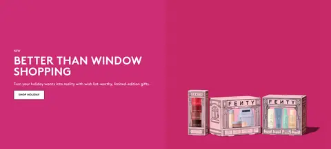
Two-column promotional panel pairs a large headline, short description, and contrasting SHOP HOLIDAY button with product-led campaign media.
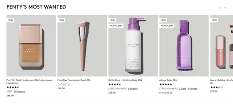
Product carousel
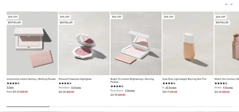
Dense horizontal product cards show pale imagery, names, ratings, size or shade details, sale pricing, and quick-shop or add-to-bag actions.
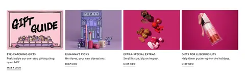
Gift category tiles
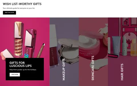
Image-led gift categories use bold photography, occasional dark text overlays, and compact SHOP NOW links.
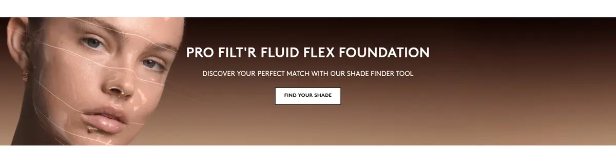
Full-width campaign banner
Wide photography or video supports a short uppercase message and a focused action such as FIND YOUR SHADE.
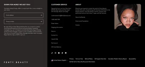
Newsletter and footer
A dark footer combines email and phone inputs with customer-service links, brand information, social links, and a campaign portrait.
Imagery · Use polished beauty product photography, campaign portraits, and packaging imagery. Product thumbnails sit against pale, low-detail backgrounds, while campaign assets use saturated pink, warm skin tones, and dramatic contrast. Include wide photographic or video banners for major launches and gift promotions. Keep product framing clean and legible, with packaging and shade details visible; treat the promotional artwork as image-led rather than forcing its colors into interface controls.
Keep the core shopping canvas white and product focused.
Use Beauty Charcoal #2d2929 for primary interface text.
Reserve Fenty Black #000000 for strong controls and dark footer regions.
Let saturated pink live primarily in campaign artwork.
Use Brown-style typography with bold headings and compact copy.
Keep product cards flat, square-edged, and information rich.
Separate dense shopping rows with clear white section bands.
✕ 不该做
Do not apply campaign pink as a universal interface background.
Do not add heavy shadows to product cards.
Do not round buttons into pills; measured button corners are square.
Do not let secondary copy compete with product names or campaign headlines.
Do not crowd the header into a single navigation row.
Do not turn illustrative or photographic colors into assumed brand tokens.
给 AI 的提示词
想快速出一个同风格的新页面,把这段话连同 DESIGN.md 一起发给 AI。
Build a new Fenty Beauty-style commerce page with a clean white canvas and a layered storefront header. Use Beauty Charcoal #2d2929 for navigation and product text, Fenty Black #000000 for high-contrast actions and dark footer areas, and Quiet Silver #d8d8d8 for restrained dividers. Keep Fenty Fuchsia #cc2d75 as a selective campaign accent, not a global UI fill. Set typography in Brown or a close sans-serif substitute, with bold compact headlines, readable body copy, and uppercase action labels. Combine a large editorial campaign area with dense horizontal product carousels and image-led category tiles. Favor crisp product photography, flat square-edged cards, and spacious white section bands. Keep purchase details and actions close to each product, and avoid decorative shadows or unnecessary interface ornament.