North star · Let the artwork and book covers carry the color; keep the surrounding typography, surfaces, and grid quiet and precise.
The page uses a restrained palette of black, white, pale gray, and muted gold, while the opening feature introduces a blue-gray field that belongs to the featured artwork rather than the core brand system. Bodoni’s high-contrast serif gives headings, descriptions, and much of the navigation a literary, finely crafted voice; Arial is reserved for uppercase, bold action links. The structure moves between full-width image-led stories, light-gray product collections, and white editorial panels. Product covers sit centered in evenly divided grids, while paired image-and-copy sections balance imagery with generous breathing room. The large opening feature gives a book cover and its illustrated backdrop room to dominate. Hairline black dividers define product cells, but the design avoids decorative shadows and rounded UI. Gold is used sparingly for selected headings and details, keeping the overall impression monochrome and gallery-like.
Primary editorial face for headings, body copy, captions, navigation, and button labels.
Aa 设计
Arial
系统字体 · 字重 400 / 700 · 占比 12%
免费替代:Arial
Bold uppercase action and discovery links.
Aa 设计
BodoniSvntytwoITCStd-BookIt
网络字体 · 字重 400 · 占比 2%
免费替代:Bodoni Moda
Small italic editorial accents and supporting text.
角色
示例
字号
字重
行高
字距
一级标题
Large serif title for the featured book or primary editorial story.
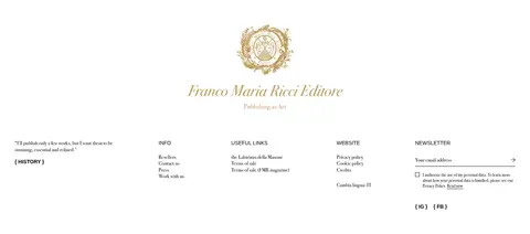
Franco Maria Ricci Editore
42px
400
1.25
0
二级标题
Serif titles for section introductions and editorial panels.
The quick brown fox 敏捷的狐狸
22px
400
1.25
0
正文
Serif descriptions accompanying books and brand stories.
The quick brown fox 敏捷的狐狸
18px
400
1.25
0
辅助文字
Small serif supporting copy and product details.
The quick brown fox 敏捷的狐狸
16px
400
1.25
0
按钮
Serif labels on understated text-only controls.
The quick brown fox 敏捷的狐狸
14px
400
1.25
0
导航
Serif navigation and utility labels.
The quick brown fox 敏捷的狐狸
14px
400
1.25
0
链接
Bold uppercase Arial for order and discovery actions.
The quick brown fox 敏捷的狐狸
14px
700
1.25
0
间距与布局
基准单位 8px · 密度:紧凑
40px版块间距
8px元素间距
200px卡片内边距
1360px内容最大宽度
8px
16px
20px
32px
40px
48px
64px
80px
The page uses full-width horizontal bands, with a generous measured maximum content width of 1360px. The hero pairs a left text panel with a dominant book image; later sections alternate full-bleed visual stories, centered headings, and three-column product displays. Selection grids use evenly divided cells with fine black rules. Editorial split panels keep text and imagery balanced rather than crowded. The overall density is compact in product areas but spacious within story panels, with section gaps and element spacing drawn from the measured 8px-based scale.
圆角与层次
没有测到阴影:页面是扁平的,层次靠底色和描边区分。
The interface is predominantly flat, with no measured shadows or decorative gradients. Thin black rules separate product-grid cells, and changes in background tone define section boundaries. Layering comes from the imagery itself: the featured book appears against its illustrated scene, while cover photography supplies depth without adding card-like UI effects.
组件
下面的预览按实测的按钮、输入框、徽标、卡片样式重建(字体用替代字体)。
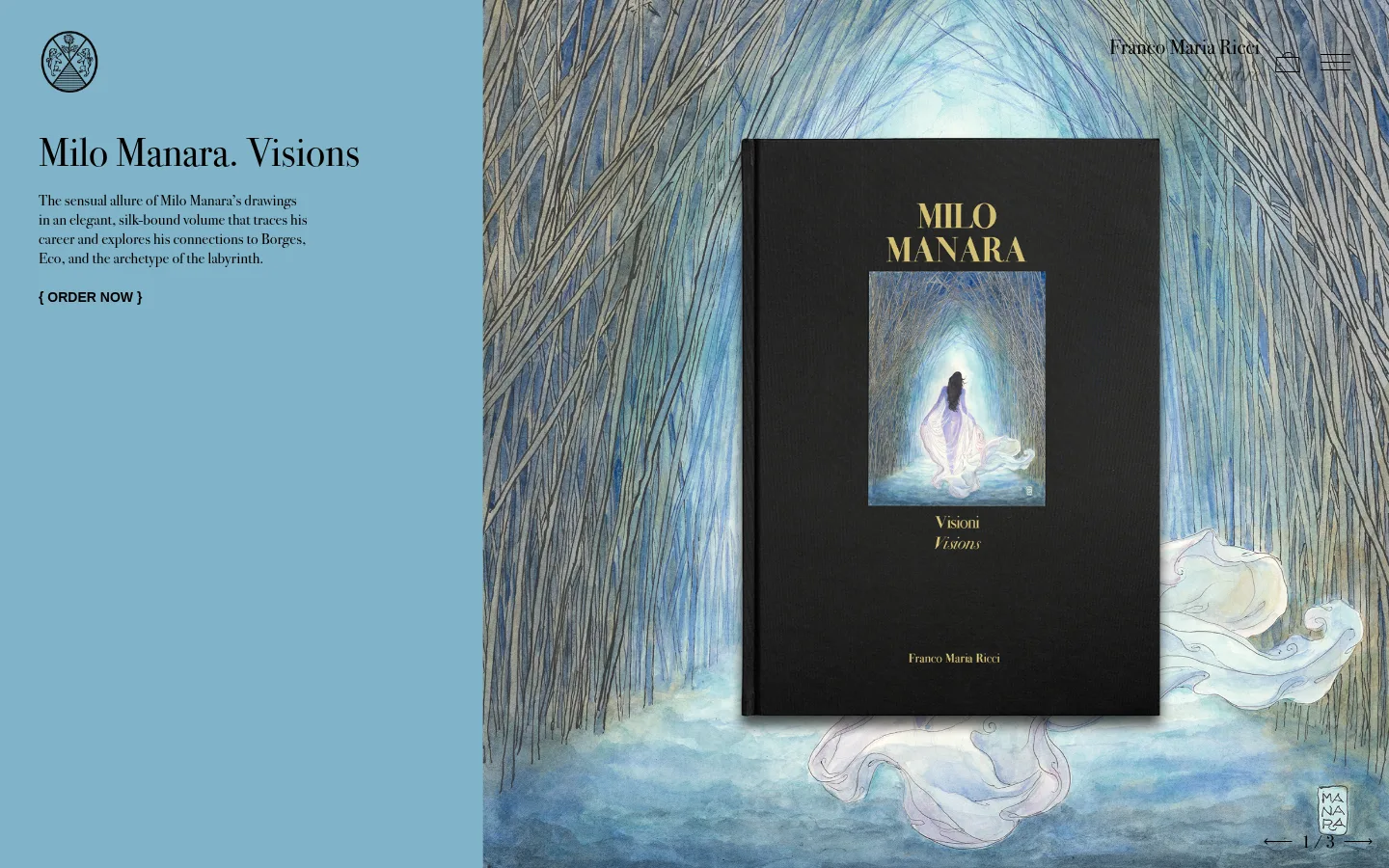
Featured book hero
Split composition with a text panel, serif title and copy, bold uppercase order link, and a large illustrated book-cover scene.
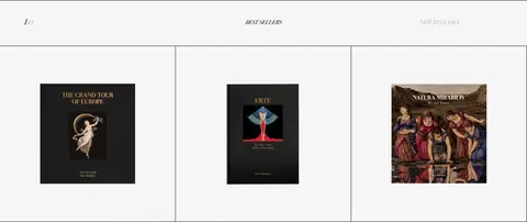
Release selector
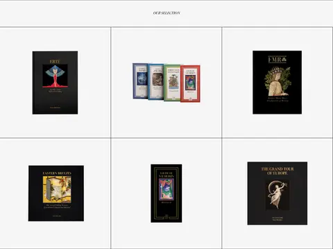
Centered release-category labels sit above a pale-gray product band, introducing a small selection of featured titles.
Product grid
Three-column book-cover gallery on #f6f6f6, separated by fine black hairlines and framed with minimal extra UI.
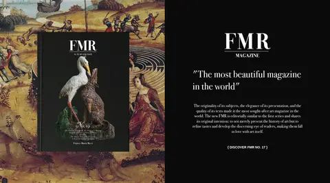
Magazine feature
Book imagery pairs with a near-black text panel, white serif copy, and a compact uppercase discovery link.
Editorial story split
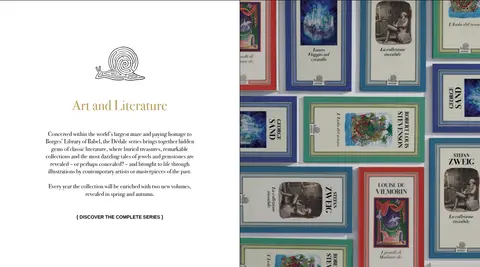
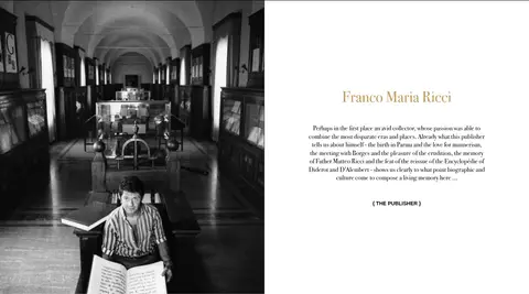
A white text panel with centered serif copy and a single strong image presents the literature series or publisher history.
Newsletter and footer
A spacious white footer combines publisher identity, compact link columns, language controls, and a simple email field.
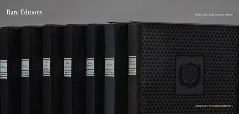
Imagery · Large, carefully composed photographs and illustrations show book covers, artwork, archival collections, and the publisher’s history. The hero pairs a prominent physical book cover with a blue-toned illustrated scene; these hues are part of the featured artwork, not a general brand palette. Product covers are centered against quiet light backgrounds, while editorial stories use paired image-and-text panels. A monochrome archival portrait and a dark rare-editions image add tonal variety.
Use Bodoni-style serif typography as the dominant voice.
Reserve bold uppercase Arial for short action links.
Keep product covers centered in quiet, divided grids.
Alternate white and pale-gray bands to organize collections.
Let featured artwork supply image-specific color.
Use Antique Gold sparingly for editorial emphasis.
✕ 不该做
Do not add rounded cards or pill-shaped controls.
Do not apply the hero artwork’s blue tones across the whole interface.
Do not add drop shadows or gradients to flat sections.
Do not replace thin grid rules with heavy borders.
Do not make every heading bold or uppercase.
Do not crowd book imagery with extra interface decoration.
给 AI 的提示词
想快速出一个同风格的新页面,把这段话连同 DESIGN.md 一起发给 AI。
Build a new art-book publisher page with the restrained editorial character of Franco Maria Ricci. Use Printer’s Ink (#000000) for primary text and hairlines, Gallery White (#ffffff) for the main canvas, and Paper Gray (#f6f6f6) for collection bands. Reserve Antique Gold (#bc9c5c) for sparse editorial emphasis; treat Silver Field (#b2b2b2) as a contextual feature surface, not a universal brand color. Set most copy in a Bodoni-style serif, with bold uppercase sans-serif only for short action links. Arrange content as full-width image-led stories, calm split panels, and centered product grids with thin dividers. Keep surfaces flat and square, omit shadows, and let the book covers and artwork provide richness. Preserve generous breathing room around editorial text and products.