North star · Keep the interface nearly invisible so a single, edge-to-edge project image carries the visual impact.
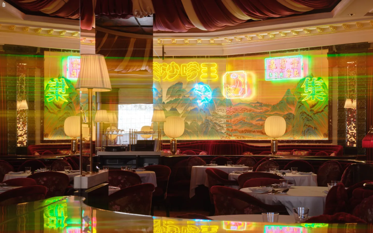
The measured interface is a strict monochrome frame: #000000 defines the canvas and #ffffff carries the small brand mark and interface text. In the supplied viewport, the dominant visual is a full-bleed photograph of an ornate restaurant, rich with warm reds, golds, and neon signage; these colors belong to the featured project imagery, not the measured site palette. Keep interface colors limited to the measured black and white rather than sampling the photograph into new brand accents. Unica77 LL is the measured sans-serif, used consistently for body copy, navigation, captions, and links at regular weight. The composition is spacious and image-led, with the project filling the viewport and a discreet white “B” mark at the upper-left. Avoid visible card framing, decorative borders, or shadows: the work itself supplies texture and color, while the site chrome stays quiet and flat.
配色
点色块复制色值。用途说明来自对页面的实测位置(背景、文字、描边、按钮)与截图判读。
品牌色
中性色
页面底色 · Gallery Black主文字 · Paper White次要文字 · Gallery Black
Shared sans-serif for body, navigation, captions, and links.
角色
示例
字号
字重
行高
字距
正文
General page copy and project-related text.
The quick brown fox 敏捷的狐狸
18px
400
1.22
0
辅助文字
Small supporting labels and image captions.
The quick brown fox 敏捷的狐狸
12px
400
1.22
0
导航
Primary navigation and menu items.
The quick brown fox 敏捷的狐狸
18px
400
1.22
0
链接
Text links and project titles.
The quick brown fox 敏捷的狐狸
18px
400
1
0
间距与布局
基准单位 1px · 密度:宽松
105px版块间距
—元素间距
—卡片内边距
—内容最大宽度
4px
5px
10px
15px
18px
20px
30px
80px
162px
Use an expansive, image-first composition with the featured work spanning the viewport. Keep navigation and identity details unobtrusive and aligned close to the image edges. The measured spacing scale is spacious, with a substantial section gap; preserve generous breathing room rather than adding dense content blocks. No measured max-width or grid was supplied, so avoid imposing a fixed container. The screenshot shows a single dominant visual with no card grid or visible section boundaries.
圆角与层次
没有测到阴影:页面是扁平的,层次靠底色和描边区分。
The measured interface has no shadows, gradients, or border colors, and the screenshot reads as a flat image canvas. Avoid cards and raised surfaces. Any depth comes from the photography itself—reflections, layered furnishings, and ambient light—not UI elevation effects.
组件
下面的预览按实测的按钮、输入框、徽标、卡片样式重建(字体用替代字体)。
Brand mark
A small white “B” sits at the top-left over the hero image, acting as the primary visible identity element.
Project hero
A full-bleed featured project image dominates the first viewport; its warm, detailed scene supplies the page's visual color.
Primary navigation
Measured navigation uses Unica77 LL at regular weight, with white text on dark contexts and black text where the background is light.
Text links
Project and section links use regular 18px Unica77 LL; measured examples are unboxed, with no padding, border, or shadow.
Section labels
Labels such as “Recognition” and “Selected clients” are plain text rather than filled or outlined button controls.
Imagery · Lead with high-impact project photography, cropped edge-to-edge so the work fills the viewport. The supplied image depicts a richly decorated restaurant interior with layered reflections, warm golds, dark reds, and luminous signage. Treat these hues as image content rather than brand colors; keep interface marks legible and minimal over the photograph.
该做与不该做
✓ 该做
Use only #000000 and #ffffff for measured interface colors.
Let the featured project image fill the available viewport.
Keep the brand mark small and easy to scan.
Use Unica77 LL or a close neutral sans-serif substitute.
Keep controls text-led, flat, and unboxed.
Preserve generous negative space around interface elements.
✕ 不该做
Do not adopt the photograph's gold or red hues as brand accents.
Do not overlay dense navigation or promotional copy on the hero.
Do not add card shadows, gradients, or decorative borders.
Do not invent a fixed content width or grid not present in the measurements.
Do not make the interface louder than the featured work.
给 AI 的提示词
想快速出一个同风格的新页面,把这段话连同 DESIGN.md 一起发给 AI。
Build a design-studio page with an almost invisible interface and a dominant, edge-to-edge project image. Use Gallery Black (#000000) for the measured canvas and Paper White (#ffffff) for the brand mark, links, and navigation where contrast requires it. Keep image-derived colors inside the artwork; do not promote them into UI accents. Set interface text in Unica77 LL, regular weight, or a close sans-serif substitute such as Inter. Keep the visible identity compact near the upper-left and use plain text links without boxes, borders, or shadows. Favor a spacious, image-led composition with few competing elements. Do not invent fixed widths or section details unsupported by the measured page; let the selected project remain the main event.