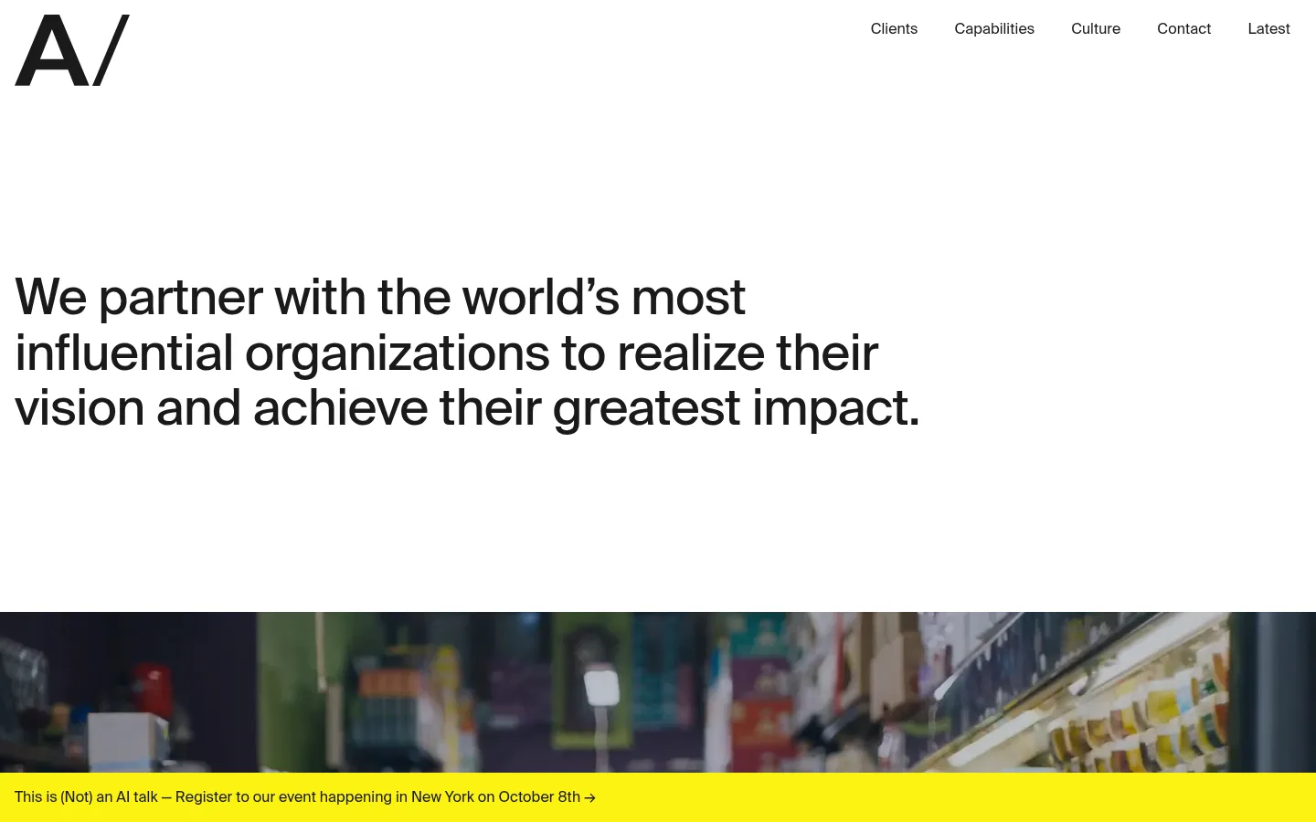
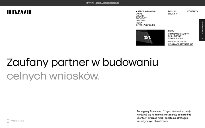
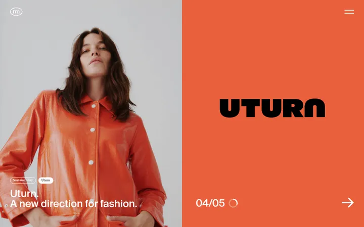
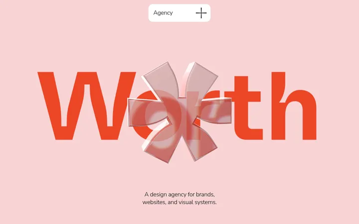
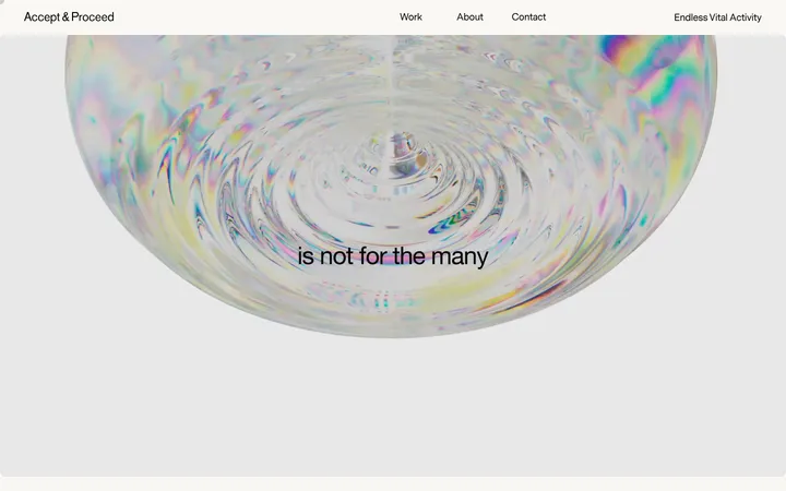
AREA 17 首页以醒目的文字表达和大面积留白构建清晰、克制的编辑式视觉。全幅影像、纤细分隔线与低调的链接文字,呈现出专业机构作品集的气质。
North star · Let oversized, left-aligned typography and generous white space lead; keep interface decoration nearly invisible.
The page is defined by a bright white canvas, despite dark-theme metadata: the screenshots show expansive white sections, with near-black typography and fine pale-gray separators. SuisseIntl supplies the visual voice, from the oversized opening statement to compact navigation and understated labels; headings use medium weight and subtly tight tracking, while links and body copy stay restrained. The layout favors broad, open blocks rather than boxed modules: a compact top navigation sits above a large left-aligned hero, followed by full-bleed documentary imagery and long intervals of white space. A vivid yellow announcement strip is visible over the hero image, but it reads as event-specific content rather than a core palette color. Later content uses muted gray category links and editorial update rows with aligned text and small media tiles. Blue, teal, and red measured accents appear in cards or portfolio imagery, not as dominant site chrome. Keep borders delicate and elevation nearly absent.
Major editorial statements and prominent section headings.
AREA 17
42px
500
1.1
-0.014em
三级标题
Secondary section titles and substantial content headings.
AREA 17
32px
500
1.15
-0.013em
四级标题
Compact subheadings and small content-group labels.
The quick brown fox 敏捷的狐狸
20px
500
1.4
0
正文
Supporting copy, announcement text, and footer details.
The quick brown fox 敏捷的狐狸
16px
400
1.4
0.004em
导航
Top-level navigation and utility links.
The quick brown fox 敏捷的狐狸
16px
400
1.4
0.004em
链接
Large muted category links, including the industry list.
AREA 17
42px
500
1.1
-0.014em
间距与布局
基准单位 1px · 密度:适中
48px版块间距
8px元素间距
—卡片内边距
1408px内容最大宽度
4px
8px
12px
16px
24px
48px
85px
119px
A broad desktop composition uses a measured maximum content width of 1408px, with navigation spread across the top and major text aligned to the left. The opening statement occupies a generous white field before full-width imagery. Content later shifts between open single-column areas and two-column editorial arrangements, with update rows divided by fine horizontal rules. Measured spacing follows a comfortable rhythm; retain conspicuous gaps between sections rather than compressing content. The page feels deliberately sparse, with content anchored to the edges of broad columns rather than centered in cards.
圆角与层次
按钮 · 8px
输入框 · 8px
卡片 · 8px
图片 · 8px
导航 · 4px
链接 · 8px
hairline · other
The interface is predominantly flat: no meaningful drop shadows are measured, and content relies on white space instead of stacked surfaces. Use thin #e6e6e6 rules to distinguish update rows and outlines. Cards may have softly rounded corners where measured, but avoid pronounced borders, floating panels, or layered effects.
组件
下面的预览按实测的按钮、输入框、徽标、卡片样式重建(字体用替代字体)。
Top navigation
Compact wordmark at the left with a row of restrained 16px links aligned to the upper right; use near-black text on white.
Hero statement
Large, medium-weight SuisseIntl headline with tight tracking, left aligned in an expansive white field.
Announcement strip
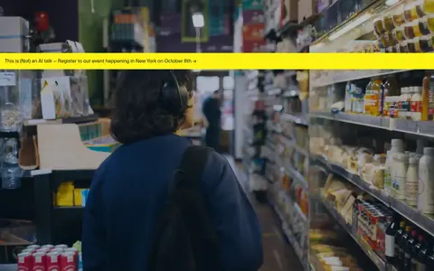
A bright event notice overlays the documentary image as a narrow, high-contrast yellow band; treat the yellow as campaign-specific.
Industry link list
Large muted-gray category links in a simple vertical list, with no card containers or decorative icons.
Latest updates
Editorial rows pair a small category label and text links with a project image tile; separate entries using pale hairlines.
Contact and footer
A large left-aligned contact invitation leads into a sparse footer with compact social, legal, language, and newsletter links.
Imagery · Use documentary-style photography as large, edge-to-edge moments, including the prominent retail interior visible beneath the hero. Project and update imagery appears in smaller tiles aligned beside editorial text. Preserve natural photographic color and avoid heavy overlays or ornamental framing. Some measured accent hues belong to portfolio assets, so keep them inside media rather than spreading them across interface elements.
Keep project colors inside their associated imagery.
✕ 不该做
Do not interpret dark-theme metadata as a black first-viewport canvas.
Do not add heavy shadows or layered panels.
Do not turn every content item into a card.
Do not use accent hues as broad interface backgrounds.
Do not center the main statement or compress its whitespace.
Do not use the campaign announcement yellow as a permanent brand color.
给 AI 的提示词
想快速出一个同风格的新页面,把这段话连同 DESIGN.md 一起发给 AI。
Build a new AREA 17-style agency page with a bright Gallery White (#ffffff) canvas and Soft Ink (#1a1a1a) typography. Use SuisseIntl or a close sans-serif substitute, reserving medium weight and subtly tight tracking for large, left-aligned statements. Keep navigation compact and unobtrusive. Organize content in broad editorial bands with generous gaps, a measured maximum width of 1408px, and occasional full-bleed documentary imagery. Use Muted Graphite (#949494) for secondary category links and Quiet Rule (#e6e6e6) for fine separators; Cloud Gray (#f2f2f2) can support restrained utility controls. Keep cards flat and sparsely rounded. Electric Blue (#1248de), Sea Glass (#6db7a8), and the red accents belong in project media, not general interface chrome. Favor confident type and whitespace over ornament.