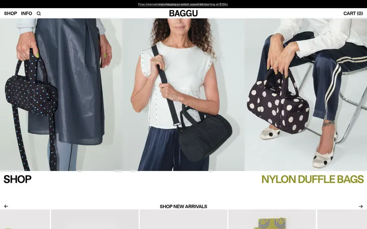
North star · Keep the interface black, white, and finely ruled; let candid full-bleed product and street imagery carry the color and emotion.
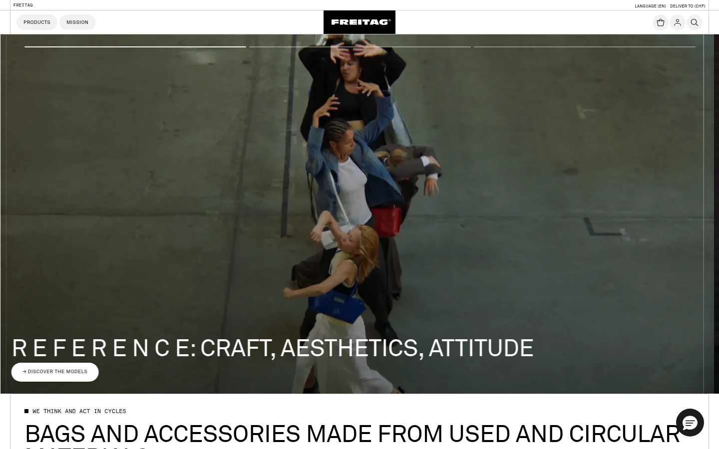
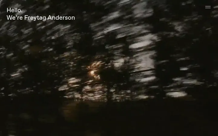
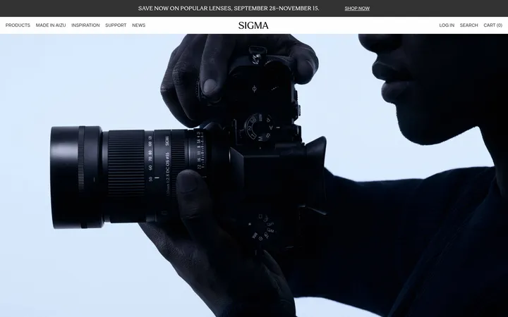
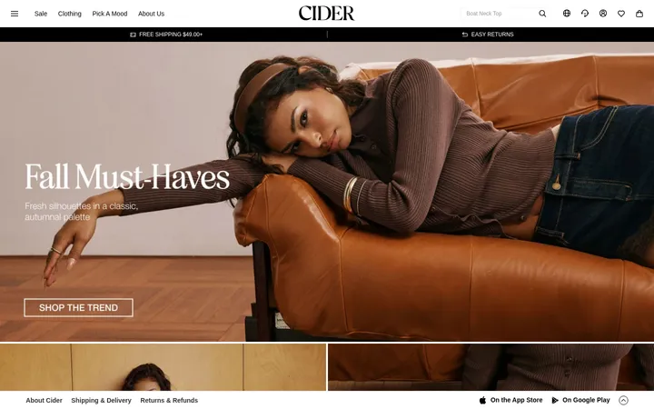
The visual system keeps the interface nearly monochrome: white canvas, black typography and controls, and pale gray hairlines separate navigation, cards, and product rows. The hero’s darkened full-bleed video introduces muted, urban colors, but those colors belong to the photography rather than the UI palette. Large uppercase AkkStdRg headlines create a compact editorial voice; small FRg uppercase labels and capsule buttons provide a contrasting utility scale. AkkStdMn supports fine product and caption details, while navigation uses a straightforward sans serif. A centered, fixed header sits above full-width media; lower sections shift into aligned editorial blocks, category cards, and a tightly packed product grid. Generous gaps between major stories contrast with close-set merchandise. Borders do most of the structural work, while restrained shadows and rounded controls keep interaction cues legible without softening the deliberately direct, industrial character.
Fine captions and small product or editorial details.
Aa 设计
AkkStdRg
网络字体 · 字重 400 · 占比 33%
免费替代:Barlow
Large editorial headings, prominent text links, and product/category labels.
Aa 设计
FRg
网络字体 · 字重 400 · 占比 8%
免费替代:Barlow Condensed
Eyebrows and compact button labels.
Aa 设计
ui-sans-serif
系统字体 · 字重 400 · 占比 2%
免费替代:Inter
Navigation and general interface text.
角色
示例
字号
字重
行高
字距
一级标题
Hero statement in large uppercase display text.
FREITAG
48px
400
0.97
-0.01em
二级标题
Section titles and oversized editorial links.
FREITAG
32.5px
400
0.97
-0.01em
三级标题
Subsection headings and medium editorial titles.
The quick brown fox 敏捷的狐狸
24px
400
1.1
0
正文
Brand descriptions and supporting editorial copy.
The quick brown fox 敏捷的狐狸
14px
400
1.21
0
辅助文字
Product metadata and compact secondary details.
The quick brown fox 敏捷的狐狸
11.5px
400
1.15
0.02em
按钮
Short uppercase calls to action.
The quick brown fox 敏捷的狐狸
10px
400
0.74
0.05em
导航
Header navigation, locale, and account controls.
The quick brown fox 敏捷的狐狸
16px
400
1.5
0
链接
Large uppercase editorial and shopping links.
FREITAG
32.5px
400
0.97
-0.01em
眉题
Small uppercase labels above or beside content.
The quick brown fox 敏捷的狐狸
10px
400
0.74
0.05em
间距与布局
基准单位 4px · 密度:宽松
232px版块间距
4px元素间距
—卡片内边距
1400px内容最大宽度
1px
4px
8px
12px
16px
20px
22px
24px
Use a centered, spacious page structure with a measured maximum width of 1400px, while allowing hero media to run full bleed. Keep the header shallow and visually light, with utility controls aligned across its top and main navigation centered around the logo. Align section headings to the left. Follow major editorial blocks with category cards and a dense, evenly divided product grid. The measured spacing system is based on a 4px unit, with a notably generous section gap; let this contrast with compact product details.
圆角与层次
按钮 · 9999px
图片 · 3px
链接 · 6px
hairline · media
md · button
hairline · footer
Keep most surfaces flat and use thin gray borders to define cards, navigation divisions, and product cells. A modest button shadow is measured, but should remain subtle. Use the hero’s dark image overlay for text contrast rather than adding interface panels; reserve rounded shapes for controls and small media details.
组件
下面的预览按实测的按钮、输入框、徽标、卡片样式重建(字体用替代字体)。
Utility header
A white, compact header with fine gray dividers, small locale and delivery details, capsule navigation controls, centered FREITAG identity, and circular utility icons.
Full-bleed hero
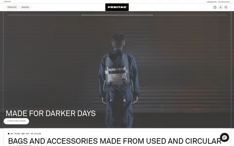
Wide video or photography with a dark lower gradient, a large uppercase white headline, a thin progress rule, and a white pill CTA.
Category cards
Three image-led category tiles with restrained borders, bottom-aligned white labels, and compact pill actions.
Product grid
A tightly arranged catalogue of individual product images on pale surfaces, separated by fine gray rules and paired with tiny product metadata.
Black shopping CTA
A full-width black link with white uppercase text and a leading plus sign, edged by a fine light border.
Editorial story cards
Photographic cards with short white uppercase overlay titles and small rounded white links, arranged within the editorial grid.
Imagery · Favor candid photography and video of people, bags, materials, and urban environments. Hero media fills the viewport width and receives a dark bottom gradient so white overlay text remains readable. Category and editorial cards use cropped photographs with compact overlay labels and pill-shaped actions. Product images are isolated against quiet, pale backgrounds; color variation belongs to the one-off products, not the interface palette.
Use white pill controls over dark imagery and black shopping links.
✕ 不该做
Do not introduce bright UI accent colors absent from the measured palette.
Do not add gradients to ordinary interface surfaces.
Do not soften the layout with heavy shadows or excessive card decoration.
Do not make every section dense; preserve generous space between stories.
Do not place long text over busy images without a dark readability treatment.
Do not round product-grid cells; their measured borders are square.
给 AI 的提示词
想快速出一个同风格的新页面,把这段话连同 DESIGN.md 一起发给 AI。
Build a new FREITAG-style storefront page with a white Gallery White (#ffffff) canvas, Workshop Ink (#000000) typography and shopping controls, and Fine Aluminum (#cacaca) hairline dividers. Keep the header compact and precise, with small utility text, centered brand identity, and simple icon controls. Use a full-width cinematic image or video for the hero, adding a subtle dark gradient behind large uppercase headline text and a white pill CTA. Let documentary urban and product photography provide color; do not add UI accent hues. Pair spacious editorial sections with compact category cards and a tightly ruled product grid. Use regular-weight, condensed-feeling sans typography, small tracked uppercase labels, and restrained elevation. Maintain clear shopping paths and generous separation between major stories.