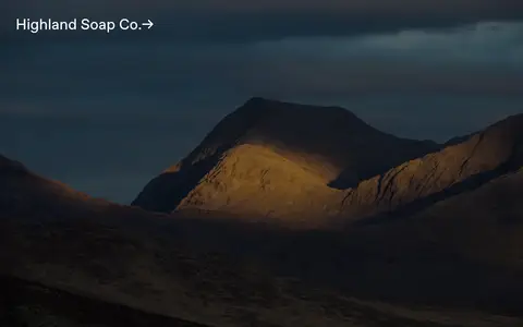
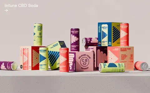
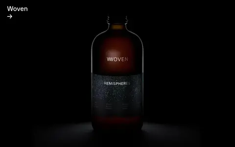
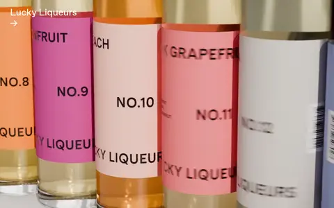
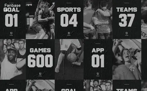
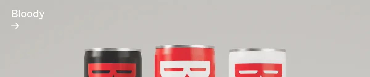
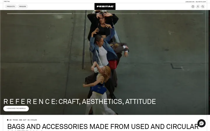
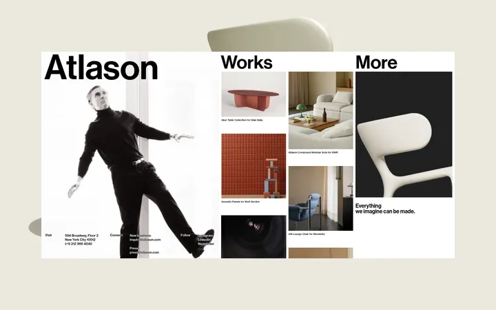
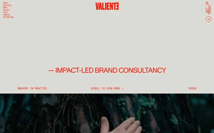
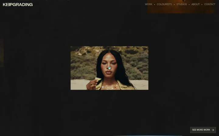
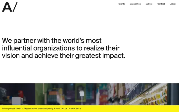
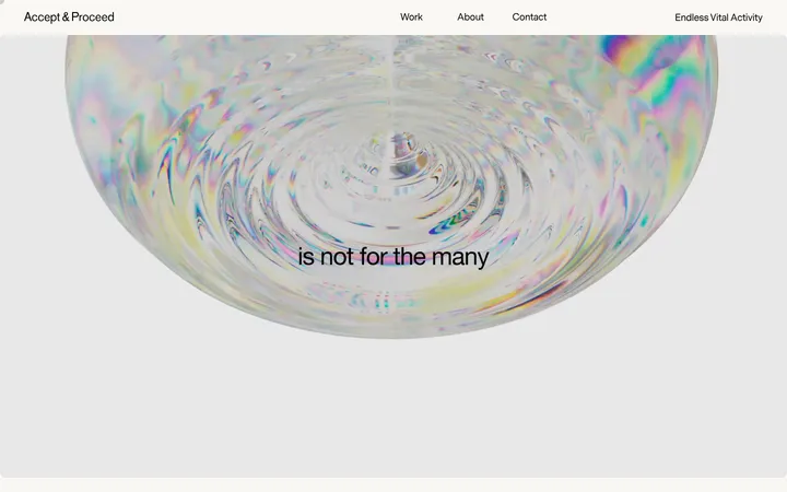
North star · Keep the interface quiet and spacious so each full-bleed project image carries the visual emphasis.
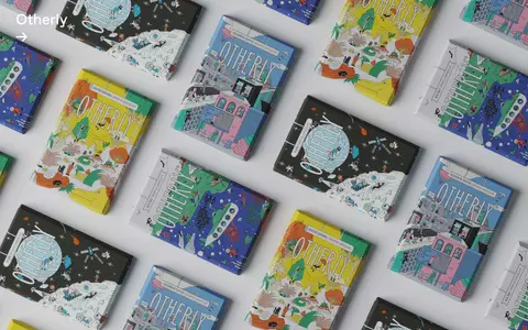
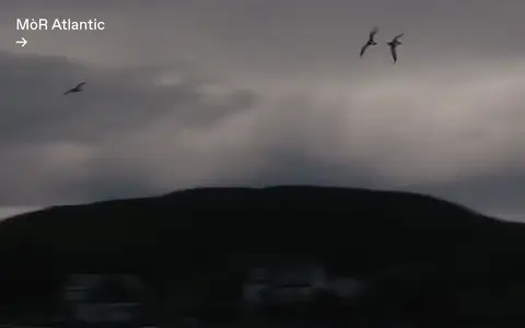
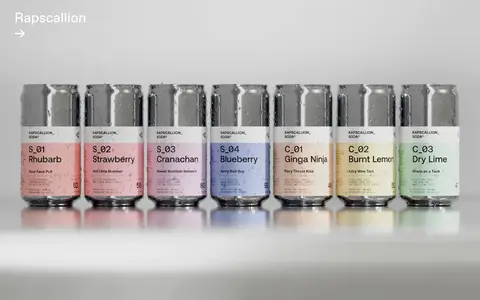
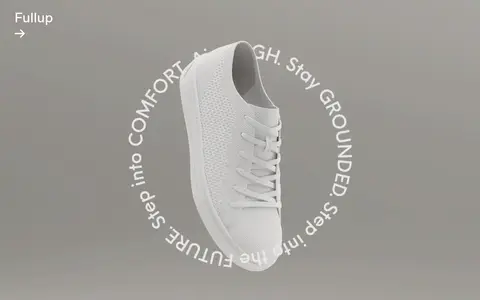
The page balances a near-black, warm canvas with large expanses of white, shifting from an atmospheric opening video into a sparse studio introduction and a long portfolio sequence. White is used for the editorial canvas and reversed text; black and soft grey support text on light sections, while the dark canvas anchors the opening. FAVORIT supplies the main identity: clean, unembellished headings and compact, lightly tracked body copy. Oversized project titles act as links rather than button-like controls. The content is deliberately spacious, with large gaps between introductory content and a project-led rhythm below. Portfolio entries use broad, often full-bleed photography or video, typically with a project title placed directly over the image. Project colours are allowed to vary and should not be mistaken for interface accents: packaging, landscapes, and product shots provide their own palettes. The overall effect is editorial and cinematic, not a uniform set of branded cards.
Primary typeface for headings, body copy, navigation, and project links.
Aa 设计
halyard-display
网络字体 · 字重 300 · 占比 3%
免费替代:Inter
Measured button-label typeface, including the skip-to-content control.
角色
示例
字号
字重
行高
字距
一级标题
Large editorial statement or introductory page heading.
Freytag Anderson
41px
400
1.18
0
正文
Studio introduction, supporting copy, and concise portfolio details.
The quick brown fox 敏捷的狐狸
15.5px
300
1.4
-0.022em
按钮
Small utility control labels such as skip to content.
The quick brown fox 敏捷的狐狸
15.5px
300
normal
0.02em
导航
Menu control and navigation text.
The quick brown fox 敏捷的狐狸
17px
400
normal
0
链接
Prominent project titles presented as oversized linked headings.
Freytag Anderson
41px
400
1.18
0
间距与布局
基准单位 1px · 密度:宽松
288px版块间距
—元素间距
—卡片内边距
—内容最大宽度
1px
6px
12px
16px
17px
20px
29px
43px
95px
The page uses a single-column editorial flow, with the opening occupying a full viewport and the introduction receiving generous whitespace. The work then becomes a long vertical portfolio, with broad two-column project compositions and full-bleed media. Text is left aligned, often pinned near a project image’s upper-left edge. The measured spacing is exceptionally spacious, including a large section gap; preserve the sense of separation rather than compressing content. No measured maximum page width is available, so avoid inventing one.
圆角与层次
按钮 · 9999px
没有测到阴影:页面是扁平的,层次靠底色和描边区分。
The interface is predominantly flat: no measured shadows or border palette define its components. Large image surfaces and changes between white and dark backgrounds provide the layering. Avoid card elevation, decorative outlines, or floating UI; the hero and project media should sit directly in the page composition.
组件
下面的预览按实测的按钮、输入框、徽标、卡片样式重建(字体用替代字体)。
Opening hero
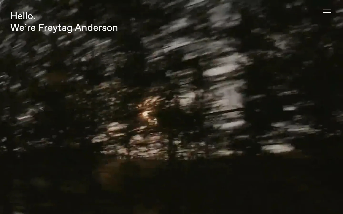
Full-bleed video on the #141109 warm-dark canvas, with a white two-line greeting at upper left and a minimal menu icon at upper right.
Menu control
A simple text-and-icon navigation affordance; measured navigation uses light text without a surrounding border or filled button.
Studio introduction
Sparse white section with a short agency statement and substantial open space before the work introduction.
Work introduction
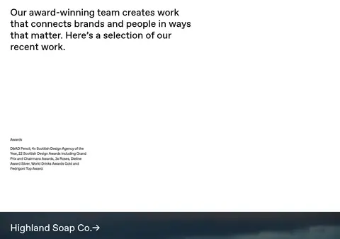
Left-aligned editorial heading followed by compact awards information, separated by generous whitespace.
Portfolio project
Large photographic or video area, commonly full bleed, with a light project-name link and arrow overlaid near the top-left.
Skip-to-content control
Utility link measured with #dcdcdc background, #000000 text, and a pill-shaped treatment.
Imagery · Photography and video dominate: the hero uses blurred, sunlit outdoor footage, while project entries show landscapes, products, packaging, and campaign imagery. Media often fills its section, with project titles layered over the image in simple light type. Each project has its own art direction and colour range; these vivid or dark tones belong to the portfolio work, not the site’s interface palette.
Keep the interface palette neutral and restrained.
Give project imagery broad, full-bleed space.
Align project titles to the left over their media.
Use FAVORIT-like typography with light supporting copy.
Preserve generous whitespace between editorial blocks.
✕ 不该做
Do not apply one accent colour across every project.
Do not turn each project into a raised card.
Do not crowd the introduction with extra interface elements.
Do not add unmeasured borders, shadows, or radii.
Do not mistake packaging colours for brand interface colours.
Do not center the portfolio titles by default.
给 AI 的提示词
想快速出一个同风格的新页面,把这段话连同 DESIGN.md 一起发给 AI。
Build a new page in the Freytag Anderson visual style: a restrained editorial interface that lets imagery lead. Use Warm Night (#141109) for a cinematic opening, Gallery White (#ffffff) for broad content areas, and Pure Ink (#000000) or Mist Grey (#dcdcdc) for measured text treatments. Set headings and body copy in a FAVORIT-like sans serif, with light supporting text and large, left-aligned project links. Start with full-bleed video or photography and minimal navigation; follow with spacious studio copy and a vertically flowing portfolio of broad image-led sections. Overlay concise project titles directly on media. Keep decoration flat, avoid invented shadows or borders, and let each project image retain its own palette rather than treating it as a site-wide accent.