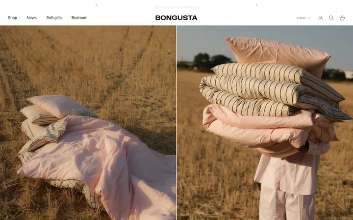
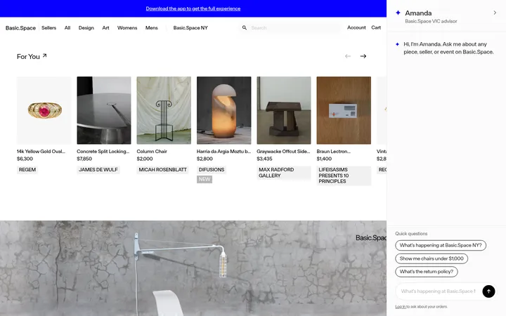
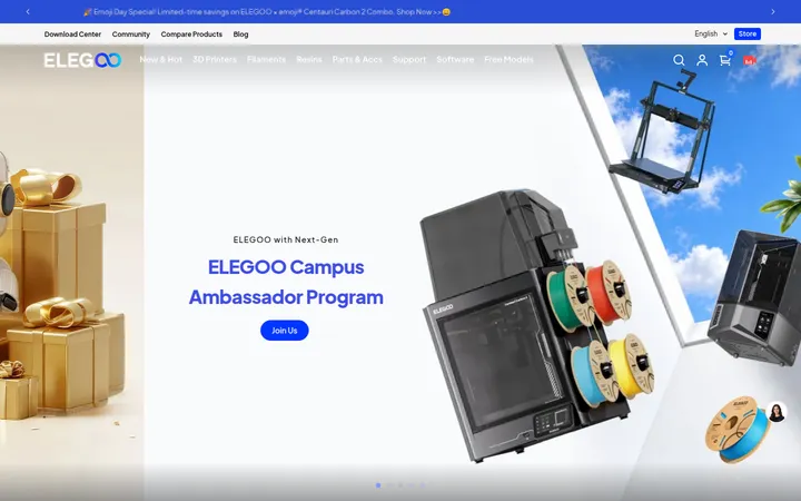
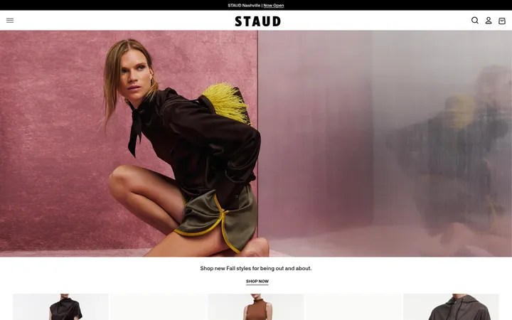
North star · Keep the interface stark and direct, letting colorful product photography provide nearly all of the visual variation.
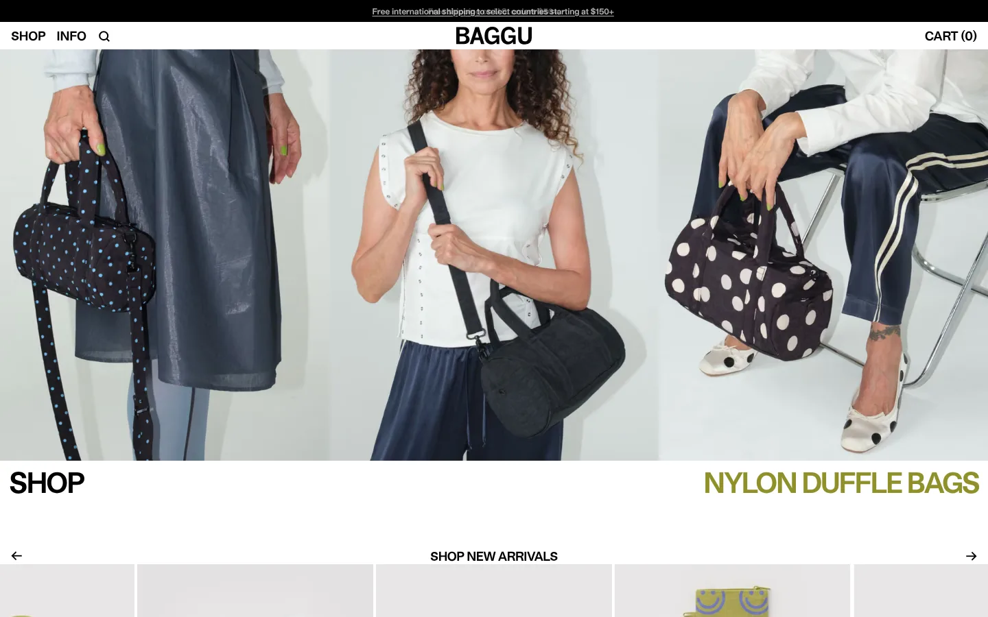
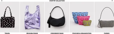
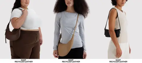
The page uses a white canvas and black text as its visual foundation, keeping the interface nearly monochrome so product imagery carries the color and personality. A narrow black shipping strip anchors the top, while the centered BAGGU wordmark and simple edge-aligned navigation sit over the hero image. Typography is consistently bold and compact: uppercase headings create sharp signposts, while smaller labels and product names stay legible without competing with photography. The homepage moves through broad, image-led bands—hero, new arrivals, travel, collections, recycled leather, and social content—with white gutters and restrained separators rather than decorative containers. Product tiles and category panels use straightforward grids; lifestyle photography supplies human scale and changing color. Olive and violet appear as small, selective text accents, not as broad interface fills. The footer returns to a practical black-and-white system with an email field, pill-shaped subscribe button, and dense link groups.
Site-wide interface, navigation, headings, product labels, buttons, and footer copy.
角色
示例
字号
字重
行高
字距
一级标题
Oversized uppercase hero or campaign headline.
BAGGU
41px
700
1
-0.05em
二级标题
Bold section and product-group headings.
The quick brown fox 敏捷的狐狸
18px
700
1
-0.025em
正文
Compact supporting copy and product details.
The quick brown fox 敏捷的狐狸
14px
700
1.25
-0.025em
辅助文字
Small secondary labels and metadata.
The quick brown fox 敏捷的狐狸
12px
700
1
-0.01em
按钮
Prominent action text, including subscribe and shop cues.
The quick brown fox 敏捷的狐狸
18px
700
1.25
-0.056em
链接
Compact navigation and product links.
The quick brown fox 敏捷的狐狸
12px
700
1
-0.01em
间距与布局
基准单位 4px · 密度:适中
64px版块间距
24px元素间距
—卡片内边距
—内容最大宽度
2px
3px
4px
8px
12px
13px
16px
20px
24px
36px
44px
64px
Build a wide, full-bleed storefront with navigation aligned to the edges and the wordmark centered. The page alternates between broad image bands and product or category grids, generally using three-, five-, or multi-column arrangements. Keep content aligned to the viewport rather than introducing an unmeasured fixed maximum width. Separate sections with generous white breathing room and slim gutters. The overall density is comfortable: each block is visually simple, with product imagery and concise labels doing most of the work.
圆角与层次
按钮 · 9999px
输入框 · 4px
hairline · input
The page is predominantly flat: white sections meet directly, and black text and image edges provide definition. Avoid card shadows and decorative depth. Use crisp gutters and occasional thin black rules or borders where needed; the measured input shadow is effectively imperceptible. The subscribe action is a black pill against the white footer.
组件
下面的预览按实测的按钮、输入框、徽标、卡片样式重建(字体用替代字体)。
Announcement strip
A slim black band at the very top with centered, small white shipping copy.
Store navigation
White header with SHOP and INFO at left, centered BAGGU wordmark, and CART (0) at right; keep labels black and bold.
Image-led hero
Wide lifestyle photograph followed by a stark SHOP label and olive category headline on white.
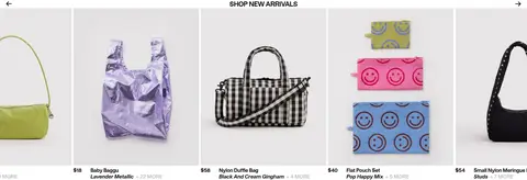
New-arrivals carousel
Product image tiles with compact names, color details, price, and small MORE indicators; use arrows and a centered section label.
Category tile grid
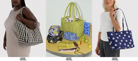
Lifestyle or product images in even columns, with short uppercase shop links directly beneath.
Newsletter signup
Footer email input with violet text treatment and a black rounded SUBSCRIBE button.
Link footer
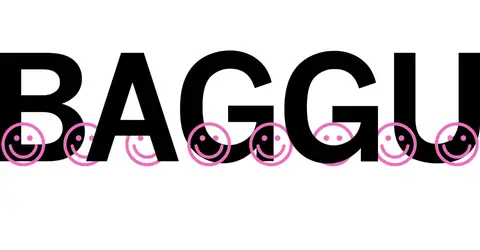
Compact black links arranged in plain columns on white, above an oversized BAGGU wordmark graphic.
Imagery · Use crisp lifestyle and product photography as the main source of color and texture. Hero imagery spans the viewport and crops closely around people carrying bags; later sections mix product-only tiles with models and styled groupings. Keep photos bright and natural, without heavy overlays, frames, or illustration-led decoration. The social feed uses small real-world snapshots, while the oversized footer wordmark is a graphic treatment rather than product imagery.
Use white space and black typography as the interface baseline.
Let product photography bring most color into the page.
Keep navigation short, bold, and edge-aligned.
Use uppercase display labels for prominent shop cues.
Present products in clean, evenly spaced image grids.
Reserve olive and violet for small, intentional accents.
✕ 不该做
Do not add gradients or decorative background fills.
Do not place every product in a raised card.
Do not let interface color compete with the photography.
Do not use soft, low-contrast text for key labels.
Do not crowd image tiles with long descriptions.
Do not add unsupported shadows or rounded containers.
给 AI 的提示词
想快速出一个同风格的新页面,把这段话连同 DESIGN.md 一起发给 AI。
Build a new BAGGU-style ecommerce page with a clean white canvas (#ffffff, Gallery White) and high-contrast black typography (#000000, Baggu Ink). Keep the header minimal: compact navigation at the left, centered wordmark, and cart at the right; a slim black announcement strip can sit above it. Use bold, tightly tracked sans-serif headings, simple uppercase shop cues, and small product labels. Arrange large lifestyle photography and product images in broad bands and clean grids, with open white gutters and no card shadows. Use #90912b Olive Signal and #3024b7 Violet Signal only for small accent details, never as broad fills. Keep the footer practical, with grouped links, an email field, and a black pill-shaped subscribe button. Prioritize direct shopping paths and photography over decorative UI.