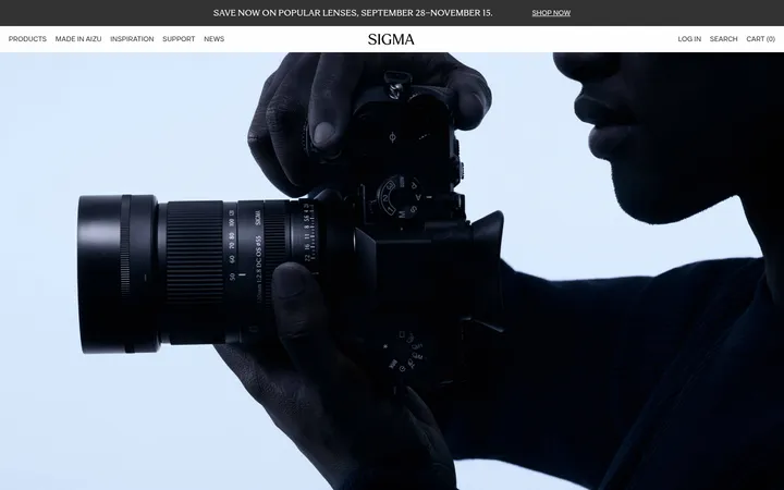
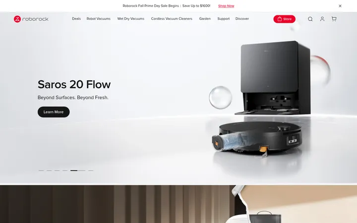
North star · Let expansive creator-focused photography lead, while the white canvas, restrained Inter typography, and quiet gray details keep the store composed.
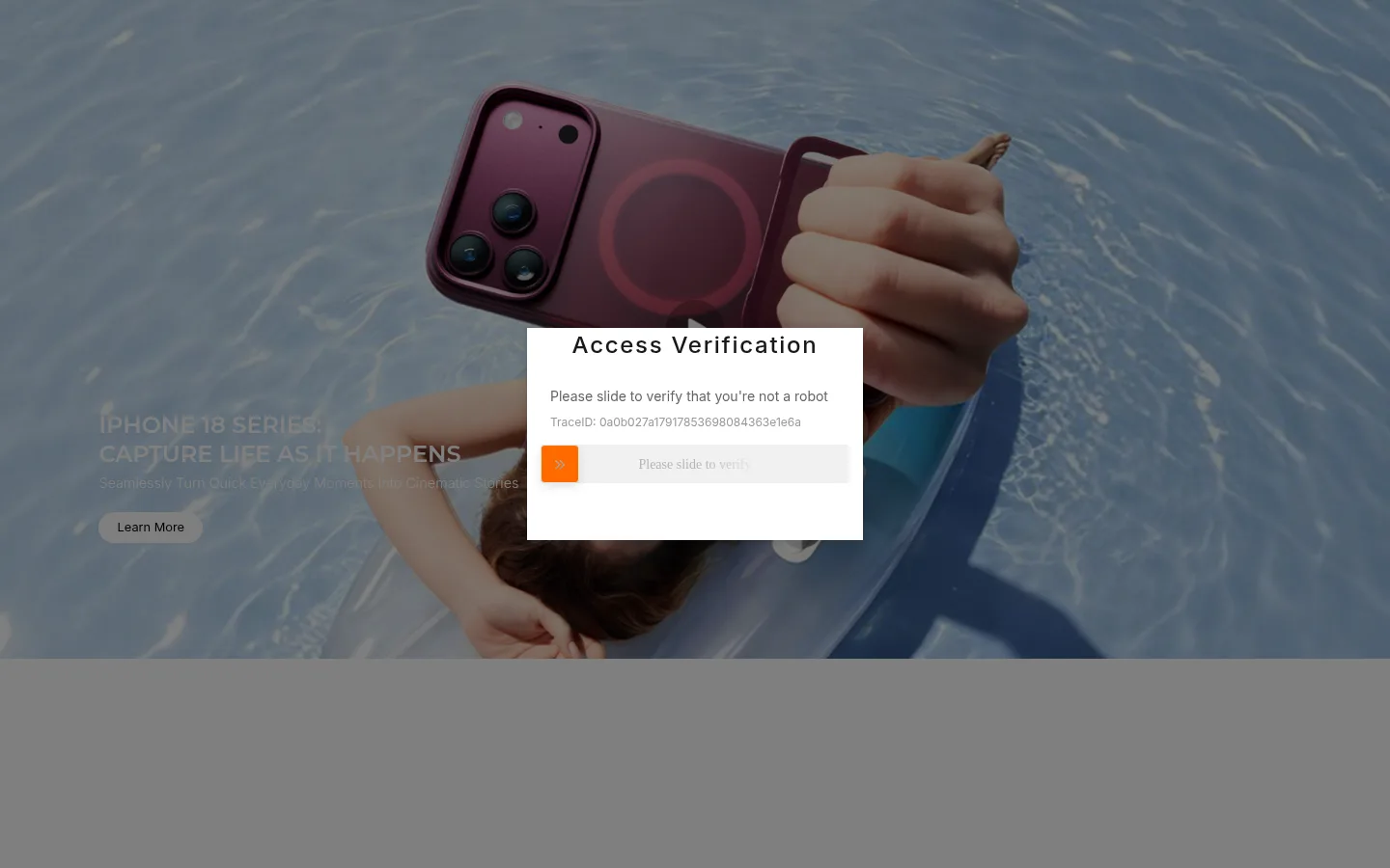
The measured page is predominantly white, with a long, spacious vertical canvas and very little visible interface chrome. The captured first screen shows a cinematic lifestyle campaign: a person using a phone near water, darkened by an access-verification overlay. Treat its blue-gray water and burgundy phone as campaign-image colours, not core brand colours. Typography is led by Montserrat for the bold main heading and Inter for supporting text, with muted gray copy and dark text. The measured palette offers no verified brand accent; the orange slider handle belongs to the verification widget, so do not promote it into the storefront palette. The page sections are measured as white bands, with a subtle near-white lower section. Preserve generous separation between content areas, let wide campaign photography carry the visual impact, and use fine pale borders only where needed.
配色
点色块复制色值。用途说明来自对页面的实测位置(背景、文字、描边、按钮)与截图判读。
表层色
中性色
功能色
页面底色 · Gallery White表层 · Rig Black主文字 · Studio Gray次要文字 · Gallery White弱文字 · Caption Gray描边 · Mist Line
Verification-widget icon glyphs only; not storefront typography.
角色
示例
字号
字重
行高
字距
一级标题
Campaign or page headline; bold, prominent title styling.
SmallRig
30px
600
1.25
0
二级标题
Section headings with a measured, widely tracked treatment.
The quick brown fox 敏捷的狐狸
24px
500
1.5
0.071em
正文
Supporting campaign and product-description copy.
The quick brown fox 敏捷的狐狸
18px
300
1.42
0
辅助文字
Compact labels, metadata, and secondary interface text.
The quick brown fox 敏捷的狐狸
14px
400
1.5
0
间距与布局
基准单位 4px · 密度:宽松
128px版块间距
4px元素间距
—卡片内边距
—内容最大宽度
4px
6px
8px
10px
12px
14px
16px
20px
24px
40px
50px
128px
150px
The measured page is a long, single-column sequence of full-width section bands, predominantly white, with a near-white band near the bottom. The first campaign fills the viewport and places its headline and CTA over imagery; the visible overlay obscures much of that composition. The data does not establish a content max width or card grid, so keep those flexible rather than inventing dimensions. Section spacing is spacious, while small text and interface details remain comparatively compact.
圆角与层次
md · card
md · other
The page is mostly flat and open, with white canvas bands and little visible card framing. Measured card shadow is soft and restrained; use it only for a floating surface such as the verification panel. Pale gray borders are available for subtle separation. Avoid strong outlines or stacking effects that compete with the campaign image.
组件
下面的预览按实测的按钮、输入框、徽标、卡片样式重建(字体用替代字体)。
Campaign hero
Full-width lifestyle image with a left-side headline and compact Learn More CTA visible beneath the overlay.
Verification panel
Centered white rectangular access-check panel with dark heading, muted instructions, and a slider control; transient crawler state, not core storefront UI.
Section bands
Long vertical content areas measured primarily as #ffffff, followed by a lower #fafafa section outside the specified palette list.
Text hierarchy
Montserrat semibold display heading paired with Inter supporting copy, captions, and secondary headings.
Imagery · The visible campaign uses full-bleed lifestyle photography: a person holds a phone near water, with the device and hands prominent in frame. A dark overlay from the verification state mutes the scene. Blue-gray water and burgundy device tones belong to this campaign image, not the measured brand palette. The supplied full-page captures show blank later sections, so avoid inferring unseen image treatments.
Let broad creator-focused photography anchor campaign areas.
Use Inter for supporting copy and captions.
Reserve Montserrat semibold for prominent headings.
Keep borders pale and visually quiet.
Treat image colours as campaign-specific rather than brand accents.
✕ 不该做
Do not adopt the captcha slider orange as a storefront accent.
Do not treat the campaign's water or phone colours as brand tokens.
Do not fill the generous page rhythm with dense card grids.
Do not invent a measured max-width or unreported spacing value.
Do not add heavy shadows to ordinary content.
Do not reproduce the verification overlay as a normal page component.
给 AI 的提示词
想快速出一个同风格的新页面,把这段话连同 DESIGN.md 一起发给 AI。
Build a new SmallRig-style ecommerce page with a clean #ffffff Gallery White canvas and generous vertical breathing room. Make wide creator-focused photography the visual anchor for campaign sections; keep photographed colour treatment image-specific rather than adding it to the brand palette. Use Montserrat semibold for primary headlines and Inter for body, secondary headings, and captions. Set supporting text in #666666 Studio Gray or #999999 Caption Gray, with #181818 Near Black for stronger text. Use #e5e7eb Mist Line only for subtle dividers. Keep the layout open and uncluttered, with full-width section bands and clear headline-to-copy hierarchy. Do not invent a bright accent from the captcha UI, or add heavy card shadows and dense interface chrome.