North star · Let one oversized typographic gesture introduce a quiet, asymmetric portfolio where the work—not interface decoration—commands attention.
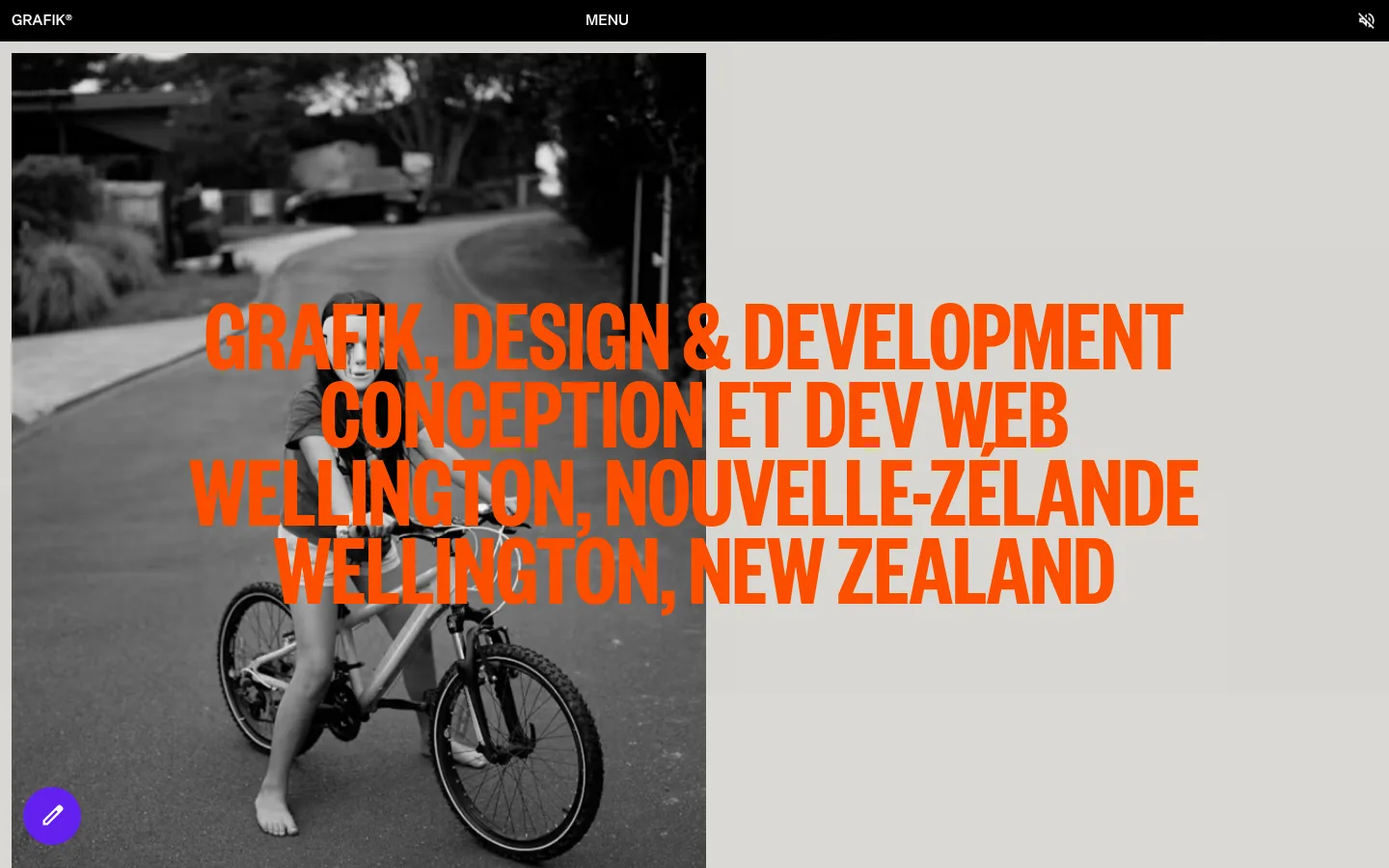
Grafik’s portfolio pairs a warm gray page canvas (#dad9d5) with a narrow black navigation bar and white project-information panels. The hero’s oversized condensed headline in vivid orange (#ff4f00) overlays a monochrome photograph, creating the page’s clearest point of emphasis. Most interface text is black; white is used for project surfaces and reversed navigation text. A vivid violet (#6320ee) appears as a small floating circular control rather than a dominant brand field. Die Grotesk handles the compact body copy and navigation, while Founders Grotesk X Condensed gives the hero its tall, tightly stacked uppercase character. The long portfolio uses an asymmetric, image-led arrangement: project media occupies shifting grid positions while concise descriptions sit in a consistent white column. Thin black horizontal rules divide entries. The overall effect is deliberately flat and spacious, with striking typography and varied project imagery doing more work than decorative UI.
配色
点色块复制色值。用途说明来自对页面的实测位置(背景、文字、描边、按钮)与截图判读。
品牌色
强调色
表层色
中性色
页面底色 · Warm Cement表层 · Gallery White主文字 · Studio Ink次要文字 · Gallery White强调 · Violet Signal强调 2 · Studio Orange
文字
背景
对比度
WCAG
#000000 Studio Ink
#dad9d5 Warm Cement
14.87:1
AAA
#000000 Studio Ink
#ffffff Gallery White
21:1
AAA
#ffffff Gallery White
#dad9d5 Warm Cement
1.41:1
不达标
#6320ee Violet Signal
#dad9d5 Warm Cement
5:1
AA
#6320ee Violet Signal
#ffffff Gallery White
7.07:1
AAA
字体
字号阶梯:Custom(比例约 7.2,正文 15px)。示例用免费替代字体渲染,数值为实测。
Aa 设计
Die Grotesk A Regular
网络字体 · 字重 700 / 400 · 占比 94%
免费替代:Inter
Primary interface and project text, including body copy, buttons, and links.
Aa 设计
Die Grotesk A Medium
网络字体 · 字重 700 / 400 · 占比 3%
免费替代:Inter
Uppercase navigation labels and the Grafik wordmark treatment.
Aa 设计
Founders Grotesk X Condensed Semibold
网络字体 · 字重 700 · 占比 3%
免费替代:Roboto Condensed
Oversized display headline in the hero.
角色
示例
字号
字重
行高
字距
特大标题
Oversized uppercase hero statement layered across the opening image.
Grafik
108px
700
0.75
0
正文
Compact project descriptions and supporting portfolio text.
The quick brown fox 敏捷的狐狸
15px
700
1.25
0
按钮
Short, bold labels on the small floating action control.
The quick brown fox 敏捷的狐狸
15px
700
1.25
0
导航
Uppercase menu label and compact navigation text.
The quick brown fox 敏捷的狐狸
15px
400
1.25
0
链接
Project names and concise linked portfolio labels.
The quick brown fox 敏捷的狐狸
15px
400
1.25
0
间距与布局
基准单位 4px · 密度:适中
55px版块间距
12px元素间距
—卡片内边距
1048px内容最大宽度
12px
24px
180px
The page uses a comfortable, asymmetric portfolio grid, with project media spread across broad areas and descriptions aligned in a narrow white column. The measured page max width is 1048px. A full-width black navigation strip anchors the top; the hero sets a large photo against the gray canvas, then project entries continue as varied image arrangements. Thin horizontal rules mark transitions. Measured spacing uses a 4px base unit, 55px section gap, and 12px element gap; generous blank canvas keeps the dense media sequence from feeling crowded.
圆角与层次
按钮 · 50%
没有测到阴影:页面是扁平的,层次靠底色和描边区分。
The interface is essentially flat: measured shadows are absent and the dominant structure comes from canvas changes, white project panels, media blocks, and black hairline rules. Avoid floating cards or glossy effects. Keep the violet circular control as the exception, with its rounded silhouette clearly distinct from the square-edged portfolio layout.
组件
下面的预览按实测的按钮、输入框、徽标、卡片样式重建(字体用替代字体)。
Top navigation
A narrow black full-width strip with the Grafik mark at left, centered uppercase MENU label, and a small utility icon at right; use white text.
Hero statement
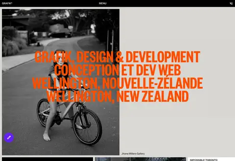
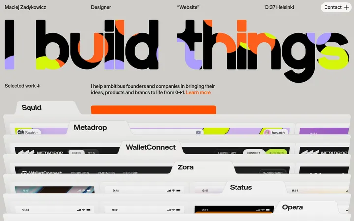
Large condensed uppercase orange copy overlaps a monochrome hero photograph and extends across the gray canvas.
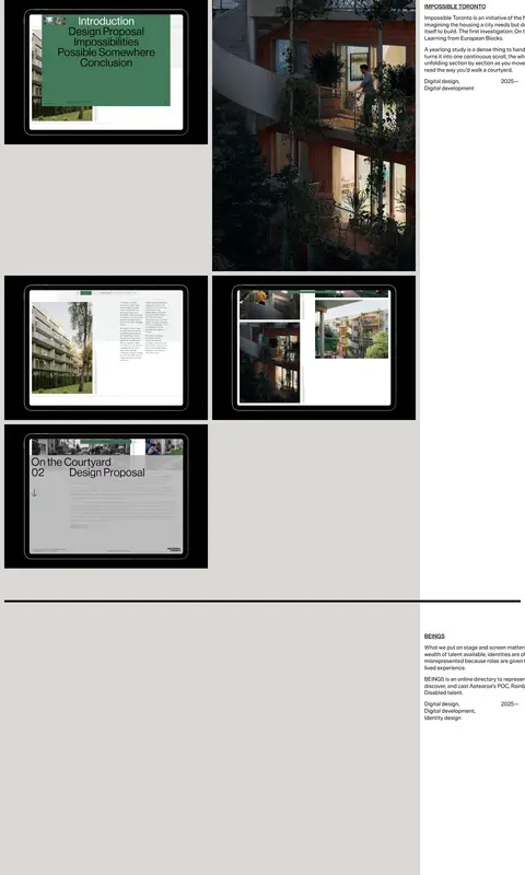
Project media grid
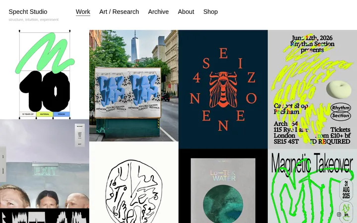
Asymmetric arrangement of rectangular client imagery, site mockups, and occasional video, with varied image sizes and open canvas between items.
Project information panel
White text area paired with project media, containing a compact black project title, description, services, and date.
Section divider
Thin black horizontal rule spanning the portfolio width to separate successive project entries.
Floating action control
Small vivid-violet circular control placed over the portfolio canvas, with a simple white icon.
Imagery · Photography, video, and website mockups dominate the portfolio. The hero pairs a monochrome cycling image with orange type, while later projects mix architectural photography, portraits, brand objects, and screen-based work. Media is presented in varied rectangular crops and sizes, often with minimal framing. Treat project images as client work: preserve their own color and contrast rather than imposing a uniform filter.
Use Warm Cement (#dad9d5) as the broad portfolio canvas.
Reserve Studio Orange (#ff4f00) for a striking display-text moment.
Keep the navigation black with white, uppercase labels.
Arrange project media asymmetrically and let images retain their own treatment.
Pair project imagery with compact white information panels.
Separate project entries with thin black rules.
Use generous open canvas around the media.
✕ 不该做
Do not turn the page into a uniform card grid.
Do not use gradients or decorative shadows.
Do not spread Violet Signal (#6320ee) across large surfaces.
Do not recolor project images to create a false brand treatment.
Do not use oversized body copy to compete with the hero.
Do not add rounded corners to the main portfolio panels.
Do not crowd the project descriptions with extra interface chrome.
给 AI 的提示词
想快速出一个同风格的新页面,把这段话连同 DESIGN.md 一起发给 AI。
Build a new digital-studio portfolio page in Grafik’s visual language. Use Warm Cement (#dad9d5) as the dominant canvas, Studio Ink (#000000) for the top navigation, copy, and divider rules, and Gallery White (#ffffff) for project-information panels. Set a compact black navigation strip with reversed white uppercase labels. Introduce the page with a large, tightly stacked condensed uppercase headline in Studio Orange (#ff4f00), layered across monochrome or restrained photography. Continue into an asymmetric, image-led project sequence: vary rectangular media placements and pair them with concise project details in white panels. Keep the layout open and flat, using thin black rules instead of shadows or card borders. Use Violet Signal (#6320ee) only for a small isolated circular control. Preserve each project image’s original character.