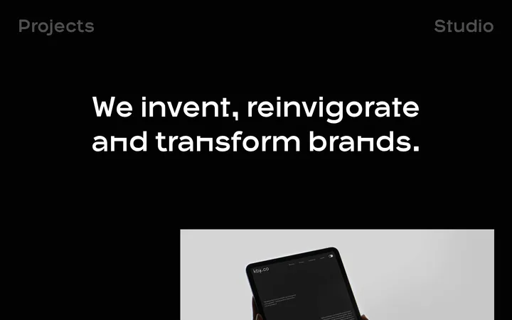
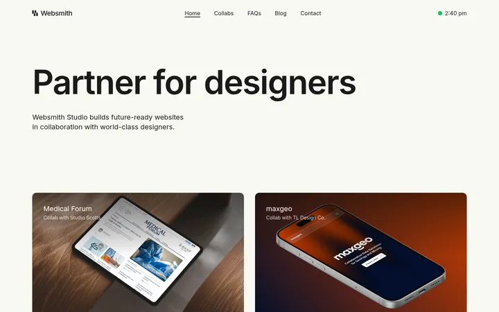
North star · Keep the site chrome quiet and consistent so the varied portfolio artwork supplies nearly all of the visual drama.
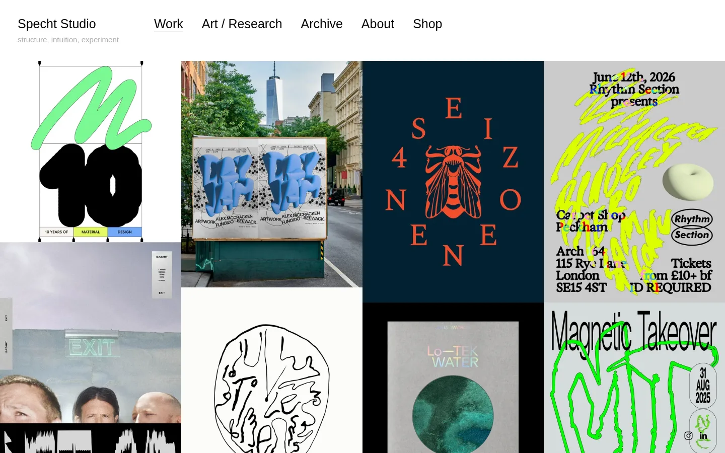
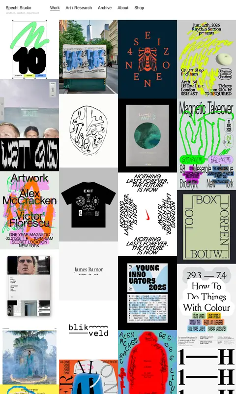
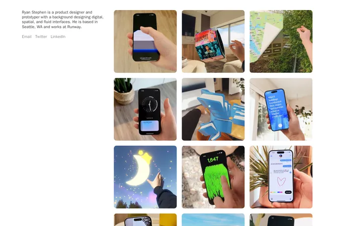
The page uses a pure white canvas and black navigation as a quiet frame for a tightly packed portfolio. The palette is intentionally restrained: #ffffff defines the background, #000000 anchors navigation and link text, and muted #b0b0b0 softens the studio descriptor. More saturated colours belong chiefly to project artwork, not the site chrome. Helvetica Neue, or a close sans-serif fallback, keeps the identity direct and unornamented; the studio name and navigation are set notably larger than supporting text. A single, asymmetric image grid fills the page, with project images varying in colour, texture, and visual density. Their contrasts create the rhythm instead of decorative section backgrounds or card treatments. Spacing gives the header breathing room, while the portfolio itself remains closely packed. The result feels like a considered gallery index: simple shared structure, with each project allowed its own visual language.
配色
点色块复制色值。用途说明来自对页面的实测位置(背景、文字、描边、按钮)与截图判读。
表层色
中性色
页面底色 · Gallery White主文字 · Studio Ink次要文字 · Soft Graphite描边 · Studio Ink
Brand wordmark, navigation, headings, and supporting page text.
角色
示例
字号
字重
行高
字距
一级标题
Studio identity and prominent introductory heading.
The quick brown fox 敏捷的狐狸
25px
400
1.4
0
正文
Project descriptions and supporting portfolio text.
The quick brown fox 敏捷的狐狸
15px
400
1.4
0
导航
Studio name and primary navigation links.
The quick brown fox 敏捷的狐狸
25px
400
1
0
间距与布局
基准单位 2px · 密度:适中
67px版块间距
—元素间距
—卡片内边距
—内容最大宽度
2px
10px
13px
24px
35px
A single white page begins with a horizontal header: studio identity at the left and navigation links arranged across the top. Below, a dense, asymmetric portfolio grid spans the available content area, using adjacent image tiles of varied proportions and visual scales. Alignment is predominantly left-led; project edges and whitespace create the rhythm rather than cards or colored section bands. The measured page has a comfortable overall density and a generous break between the header and portfolio. A fixed maximum width is not measured, so preserve the screenshot’s broad, viewport-filling composition without assuming one.
圆角与层次
没有测到阴影:页面是扁平的,层次靠底色和描边区分。
The measured styling is flat: no shadows, gradients, or rounded component treatments are recorded. Keep the white canvas and artwork surfaces visually direct, using grid adjacency and whitespace for separation. The black border measurement belongs to site styling data, but the screenshot’s overall impression is not of outlined cards.
组件
下面的预览按实测的按钮、输入框、徽标、卡片样式重建(字体用替代字体)。
Studio header
Place the Specht Studio name at the left of a white header, with a smaller muted descriptor directly below.
Primary navigation
Use large, regular black text for horizontal Work, Art / Research, Archive, About, and Shop links.
Active navigation link
Distinguish the selected Work link with a simple underline, not a filled tab or button.
Portfolio grid
Present projects as a dense, asymmetric, multi-column image gallery with varied tile proportions.
Project link
Keep project links visually light and text-led; measured link styling is black 16px Helvetica Neue with no padding or radius.
Imagery · The portfolio is the main visual content: a long sequence of project images showing posters, identity work, editorial layouts, illustration, and photography. Images retain their individual palettes and art direction, ranging from sparse monochrome compositions to vivid, textured graphics. Crop and tile them to preserve a varied, asymmetric gallery rather than imposing a unified image treatment.
Keep navigation black, regular-weight, and plainly styled.
Make the studio descriptor quieter than the wordmark.
Let project imagery retain its original palette and character.
Build a tightly composed, asymmetric portfolio gallery.
Use whitespace to distinguish the header from the image field.
✕ 不该做
Do not add decorative brand colours to the page chrome.
Do not standardize every project image into one art direction.
Do not place projects in rounded cards or add shadows.
Do not replace the image-led gallery with text-heavy sections.
Do not style navigation as prominent filled buttons.
Do not invent fixed dimensions absent from the measured data.
给 AI 的提示词
想快速出一个同风格的新页面,把这段话连同 DESIGN.md 一起发给 AI。
Build a new design-studio portfolio page with a quiet white (#ffffff) canvas and a flat, image-led composition. Use regular Helvetica Neue, or a close sans-serif substitute, for the studio name, navigation, and supporting copy. Set the primary navigation and project links in black (#000000); use muted gray (#b0b0b0) for secondary studio text. Start with a simple horizontal header and a discreet underline for the active link. Below it, create a dense asymmetric gallery of varied project imagery, allowing each image to keep its own colour, crop, texture, and typography. Maintain a clear gap after the header, then let tile adjacency and changing artwork supply the rhythm. Avoid shadows, gradients, rounded cards, decorative colour bands, and oversized UI. Do not impose unmeasured fixed spacing or widths.