North star · Keep the interface almost entirely white and black, then let oversized editorial type and one expressive artwork carry the personality.
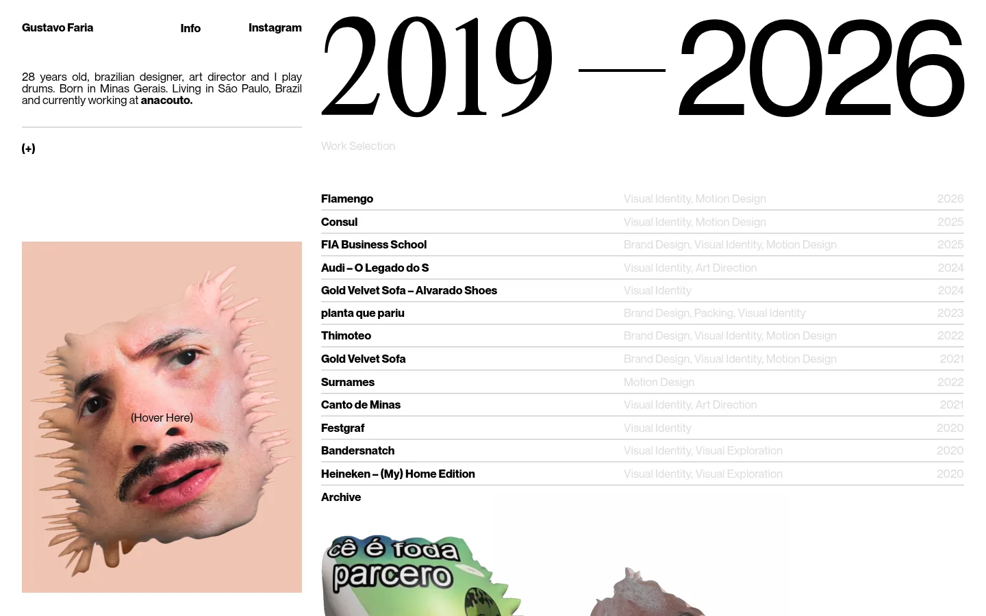
The page is built on a white canvas with black text and exceptionally pale gray secondary information. A muted peach tone appears as the backdrop for the portrait artwork, adding warmth without becoming a broad interface colour. Typography establishes the hierarchy: an enormous, high-contrast year span dominates the main column, while compact bold project names and small supporting details keep the index functional. The layout is intentionally asymmetric, placing the personal introduction and image in a narrow left rail beside a much wider project area. Fine gray horizontal rules organize the project rows instead of cards or filled panels. The portrait is tightly framed and visually strange, giving the page a personal, art-directed quality. Generous open areas around the headline contrast with the compact listing, creating a rhythm that feels editorial rather than like a conventional agency site.
Display headline, body copy, navigation, project links, and supporting labels.
角色
示例
字号
字重
行高
字距
特大标题
Oversized 2019–2026 year-span headline.
GUSTAVO Faria
142px
400
0.81
-0.047em
一级标题
Large heading treatment for the portfolio’s date-range title.
GUSTAVO Faria
125px
400
1.02
0
正文
Compact introduction and project metadata.
The quick brown fox 敏捷的狐狸
12px
400
1.67
0
链接
Bold project names and navigation links.
The quick brown fox 敏捷的狐狸
12px
700
1.67
0
间距与布局
基准单位 1px · 密度:适中
—版块间距
—元素间距
—卡片内边距
—内容最大宽度
1px
An asymmetric two-column composition places identity, short biography, and portrait in a narrow left rail, with the dominant year-span and long project index occupying the broad right area. The headline aligns to the index rather than the page edge. Project rows form a tightly stacked list with names, pale discipline labels, and right-aligned years, separated by thin rules. There is no measured maximum width or section spacing value; preserve the screenshot’s airy margins and contrast between open headline space and dense index content.
圆角与层次
没有测到阴影:页面是扁平的,层次靠底色和描边区分。
The interface reads as flat: no measured shadows, gradients, or rounded component treatments. Thin pale rules divide project rows, while the portrait and project artwork sit directly on the canvas without card framing. Preserve clear alignment and contrast rather than introducing depth effects.
组件
下面的预览按实测的按钮、输入框、徽标、卡片样式重建(字体用替代字体)。
Top navigation
Small, bold black identity and navigation links sit across the top edge of the content area.
Biography block
Compact black text in the left rail gives the designer’s role, location, and current work.
Year-span headline
An oversized 2019–2026 display title anchors the wide right column.
Project index
A dense list pairs bold black project names with pale gray disciplines and right-aligned years.
Row separators
Fine gray horizontal rules create structure between otherwise unboxed project entries.
Portrait artwork
A large face image on a peach ground adds an experimental, personal visual counterpoint.
Imagery · A prominent, square-ish portrait artwork sits in the left rail, showing a close-cropped face with an irregular, spiky edge against a muted peach ground. Its treatment is surreal and playful rather than polished product photography. Additional project imagery begins below the index and appears as cropped artwork, so keep images expressive and project-led instead of imposing a uniform card system.
该做与不该做
✓ 该做
Use a white canvas and crisp black primary text.
Make the main display typography dramatically larger than interface copy.
Build an asymmetric two-column composition.
Keep project names bold and metadata faint.
Separate project rows with fine horizontal rules.
Use artwork as an expressive, image-specific accent.
✕ 不该做
Do not turn the page into a centered, uniform card grid.
Do not promote pale metadata to primary contrast.
Do not use peach as a site-wide interface colour.
Do not add unmeasured shadows, gradients, or rounded cards.
Do not crowd the headline with extra interface elements.
Do not replace the project index with oversized promotional copy.
给 AI 的提示词
想快速出一个同风格的新页面,把这段话连同 DESIGN.md 一起发给 AI。
Build a new portfolio page in GUSTAVO Faria’s visual style. Use Gallery White (#ffffff) as the canvas and Ink (#000000) for primary typography, with Quiet Gray (#dcdcdc) reserved for secondary metadata. Treat Portrait Peach (#efc4b2) as an artwork colour, not a general UI fill. Create an asymmetric layout: a narrow left rail for identity, concise biography, and a bold editorial image; a broad right area for an oversized display headline and a compact, ruled list of work. Keep the project index information-dense, with strong names, faint descriptors, and years aligned consistently. Use generous open space around the headline, flat surfaces, and thin separators. Avoid card styling, decorative shadows, and unnecessary interface chrome.