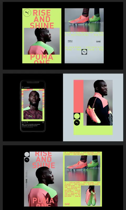
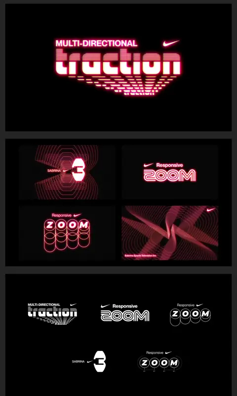
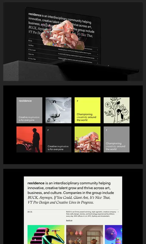
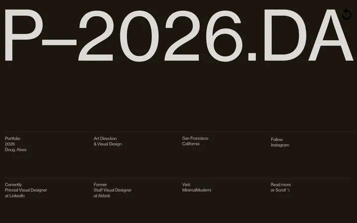
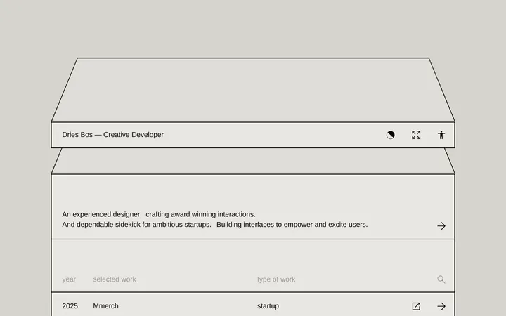
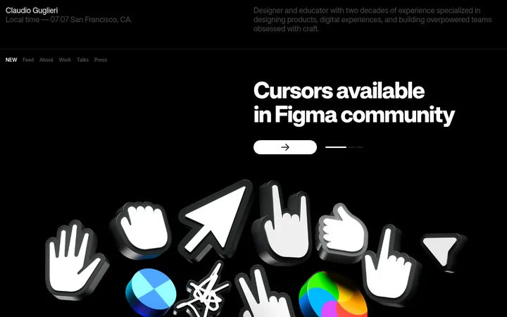
North star · Keep the interface quiet and typographically direct so the vivid, varied portfolio imagery remains the main event.
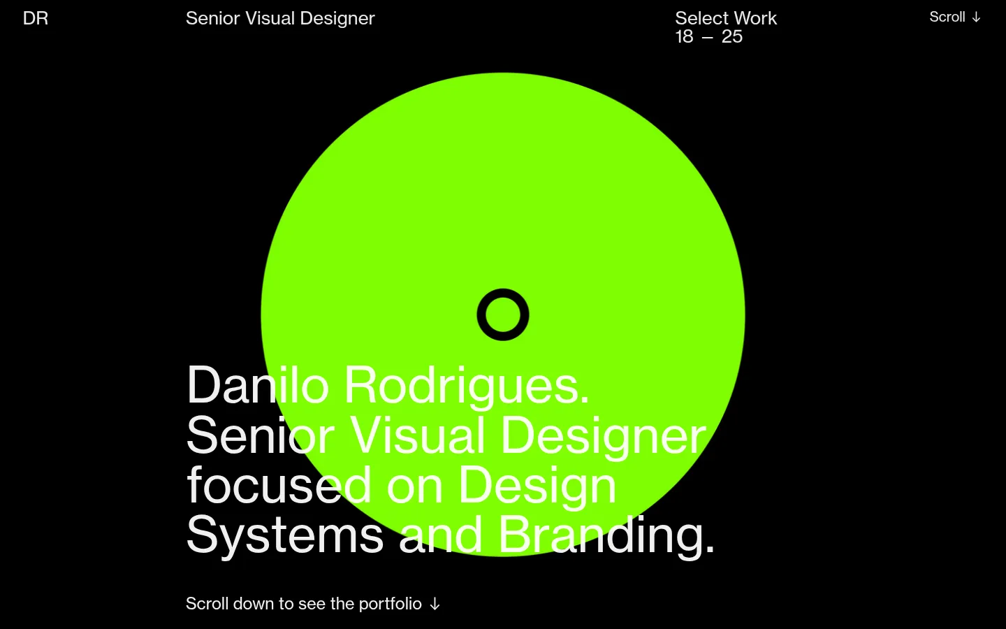
The page uses a dark, restrained shell that gives the portfolio work room to supply most of the color. The opening viewport pairs a nearly black field with a large electric-lime circular motif and oversized, regular-weight white introductory type. Below, a charcoal canvas hosts concise biography and project captions, while black image frames visually contain the case-study artwork. Neue Haas Grotesk keeps navigation, descriptions, and display copy in one coherent sans-serif voice; the type grows large for the introduction and remains compact in project metadata. The layout is editorial and long-form: a sparse introduction gives way to alternating two-column project details and broad, stacked media. Images vary between campaign photography, brand layouts, digital mockups, and motion-derived graphics, retaining their own palettes rather than imposing a uniform filter. Flat surfaces, generous breathing room, and minimal decorative UI keep attention on the work.
配色
点色块复制色值。用途说明来自对页面的实测位置(背景、文字、描边、按钮)与截图判读。
表层色
中性色
功能色
页面底色 · Graphite Canvas表层 · Gallery Black主文字 · Paper White
Navigation, large introductory statement, biography, captions, and project metadata.
角色
示例
字号
字重
行高
字距
特大标题
Oversized opening statement layered over the lime circular motif.
Danilo Rodrigues
71.5px
400
1
0
一级标题
Primary introduction and prominent page-level copy.
Danilo Rodrigues
31px
400
1.1
0
二级标题
Secondary project or content headings.
The quick brown fox 敏捷的狐狸
26px
400
1
0
三级标题
Project captions and supporting section text.
The quick brown fox 敏捷的狐狸
23.5px
400
1.3
0
正文
Biography, descriptions, navigation, and project credits.
The quick brown fox 敏捷的狐狸
19.5px
400
1.2
0
间距与布局
基准单位 1px · 密度:适中
32px版块间距
—元素间距
—卡片内边距
1375px内容最大宽度
13px
22px
26px
32px
45px
83px
130px
The page is a long, single-column portfolio with a measured maximum content width of 1375px and a comfortable density. The opening viewport uses a slim four-part navigation row above a centered graphic and left-aligned statement. Biography copy sits in a narrow column with substantial empty space. Project introductions use two columns for title and credits, followed by broad media panels stacked vertically. Charcoal bands separate phases of the page, and the measured section rhythm uses a 32px section gap.
圆角与层次
没有测到阴影:页面是扁平的,层次靠底色和描边区分。
The interface is predominantly flat, with no measured shadows or radius system. Black panels and charcoal bands create contrast through surface changes rather than elevation. Images sit as crisp, rectangular blocks; artwork may include its own mockup depth, texture, or lighting, but those effects belong to the case studies rather than the surrounding UI.
组件
下面的预览按实测的按钮、输入框、徽标、卡片样式重建(字体用替代字体)。
Top navigation
Sparse horizontal row with the DR monogram, role, selected-work years, and a scroll cue in light text.
Intro statement
Large regular-weight white text overlaps a bright lime circular graphic on the black opening canvas.
Biography block
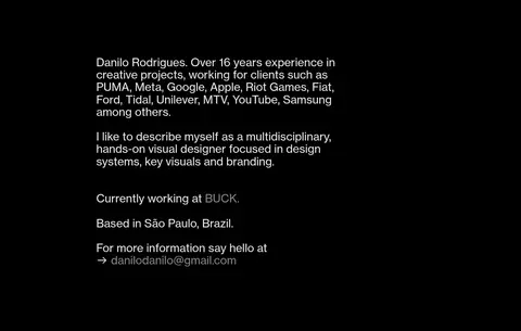
Compact left-aligned biography and contact copy on a black surface, with subdued inline details.
Project caption row
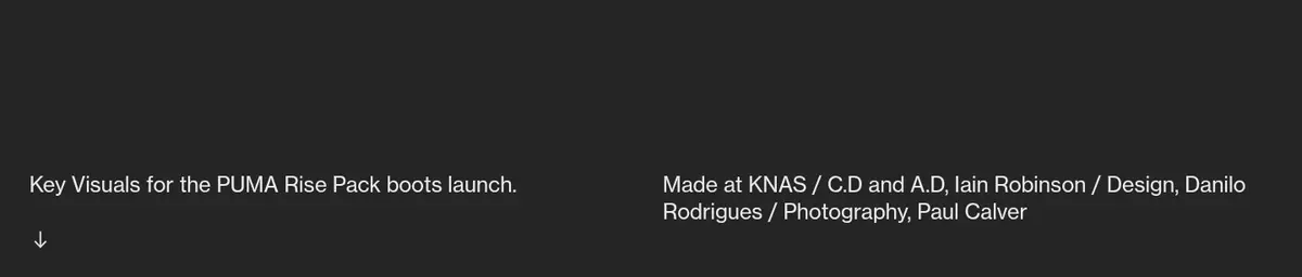
Two-column project description and credits on charcoal, with a small downward continuation cue.
Case-study media panel
Large rectangular artwork framed by a black mat, often followed by more stacked panels.
Inline contact link
Simple text link embedded in biography copy, using muted text rather than a button treatment.
Imagery · Case studies dominate the lower page: campaign photography, sneaker visuals, brand systems, responsive layouts, phone mockups, and 3D scenes. Artwork is presented in large rectangular panels, often against black, with varied internal compositions and vivid colors retained as supplied. The opening lime circle is a simple graphic motif, not a general page palette.
Reserve the lime motif for a deliberate focal graphic.
Set introductory copy large and regular-weight.
Give each project its own broad media panels.
Separate project titles from credits with a clear two-column row.
Keep interface details quieter than the featured work.
✕ 不该做
Do not turn portfolio artwork colors into global UI accents.
Do not add gradients or shadows to the interface without evidence.
Do not crowd the introduction with controls.
Do not apply rounded cards to rectangular media panels.
Do not make captions compete with the case-study imagery.
Do not force a uniform color treatment onto varied project assets.
给 AI 的提示词
想快速出一个同风格的新页面,把这段话连同 DESIGN.md 一起发给 AI。
Build a new portfolio page in this restrained editorial style. Use Graphite Canvas (#252525) and Gallery Black (#000000) for the page shell and media areas, with Soft Chalk (#eaeaea) for primary text and Muted Stone (#878787) for quiet secondary details. Treat Paper White (#f2f2f2) as a measured text color, not a new accent. Use a clean regular-weight grotesk, with an oversized introductory statement and compact project captions. Keep navigation sparse, biography copy narrow, and project metadata in a two-column row. Present case studies as large, sharp-cornered image panels, allowing each project’s artwork to retain its own palette. Favor flat surfaces and open spacing; avoid decorative borders, shadows, generic cards, and extra interface chrome.