North star · Let oversized aqua typography and honest, isolated product photography lead on a quiet white canvas.
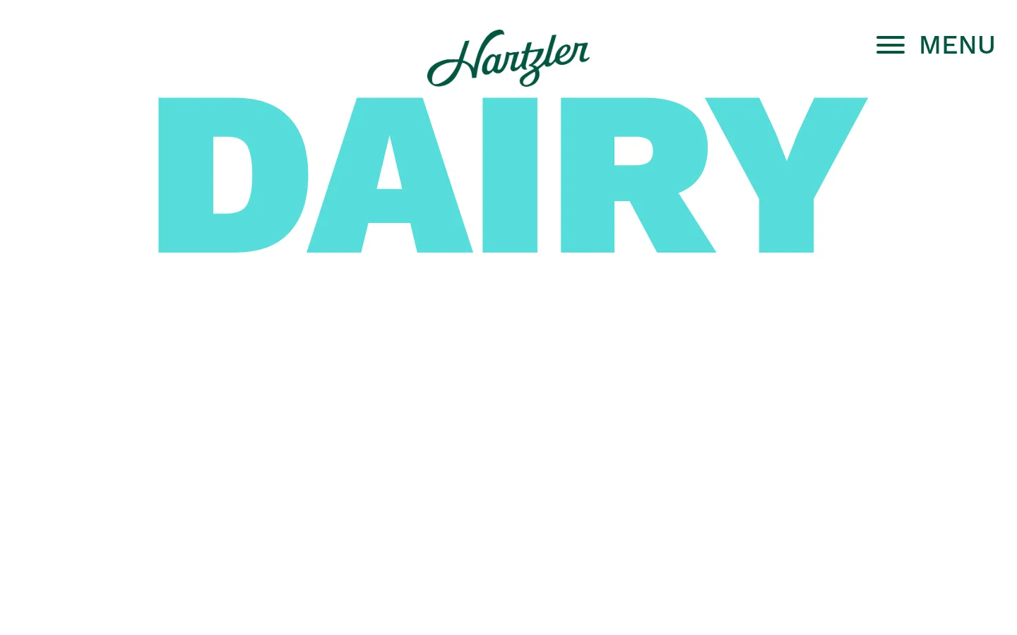
The page uses white as an expansive canvas, leaving generous open space around the products and oversized display words. Deep green (#035542) anchors the Hartzler script logo, menu, and outlined product navigation, while vivid aqua (#56dddb) carries the enormous “DAIRY” headline and product labels. Pale yellow (#f9e9a9) appears as a secondary display accent in “FRESH”; it is a supporting graphic colour rather than a defining interface colour. Work Sans supplies both the heavy, compact display lettering and the restrained supporting copy. A centered brand mark and menu sit above the hero composition; bottle and ice-cream photography is arranged across the page, with small captions and floating category labels. The layout is sparse and vertically paced, letting product imagery and typographic gestures define the page instead of cards, shadows, or dense content. Green outlined pill buttons and small social marks finish the footer.
Display lettering, headings, body copy, captions, links, and menu text.
角色
示例
字号
字重
行高
字距
特大标题
Oversized graphic words such as “DAIRY” and “FRESH”.
Hartzler Family Dairy
333px
900
1
0
一级标题
Primary hero headline, rendered as bold display lettering.
Hartzler Family Dairy
275px
900
0.7
-0.011em
二级标题
Supporting section headings.
Hartzler Family Dairy
40px
400
1
0
正文
Product and brand description copy.
The quick brown fox 敏捷的狐狸
18px
400
1.45
0
辅助文字
Small product captions and supporting labels.
The quick brown fox 敏捷的狐狸
17px
500
1.06
0
链接
Compact functional links and footer navigation.
The quick brown fox 敏捷的狐狸
14px
400
1.45
0
间距与布局
基准单位 4px · 密度:适中
50px版块间距
—元素间距
—卡片内边距
—内容最大宽度
10px
12px
15px
20px
24px
30px
50px
Use a centered, single-page composition with broad white margins and a vertical flow from compact header into a large product-led hero, then supporting display text and footer navigation. Keep the logo centered and the menu aligned to the upper-right. Product imagery forms a loose horizontal group rather than a boxed grid; captions sit close to their products. Preserve the airy density and substantial gaps between content groups. Exact maximum width and column measurements are not supplied, so derive them from the reference composition rather than adding arbitrary fixed dimensions.
圆角与层次
按钮 · 20px
没有测到阴影:页面是扁平的,层次靠底色和描边区分。
The interface is predominantly flat: white canvas, unshadowed typography, and product photography provide the depth. Outlined green pill controls create the main interface boundary, with fine caption text and small labels around the products. Avoid elevated cards or strong drop shadows; let overlap and image edges supply visual layering.
组件
下面的预览按实测的按钮、输入框、徽标、卡片样式重建(字体用替代字体)。
Header and menu
Centered script logo with a green hamburger icon and MENU label aligned to the upper-right on white.
Display hero
A huge, heavy aqua “DAIRY” word sits behind or alongside the prominently arranged product photographs.
Product group
Large cutout-style milk bottles and an ice-cream tub form a loose horizontal showcase, with concise captions beneath.
Category labels
Small aqua tags identify products such as chocolate milk, classic milk, ice cream, and butter.
Secondary display word
A large pale-yellow “FRESH” graphic repeats the bold typographic motif lower on the page.
Footer navigation
Script logo, green outlined pill links, and compact social icons sit on the white canvas.
Imagery · Use high-quality, isolated product photography of milk bottles and ice cream, with packaging labels and natural product details visible. Arrange products at large scale against the white background, allowing slight overlap with the giant aqua headline. Small aqua category tags and concise captions identify items. Keep imagery photographic and product-focused; avoid adding decorative illustration or complex background scenes.
该做与不该做
✓ 该做
Keep the canvas white and the overall composition airy.
Use #035542 for branding, menu elements, and outlined navigation.
Make display words oversized, heavy, and graphic.
Show products as clear, high-quality photography.
Use #56dddb for headline emphasis and category tags.
Keep captions and supporting copy compact and unobtrusive.
✕ 不该做
Do not fill the page with colored section backgrounds.
Do not place every product inside a card.
Do not add shadows or gradients absent from the reference.
Do not use dense text blocks to compete with the products.
Do not treat #f9e9a9 as a general interface background.
Do not replace the distinctive script logo with generic text.
给 AI 的提示词
想快速出一个同风格的新页面,把这段话连同 DESIGN.md 一起发给 AI。
Build a new Hartzler-style dairy page with a pure #ffffff canvas and a sparse, product-led composition. Use #035542 for the brand mark, menu, and thin outlined pill navigation; use #56dddb for oversized bold display words and small product tags. Reserve #f9e9a9 for occasional display lettering, not large surfaces. Set all interface type in Work Sans or a close free alternative, contrasting very heavy display text with compact, regular captions. Center the logo, place the menu at the upper-right, and arrange crisp product photography in a loose horizontal showcase with small captions. Let whitespace separate content groups. Keep surfaces flat, avoid card grids and shadows, and finish with simple outlined footer links and small social icons.