North star · Let vivid, close-up food photography lead, and keep its surroundings calm, warm, and easy to scan.
The page balances appetite appeal with a calm, natural visual identity. Gallery White (#f4f3e7) is the main canvas, while pale Sage (#d8e5d6) and Oatmeal (#e8dcc6) mark distinct editorial sections. Deep Ink (#0e150e) keeps navigation, headings, and descriptive copy legible; Forest Green (#00473c) accents the wordmark and compact order control, while Citrus Glow (#e6ff55) makes the primary order CTA unmistakable. SweetSans and SweetSansText carry the page’s clean, direct voice, with Grenette used for expressive display and button typography where measured. Layout shifts between a full-bleed hero, a three-column menu presentation, and two-column image-and-copy features. Food photography is large and richly detailed, providing most of the visual complexity against otherwise flat, quiet surfaces. Compact navigation and close-set menu details contrast with generously composed feature bands, giving the long page a clear, varied rhythm.
配色
点色块复制色值。用途说明来自对页面的实测位置(背景、文字、描边、按钮)与截图判读。
品牌色
强调色
表层色
中性色
页面底色 · Gallery White表层 · Garden Sage表层 2 · Warm Oat主文字 · Deep Ink描边 · Deep Ink强调 · Forest Green
Navigation, body copy, captions, links, labels, and most page text.
Aa 设计
SweetSans
网络字体 · 字重 400 · 占比 8%
免费替代:DM Sans
Large display and main hero heading.
角色
示例
字号
字重
行高
字距
特大标题
Oversized hero or campaign display copy.
sweetgreen
80px
400
0.85
0
一级标题
Primary hero headline.
sweetgreen
70px
400
0.85
0
二级标题
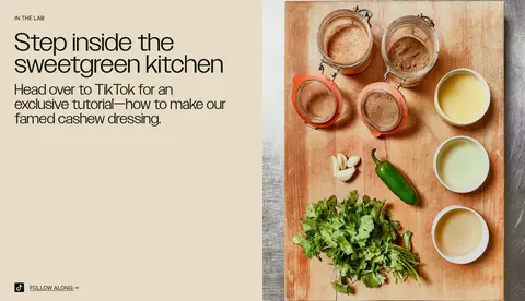
Expressive section headline, including kitchen feature.
sweetgreen
48px
200
1
-0.047em
三级标题
Menu item names or prominent feature headings.
sweetgreen
40px
400
1
0
四级标题
Secondary feature and content headings.
The quick brown fox 敏捷的狐狸
24px
400
1.2
0
正文
Menu descriptions and supporting editorial copy.
The quick brown fox 敏捷的狐狸
18px
400
1.25
0
辅助文字
Small labels, dietary notes, and image captions.
The quick brown fox 敏捷的狐狸
16px
400
1.38
0
按钮
Large editorial-style button labels where used.
sweetgreen
48px
200
1
-0.047em
导航
Uppercase primary navigation labels.
The quick brown fox 敏捷的狐狸
16px
400
1
0
链接
Inline actions such as menu ordering and follow-along.
The quick brown fox 敏捷的狐狸
18px
400
1.25
0
眉题
Uppercase section labels above feature headings.
The quick brown fox 敏捷的狐狸
24px
400
1.2
0.03em
间距与布局
基准单位 4px · 密度:紧凑
40px版块间距
8px元素间距
—卡片内边距
1360px内容最大宽度
3px
4px
5px
8px
10px
12px
13px
15px
16px
20px
24px
30px
35px
40px
43px
60px
The page uses a broad desktop canvas measured to a 1360px maximum width, with a compact horizontal navigation row and mostly left-aligned content. The hero spans the viewport; the menu becomes a three-column product grid, while workplace and kitchen stories use two-column image-and-copy splits. Sections alternate warm neutral, sage, and oat backgrounds for clear pacing. Spacing feels compact around navigation and menu details, but more open around editorial feature content.
圆角与层次
按钮 · 9999px
输入框 · 10px
图片 · 20px
链接 · 4px
没有测到阴影:页面是扁平的,层次靠底色和描边区分。
The visual system is predominantly flat: section backgrounds and photography create hierarchy instead of shadows. Thin dark outlines appear on simple controls, and menu images sit directly on the canvas without prominent card framing. Use rounded pill shapes for order actions and restrained corner rounding for media; avoid decorative layering.
组件
下面的预览按实测的按钮、输入框、徽标、卡片样式重建(字体用替代字体)。
Primary navigation
A compact horizontal row on Gallery White, with uppercase SweetSansText links, centered green wordmark, and a dark green order pill.
Hero order CTA
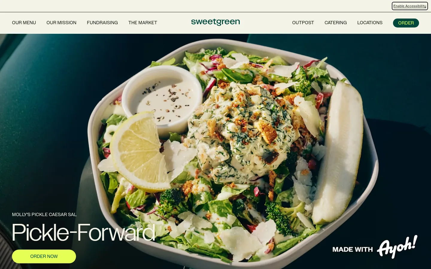
Bright Citrus Glow pill with Forest Green uppercase text, placed over the lower-left area of the full-bleed hero image.
Menu category and product grid
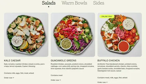
Category labels above three aligned food cards; each card pairs a food photograph with a bold name, concise ingredients, dietary notes, and an order link.
Editorial feature split
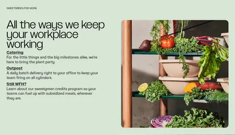
Two-column feature band with short copy and a supporting photograph; workplace content uses Garden Sage, kitchen content uses Warm Oat.
Newsletter signup
Two-column content area with an email field, thin Deep Ink outline, and a simple arrow action beside app download links.
Footer link columns
Multi-column navigation on Garden Sage with compact uppercase group headings, small links, and minimal visual decoration.
Imagery · Photography is the defining visual asset: overhead and close-framed bowls, fresh produce, ingredients, and kitchen scenes. The opening salad image runs full bleed and fills most of the first viewport; menu imagery is repeated in aligned cards. Feature photography sits beside copy within split sections. Keep images natural, richly detailed, and unornamented; no illustration or 3D treatment defines the page.
Use Gallery White (#f4f3e7) as the dominant page canvas.
Let large, natural food photography anchor hero and menu sections.
Use Garden Sage (#d8e5d6) and Warm Oat (#e8dcc6) for editorial section bands.
Keep navigation uppercase, compact, and set in a clean sans-serif.
Make the primary order action highly visible in Citrus Glow (#e6ff55).
Use Deep Ink (#0e150e) for readable copy and restrained outlines.
✕ 不该做
Do not introduce gradients or decorative shadows.
Do not add colors outside the measured palette without evidence.
Do not crowd feature imagery with extra labels or ornaments.
Do not turn food cards into heavily elevated or bordered panels.
Do not use tiny, low-contrast text for important actions.
Do not make every section the same layout or background.
给 AI 的提示词
想快速出一个同风格的新页面,把这段话连同 DESIGN.md 一起发给 AI。
Build a new restaurant page in sweetgreen’s calm, food-led visual style. Use Gallery White (#f4f3e7) as the main canvas, Deep Ink (#0e150e) for copy and navigation, Forest Green (#00473c) for brand accents, and Citrus Glow (#e6ff55) for the primary order action. Use Garden Sage (#d8e5d6) and Warm Oat (#e8dcc6) as alternating editorial section surfaces. Set a compact uppercase sans-serif navigation above a dominant, full-bleed food photograph. Follow with a scannable product grid and varied two-column feature bands pairing concise copy with natural, richly detailed photography. Use SweetSansText-like sans-serif typography for utility and body text, with a softer editorial display face for major headings. Keep surfaces flat, spacing purposeful, and controls simple and rounded.