North star · Let expressive hand-drawn storytelling breathe on white, and keep every interface element quieter than the artwork.
The page is defined by a pure white canvas and a deliberately limited measured palette: black carries the navigation, hand-drawn artwork, and prominent lettering, while muted gray supports footer copy. Most of the brand expression comes from typography and imagery rather than colored UI. HeyteaSans provides the widely tracked navigation, body copy, and controls; JaaamForHeytea gives section headings and the hero slogan a loose, handwritten character. The layout is spacious and editorial, with a compact navigation above large, open content areas and long vertical intervals between stories. Full-bleed hero illustrations establish the brand voice, while product cups and store photographs supply the principal color and texture. Keep interface furniture quiet: links read as plain text, sections remain flat, and images sit directly in the page rather than inside decorative cards. The result feels personal and playful without sacrificing clarity.
Handwritten display lettering, including section headings and hero slogan
Aa 设计
HeyteaSans-Light
网络字体 · 字重 400 · 占比 1%
免费替代:Jost
Occasional light supporting copy
角色
示例
字号
字重
行高
字距
正文
Supporting descriptions and brand-story copy
The quick brown fox 敏捷的狐狸
19px
400
1.5
0.132em
按钮
Plain text controls and calls to explore
The quick brown fox 敏捷的狐狸
19px
400
1.5
0.132em
导航
Top-level site navigation and language selector
The quick brown fox 敏捷的狐狸
19px
400
1.5
0.132em
间距与布局
基准单位 4px · 密度:宽松
160px版块间距
6px元素间距
—卡片内边距
1247px内容最大宽度
6px
12px
16px
36px
43px
45px
47px
58px
96px
160px
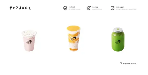
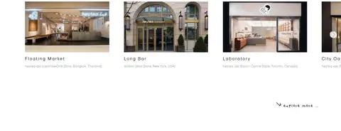
Use a spacious, single-column editorial page with a measured maximum content width of 1247px. The header aligns a small brand mark left and navigation right; content sections alternate between open text-and-illustration compositions and image-led galleries. Maintain the measured 160px section rhythm and 6px element gap as references, while keeping alignment calm and uncluttered. The measured density is spacious. Product imagery can form a three-column presentation, and store photography can run as a horizontal multi-item gallery.
圆角与层次
没有测到阴影:页面是扁平的,层次靠底色和描边区分。
The page reads as flat: measured data reports no shadows, gradients, or radius scale, and the screenshot shows no prominent card surfaces. Keep sections on the same white canvas and avoid decorative layering. Let image content provide depth; use simple, unobtrusive separation rather than invented borders or raised panels.
组件
下面的预览按实测的按钮、输入框、徽标、卡片样式重建(字体用替代字体)。
Header navigation
Small brand mark at left; widely tracked text links and an English language control aligned across the right side on white.
Hand-drawn hero
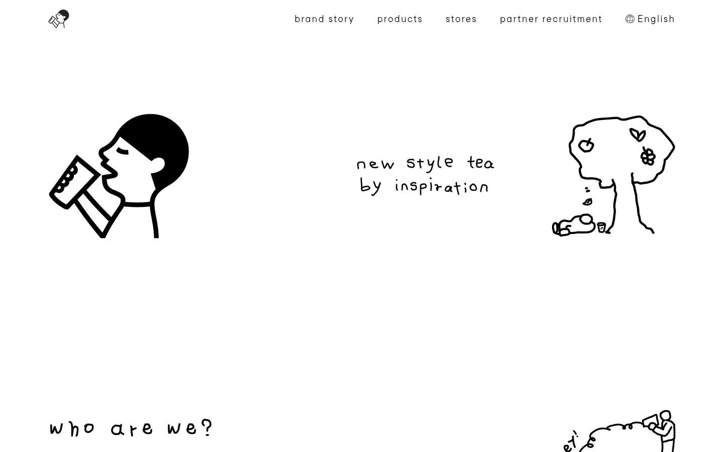
Open hero composition pairing black line-art characters with a short handwritten slogan; keep the artwork visually dominant.
Story introduction
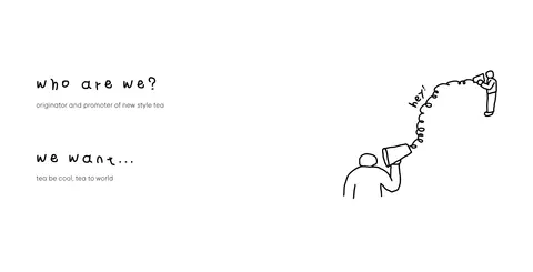
Brief handwritten heading and supporting copy arranged with a small accompanying line illustration.
Brand story feature
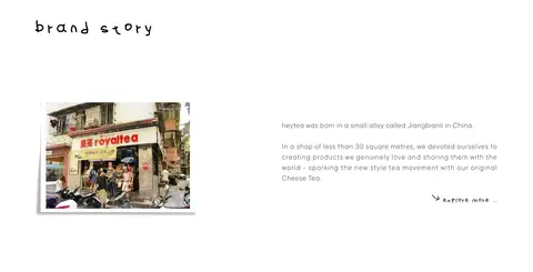
Editorial brand-history section combining a heading, archival-style shop photograph, concise copy, and a text-link prompt.
Product showcase
Three-column drink presentation with product imagery, short handwritten heading, and compact feature notes.
Store gallery
Horizontal row of store photographs with concise location labels and supporting descriptions.
Footer
Restrained brand sign-off with muted information text and small utility links on the same white canvas.
Imagery · Use loose black line-art illustrations as the signature visual language, especially in the hero and introductory storytelling. Pair them with real brand-history and store photography, plus isolated product images that show drinks and packaging clearly. Keep imagery on the white canvas with minimal framing; color should come mainly from the photographed products and spaces rather than added interface decoration.
Keep the page canvas white and the interface palette restrained.
Use hand-drawn lettering for short, expressive display moments.
Give illustrations and section transitions generous breathing room.
Use plain text for navigation and understated calls to explore.
Let real drink and store photography supply most non-neutral color.
Keep story copy compact and subordinate to its imagery.
✕ 不该做
Do not introduce bright UI accent colors absent from the measured palette.
Do not place every image inside a card or framed panel.
Do not use heavy shadows, gradients, or rounded-card styling.
Do not make handwritten display type carry long paragraphs.
Do not compress the large intervals between editorial sections.
Do not let navigation or supporting copy overpower the illustrations.
给 AI 的提示词
想快速出一个同风格的新页面,把这段话连同 DESIGN.md 一起发给 AI。
Build a new heytea page as a spacious, white editorial experience. Use Gallery White (#ffffff) for the continuous canvas, Sketch Ink (#000000) for navigation, headlines, and line-art, and Soft Graphite (#444444) only for subdued supporting or footer copy. Set navigation and body text in a clean sans-serif close to Jost, with open tracking; use a Caveat-like handwritten display face sparingly for short headings and slogans. Compose sections with generous whitespace, compact copy, and clear image-to-text relationships. Favor loose black illustrations and real product or store photography over decorative UI. Keep components flat, avoid invented shadows, gradients, and colored panels, and make links feel like understated text rather than prominent buttons. Preserve a calm, playful, hand-drawn brand voice.