North star · Let the seasonal fashion photography carry the drama; keep the surrounding interface warm, quiet, editorial, and spacious.
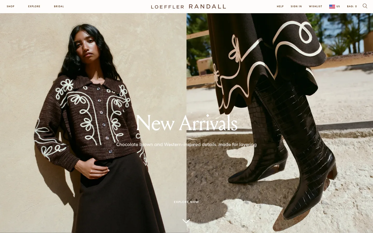
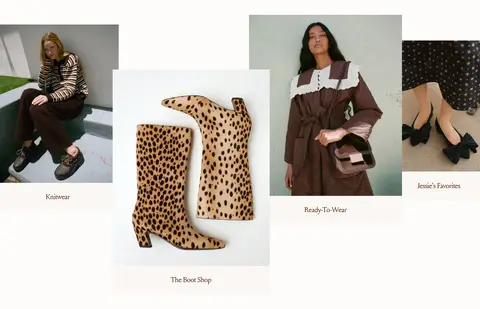
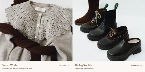
The visual system is built around an ivory canvas (#fdfcfa), deep brown text and links (#4f1f00), and a black-backed opening campaign section (#000000). Keep the interface’s own color restrained; richer browns, creams, and other tones belong primarily to the seasonal photography rather than the UI palette. Louize supplies the elegant, regular-weight serif for campaign and section headings, while Centra handles navigation, body copy, captions, and compact uppercase actions. The hero pairs two adjacent fashion photographs with centered white campaign copy, making imagery the dominant element. Below it, editorial category images form an irregular four-item arrangement, followed by balanced two-column product features and a centered customer-style portrait and quote. Generous section breathing room offsets the dense photographic content. Components remain mostly flat and square-edged, with subtle warm fills on selected cards and buttons rather than shadows or decorative borders.
Navigation, body copy, captions, links, buttons, and utility labels.
Aa 设计
Louize
网络字体 · 字重 400 · 占比 37%
免费替代:Cormorant Garamond
Display and section headings, including the opening campaign title.
角色
示例
字号
字重
行高
字距
特大标题
Oversized campaign title over the opening hero photography.
Loeffler Randall
84px
400
1.5
0
一级标题
Primary page or campaign heading.
Loeffler Randall
30px
400
1.5
0
二级标题
Centered section titles such as Featured Items.
The quick brown fox 敏捷的狐狸
26px
400
1.38
0
三级标题
Subsection headings and editorial feature titles.
The quick brown fox 敏捷的狐狸
25.5px
400
1.38
0
四级标题
Smaller editorial headings within content blocks.
The quick brown fox 敏捷的狐狸
22px
400
1.36
0
正文
Product descriptions, newsletter copy, and supporting text.
The quick brown fox 敏捷的狐狸
14px
400
1.86
0.014em
辅助文字
Category names and short image-adjacent labels.
The quick brown fox 敏捷的狐狸
13px
400
1.73
0
按钮
Compact uppercase calls to action such as SHOP HER PICKS.
The quick brown fox 敏捷的狐狸
12px
500
1
0.1em
导航
Primary navigation and utility navigation labels.
The quick brown fox 敏捷的狐狸
13px
400
1.73
0
链接
Short text actions such as SHOP NOW.
The quick brown fox 敏捷的狐狸
12px
500
1
0.1em
眉题
Small uppercase section or content identifiers.
The quick brown fox 敏捷的狐狸
9px
500
2.5
0.16em
间距与布局
基准单位 2px · 密度:适中
45px版块间距
5px元素间距
16px卡片内边距
1395px内容最大宽度
4px
5px
8px
11px
14px
15px
18px
20px
21px
23px
26px
30px
32px
45px
54px
60px
A slim full-width utility header sits above a two-image campaign hero. Below, the page alternates centered section headings with an irregular four-category image arrangement, a balanced two-column feature row, and a centered portrait-and-quote feature. The footer resolves into four columns. Content uses a measured maximum width of 1395px and comfortable density; the measured section gap is 45px. Preserve substantial vertical breathing room and let image widths and asymmetry create editorial rhythm rather than adding extra UI framing.
圆角与层次
没有测到阴影:页面是扁平的,层次靠底色和描边区分。
The page is predominantly flat, with no measured shadows or gradients. Use square-edged controls and image cards; rely on photography, white space, and occasional overlap in the category layout for depth. Warm off-white card fills can distinguish product labels or actions without adding visible elevation.
组件
下面的预览按实测的按钮、输入框、徽标、卡片样式重建(字体用替代字体)。
Editorial campaign hero
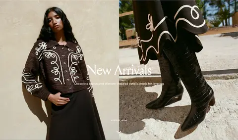
Two adjacent fashion photographs anchor the first section, with a large centered Louize title, supporting copy, and a small explore action over the imagery.
Primary navigation
A narrow ivory header places SHOP, EXPLORE, and BRIDAL at left, the spaced brand wordmark centrally, and help, account, wishlist, region, bag, and search utilities at right.
Category image cards
Four editorial category links use uneven image sizing and staggered placement; each receives a simple Centra label beneath or beside its image.
Two-column feature cards
Paired wide product images sit above concise serif titles, compact supporting copy, and understated SHOP NOW links.
Quote and customer portrait
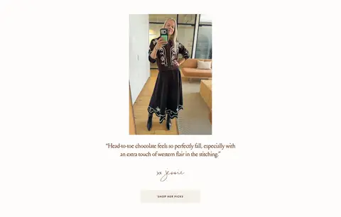
A centered portrait is followed by a short fashion quote, handwritten-style attribution in the image content, and a warm-filled SHOP HER PICKS button.
Newsletter and footer
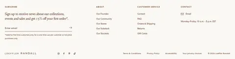
A four-column footer combines a signup form and compact About, Customer Service, and Contact link lists, with small utility links along the bottom.
Imagery · Use high-quality fashion and product photography as the main visual content: seasonal looks, footwear, knitwear, and accessories. The opening hero juxtaposes a model portrait with a close product-fashion scene; later category cards use varied portrait and product crops. Keep images natural and tactile, with warm real-world light and minimal graphic treatment. No illustration or 3D-rendered imagery defines the visual identity.
Reserve #000000 for dark campaign surfaces where appropriate.
Let large, tactile fashion photographs lead each section.
Use Louize for editorial headings and Centra for interface copy.
Keep controls flat, square-edged, and visually understated.
Preserve generous gaps between distinct editorial sections.
✕ 不该做
Do not introduce extra brand colors beyond the measured palette.
Do not add shadows, gradients, or rounded card treatments.
Do not crowd the hero with navigation-like overlays.
Do not use heavy all-caps styling for every text role.
Do not make the layout feel like a dense product catalog.
Do not treat colors inside campaign photography as interface colors.
给 AI 的提示词
想快速出一个同风格的新页面,把这段话连同 DESIGN.md 一起发给 AI。
Build a new fashion-commerce page in Loeffler Randall’s warm editorial style. Use Gallery Ivory (#fdfcfa) as the canvas and Roasted Umber (#4f1f00) for interface text and links; use Campaign Black (#000000) only for an intentional dark campaign surface. Set prominent editorial headings in a Louize-like serif and navigation, descriptions, captions, and actions in a Centra-like sans serif. Lead with large, carefully cropped fashion photography, then alternate centered headings, asymmetrical image categories, and balanced product features. Keep the overall layout spacious, with square-edged flat components, restrained warm button fills, and minimal borders. Make calls to action compact and understated. Do not add decorative gradients, shadows, bright UI accents, or rounded cards; allow the photography to provide the seasonal palette and visual drama.