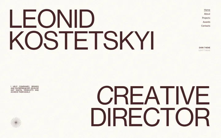
North star · Let oversized literary typography and stark light-dark section changes carry the identity; keep every supporting detail quiet and legible.
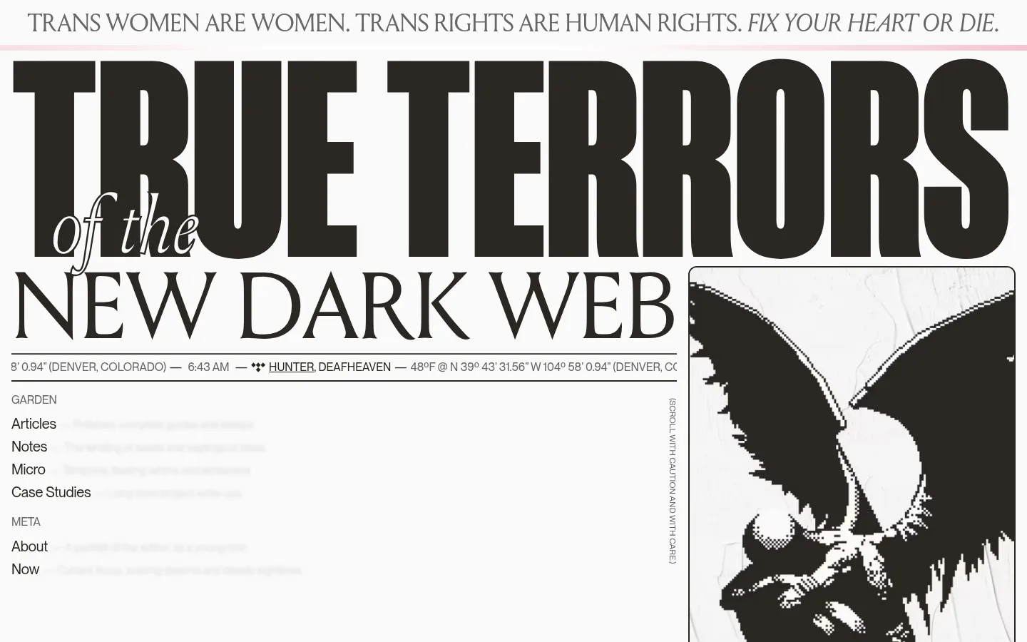
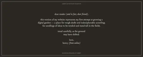
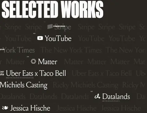
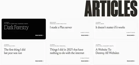
The visual identity is built around a near-black brown, #2a2722, against the warm off-white #fafafa. Large, high-contrast serif display lettering supplies a literary, poster-like voice, while Neue Montreal keeps navigation, metadata, and explanatory copy direct and contemporary. The opening is an intentionally oversized typographic composition, paired with a monochrome illustration rather than conventional portfolio photography. Alternating light and dark section bands create a clear long-scroll rhythm: the letter and selected work sit on dark fields, while the author profile and article listings return to the pale canvas. Layouts range from a spacious single-column statement to split biography and work areas, then a compact article grid. Thin rules, quiet metadata, and restrained borders organize dense content without decorative effects. The result feels personal and handmade, yet structured enough for browsing.
Body copy, navigation, links, captions, and metadata
Aa 设计
Louize Display
网络字体 · 字重 400 · 占比 33%
免费替代:Bodoni Moda
Oversized hero lettering and major section headlines
Aa 设计
Louize
网络字体 · 字重 400 · 占比 9%
免费替代:Cormorant Garamond
Smaller serif headings and article or editorial titles
角色
示例
字号
字重
行高
字距
特大标题
Oversized editorial hero headline and prominent project-link lettering.
Henry From Online
77px
400
normal
0
一级标题
Uppercase hero title, tightly stacked over the opening composition.
Henry From Online
34.5px
400
0.9
0
二级标题
Section headings, including the letter and article area.
Henry From Online
32px
400
1.1
0
三级标题
Smaller serif article and subsection titles.
The quick brown fox 敏捷的狐狸
24px
400
1.3
0
正文
Biography, personal letter, and explanatory portfolio copy.
The quick brown fox 敏捷的狐狸
20px
400
1.2
0
辅助文字
Uppercase metadata, category labels, and compact annotations.
The quick brown fox 敏捷的狐狸
12px
400
normal
0
导航
Header and footer navigation labels.
The quick brown fox 敏捷的狐狸
16px
400
1.2
-0.01em
链接
Readable inline links and calls to action.
The quick brown fox 敏捷的狐狸
20px
400
1.5
0
间距与布局
基准单位 8px · 密度:适中
64px版块间距
12px元素间距
28px卡片内边距
1408px内容最大宽度
4px
5px
8px
12px
16px
19px
20px
24px
32px
64px
The measured page max width is 1408px, with a comfortable density and a spacious single-column opening. The hero uses a dramatic type-led area beside framed artwork; later content alternates between centered letter writing, a two-column author section, two-column selected work, and a one-column article feed with card-like entries. Section transitions are broad and deliberate, using a measured 64px section gap. Supporting elements align to clear edges, while small uppercase labels and rules separate metadata from primary content.
圆角与层次
卡片 · 12px
没有测到阴影:页面是扁平的,层次靠底色和描边区分。
The visual system is mostly flat, with no measured shadows. Section color changes, fine rules, and card borders provide structure rather than raised surfaces. Cards use a measured 12px radius and a 2px border; dark work areas rely on tonal contrast and layered typography instead of conventional elevation.
组件
下面的预览按实测的按钮、输入框、徽标、卡片样式重建(字体用替代字体)。
Oversized hero
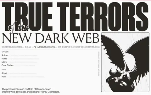
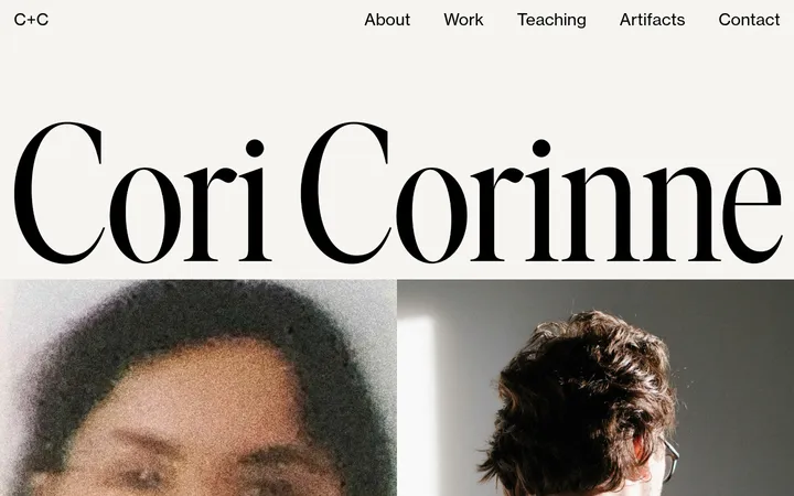
A tightly composed headline pairs massive uppercase Louize Display lettering with smaller serif phrasing, metadata rules, navigation, and a framed monochrome illustration.
Announcement strip
A thin top line carries an uppercase serif statement with an italicized ending, set apart from the hero by a subtle divider.
Editorial letter
Centered, restrained serif writing sits on a #2a2722 section, framed by a fine border and generous surrounding space.
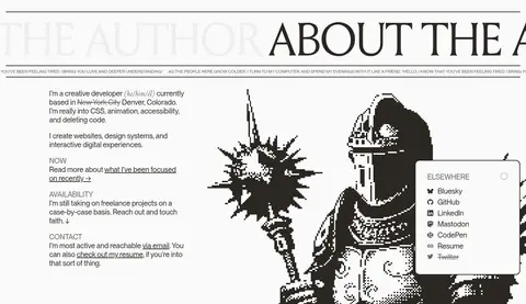
Author profile
Biography and availability copy share a two-column light section with a large black-and-white drawing and a compact social-links panel.
Selected work list
A dark portfolio section presents oversized white serif project names over subdued repeated wordmarks and compact case-study links.
Article cards
A light content feed uses fine #eeeeee borders, small uppercase category and reading metadata, serif titles, and compact read-more links.
Directory footer
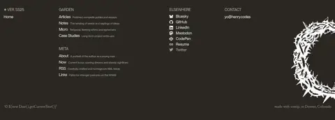
A dark footer groups garden, elsewhere, contact, and meta links into compact columns, with quiet secondary text and a large decorative illustration.
Imagery · The page favors monochrome, high-contrast illustrated imagery over polished product photography. A framed, distressed-looking image anchors the hero, and a large hand-drawn figure sits beside the author copy. The footer includes a hazy skyline image. Work references use understated repeated wordmarks and pale text textures, keeping imagery subordinate to the typography.
Use #fafafa and #2a2722 as the dominant alternating fields.
Give major headings a literary serif voice and dramatic scale.
Keep metadata small, uppercase, and visually subordinate.
Use monochrome, hand-rendered imagery with deliberate framing.
Organize long content into clearly differentiated section bands.
Use fine rules and restrained borders instead of shadows.
✕ 不该做
Do not introduce bright accent colors or gradients.
Do not replace the editorial typography with generic heavy sans-serif headings.
Do not fill every section with decorative imagery.
Do not use raised cards or pronounced drop shadows.
Do not compress the hero into a conventional centered headline.
Do not make metadata compete with titles and body copy.
给 AI 的提示词
想快速出一个同风格的新页面,把这段话连同 DESIGN.md 一起发给 AI。
Build a new page in the Henry From Online visual style. Use Paper White (#fafafa) as the light canvas and Charcoal Umber (#2a2722) for deliberate dark section bands; reserve muted grays for secondary copy, rules, and footer detail. Set dramatic editorial headlines in a Louize Display-like serif and keep navigation, body copy, and metadata in a clean Neue Montreal-like sans serif. Compose the opening around oversized typography and a framed monochrome illustration, then use clear long-scroll blocks with varied single- and two-column layouts. Keep the page flat: rely on section contrast, fine borders, and carefully aligned content rather than shadows. Use quiet uppercase captions and readable link labels. Maintain generous breathing room around primary statements, while keeping article and footer metadata compact.