North star · Keep the interface quiet and neutral so the varied project artwork carries all the colour and visual emphasis.
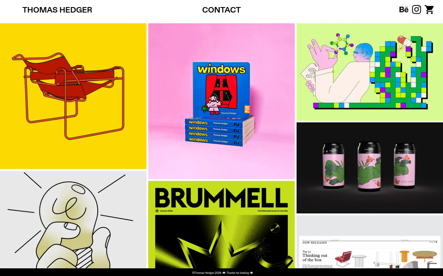
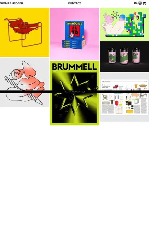
The page uses a white canvas and black typography as a neutral frame for a diverse portfolio, rather than imposing a strong colour system on the work. Bright yellow, pink, lime, and other hues appear inside project images; treat these as project-specific artwork, not interface colours. A compact, bold header sits above a closely packed, irregular multi-column gallery, with narrow white gutters separating images of differing proportions. The layout feels editorial and image-led: no prominent introductory copy competes with the work, and the expansive white canvas continues below the visible gallery. Diatype supplies the small regular text, while its variable bold counterpart handles the larger, emphatic links and identity text. Keep navigation black, direct, and visually light on the page. The overall strategy is deliberately flat and restrained, allowing contrasting illustration, typography, product imagery, and graphic compositions to define the mood from tile to tile.
配色
点色块复制色值。用途说明来自对页面的实测位置(背景、文字、描边、按钮)与截图判读。
表层色
中性色
页面底色 · Gallery White主文字 · Ink Black次要文字 · Gallery White
文字
背景
对比度
WCAG
#000000 Ink Black
#ffffff Gallery White
21:1
AAA
字体
字号阶梯:Custom(比例约 2.889,正文 9px)。示例用免费替代字体渲染,数值为实测。
Aa 设计
Diatype
网络字体 · 字重 400 · 占比 63%
免费替代:Inter
Small regular supporting text and compact labels.
Aa 设计
Diatype Variable
网络字体 · 字重 700 · 占比 37%
免费替代:Inter
Bold wordmark, navigation links, and prominent short labels.
角色
示例
字号
字重
行高
字距
一级标题
Prominent bold identity or short headline treatment.
The quick brown fox 敏捷的狐狸
26px
700
1.1
0
正文
Small, quiet supporting copy and compact labels.
The quick brown fox 敏捷的狐狸
9px
400
1.1
0
链接
Bold navigation and identity links in the header.
The quick brown fox 敏捷的狐狸
26px
700
1.1
0
间距与布局
基准单位 2px · 密度:宽松
317px版块间距
—元素间距
—卡片内边距
—内容最大宽度
3px
Use a slim full-width header, then move directly into a dense, asymmetrical portfolio gallery. The gallery uses multiple vertical columns with images of varied heights and proportions; thin white gutters create separation without card framing. Align the wordmark left, contact link centrally, and social or shop icons right. Preserve the measured spacious page canvas beneath the compact image cluster rather than filling every viewport with content. No fixed max width is measured.
圆角与层次
没有测到阴影:页面是扁平的,层次靠底色和描边区分。
The interface reads as flat: no measured shadows, gradients, or card treatments. Use white gutters to distinguish adjacent works rather than outlines or elevation. Keep the header visually integrated with the canvas. Project artwork may contain its own dark areas, highlights, or layered compositions; preserve those as part of each image rather than recreating them as interface effects.
组件
下面的预览按实测的按钮、输入框、徽标、卡片样式重建(字体用替代字体)。
Header wordmark
Bold black “THOMAS HEDGER” text aligned at the left of the white header.
Contact link
Prominent bold black contact label centered in the header.
Social and shop links
Compact black social and shopping icons grouped at the right edge.
Portfolio gallery
Asymmetrical multi-column arrangement of edge-to-edge project images with narrow white separators.
Project tiles
Rectangular image-led works with differing proportions and no visible card chrome.
Footer credit
Small black credit line over the gallery area near the end of the visible work.
Imagery · Make the portfolio grid the visual focus, mixing illustration, graphic design, editorial layouts, and product imagery. Keep each project image in its own rectangular tile and retain its original artwork colours and composition. The bright yellows, pinks, greens, and dark backgrounds belong to project images, not the shared interface palette. Mix tile proportions to create a varied, collage-like rhythm.
Use black for the compact navigation and wordmark.
Let project images provide the colour.
Vary tile proportions in an irregular gallery.
Separate images with clean white gutters.
Keep interface decoration flat and restrained.
✕ 不该做
Do not turn artwork colours into global UI accents.
Do not add prominent hero copy above the portfolio.
Do not force every tile into one uniform ratio.
Do not add shadows or decorative card borders.
Do not crowd the header with extra navigation.
Do not fill the long white canvas with invented content.
给 AI 的提示词
想快速出一个同风格的新页面,把这段话连同 DESIGN.md 一起发给 AI。
Build a new portfolio page in Thomas Hedger’s restrained, image-first style. Use Gallery White (#ffffff) as the continuous canvas and Ink Black (#000000) for the wordmark, navigation, and small icons. Place a compact header above an asymmetrical multi-column gallery; use varied rectangular image proportions and narrow white gutters rather than card borders. Keep the header simple, with identity on the left, a contact link centered, and social or shop actions on the right. Use bold Diatype-like typography for short navigation labels and regular sans-serif for supporting text. Let project imagery bring its own vivid colours and visual language; do not promote those image colours into the site palette. Avoid shadows, gradients, oversized introductory copy, and decorative UI. Preserve generous white space after the work.