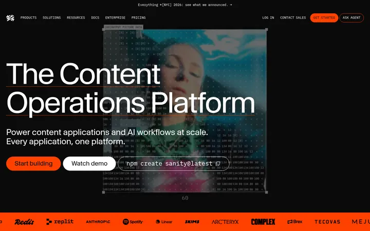
North star · Let luminous, carefully framed product UI carry the story, using restrained typography and alternating dark and light fields for clarity.
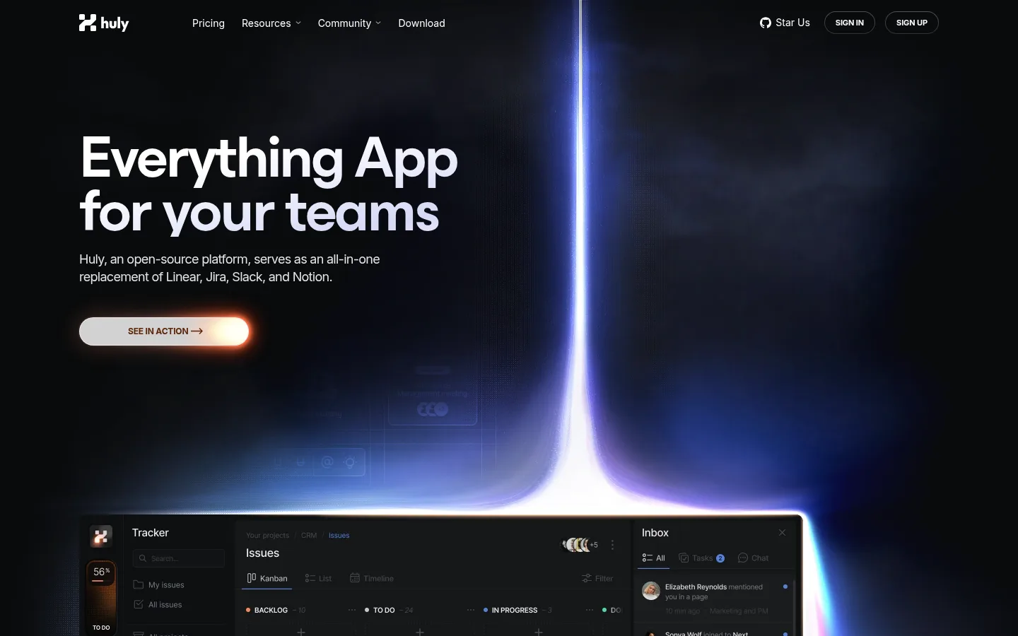
The page balances a near-black product atmosphere with broad, pale content bands. The hero and GitHub synchronization section use #090a0c and #111111 as immersive backdrops; #f6f6f6 provides a calm canvas for collaboration and documentation. Bright white display text and product screenshots stand out against dark fields, while dark headings and muted body copy keep light sections readable. Inter handles navigation, supporting copy and controls; a compact monospace face gives large headlines a distinctive technical character. Wide, left-aligned headings introduce sections, and full-bleed interface visuals carry much of the storytelling. Product panels combine dark UI, subtle glows and blue-violet light, while warm coral appears sparingly as part of artwork and gradients rather than a dominant brand fill. Generous vertical intervals separate dense feature layouts, and rounded controls and media frames soften the otherwise precise, software-focused presentation.
配色
点色块复制色值。用途说明来自对页面的实测位置(背景、文字、描边、按钮)与截图判读。
强调色
表层色
中性色
功能色
页面底色 · Gallery Mist表层 · Night Interface表层 2 · Carbon Band主文字 · Graphite Ink次要文字 · Bright Type弱文字 · Soft Slate描边 · Quiet Rule强调 · Signal Blue
Oversized hero and prominent section display headlines.
Huly
84px
600
0.9
-0.04em
一级标题
Primary page headline in the opening hero.
Huly
80px
600
0.8
-0.05em
二级标题
Major feature-section headings.
Huly
32px
400
1
-0.02em
三级标题
Subsection titles within product feature areas.
Huly
28px
400
1
-0.02em
四级标题
Smaller feature-card and documentation headings.
The quick brown fox 敏捷的狐狸
24px
500
1.38
-0.02em
正文
Supporting paragraphs and explanatory product copy.
The quick brown fox 敏捷的狐狸
15px
300
1.38
-0.02em
辅助文字
Compact descriptions and interface-related notes.
The quick brown fox 敏捷的狐狸
14px
400
1
-0.02em
按钮
Action labels, including uppercase hero CTA.
The quick brown fox 敏捷的狐狸
14px
400
1.5
0
导航
Header navigation and account links.
The quick brown fox 敏捷的狐狸
14px
400
1.5
0
间距与布局
基准单位 4px · 密度:宽松
180px版块间距
18px元素间距
—卡片内边距
960px内容最大宽度
2px
4px
5px
6px
8px
10px
12px
14px
16px
18px
19px
20px
24px
32px
40px
64px
A centered, spacious page uses a measured maximum content width of 960px, with wide full-bleed media extending beyond text columns. Headings and copy generally align left; the collaboration section centers its headline over a broad visual. Feature cards use varied multi-column arrangements, while documentation becomes a narrower editorial flow. Large measured section gaps give each product story room, balanced by compact feature grids within individual sections.
圆角与层次
按钮 · 9999px
卡片 · 12px
图片 · 30px
md · other
hairline · card
sm · other
lg · media
Depth comes mostly from dark media panels, luminous edges, and layered product imagery rather than prominent card shadows. Cards have measured 12px corners, media frames 30px corners, and buttons pill-shaped corners. Use subtle outlines and restrained shadows to separate UI from canvas without adding heavy elevation.
组件
下面的预览按实测的按钮、输入框、徽标、卡片样式重建(字体用替代字体)。
Header navigation
Compact Inter navigation sits on the dark hero, with brand mark at left and community, download, and account links arranged across the top.
Hero CTA
Pill-shaped action sits beneath the hero copy; the screenshot shows a pale fill and warm edge glow over a dark background.
Product showcase
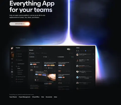
Large dark interface image is framed by blue-violet luminous treatment and anchored near the bottom of the opening section.
Feature tile
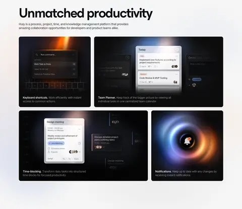
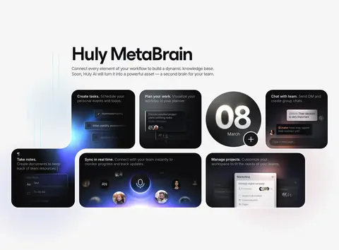
Rounded dark product-image cards pair interface visuals with short captions, arranged in an irregular multi-column grid.
Collaboration media
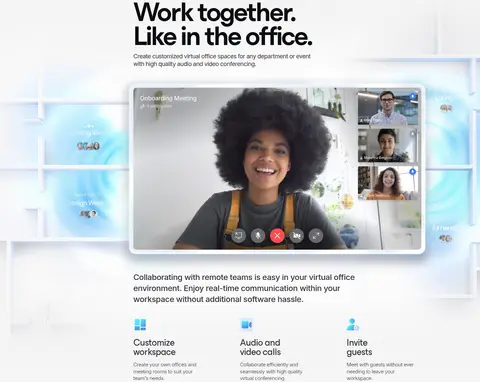
Wide video-call frame shows participants within a pale virtual-office setting, with supporting copy and compact feature summaries below.
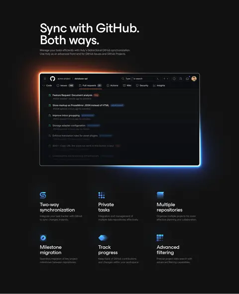
GitHub feature band
Near-black section centers a large synchronization screenshot above a three-column set of concise feature descriptions and blue-tinted icons.
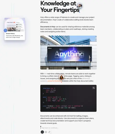
Documentation content
Light editorial section combines text, product visuals, a building-mounted campaign image, and a dark code example.
Closing CTA
Dark footer-like block pairs a circular glowing product illustration with a short invitation, pill action, and low-emphasis footer links.
Imagery · Product UI is the main visual material: dark screenshots, task boards, call interfaces, and documentation panels appear as large framed showcases and smaller feature tiles. The hero uses a luminous vertical blue-violet beam behind a product screenshot. Soft glow, atmospheric gradients, and occasional warm coral highlights are integrated into media. Real video-call imagery adds a human moment amid primarily interface-led visuals.
Use the measured near-black and pale canvas colors as the main section alternation.
Give product screenshots generous space and treat them as the primary storytelling device.
Reserve blue and coral accents for selective glow, media, or interaction highlights.
Keep headings left-aligned and supporting copy compact.
Use large section intervals to distinguish product stories.
Favor rounded media frames and pill-shaped actions.
✕ 不该做
Do not turn the page into a uniformly dark layout.
Do not use bright accents as large flat background fills.
Do not crowd the hero with extra copy or decorative controls.
Do not place generic stock imagery ahead of product UI.
Do not add heavy shadows to every card.
Do not use oversized, dense navigation.
给 AI 的提示词
想快速出一个同风格的新页面,把这段话连同 DESIGN.md 一起发给 AI。
Build a new productivity SaaS page in Huly’s visual style. Use Night Interface (#090a0c) for immersive hero or CTA bands and Gallery Mist (#f6f6f6) for editorial feature sections; reserve Carbon Band (#111111) for a distinct dark product feature. Set headings in a technical monospace display face and use Inter for navigation, body copy, and controls. Keep the content centered within the measured 960px maximum width, with broad product media, generous vertical section rhythm, and mostly left-aligned text. Make real interface screenshots the hero of each feature, framing them with restrained glow. Use Signal Blue (#5683da), Warm Haze (#f8e6dd), and Coral Flare (#ff8964) sparingly in media accents. Prefer rounded panels, pill actions, subtle borders, and clear contrast over decorative ornament.