North star · Keep the page calm and spacious, using bold navy typography and playful hand-drawn product details as its defining contrast.
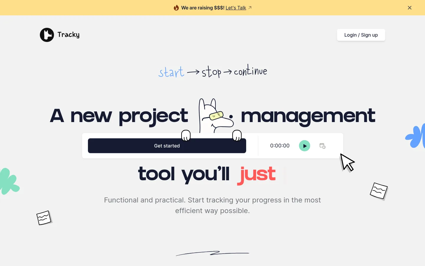
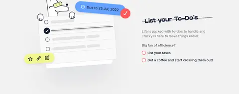
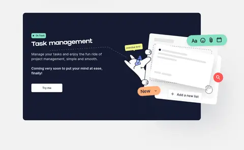
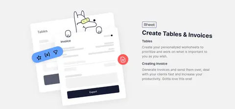
The visual strategy balances a restrained interface with expressive product storytelling. A light gray canvas (#f2f2f2) runs continuously through the page, while near-black navy (#151b31) anchors headlines, calls to action, and large product panels. Muted gray supports explanatory copy; coral red appears selectively as emphasis, and mint, blue, and warm yellow details are chiefly part of the illustrations rather than a broad UI palette. Heavy GRIFTER display headings contrast with practical Inter body text and navigation. The layout is centered and spacious at the top, then shifts between feature sections, angled interface mockups, and dark showcase panels. Hand-drawn mascot art, cursor marks, scribbles, and floating controls give the polished software previews a personable edge. White interface cards lift from the canvas with restrained shadows, while dark panels provide contrast without changing the overall light-page character.
Body copy, navigation, links, buttons, captions, and supporting headings.
Aa 设计
GRIFTER
网络字体 · 字重 700 · 占比 13%
免费替代:Archivo Black
Large display and section headings.
角色
示例
字号
字重
行高
字距
特大标题
Large promotional display moments and standout headline treatments.
Tracky
108px
600
1.3
0
一级标题
Main hero headline in bold GRIFTER.
Tracky
64px
700
1.2
0
二级标题
Major section headings, including feature and showcase titles.
Tracky
48px
700
1
0
三级标题
Feature headings and smaller prominent product-section titles.
Tracky
36px
700
1
0
四级标题
Supporting headings and product or testimonial subheads.
The quick brown fox 敏捷的狐狸
24px
400
1.5
0
正文
Explanatory copy, feature descriptions, and hero supporting text.
The quick brown fox 敏捷的狐狸
20px
400
1.4
0
辅助文字
Secondary descriptions and small supporting interface text.
The quick brown fox 敏捷的狐狸
18px
400
1.55
0
链接
Navigation, inline actions, and footer links.
The quick brown fox 敏捷的狐狸
16px
500
1.18
0
间距与布局
基准单位 2px · 密度:适中
75px版块间距
16px元素间距
15px卡片内边距
1200px内容最大宽度
4px
8px
10px
12px
13px
15px
16px
20px
24px
32px
40px
48px
50px
65px
75px
100px
Use a centered content frame with a measured maximum width of 1200px. The hero pairs headline and product demonstration content, followed by centered showcase sections and alternating feature splits. Keep the light canvas continuous; use dark panels as occasional anchors rather than alternating full-width color bands. The measured spacing system is comfortable, with a 75px section gap and 16px element gap. Align feature copy to the start and showcase headings to center, while allowing mockups and decorative marks to overlap their columns.
圆角与层次
按钮 · 6px
卡片 · 16px
图片 · 10px
链接 · 8px
sm · button, link, card
md · button
sm · card
sm · card
Favor flat sections and restrained card lift over strong shadows. White interface cards use soft, low-contrast shadowing against the gray canvas; dark feature panels provide depth through color contrast. Keep borders minimal, reserving the measured black border for card-like details, and use rounded corners to soften panels and controls.
组件
下面的预览按实测的按钮、输入框、徽标、卡片样式重建(字体用替代字体)。
Announcement strip
A narrow warm yellow band at the top with a centered fundraising message, inline link, and close control.
Hero headline
Large bold GRIFTER wording on the light canvas, with a single coral-highlighted word and playful illustration overlays.
Primary CTA
Midnight Ink (#151b31) fill, white Inter text, an 8px radius, and a subtle small shadow.
Login button
White surface, Midnight Ink (#151b31) Inter label, 6px radius, and a restrained button shadow.
Product showcase panel
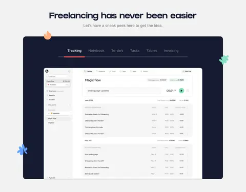
Large Midnight Ink (#151b31) rounded panel framing a white software interface preview, with small decorative accents.
Feature split
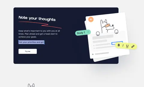
Two-column section pairing concise copy and an action with an angled product mockup or mascot illustration.
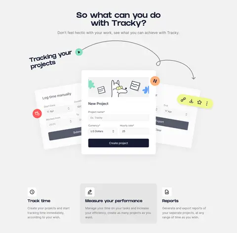
Floating UI card
White rounded interface card layered above mockups, using soft shadow and compact readable Inter labels.
Footer CTA
Oversized closing brand message with coral emphasis, a dark primary action, and a simple white footer bar.
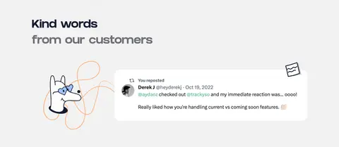
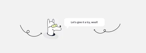
Imagery · Use interface mockups and custom illustrations, not photography, as the main visual content. Frame software screens as crisp white cards or layered sheets, with the small hand-drawn mascot, scribbles, arrows, cursor, and floating controls surrounding them. Keep illustration accents colorful but localized. Combine clean product UI with informal line art so the page remains friendly without making the interface previews feel imprecise.
Keep the page canvas light gray and visually continuous.
Use Midnight Ink for display headings and the primary action.
Reserve Coral Spark for brief emphasis rather than large areas.
Pair bold display headings with readable Inter body copy.
Use hand-drawn details to animate otherwise clean product previews.
Give interface mockups room to overlap their feature columns.
Keep shadows soft and card corners rounded.
✕ 不该做
Do not introduce full-page dark backgrounds.
Do not make illustration colors the dominant UI palette.
Do not use photographic imagery in place of the product mockups.
Do not crowd the hero or feature sections with dense copy.
Do not apply coral to every heading or control.
Do not add heavy borders or pronounced shadows to every card.
给 AI 的提示词
想快速出一个同风格的新页面,把这段话连同 DESIGN.md 一起发给 AI。
Build a polished productivity SaaS page with Tracky's calm, playful visual language. Use Quiet Canvas (#f2f2f2) as the continuous background and Midnight Ink (#151b31) for bold headings, dark showcase panels, and the primary CTA. Set display headings in a heavy geometric face such as Archivo Black and supporting text in Inter. Use Coral Spark (#ff5858) only for selective emphasis; reserve Paper White (#ffffff) for floating interface cards. Create centered sections within the measured 1200px maximum width, alternating feature copy with layered product mockups and hand-drawn mascot details. Keep a comfortable rhythm, soft card shadows, rounded corners, and restrained borders. Make product screens crisp and legible, and let sketchy arrows or decorative marks add personality without obscuring the interface.